











by Andrew Stychinskij
Door Sign and Door Number Sizes: A Practical Guide to Choosing the Right Size
The 2010 ADA Standards for Accessible Design do not prescribe a universal overall panel size for door signs or door numbers. The right door sign size follows from the sign's job, its content, viewing distance, and applicable accessibility requirements. Signs that identify permanent rooms are regulated through character height, Braille, and mounting requirements rather than a single required panel size.
Searching for a standard size often produces conflicting answers because manufacturers, institutions, and accessibility standards address different things. A format that works for a one-digit apartment number may not fit a department name, employee title, or tactile room label. Viewing distance, available space, and the amount of information all affect the final dimensions.
This guide explains how to choose a practical size, why panel dimensions and character height are not interchangeable, and when accessibility rules apply. BSign also helps customers evaluate the layout and can manufacture signs to custom dimensions when a ready-made option does not fit the project.
Key Takeaways
-
The 2010 ADA Standards do not prescribe a universal overall panel size for door signs or door numbers. Signs identifying permanent rooms are subject to tactile and visual requirements, while directional and informational signs follow visual-character requirements.
-
Raised characters on signs identifying permanent rooms must be 5/8 inch (16 mm) to 2 inches (51 mm) tall under §703.2.5. Minimum visual character height depends on mounting height and viewing distance under Table 703.5.5.
-
Panel size and character height are separate. Readability also depends on contrast and other design factors.
-
Greater viewing distance generally calls for larger characters; use Table 703.5.5 when §703.5 applies.
-
BSign checks content fit and may recommend different or custom dimensions.
What Determines Door Sign and Door Number Size
The right door sign size follows from the sign's job, its content, and the conditions in which people will read it. Start with purpose: a room number, an employee nameplate, and a directional message carry different amounts of information and serve different wayfinding needs. That purpose determines the text, symbols, and any accessibility features the layout must accommodate.
Next, consider viewing distance. A room number that visitors need to spot while walking down a corridor generally needs more prominent characters than a name read from directly outside an office. Character height then helps establish the space required for the text. Longer wording, multiple lines, a logo, or Braille can increase the overall panel dimensions even when the characters stay the same size.
Installation space matters as well. Measure the usable area on the door or adjacent wall, note nearby hardware and trim, and consider how the panel will relate to the door's proportions. For a multi-room property, evaluate door signs as a coordinated system instead of sizing each one in isolation.
In practical terms, use this sequence: purpose, information, viewing distance, character size, panel dimensions, accessibility check, and final size. It keeps visual preference in the process without letting appearance override legibility or applicable requirements.
Is There a Standard Door Sign Size?
No universal overall panel size is prescribed by the 2010 ADA Standards for Accessible Design. Instead, the applicable requirements depend on what the sign communicates. A sign identifying a permanent room or space is subject to tactile- and visual-character provisions, while directional and informational signs are subject to visual-character provisions. Those rules affect features such as characters, Braille, contrast, and placement, not a single width and height for every panel.
Why, then, do searches return so many "standard" sizes? In many cases, the term describes a manufacturer's commonly offered format. In others, it refers to an internal sign standard created by a college, hotel, hospital, or corporate campus for consistency across that particular property. Neither use establishes a universal requirement.
Formats such as 6 × 9 inches or 4 × 3 inches may be commonly offered, but that does not make either one the required choice. A short room label may fit a compact panel, while a department name, staff title, or bilingual message may require more width or an additional line. Tactile characters and Braille can also increase the space needed.
Treat an off-the-shelf size as a starting point. Confirm that the content fits at a readable character height, check whether accessibility provisions apply, and then decide whether the available format works or custom dimensions are more appropriate.
Door Number Sizes for Rooms, Apartments, and Hotels
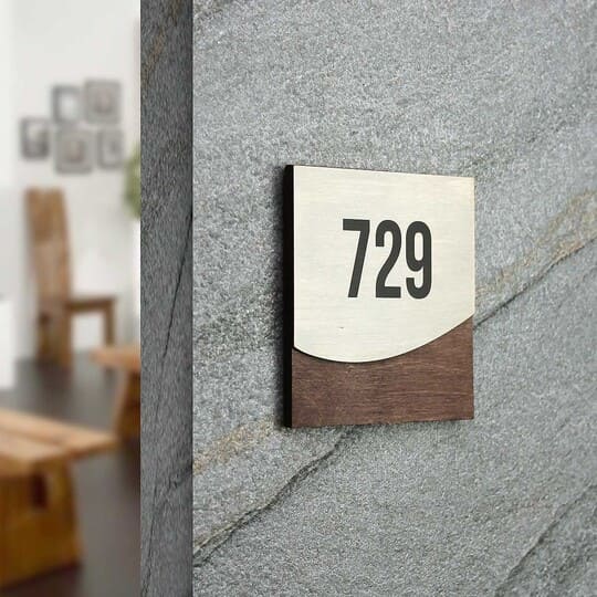
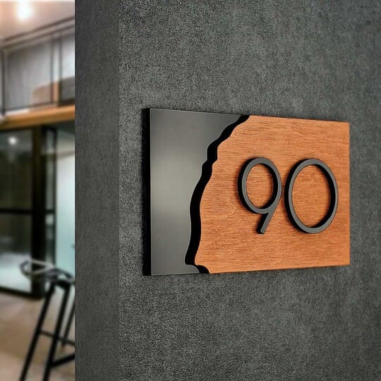
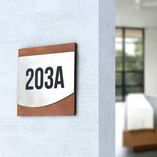
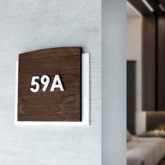
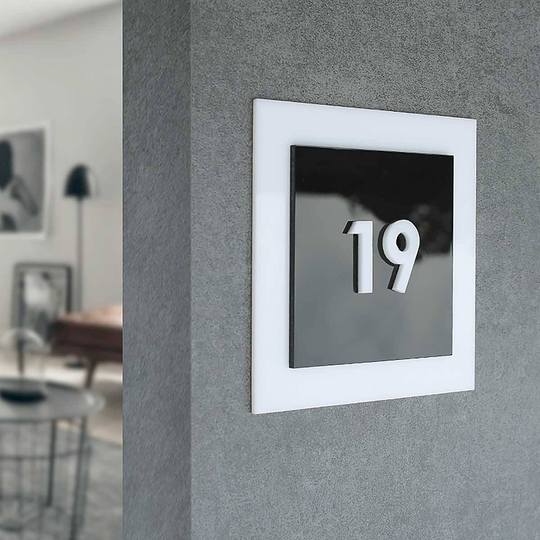
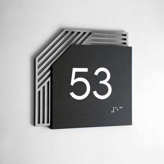
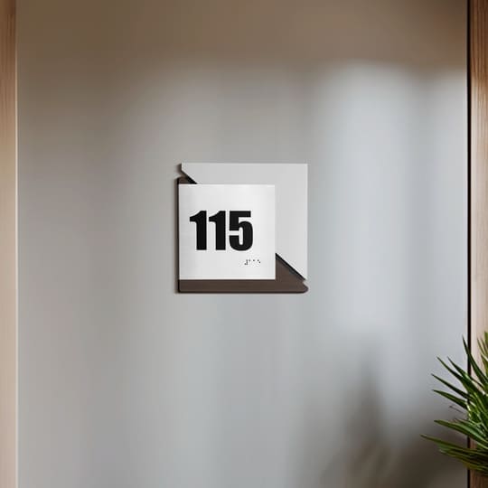
Interior door number sizes depend on viewing distance, the number of digits, available mounting space, and whether the number appears as individual digits or on a panel. Individual door numbers make digit height the main product dimension. On a number plate, the layout must also provide enough width for the digits and spacing around them.
A single hotel room number can use a compact composition, while a longer apartment number or an alphanumeric label needs more horizontal space. If the number shares a panel with a room name, department, or accessibility information, the overall dimensions may need to increase even when the digit height remains unchanged. Across a hotel or apartment building, keep the format consistent so guests, residents, and staff know where to look.
Interior room numbers should not be confused with house or address numbers. Address numbers are exterior identifiers intended to be seen from a street, driveway, or site entrance. Their requirements vary by jurisdiction and may be established by local building or fire codes. Check the rules for the project's location before selecting house number signs. The exterior recommendations and long-distance visibility formulas often found online should not be applied automatically to interior room identification.
Table 1. Door Number Formats and Size Considerations
|
Format |
What affects the size |
Notes |
|
Individual door digits |
Viewing distance, number of digits, available space |
No separate panel; digit height is the product height |
|
Door number sign |
Number of digits, spacing, panel proportions |
Overall panel size depends on the layout |
|
Room sign with number and text |
Amount of information, character height, spacing |
More content may require a larger panel |
|
Custom door sign |
Content, viewing distance, door or wall proportions |
Dimensions can be adjusted for the specific project |
Sign Size vs. Character Height: The Difference That Matters
Panel dimensions determine how much information a sign can hold; character height determines how large the letters or numbers appear. Character height is the height of the uppercase letter "I," which is how the 2010 ADA Standards measure it. In practical terms, letter height helps determine how readable text will be from a given distance, while the overall panel size determines how that text fits into the sign.
The basic relationship is straightforward: the greater the viewing distance, the larger the characters generally need to be. However, a letter height visibility chart published by a sign manufacturer is an industry reference, not a regulatory standard. Values differ among charts, and many widely circulated formulas were developed for exterior signs viewed over much longer distances. They should not be treated as universal rules for interior door signage.
For visual characters required to comply with §703.5 of the 2010 ADA Standards, minimum height comes from Table 703.5.5. For example, when characters are mounted from 40 inches (1015 mm) to 70 inches (1780 mm) above the floor and the horizontal viewing distance is less than 72 inches (1830 mm), the minimum character height is 5/8 inch (16 mm).
Height is only part of legibility. Character form, proportions, stroke thickness, spacing, finish, and contrast also affect how quickly text can be recognized. See BSign's fonts for interior signs for a closer look at type and shape choices.
How Material and Mounting Affect Perceived Size
Two signs with identical dimensions can look different once material, finish, contrast, and mounting are taken into account. Acrylic, wood, and stainless steel interact differently with the surrounding door or wall, while a matte or reflective surface changes how light behaves across the panel. These effects influence visual presence, but they do not prove that one material is inherently more readable than another.
For visual characters covered by §703.5 of the 2010 ADA Standards, §703.5.1 requires the characters and background to have a non-glare finish and to contrast with each other, using either light characters on a dark background or dark characters on a light background. The provision does not specify a contrast percentage.
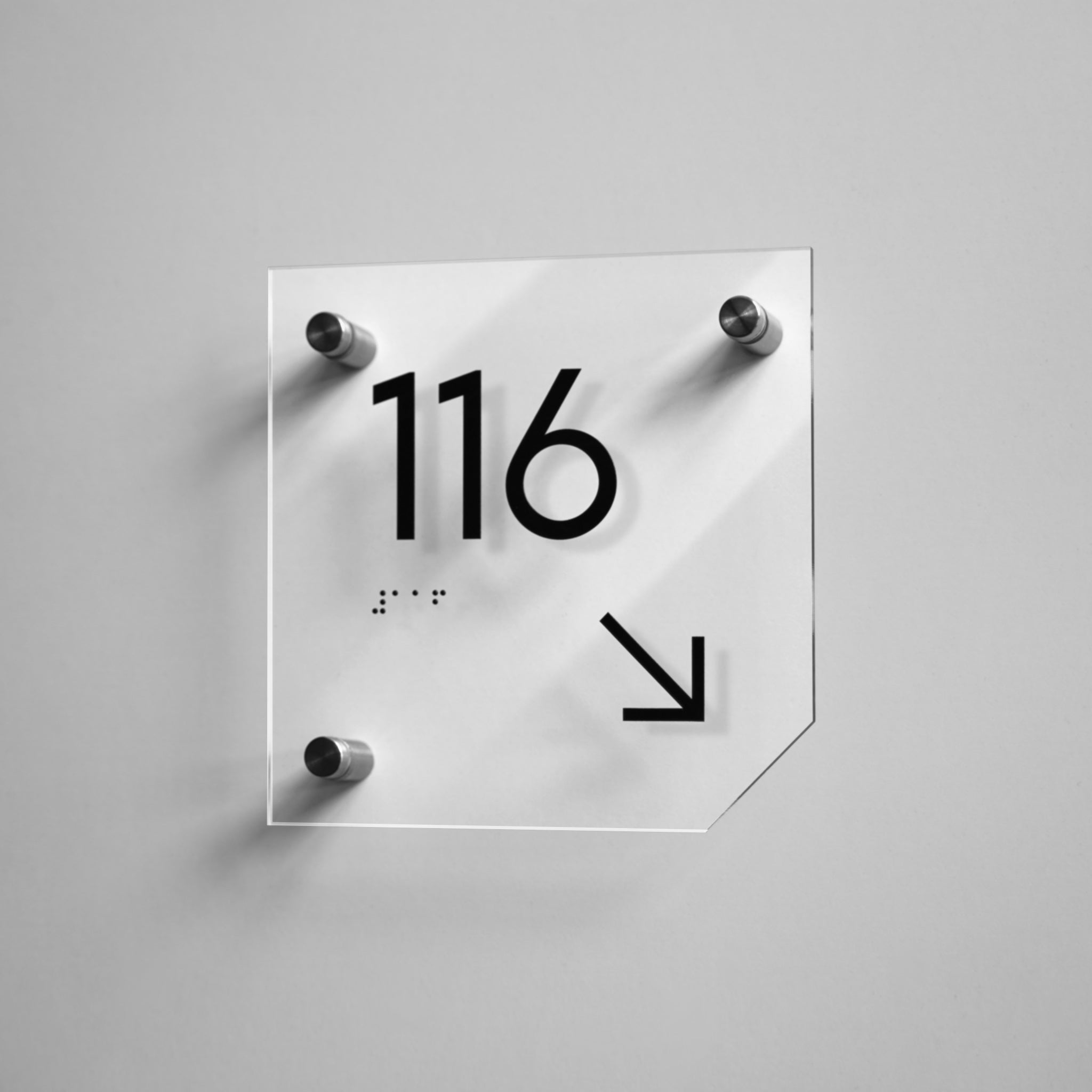
Mounting also affects perception. Double-sided tape keeps a panel close to a smooth surface. BSign metal spacers, or standoffs, position it 20 mm away from the wall, creating visible depth and shadow. That offset changes how substantial the sign appears without changing its width or height.
Before increasing the panel or character size, review the contrast, surface finish, background, and mounting method together. A better-balanced combination may address the visual issue without unnecessarily enlarging the sign.
When Character Size Is Regulated: Accessibility Requirements
Character-size rules apply to specific sign types, not automatically to every door plaque or number. Under §216.2 of the 2010 ADA Standards for Accessible Design, signs identifying permanent rooms and spaces must meet the tactile- and visual-character requirements in §§703.2 and 703.5. Directional and informational signs covered by §216.3 must meet the visual-character requirements in §703.5 of the 2010 ADA Standards.
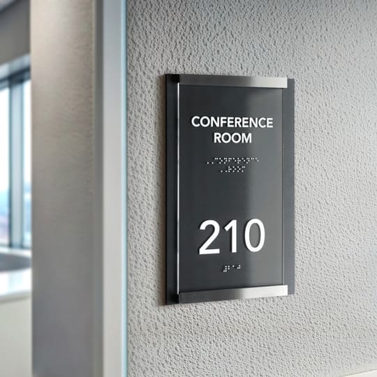
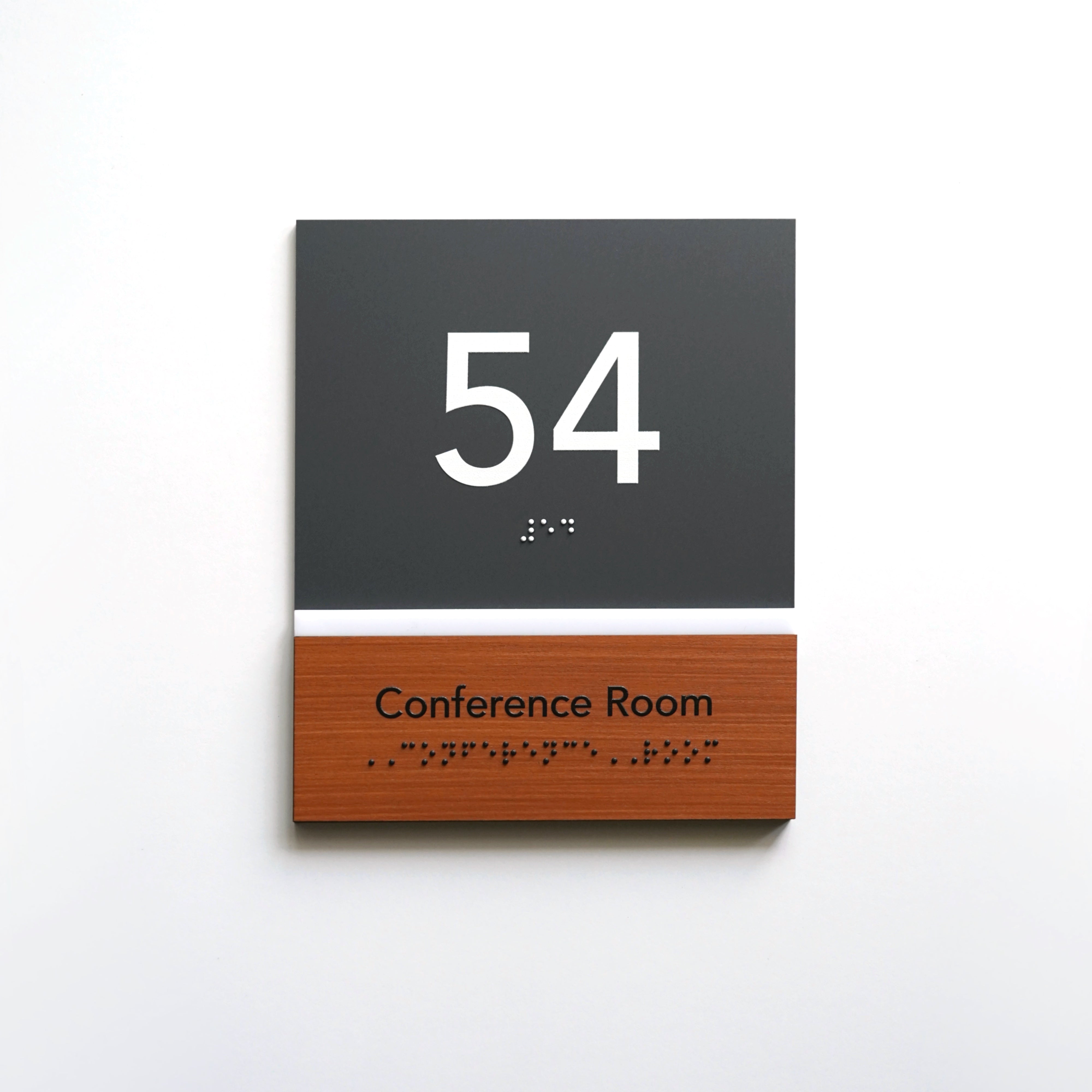
A room identification sign identifies a permanent room or space, such as a restroom or numbered office. Tactile characters are raised characters designed to be read by touch. Under §703.2.5 of the 2010 ADA Standards, raised characters must be 5/8 inch (16 mm) to 2 inches (51 mm) tall, measured using an uppercase "I." Where separate raised and visual characters with the same information are provided, the raised characters may be 1/2 inch (13 mm) minimum.
Minimum visual-character height comes from Table 703.5.5 of the 2010 ADA Standards and depends on mounting height and viewing distance.
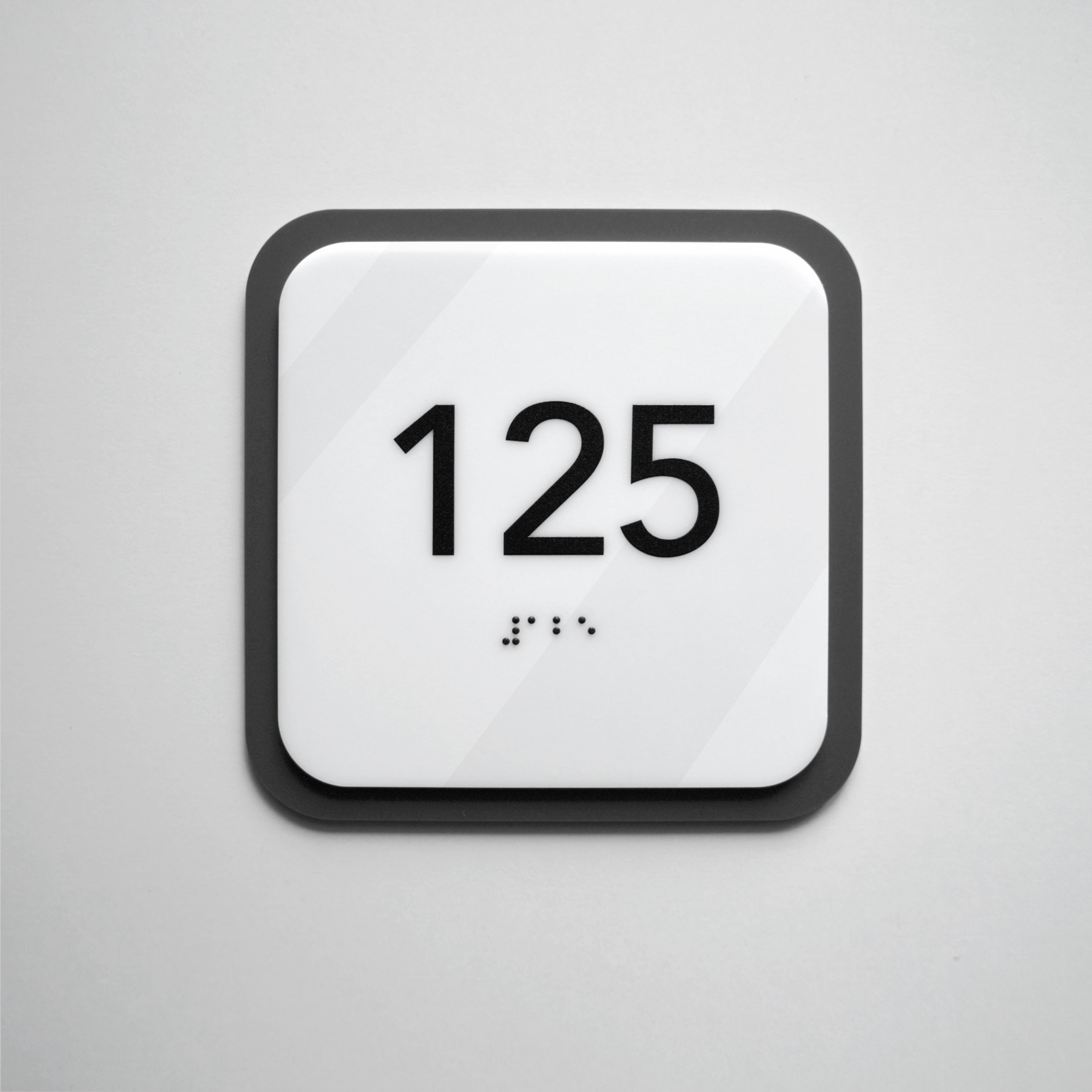
Contracted (Grade 2) Braille is placed below the corresponding text. Section 703.3.2 of the 2010 ADA Standards requires at least 3/8 inch (9.5 mm) of separation from other tactile characters, raised borders, and decorative elements, so Braille can increase the panel height. See BSign's ADA Braille signs for applicable product options.
Placement is regulated separately. Under §703.4.1 of the 2010 ADA Standards, the baseline of the lowest tactile character must be at least 48 inches (1220 mm) above the finish floor, and the baseline of the highest tactile character must be no more than 60 inches (1525 mm). Visual characters must be at least 40 inches (1015 mm) above the floor under §703.5.6 of the 2010 ADA Standards. The separate guide to ADA sign mounting height covers placement in more detail.
Table 2. When Character Size Is Regulated
|
Sign type |
Character size requirement |
Source |
|
Sign identifying a permanent room or space, tactile and visual |
Raised characters: 5/8 inch (16 mm) minimum to 2 inches (51 mm) maximum |
2010 ADA Standards §703.2.5 |
|
Directional or informational sign, visual only |
Minimum character height is determined by Table 703.5.5 based on mounting height and viewing distance |
2010 ADA Standards §216.3, §703.5.5 |
|
General interior door sign or door number not covered by the ADA Standards |
No character-size requirement under the 2010 ADA Standards; check other applicable codes if relevant |
— |
|
House or address numbers on a building |
Requirements depend on local building or fire codes |
Local code |
The ADA Standards regulate characters, Braille, contrast, and placement where applicable. They do not establish one universal overall panel size.
Sign Sizes by Space: Offices, Hotels, Apartments, Healthcare, and Schools
The setting changes what a sign must communicate and how people encounter it. The size should support the property's full wayfinding system, not just one door.
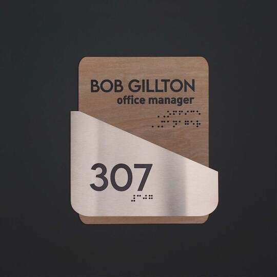
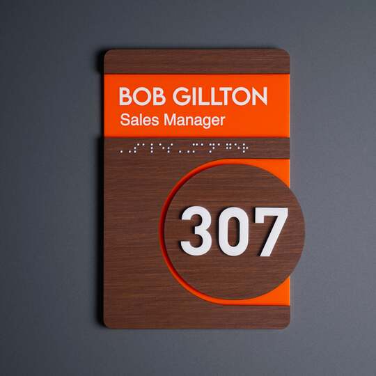
In offices, a panel may carry a room number, employee name, title, or department. More information can require additional width or lines, so office door signs should use a coordinated format that accommodates the longest typical message.
Hotels usually emphasize room numbers that guests can identify while moving through a corridor. Keep hotel door numbers consistent in position, character treatment, and panel proportions throughout the property. Apartment buildings have similar system-level needs, but the number of digits and usable space on each door may vary.
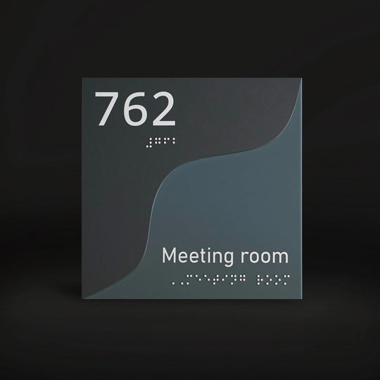
Healthcare facilities and schools often combine numbers with room functions or names. If a sign identifies a permanent room in a facility covered by the 2010 ADA Standards, the applicable character, Braille, and placement provisions must be included in the layout.
Table 3. How to Choose Sign Size for Different Spaces
|
Space |
What the sign carries |
Size logic |
|
Office |
Room number, name, title |
Size depends on the amount of information and the overall office signage system |
|
Hotel |
Room number |
Consider corridor viewing distance and use a consistent system across the property |
|
Apartment building |
Unit number |
Consider the number of digits, available space, and the building-wide signage system |
|
Healthcare |
Room number and function |
If the sign identifies a permanent room in an ADA-covered facility, character requirements apply |
|
School |
Room number and name |
Consider the information and overall system; permanent-room signs in an ADA-covered facility are subject to character requirements |
How to Choose the Right Size Before Ordering
Choose the final dimensions only after confirming the content, viewing conditions, accessibility needs, and physical installation area. A simple six-step check keeps those factors aligned:
- Define the sign's function and finalize the wording, number, and symbols.
- Estimate the distance from which people will usually read it.
- Select an appropriate character height. If §703.5 of the 2010 ADA Standards applies, use Table 703.5.5; otherwise, use viewing distance as a practical guide without relying on a universal formula.
- Size the panel around the content, spacing, and Contracted (Grade 2) Braille when required.
- Compare the proposed dimensions with the door or wall and with the property's wider sign system.
- Choose custom door signs if the available formats do not support the layout.
BSign product pages include a Size guide and a View in your space feature for a 3D preview. For custom orders, the team checks whether the information fits. If the wording is crowded or the panel appears out of proportion, BSign may recommend a different size before manufacturing. A layout can be sent for approval when requested or when text placement needs clarification.
For a multi-room project, send the room list and sign copy so BSign can help coordinate the sizes and produce a consistent set. You can order custom-size door signs for the full property or for an individual space.
Frequently Asked Questions
What is the standard size of a door sign?
The 2010 ADA Standards do not prescribe one overall panel size for every door sign. Manufacturers offer common ready-made formats, but the appropriate dimensions depend on content, viewing distance, available space, and any applicable accessibility requirements. Requirements for tactile and visual characters are separate from the panel's overall width and height.
What size should a door number be?
Choose a size based on the usual viewing distance, the number of digits, available space, and whether the digits stand alone or sit on a panel. The number should be easy to identify in its actual corridor or entry setting. BSign offers multiple formats and can also manufacture custom dimensions for a specific project.
How big should letters be on a sign?
The greater the viewing distance, the larger the letters generally need to be. For visual characters required to comply with §703.5 of the 2010 ADA Standards, use Table 703.5.5. For characters mounted 40 to 70 inches above the floor and read from less than 72 inches away, Table 703.5.5 gives a minimum of 5/8 inch (16 mm). This is a minimum sign letter height under those specific conditions, not a universal value for every sign.
What are the ADA character height requirements?
Under §703.2.5 of the 2010 ADA Standards, raised characters must be 5/8 inch (16 mm) to 2 inches (51 mm) tall. For visual characters covered by §703.5 of the 2010 ADA Standards, the minimum height is determined by mounting height and viewing distance in Table 703.5.5. These are character requirements, not an overall panel-size rule.
What size should an office door sign be?
An office sign should be large enough to hold the required room number, name, title, or department at a readable character height. Consider the normal viewing distance and make sure the dimensions fit the office's overall wayfinding system. A consistent format across rooms is usually more useful than sizing each sign independently.
Do hotel room numbers have a required size?
The 2010 ADA Standards do not prescribe a universal overall panel size for hotel room-number signs. If a sign identifies a permanent room and the 2010 ADA Standards apply to the facility, the layout must account for the relevant character, Braille, contrast, and mounting provisions. Other applicable codes may also need to be checked.
Are house numbers regulated?
House and address numbers may be regulated by local building or fire codes, and the requirements vary by jurisdiction. Check the rules that apply at the property's location before choosing a size or placement. Exterior address numbers serve a different purpose and viewing distance than interior door or room numbers.


