







by Oleksandr Radich
The Art of Wayfinding Signage: How Directional Systems Help People Navigate Spaces
Have you ever walked into a building and immediately felt at ease — not because of the marble floors or the soaring atrium, but because you simply knew where to go? That is the quiet power of wayfinding signage: clear directional signage, interior wayfinding signs, intuitive room numbers, and well-placed interior wayfinding signs that help people move through a space without stress.
And have you ever felt the opposite: the quiet, rising unease of not knowing which corridor leads where, which elevator serves your floor, which exit takes you back to where you parked?

Illustration: Bsign wayfinding sign - A custom layered wall wayfinding sign combining warm wood and brushed metal finishes to clearly direct visitors across the first and second floors.
That second feeling is more common than it should be. I have experienced it myself — at a conference in Kyiv, where I left my car in one of several underground parking levels and later that evening found it only because, by pure instinct, I had photographed the entrance on my way out. The building was modern. The parking was perfectly functional. But it gave me nothing to hold onto. No landmark, no color code, no clear sign. Just identical concrete and fluorescent light.
This is exactly the kind of problem that thoughtful building navigation signs, parking wayfinding signs, and custom directional signs are meant to solve.
It reminds me of Jerome K. Jerome's maze — the one where a child keeps rediscovering a toy she had lost an hour earlier, because the group was simply walking in circles. At the Toronto Zoo, only a well-designed map allowed me to cover nearly half the exhibits in three hours. Without it, the pavilions, enclosures, and paths formed exactly that kind of labyrinth.

The same applies at the Science Centre and the Royal Ontario Museum: spaces of genuine architectural ambition, where without strong wayfinding signage, floor signs, restroom signs, exit signs, and information signs, the corridors multiply into a puzzle. You are not in danger, exactly. But you are disoriented, and disorientation has a way of turning even beautiful space into hostile space.
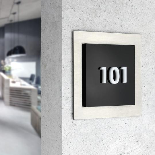
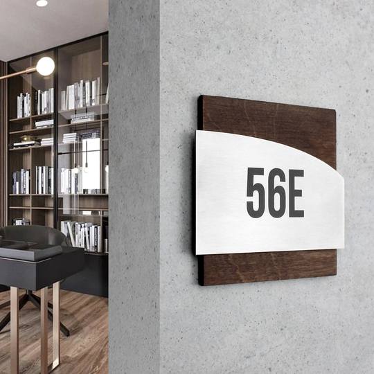
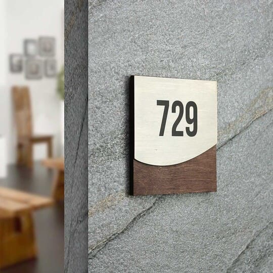
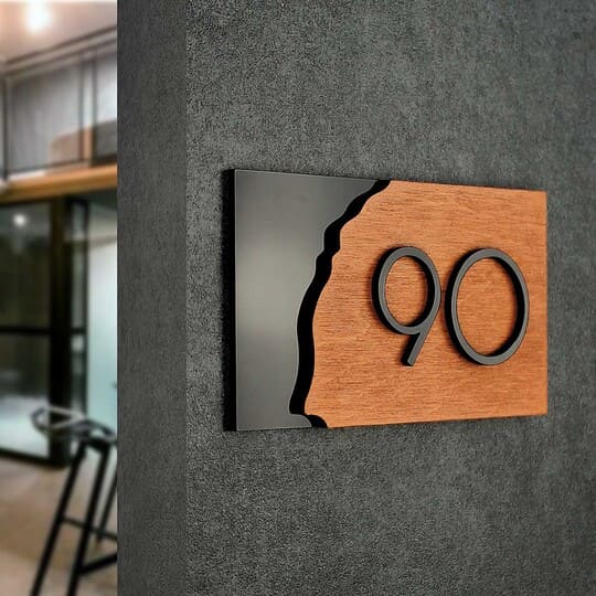
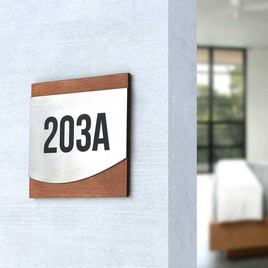
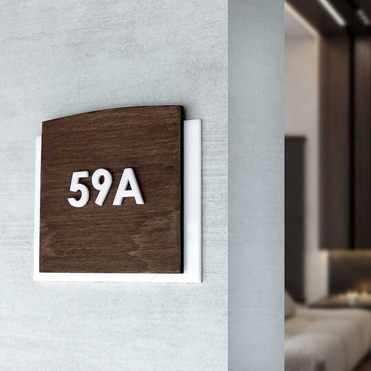
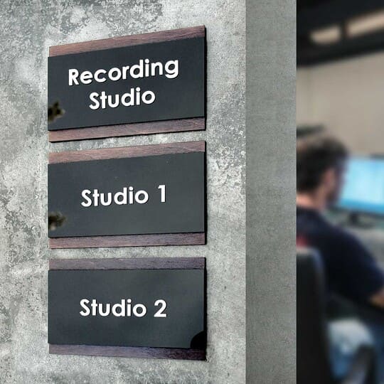
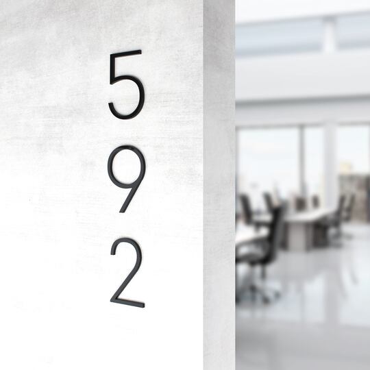
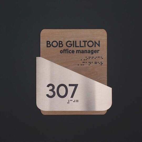
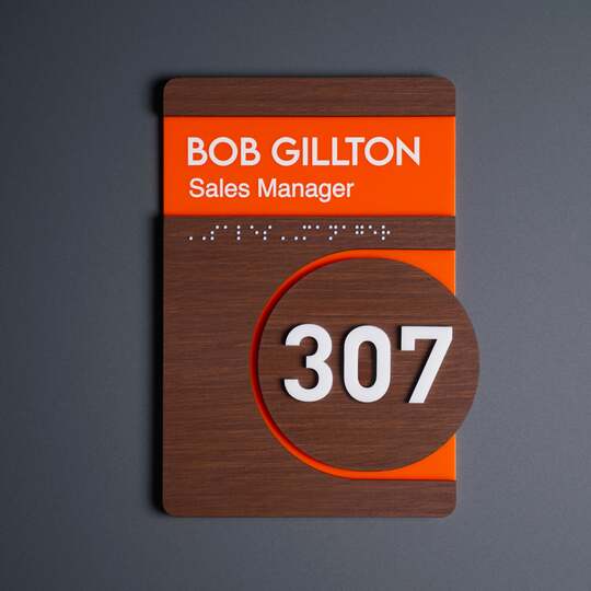
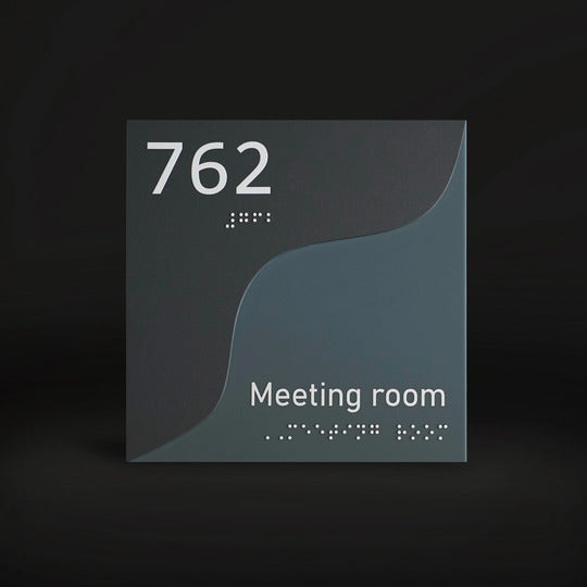
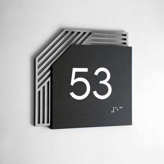
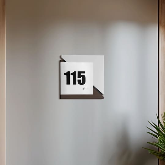
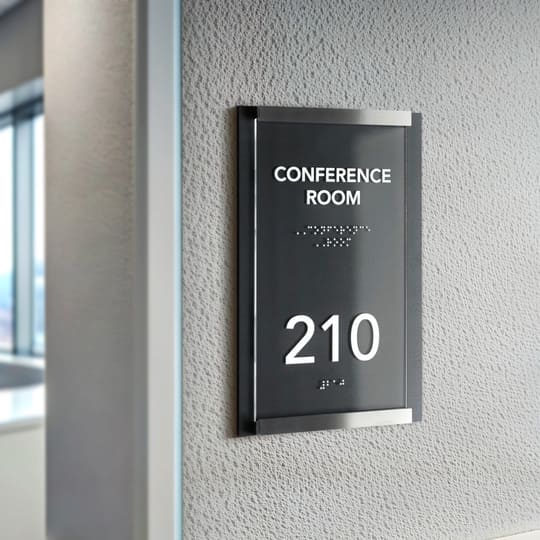
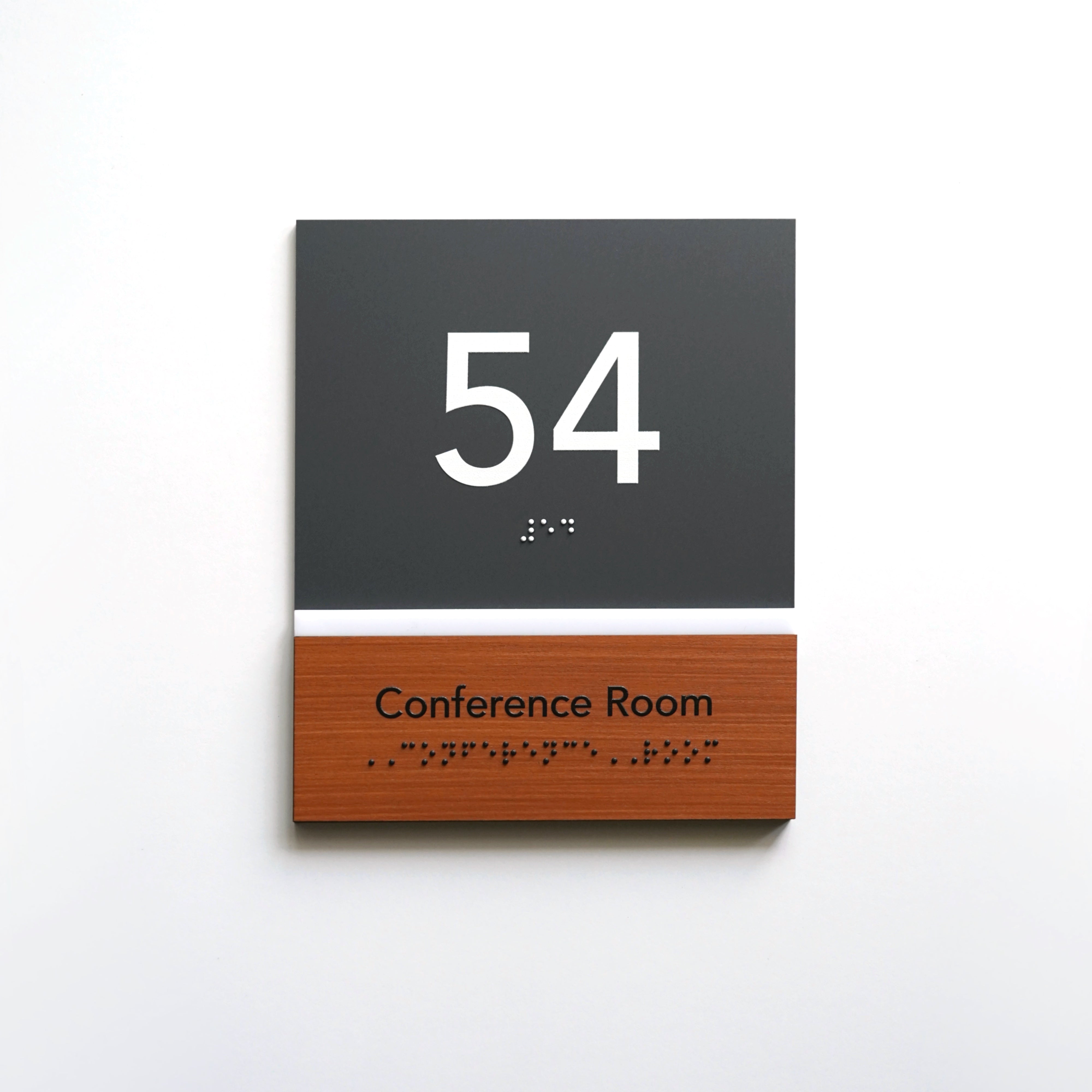
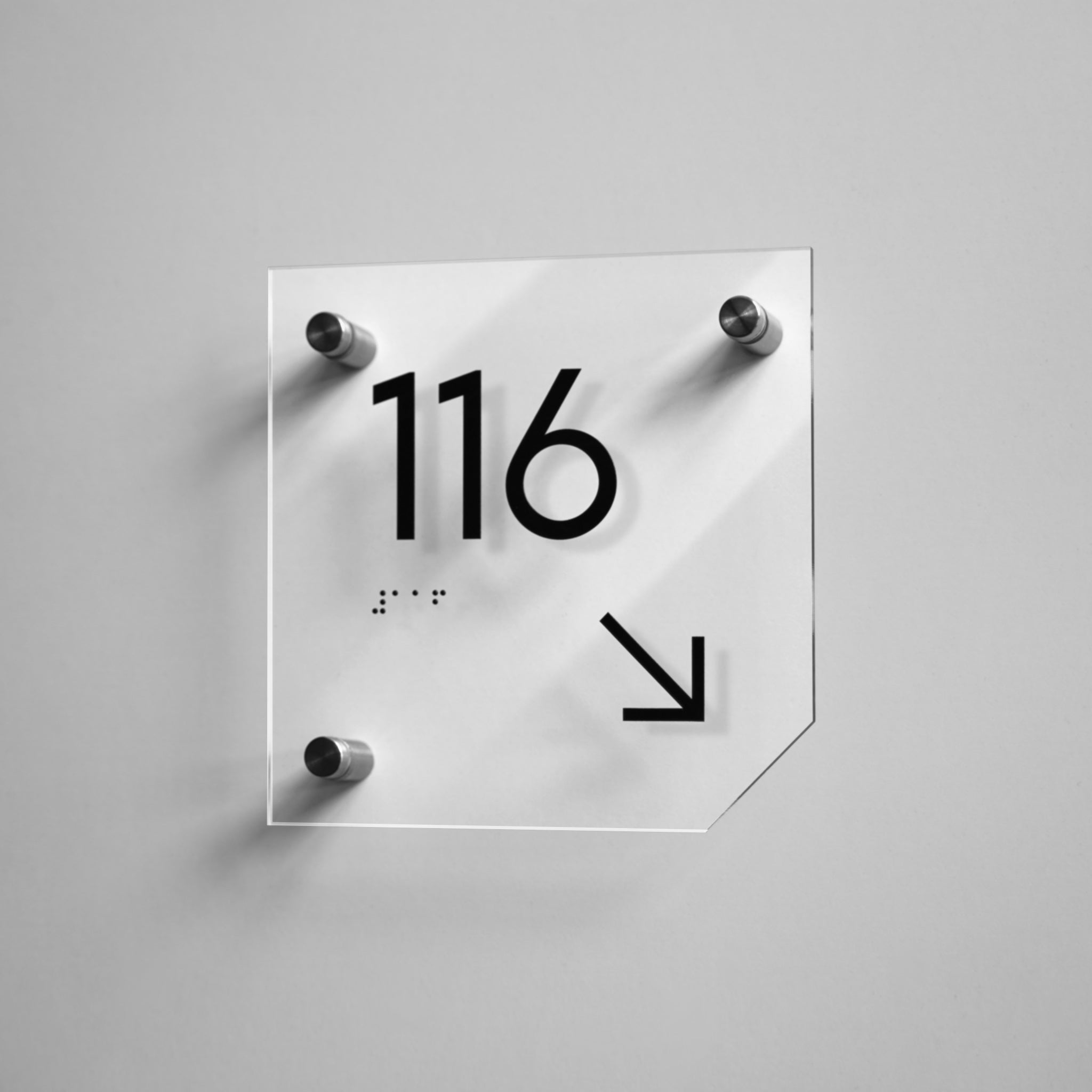
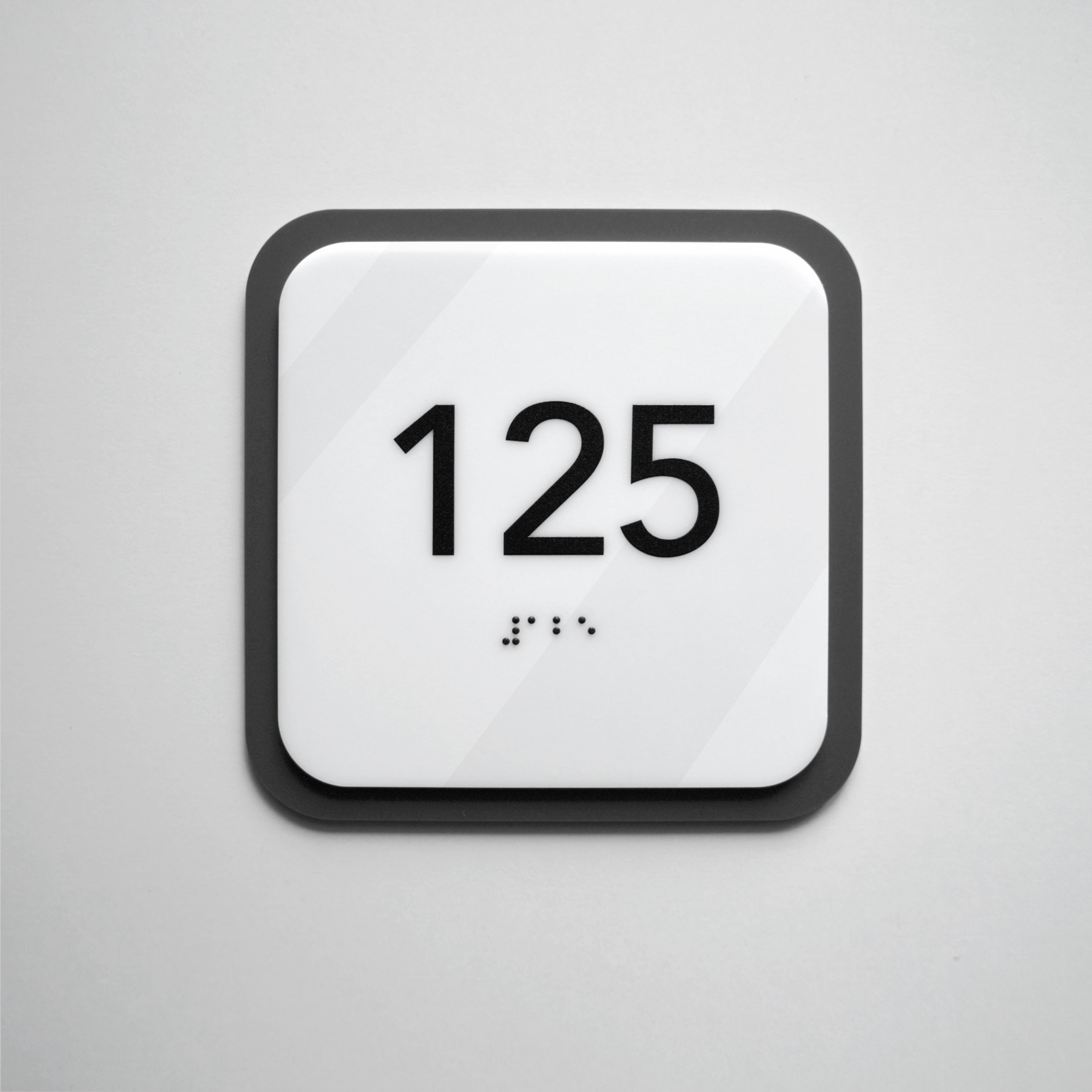
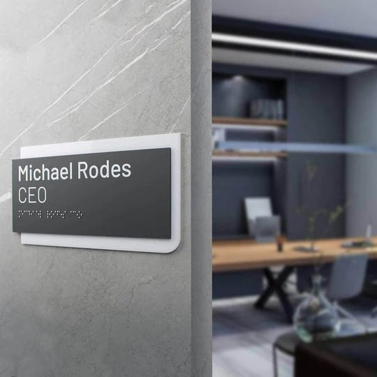
This is where companies like Bsign Store - Door Signs, Wayfinding become relevant for architects, interior designers, hotels, clinics, offices, apartment complexes, and public interiors. Bsign creates custom door signs from wood, acrylic, and stainless steel — exactly the small but essential visual cues that make a building easier to understand. Their products are customizable by size, text, icon, material, finish, QR code, and Braille, which makes them useful not only as decoration, but as part of a complete interior navigation system.
Why Wayfinding Design Starts with User Empathy
Before we talk about signs, maps, or design systems, there is a deeper question worth asking: can genuine attention to a person’s needs matter more than an impressive facade?
I think of a small hotel in Badrinath, perched at 10,000 feet near the edge of India and Tibet. It had no chandeliers, no scripted luxury, no polished concierge ritual. But the host immediately understood what a traveler needed at that altitude and at that hour.
Contrast that with a polished five-star venue in Kyiv where hospitality seemed to mean announcing complimentary red caviar at a business event. Notice: I have never gone to that event again.
True hospitality runs deeper than elegant phrasing or luxury surfaces. It is about sensing what a guest feels in a precise moment and helping them shed the anxiety they arrived with.
Architecture is no different. A building that does not communicate with its visitors is not neutral. It becomes a fortress. For someone navigating under time pressure, in an unfamiliar city, in a second language, or simply after a long day, that fortress can become exhausting.
Sometimes the stakes are even higher. Finding an exit can become a matter of life and death during a fire or an air raid alert — something we experience almost every week in Kyiv, Ukraine. A well-planned evacuation and wayfinding system is not decorative. It is part of the design brief.
What Is Wayfinding Signage?
To understand why wayfinding design matters, it helps to begin with a definition. Kevin Lynch, in The Image of the City, treated wayfinding as a basic function of a legible environment: people need surroundings they can understand in order to orient themselves and act with confidence.

Romedi Passini later expanded this idea in Wayfinding in Architecture, presenting wayfinding not as isolated signs, but as a broader problem of spatial decision-making: gathering information, choosing between options, and executing decisions while moving through space.
Chris Calori and David Vanden-Eynden extend that lineage into professional practice by defining environmental graphic design as a visually cohesive communication system within the built environment.
In other words, wayfinding is not only about signs telling people where to turn. It is about making the environment itself understandable.
People do not get lost only when signs are missing. They get lost when a space overloads them with choices, hides landmarks, delays critical cues, or forces decisions too late. Good wayfinding supports anticipation, not merely reaction.

What is Wayfinding Signage?
Wayfinding signage is a system of visual cues including directional signs, room numbers, and maps designed to help people navigate a space efficiently and without confusion.
Key Elements of Effective Wayfinding
- Clear directional signage
- Consistent naming systems
- Visible landmarks
- Logical placement at decision points
- Accessible design (Braille, contrast, height)
- The Mongrel of Design
Where Wayfinding Signage Is Used
- Hospitals
- Hotels
- Office buildings
- Parking structures
- Shopping centers
Environmental Graphic Design (EGD) in Wayfinding Systems
Calori and Vanden-Eynden describe environmental graphic design as the “ultimate hybrid” — even the “mongrel” of design — because it brings together graphic design, architecture, industrial design, interior design, landscape architecture, city planning, and urban thinking.
That phrase captures a professional truth. The wayfinding designer must work across disciplines that are often separated. Typography must remain legible at a distance. Materials must survive weather, touch, glare, and vandalism. Wording must be brief, humane, and unambiguous. Placement must align with circulation, sightlines, and decision points.

Environmental graphic design works in both 2D and 3D. Scale, lighting, material, movement, and architecture all affect meaning. Because it sits between disciplines, the designer often becomes a translator between client, architect, fabricator, and user. Even the most beautiful sign can fail if it appears five meters too late.
How Poor Navigation Affects Buildings and Users
Poor wayfinding is not a soft problem. Studies in hospitals show that staff spend significant time helping visitors find their way — time pulled away from patient care and often linked to stress, fatigue, and frustration.
One landmark hospital study estimated that poor wayfinding cost a single tertiary hospital more than $220,000 per year and consumed over 4,500 staff hours in giving directions. That is not a design inconvenience. It is a measurable drain on attention, labor, and institutional trust.

Research on complex indoor environments confirms that disorientation is especially difficult to prevent in repetitive spaces where landmarks are weak or absent. The labyrinth is not just a metaphor. It is a real spatial condition.
How Architecture Shapes Wayfinding Systems
Many wayfinding failures begin not with signage, but with architecture itself. A clear entrance sequence, visible destinations, intuitive vertical circulation, strong landmarks, daylight cues, naming logic, and consistent terminology all do as much work as arrows do.

This is where wayfinding stops being only a graphic exercise and becomes a human one. People do not navigate like robots reading instructions. They infer, compare, hesitate, remember, and guess. They look for reassurance. They search for patterns.
Good design respects that messy cognitive reality. The more decisions a visitor must make, the more mental energy they spend — and the more errors accumulate. For most people, poor wayfinding creates frustration. For doctors, pilots, emergency responders, and others working under pressure, additional cognitive load can become a genuine risk.

Why Signage and EGD Are Part of Building Infrastructure
Environmental graphic design is still often treated as something to add at the end of a project, once the architecture is finished. This is a costly mistake. When wayfinding is postponed, electrical needs may be missed, surfaces may already be fixed, finishes may clash, and circulation problems may become permanent.

Signage and Wayfinding Design argues against this afterthought approach. EGD is environmental communication — a disciplined process that should begin early in spatial planning, not in the final weeks before opening.
Calori and Vanden-Eynden’s “Signage Pyramid” offers a useful method: first define the information content system, then develop the graphic system, and only then give the system physical form through materials, size, mounting, and lighting.
The pyramid prevents a common mistake: designing attractive sign objects before the message logic is clear.

The Role of a Signage Designer in Complex Spaces
Clients sometimes imagine the wayfinding designer as a visual magician who disappears, returns with concepts, and solves the problem through inspiration. In reality, the designer becomes a sponge.

They absorb user needs, stakeholder politics, circulation problems, architectural constraints, access requirements, brand ambitions, fabrication realities, and nomenclature. What is this place called? What do visitors call it? What do staff call it? Which term is shortest, clearest, and least likely to be misread under stress?
These are design questions too. In hospitals, the most commonly searched destinations are often simple ones: cafeterias, restrooms, elevators, exits, and main lobbies. Each represents a user who is likely unfamiliar, stressed, or in a hurry.
Effective wayfinding research may include site visits, interviews, multilingual signage tests, accessibility reviews, and pictogram studies. This is not styling. It is research into who the users actually are.
 Illustration: In Phase 5, the project shifts from design to procurement, where the client’s contract representative manages the bidding process while the designer protects design quality through technical guidance and clear communication protocols.
How Navigation Systems Are Designed (Concept Phase)
Once research is complete, creative work begins — and one danger appears immediately: falling in love with the first good idea.

Wayfinding systems need conceptual breadth before polish. A mediocre idea rendered beautifully can survive longer than it should. That is why many designers still begin with sketching, diagramming, and collaborative pinups rather than polished digital presentations.
The early questions matter most: What decisions are users actually making? Where do they hesitate? Which messages repeat? Which terms confuse? Which concepts can scale across hundreds of sign conditions?
Early-stage wayfinding requires creative freedom, but also creative skepticism. A concept must remain legible at speed, survive real-world constraints, support first-time visitors, and stay coherent across the entire building.

When to Start Signage Design in a Project
Timing separates student projects from professional practice. Calori and Vanden-Eynden argue that signage design should usually lag behind architecture by one or two phases.

If the wayfinding designer is brought in too early, the building may still be changing. Floor plans, room names, and circulation paths may remain unstable. But if the designer is brought in too late, the architecture is already locked, surfaces are finished, electrical needs are missed, and signage is forced into compromise.
Major wayfinding projects can take months or even years because they must track architectural and construction timelines. Wayfinding succeeds when it enters the project late enough to design for real conditions, but early enough to shape them.
Signage Planning and Documentation
By the time design is complete, poetry must become precision. A sign system becomes schedules, types, codes, dimensions, message families, mounting standards, materials, finishes, and location plans.
Signage programs are organized into sign types — repeatable families defined by shared characteristics such as size, material, mounting method, illumination, and construction logic. The message may change, but the underlying type remains consistent.

This logic is both aesthetic and economic. Grouping signs into types reduces chaos, controls cost, and lowers fabrication errors. Instead of inventing five hundred different objects, the designer creates a disciplined kit of parts that can be built consistently.
Accessibility in Wayfinding Signage Design
Accessibility cannot be treated as a final compliance check. It belongs at the center of the system. A navigation system that only works for confident, able-bodied, fluent users is not truly clear. It is merely selective.
Accessibility standards require many permanent room signs to include raised characters, Grade 2 Braille, non-glare finishes, contrast, and specific mounting ranges. These are not decorative upgrades. They are conditions of legibility.
Accessibility shapes naming, contrast, placement, sightlines, reach, and cognitive load. Designing for accessibility is not designing for a minority case. It is designing for the real variability of human movement, perception, and stress.
Accessibility is not the margin of wayfinding design. It is the test of whether the system is truly understandable.
Evidence-Based Navigation Design
Wayfinding is no longer guided only by taste, precedent, or intuition. The field is moving toward evidence-based design — making decisions about the built environment using credible research to achieve better outcomes.
Designers are increasingly expected to test assumptions about legibility, placement, color, landmarks, and user stress. Virtual environments, participatory evaluation, and post-occupancy research can help teams identify problems before expensive physical changes are made.
The future of wayfinding belongs less to intuition alone and more to tested decisions — design that can explain not only what works, but why.
Custom Wayfinding Signs for Real Spaces
Companies like Bsign Store create custom wayfinding signage systems designed for real-world environments, including:
- Door signs with clear numbering
- Directional signs for corridors and floors
- ADA-compliant signage with Braille
- Material options like wood, acrylic, and stainless steel
These elements help transform complex buildings into intuitive, user-friendly spaces.
Questions and Answers about Wayfinding Signage
1. Where is wayfinding signage used?
Wayfinding signage is used in hospitals, hotels, office buildings, parking structures, shopping centers, museums, airports, and any complex public interior where people need to navigate unfamiliar space.
2. Why is wayfinding important in buildings? Without clear directional signage, disorientation creates real costs — lost time, staff interruptions, and stress. In emergencies, well-placed interior wayfinding signs can be the difference between a calm evacuation and a dangerous one.
3. What makes a wayfinding system effective? Effective wayfinding signs are placed at decision points before confusion arises, use consistent naming and visual language throughout, and work for all users — including those with accessibility needs.
4. When should wayfinding design begin in a building project? Wayfinding signage should be integrated early in the design process, not added after construction — late involvement means missed electrical needs, locked surfaces, and compromised placement.
5. What does poor wayfinding actually cost? One hospital study found that weak interior wayfinding signs cost a single facility over $220,000 per year and consumed more than 4,500 staff hours redirecting lost visitors.
What Makes Wayfinding Signage Effective
When wayfinding design works, it does not call attention to itself. You do not stop to admire the sign. You simply move.
There is no applause for a traveler who catches the right train without hesitation, or for a hospital visitor who finds radiology without asking a receptionist. Yet these small successes save time, reduce stress, lower staff interruption, and preserve dignity.
A wayfinding system is not truly finished when the last sign is mounted. The real test begins when actual people use it in an actual building. The wisest designers return to the site. They watch where people pause, listen to frontline staff, and discover which names or junctions still produce hesitation.

Illustration: Wayfinding signs made by Bsign.
A wayfinding system is ultimately judged by how calmly people move through space — how little they hesitate, how rarely they ask for help, and how naturally the environment seems to explain itself. Every element plays a role in this: the clarity of directional signage at decision points, the consistency of interior wayfinding signs across corridors and floors, the quiet logic of wayfinding signs that confirm you are still on the right path.
When wayfinding signage succeeds, it does not merely move bodies through space. It gives people back a small but vital confidence: the feeling that the world is readable, and that they know how to proceed.


