










by Oleh Tomilenko
ADA Sign Compliance Checklist: How to Verify Tactile, Braille, and Visual Signs
An ADA sign check starts by classifying the sign under §216, then verifying the elements that apply: raised characters, Grade 2 Braille, visual contrast and finish, pictograms, mounting height, and door-side placement. Under the 2010 ADA Standards for Accessible Design, requirements vary by sign type, so not every sign needs Braille.
By BSign Store Editorial Team
Reviewed against the 2010 ADA Standards for Accessible Design as of August 8, 2026
Review signs at four points: artwork approval, receipt of the manufactured order, installation, and the final on-site inspection. Because ADA signage requirements vary by sign type, classify each sign before checking dimensions. Its function determines whether the tactile, Braille, visual, or pictogram rules apply. Catching an incorrect font, missing Braille line, or wrong pictogram field in the artwork usually requires a file revision. Finding the same error after production may mean remaking an entire sign package. A consistent review process keeps the designer, buyer, installer, and facility team working from the same criteria.
Key Takeaways
-
Section 216 determines whether a sign needs tactile elements, visual characters, or both.
-
Braille is not required on every informational or directional sign.
-
Tactile baselines must be at least 48 inches (1220 mm) above the finished floor or ground surface and no more than 60 inches (1525 mm) high.
-
The 2010 Standards require contrast, but they set no numeric contrast percentage.
-
Review each sign at design, production, installation, and final on-site inspection.
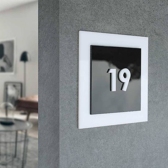
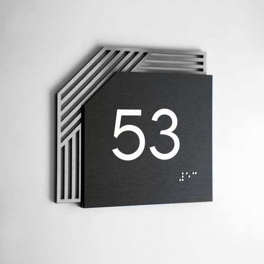
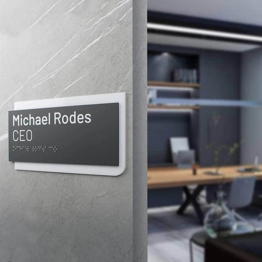
An example of an information index where the contrast between the text and the background is clearly visible, which affects its readability:
Why You Need a Sign-by-Sign Compliance Checklist
At each handoff, the designer classifies the sign, confirms its message, and checks the required tactile and visual elements. When the order arrives, the buyer compares the signs with the approved artwork and inspects character depth, Braille, finish, and fabrication. The installer verifies height, door configuration, placement, and clear floor space. Finally, the facility manager or owner reviews the installed package under normal lighting and confirms that furniture or late changes have not created conflicts. Recording each result sign by sign makes missed criteria easier to find and correct before opening.
Which Signs Fall Under ADA Requirements
Section 216 sets the scope. Permanent room and space identification signs, including room ID signs such as restroom signs, numbered or named rooms, and floor designations, need raised characters, Braille, and applicable visual characters. This category includes ADA room identification signs, not every sign attached to a door. Informational and directional signs for interior spaces need visual characters under §703.5, but they do not automatically need Braille. Doors at exit passageways, exit discharge, and exit stairways need tactile identification under §216.4.1.
The complete §216.1 exceptions cover building directories, menus, seat and row designations in assembly areas, occupant names, building addresses, company names and logos, and signs used for seven days or less. In parking facilities, signs are exempt from §216.2, §216.3, and §216.6 through §216.12; parking identification is addressed separately. Signs in detention and correctional facilities outside public-use areas are also exempt. Separately, §216.2 provides an exception for exterior permanent-room signs that are not located at the door to the space they serve: those signs are not required to comply with the raised-character requirements in §703.2.
Key fact: Permanent room identification sign
A sign that labels a room or space whose designation is unlikely to change, such as a restroom, room number, floor number, or fixed room name. Effective unit numbering and identification planning helps keep these signs consistent across a building and makes it easier for residents and visitors to locate specific units.
Step 1. Confirm the Sign Type and Required Elements
Start every review by matching the sign's function to §216 and §703.1. Record it on the sign schedule so later reviewers know which criteria apply.
-
Permanent room or space designation: raised characters, Grade 2 Braille, and applicable visual characters.
-
Directional or informational sign: visual characters under §703.5.
-
Door at an exit passageway, exit discharge, or exit stairway: tactile and applicable visual characters under §216.4.1.
-
Exempt sign: document the applicable §216.1 exception instead of assuming that all technical criteria apply.
When both visual and tactile characters are required, §703.1 allows one integrated sign or two coordinated signs, one visual and one tactile. Do not create a new category based only on a product name; classify the sign by what it communicates and where it is used.
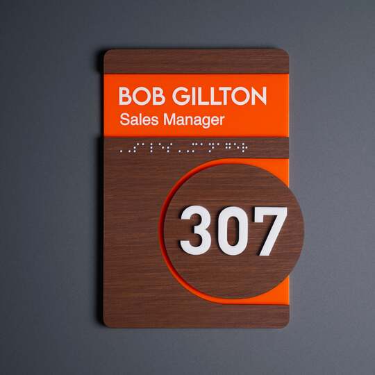
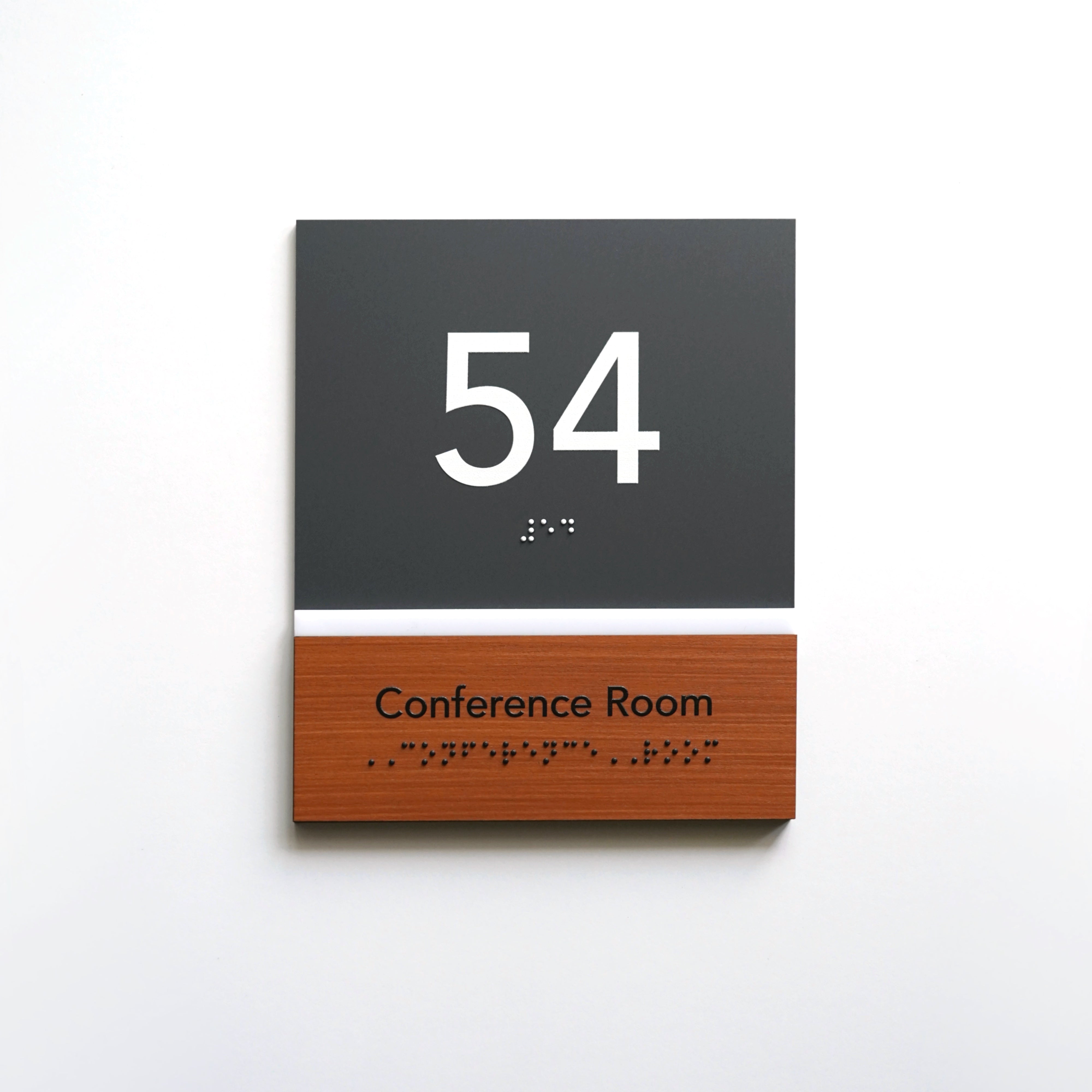
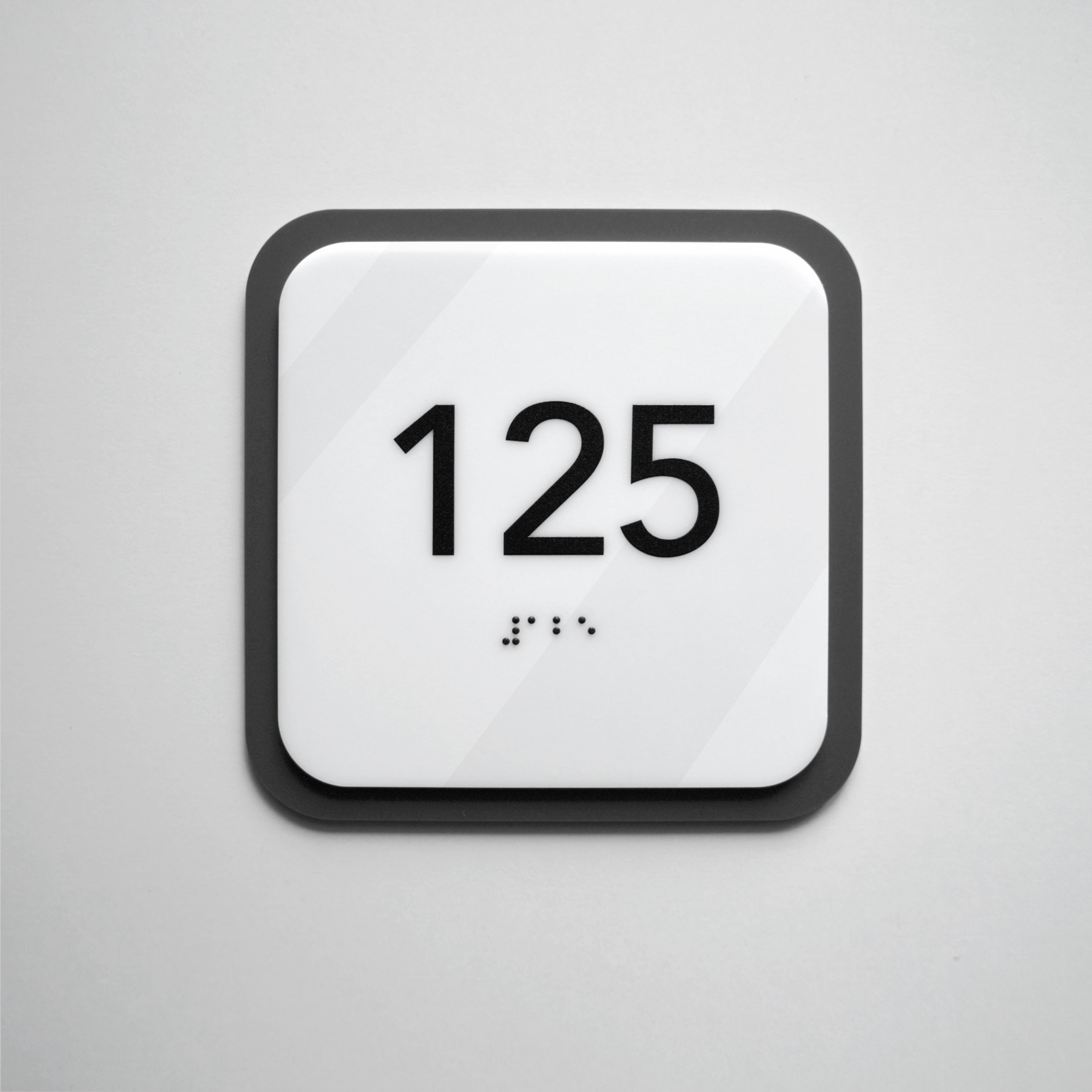
An example of a tactile sign with raised text and Braille to indicate a room:
Step 2. Check Raised Characters
Apply these checks to required raised characters. Compare artwork and a sample with §703.2.1 through §703.2.8.
-
Depth: Use a depth gauge or calipers to confirm a projection of at least 1/32 inch (0.8 mm).
-
Case and style: Confirm that characters are uppercase, sans serif, and non-decorative.
-
Proportions and height: Measure the uppercase "O" and "I." O width must be 55–110% of I height; I height must be 5/8 inch (16 mm) to 2 inches (51 mm).
-
Stroke and spacing: Stroke thickness of the uppercase letter "I" is 15% maximum of character height. For rectangular cross sections, spacing is 1/8 inch (3.2 mm) minimum and four stroke widths maximum. For other cross sections, it is 1/16 inch (1.6 mm) minimum at the base, 1/8 inch (3.2 mm) minimum at the top, and four stroke widths maximum at both points. Keep characters at least 3/8 inch (9.5 mm) from raised borders and decorative elements.
-
Line spacing: Measure baseline to baseline; accept 135–170% of character height.
If separate raised and visual characters carry the same information, the §703.2.5 exception permits raised characters as small as 1/2 inch (13 mm).
Key fact: Raised characters
Letters, numbers, or symbols that project above the sign background and can be read by touch. They are separate from Braille and follow their own dimensional rules in §703.2.
Step 3. Check the Braille
The ADA Braille sign requirements apply wherever §703.2 requires raised characters to be duplicated in Braille. Under §703.3, use Grade 2 (contracted) Braille and verify that the translation conveys the same information as the corresponding raised text. Braille belongs below that text; on a multiline message, place it below the entire text block.
Measure at least 3/8 inch (9.5 mm) from the Braille to other tactile characters, raised borders, and decorative elements. The elevator-car-control exception reduces that separation to 3/16 inch (4.8 mm) and permits adjacent placement. Inspect the physical sign, not just the artwork: dots must be domed or rounded and must meet the geometry in Table 703.3.1. Flat printing or painted dots are not tactile Braille. Check for missing, chipped, flattened, or uneven dots before accepting the order.
Key fact: Grade 2 Braille
Contracted Braille that shortens common words and letter groups according to established transcription rules. The 2010 ADA Standards require it on signs where Braille applies.
When Braille Is Not Required
Braille is required for permanent room and space identification signs and the tactile exit-door identifications covered by §216.4.1. Directional and informational signs follow §703.5 visual-character rules without a Braille requirement. Building directories, menus, and signs used for seven days or less fall outside §216. For a fuller explanation, see when Braille is required for ADA-compliant signage.
Step 4. Check Visual Characters, Contrast, and Finish
Apply these checks to signs with visual characters. Under §703.5.1 through §703.5.9, characters and their background need a non-glare finish and either a light-on-dark or dark-on-light contrast. Characters may use uppercase, lowercase, or both, but their form must be conventional, not italic, oblique, script, highly decorative, or unusual.
Confirm that uppercase O width is 55–110% of uppercase I height. Select character height from Table 703.5.5 using the baseline height and horizontal viewing distance, and locate visual characters at least 40 inches (1015 mm) above the finished floor or ground. Elevator car controls are exempt from this height rule. Stroke thickness must be 10–30% of character height, character spacing 10–35%, and line spacing 135–170%.
An integrated sign whose visual characters comply with §703.2 and are accompanied by compliant Braille is exempt from §703.5.2 through §703.5.9, but not §703.5.1. Inspect the installed sign under working light from several angles. The federal Standards do not require a 70% contrast ratio or any other numeric percentage.
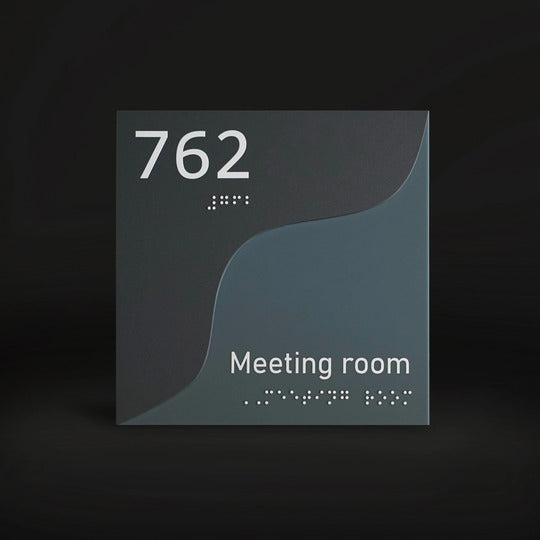
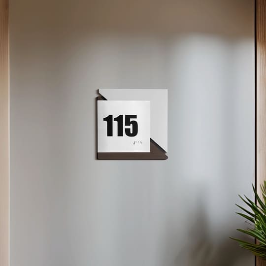
An example of a visual indicator that is checked for font readability, contrast, and ease of perception:
Step 5. Check Pictograms and the ISA
For signs with pictograms, measure a pictogram field at least 6 inches (150 mm) high and keep characters and Braille outside that field. Under §703.6, the pictogram and its field need non-glare finishes and a light-on-dark or dark-on-light contrast.
When a pictogram identifies a permanent interior room or space, place its raised and Braille text descriptor directly below the field. Not every graphic needs a descriptor: the advisory to §216.2 identifies informational graphics such as a no-smoking symbol, an occupant logo, and the International Symbol of Accessibility (ISA) as examples that do not. Use the ISA where §216 requires it, and check the symbol against §703.7 rather than treating it as an ordinary room pictogram.
Step 6. Check Materials, Edges, and Durability
For tactile signs, the advisory to §703.2 recommends avoiding sharp or abrasive edges. Treat that as guidance, not a separate mandatory technical specification. Then apply product-specific checks: confirm that cleaning and traffic will not flatten Braille dots, wear down raised characters, create glare, or remove contrast, and verify secure fastening.
Based on BSign Store's production experience, the finish and any raised or Braille elements should remain usable through facility cleaning and traffic. Durability and fastening are practical product requirements, not universal ADA criteria.
Step 7. Check Mounting Height and Placement
For tactile signs, use the guide to ADA sign mounting height and placement for detailed scenarios. Measure to character baselines, not the panel edge: the lowest tactile baseline must be at least 48 inches (1220 mm) above the finished floor or ground surface, and the highest must be no more than 60 inches (1525 mm) above the finished floor or ground surface under §703.4.1. Elevator car controls are exempt from this range.
At a single door, use the latch side. At double doors with one active leaf, use the inactive leaf; with two active leaves, mount the sign to the right of the right-hand door. If no wall space is available, use the nearest adjacent wall. Center a clear floor space of at least 18 by 18 inches (455 by 455 mm) on the tactile characters, beyond the door-swing arc from closed to 45 degrees open. The push-side exception applies only to doors with closers and no hold-open devices.
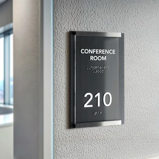
An example of a tactile sign for a sanitary facility with a pictogram, raised symbols and Braille:
Step 8. Check Access and Obstructions
When organizing door sign placement across a building, make sure a person can approach and touch a tactile sign from its required clear floor space. During the final walk-through, look for furniture, trash cans, equipment, displays, planters, or decor that blocks that position. Confirm that the reading area is outside the restricted door-swing arc and that no newly installed hardware interferes with reach or touch.
Repeat this check after furnishings arrive. A correctly placed sign can become unusable when the room setup changes. Keep this review focused on access to the sign; a full accessible-route review involves additional requirements outside the scope of this article.
Table 1. ADA Signage Requirements and Verification Criteria
|
Element |
What to verify |
Applicable sign type |
Official source |
Status |
|
Sign type and required elements |
Sign classified under §216; required tactile, visual, and pictogram elements identified |
All |
Mandatory verification step |
|
|
Raised character depth |
Characters raised 1/32 inch (0.8 mm) minimum above the background |
Tactile signs |
Mandatory ADA requirement |
|
|
Character case and style |
Uppercase, sans serif; no italic, oblique, script, or highly decorative forms |
Tactile signs |
Mandatory ADA requirement |
|
|
Character proportions and height |
Uppercase O width 55–110% of uppercase I height; character height 5/8 inch (16 mm) to 2 inches (51 mm); 1/2 inch (13 mm) minimum permitted where separate raised and visual characters carry the same information |
Tactile signs |
Mandatory ADA requirement |
|
|
Stroke and spacing |
Stroke thickness of the uppercase letter "I" is 15% maximum of character height; for rectangular cross sections, spacing 1/8 inch (3.2 mm) minimum and four stroke widths maximum; for other cross sections, 1/16 inch (1.6 mm) minimum at the base, 1/8 inch (3.2 mm) minimum at the top, and four stroke widths maximum at both points; 3/8 inch (9.5 mm) minimum from raised borders and decorative elements; line spacing 135–170% |
Tactile signs |
Mandatory ADA requirement |
|
|
Braille grade and position |
Grade 2 Braille below the corresponding text; below the entire text block when multiline |
Tactile signs |
Mandatory ADA requirement |
|
|
Braille separation and dot shape |
3/8 inch (9.5 mm) minimum separation; domed or rounded dots; elevator control exception 3/16 inch (4.8 mm); dimensions per Table 703.3.1 |
Tactile signs |
Mandatory ADA requirement |
|
|
Visual finish and contrast |
Non-glare finish; light characters on dark background or dark on light |
Signs with visual characters |
Mandatory, qualitative; no numeric ADA ratio |
|
|
Visual character style and proportions |
Conventional, non-decorative form; uppercase O width 55–110% of uppercase I height, unless the integrated-sign exception applies |
Signs with visual characters |
Mandatory ADA requirement |
|
|
Visual character stroke and spacing |
Stroke thickness 10–30%; character spacing 10–35%; line spacing 135–170%, unless the integrated-sign exception applies |
Signs with visual characters |
Mandatory ADA requirement |
|
|
Visual character height |
Height selected from Table 703.5.5; characters at least 40 inches (1015 mm) above the finished floor or ground, unless the integrated-sign or elevator-control exception applies |
Signs with visual characters |
Mandatory ADA requirement |
|
|
Pictogram field and descriptors |
Field 6 inches (150 mm) minimum; no characters or Braille inside; tactile descriptors below where a pictogram designates a permanent interior room or space |
Signs with pictograms |
Mandatory for pictogram designations |
|
|
Mounting height |
48 inches (1220 mm) minimum above the finished floor or ground surface to the lowest tactile baseline; 60 inches (1525 mm) maximum above the finished floor or ground surface to the highest |
Tactile signs except elevator car controls |
Mandatory ADA requirement |
|
|
Placement at the door |
Latch side; correct leaf or right-hand location at double doors; nearest adjacent wall if needed |
Tactile signs at doors |
Mandatory ADA requirement |
|
|
Clear floor space |
18 by 18 inches (455 by 455 mm) minimum, centered on tactile characters and beyond the door-swing arc from closed to 45 degrees open; apply the stated push-side exception |
Tactile signs at doors |
Mandatory ADA requirement |
|
|
Edges |
No sharp or abrasive edges on signs designed to be read by touch |
Tactile signs |
Best practice per advisory |
|
|
Material durability and fastening |
Surface, relief, dots, and attachment withstand facility cleaning and traffic |
All |
Manufacturer practice |
Practical inspection criterion |
|
State and local codes |
Applicable jurisdictional requirements and adopted ICC A117.1 edition reviewed for the project location |
All |
Applicable state or local code |
Requirement dependent on state or local code |
The Final ADA Sign Compliance Checklist
Use "Not applicable" to show that a criterion was considered and excluded, not overlooked. Items 4–7, 13–16, 18, and 21–22 apply to tactile signs; items 23–25 apply to tactile signs at doors. Items 21–22 exclude elevator car controls. Item 8 applies only when a pictogram is present, items 10–12 may be excluded under the integrated-sign exception, and item 30 applies only to doors covered by §216.4.1.
An asterisk (*) marks a procedural or practical check, and a dagger (†) marks a jurisdiction-dependent requirement. This worksheet supports internal review; it is not an official inspection record or a substitute for a qualified accessibility review.
Table 2. Final ADA Signage Compliance Checklist
|
Checklist item |
Yes |
No |
Not applicable |
Comments |
|
Design |
||||
|
1* Sign classified under §216 as a permanent room or space designation, directional/informational sign, door identification under §216.4.1, or exempt sign |
||||
|
2* Required elements confirmed for the sign type: raised characters, Braille, visual characters, and pictogram requirements where applicable |
||||
|
3* Sign text matches the room name or number in the project documents and other signs in the building |
||||
|
4 Raised characters are uppercase, sans serif, and non-decorative |
||||
|
5 Raised-character height, proportions, stroke, and spacing meet §703.2.4–§703.2.8, including the 1/2 inch (13 mm) exception where applicable |
||||
|
6* Grade 2 Braille translation verified by a qualified transcriber or validated translation software |
||||
|
7 Braille is below the corresponding text with 3/8 inch (9.5 mm) separation, except where the elevator-car-control exception applies |
||||
|
8 Pictogram field is at least 6 inches (150 mm) high with no characters or Braille inside; descriptors are provided where required |
||||
|
9 Characters contrast with the background in a light-on-dark or dark-on-light scheme |
||||
|
10 Visual-character height matches the intended baseline height and viewing distance under Table 703.5.5 |
||||
|
11 Visual characters use conventional, non-decorative forms and proportions under §703.5.3–§703.5.4, unless the integrated-sign exception applies |
||||
|
12 Visual-character stroke thickness and spacing meet §703.5.7–§703.5.9, unless the integrated-sign exception applies |
||||
|
Manufactured sign |
||||
|
13 Raised characters project at least 1/32 inch (0.8 mm) above the background |
||||
|
14 Braille dots are domed or rounded and meet Table 703.3.1 |
||||
|
15* Braille dots are intact and readable by touch |
||||
|
16 Braille conveys the same information as the corresponding raised text |
||||
|
17 Characters and their background have a non-glare finish |
||||
|
18* Tactile signs have no sharp or abrasive edges |
||||
|
19* Sign matches the approved artwork |
||||
|
20* Signs of the same type are uniform across the building |
||||
|
Installation |
||||
|
21 Baseline of the lowest tactile character is at least 48 inches (1220 mm) above the finished floor or ground surface |
||||
|
22 Baseline of the highest tactile character is no more than 60 inches (1525 mm) above the finished floor or ground surface |
||||
|
23 Sign is on the latch side of the door, or in the correct §703.4.2 location for its double-door configuration |
||||
|
24 If the tactile sign is on the push side of a door, the door has a closer and no hold-open device |
||||
|
25 Clear floor space of at least 18 by 18 inches (455 by 455 mm) is centered on the tactile characters and beyond the door-swing arc from closed to 45 degrees open |
||||
|
26* Fastening is secure; the sign does not shift when touched |
||||
|
Final on-site review |
||||
|
27* Sign is readable under working light; glare does not obscure characters at typical viewing angles |
||||
|
28* Access to the sign is not blocked by furniture, equipment, or decor |
||||
|
29* Room names and numbers still match the signs after late project changes |
||||
|
30 Doors at exit passageways, exit discharge, and exit stairways carry the tactile signs required by §216.4.1 |
||||
|
31† Jurisdiction-specific code requirements have been reviewed for the project location |
||||
|
32* Inspection date and reviewer recorded |
||||
Common ADA Signage Mistakes and How to Fix Them
Use the item numbers to trace each failed observation back to the stage where it can be corrected.
Table 3. Common ADA Signage Mistakes and Corrective Actions
|
Mistake |
Why it matters |
Corrective action |
Checklist item |
|
Braille added to every sign, including directories and temporary notices |
Adds unnecessary cost and can lead to inconsistent tactile-information placement |
Classify each sign under §216; add Braille where raised characters are required |
1, 2 |
|
Decorative or italic font used for raised characters |
Reduces tactile legibility and conflicts with §703.2.3 |
Replace it with a sans serif face without decorative forms |
4 |
|
Braille printed or painted flat |
Cannot be read by touch |
Produce Grade 2 Braille with domed or rounded raised dots |
14, 15 |
|
Braille conveys different information from the raised text |
Users receive different messages depending on how they read the sign |
Correct the transcription so the two messages match |
6, 16 |
|
Characters or background have a glare-producing finish |
Glare can obscure the message at common viewing angles |
Use a non-glare finish on both the characters and background |
17, 27 |
|
Tactile sign placed on the wrong side or leaf |
Placement does not match the door configuration |
Relocate it using §703.4.2 |
23, 24 |
|
Tactile baselines fall below 48 inches (1220 mm) above the finished floor or ground surface or above 60 inches (1525 mm) above the finished floor or ground surface |
Characters are outside the §703.4.1 range |
Re-mount the sign using the lowest and highest tactile baselines as measurement points |
21, 22 |
|
Clear floor space blocked by furniture, equipment, or decor |
A person cannot approach and touch the sign |
Clear a space measuring 18 by 18 inches (455 by 455 mm), or move the obstruction |
25, 28 |
|
A fixed 70% contrast ratio treated as a federal ADA requirement |
The 2010 Standards set a qualitative contrast rule, not a percentage |
Apply §703.5.1 and check whether the state or local code adds a measurable criterion |
9, 17, 31 |
When to Re-Inspect Your Signs
Recheck the signs whenever the building or its operating conditions change. A sign can remain physically intact while its message, contrast, or approach space becomes incorrect. Schedule another review:
-
after renovation or space reconfiguration;
-
after a room use or number changes;
-
after doors or frames are replaced;
-
after a wall finish changes the sign-to-background contrast;
-
after lighting is changed;
-
after a federal, state, or local requirement is updated; and
-
before a planned accessibility review.
Include signs in routine facility walk-throughs so movable furnishings do not quietly block tactile reading positions.
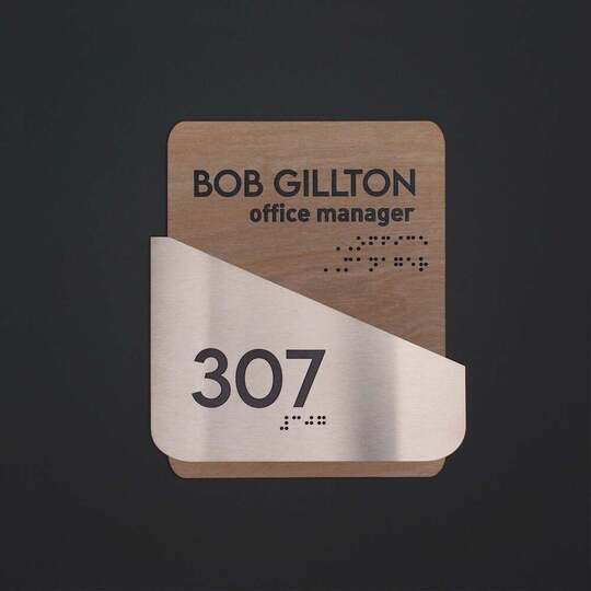
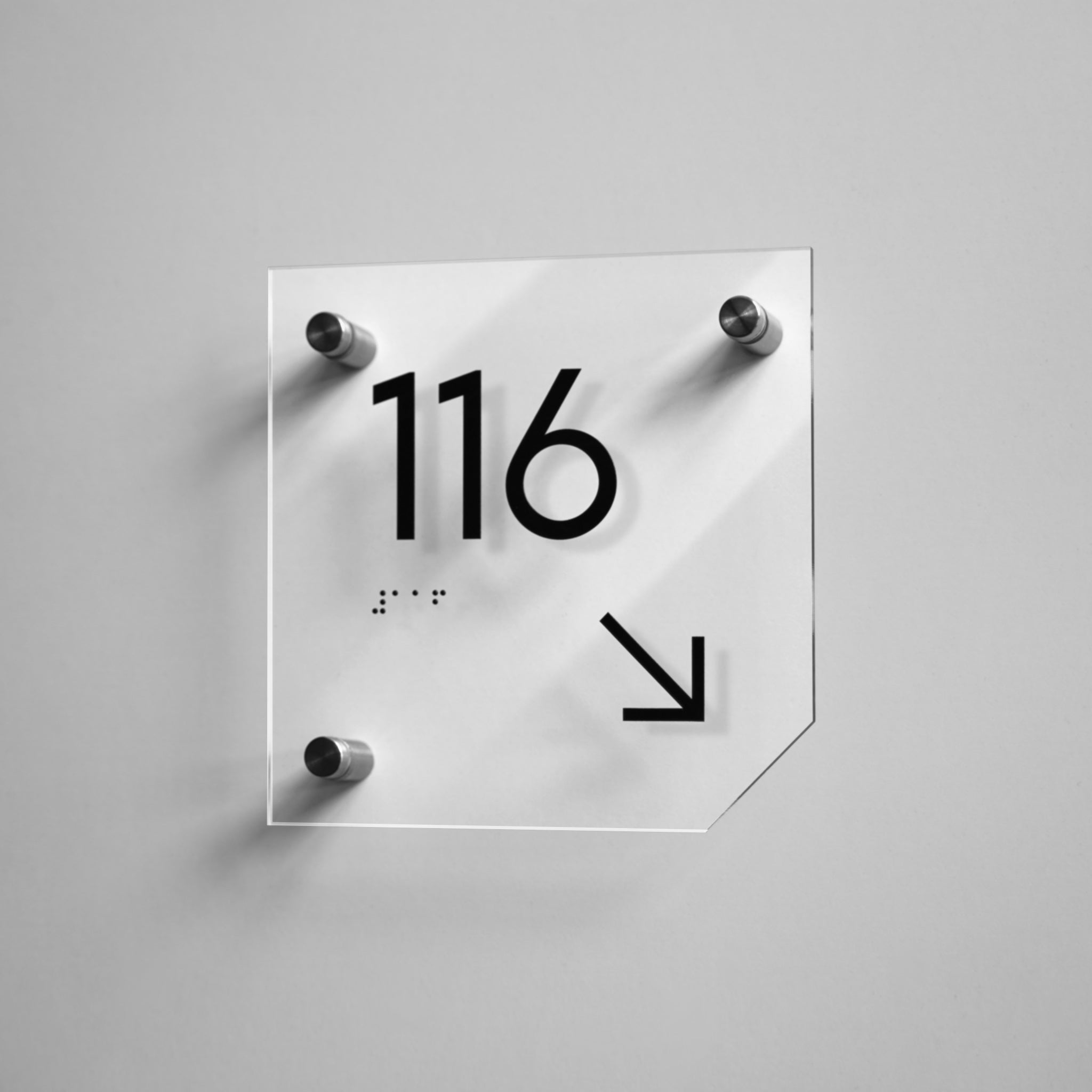
Example of a tactile sign with a room number and name, Braille lettering, and a directional arrow:
Where to Verify Current ADA Requirements
ADA.gov publishes the DOJ text of the 2010 Standards. The U.S. Access Board provides the combined ADA Standards, official advisories, and technical guidance. DOJ Standards cover most ADA facilities; public transportation facilities use DOT Standards. The federal document is a baseline, not the only source to review.
Check the code adopted for the project's location. ICC A117.1 is a model standard, and jurisdictions may adopt different editions. California Title 24, the Texas Accessibility Standards, and other state or local rules may add criteria. As of August 8, 2026, ICC lists A117.1-2026 as forthcoming, not as a universally adopted code.
Requirements verified against the 2010 ADA Standards as of August 8, 2026.
Official Sources Used
Frequently Asked Questions
Which signs are required to be ADA compliant?
Section 216 covers permanent room and space identification, interior directional and informational signs, exit-door identifications in §216.4.1, and signs for other specified accessible features. Requirements vary by sign type; §216 does not impose one identical design on every sign in a building.
Do all ADA signs need Braille?
No. Permanent room and space identification signs and exit-door identifications covered by §216.4.1 need tactile information, including Braille. Interior directional and informational signs follow §703.5 visual-character requirements without Braille. Classify each sign by function before selecting the elements needed for production.
What height should ADA signs be mounted at?
For tactile signs, the lowest baseline must be at least 48 inches (1220 mm) above the finished floor or ground surface, and the highest no more than 60 inches (1525 mm) above the finished floor or ground surface. Measure to the baselines, not the sign edge. See the ADA sign mounting height and placement guide for door-specific scenarios.
Is there a required color contrast percentage for ADA signs?
No. Section 703.5.1 requires a non-glare finish and either light characters on a dark background or dark characters on a light background. It sets no numeric percentage; 70% is not a federal ADA requirement. Check applicable state and local codes for added criteria.
What font is required for ADA signs?
The Standards name no approved typeface. Raised characters must be uppercase and sans serif, without italic, oblique, script, highly decorative, or unusual forms. Their proportions and stroke must meet §703.2. Visual characters follow the separate style, proportion, and stroke rules in §703.5.
Do temporary signs need to comply with the ADA?
Signs used for seven days or less are exempt from §216 under Exception 3. If a sign remains longer, classify it by purpose and apply the relevant requirements. Calling a long-term sign "temporary" does not extend the federal seven-day limit.
Where do you mount an ADA sign at double doors?
At double doors with one active leaf, place the tactile sign on the inactive leaf. With two active leaves, mount it to the right of the right-hand door. If that position has no space, §703.4.2 directs placement on the nearest adjacent wall.
Who should verify sign compliance before opening a facility?
Divide the review across the project: the designer checks artwork, the manufacturer verifies fabrication, the installer checks location and height, and the facility manager or owner completes the on-site review. The project team or a qualified accessibility consultant should also confirm the requirements adopted in that jurisdiction.
Running every sign through the review stages can reveal problems while corrections are still manageable. If a sign needs replacement, browse ADA Signs for ready-made options or request custom ADA signs produced from your artwork. BSign Store produces custom ADA Braille signs in-house using Grade 2 Braille.


