How to choose ADA-compliant Braille signs for hospitals and schools
In today’s world, inclusivity is no longer optional — it’s a standard of respect and comfort for everyone. Whether in hospitals, schools, universities, or business centers, available solutions play a vital role in ensuring every visitor feels respected and equal. One of the most important elements in creating such environments is the use of ADA signs. Though they may seem like small details, these signs determine whether a visually impaired person can confidently navigate a building, locate a room, or find an emergency exit without assistance.
What is Braille and why it matters in public spaces
Braille is a tactile system of raised characters that has been used by visually impaired people for over 200 years. It allows users to read braille by touch and move independently through public spaces. In countries with strong ADA compliance, Braille signage requirements are strictly enforced in places like schools, universities, hospitals, hotels, and shopping centers.
In Ukraine, the requirements for tactile signage are defined by the disabilities act. They are mandatory in buildings that provide public services.
These elements provide blind people with a sense of safety and independence, helping them identify room names and navigate indoor spaces without assistance.

ADA hospital signage: comfort and safety
In medical institutions, Braille plates are an element of trust. A visually impaired patient should be able to locate the reception, laboratory, or patient room without relying on staff.
In hospitals and clinics, it’s essential that tactile lettering and braille characters remain clean, resist moisture, and can be easily disinfected. That’s why the best signage materials are acrylic and stainless steel. These materials combine aesthetics with practicality, maintaining raised symbols even after frequent cleaning.

ADA school signs: learning without barriers
A school is where a culture of inclusivity begins. That’s why interior ADA signages should inform and promote respect for diversity.
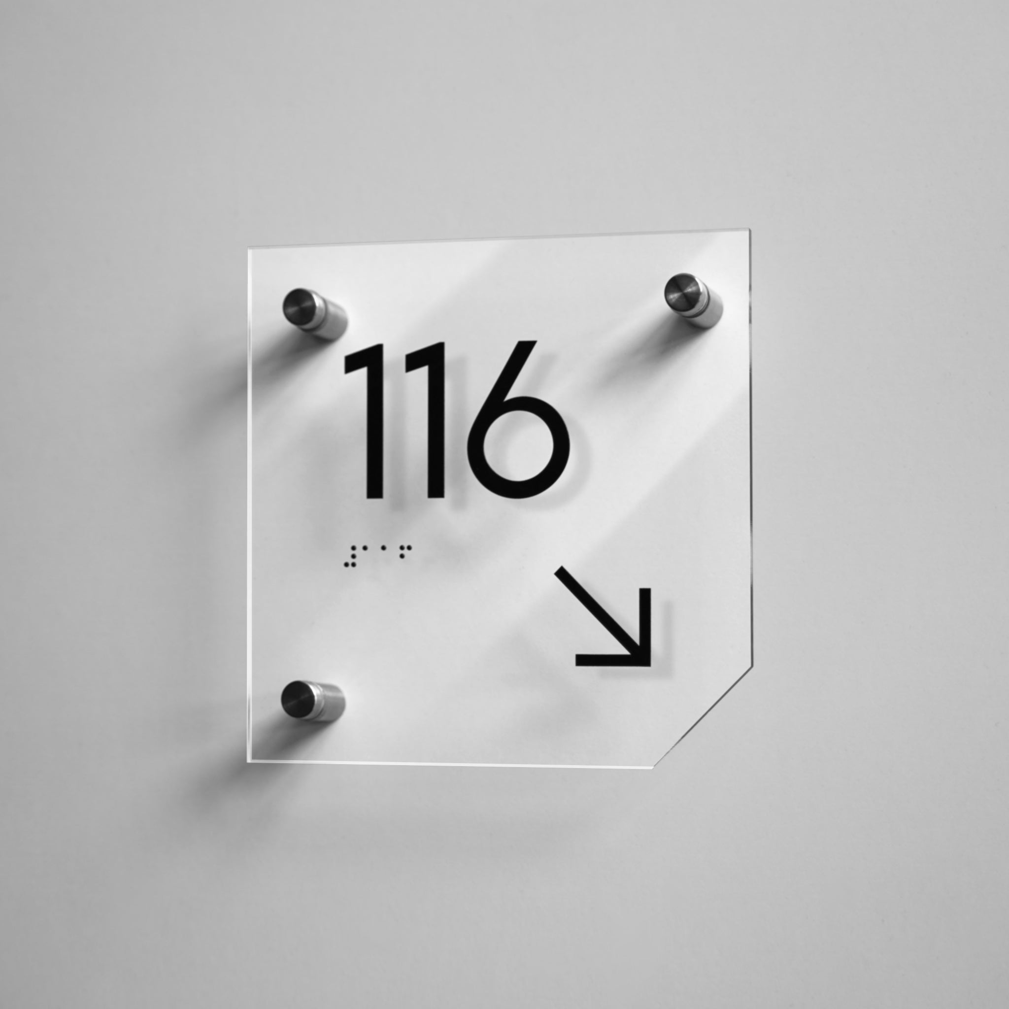
It is appropriate to place informational wayfinding signs in school hallways to indicate directions. They help students with visual impairments independently locate classrooms, the library, the cafeteria, or the gym.
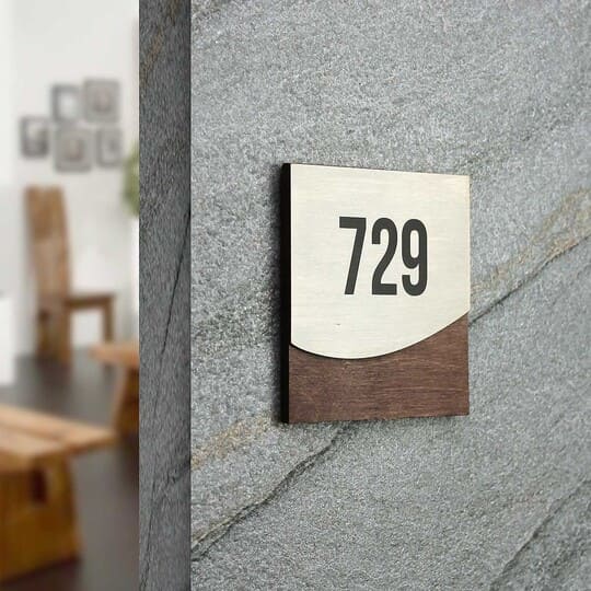
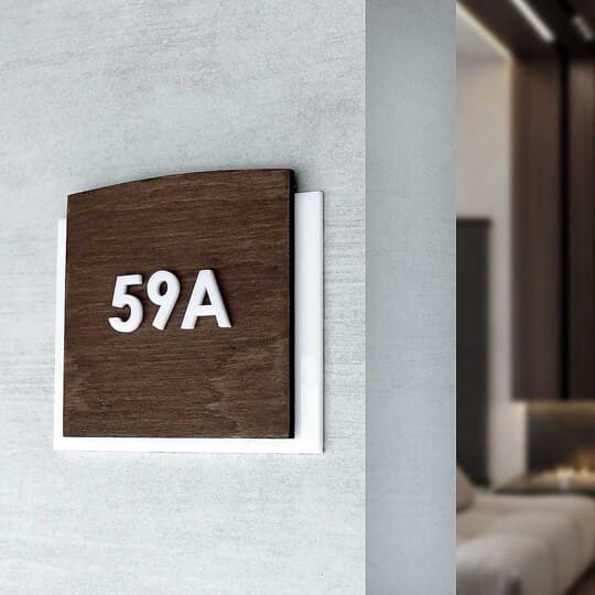
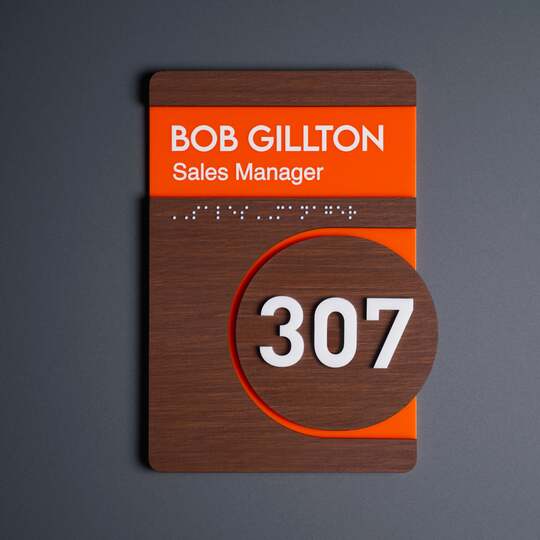
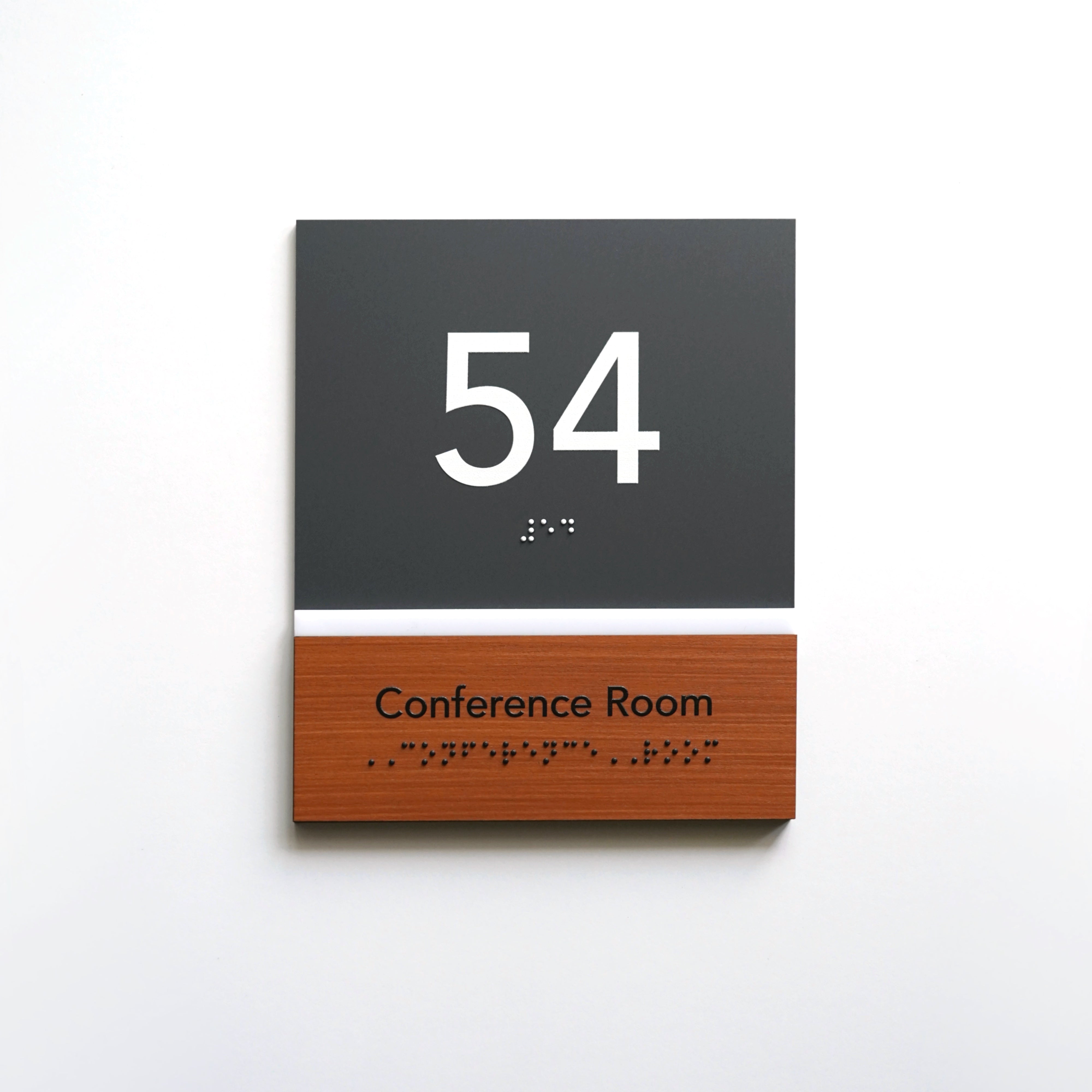
Wooden signs with acrylic elements are often chosen for school environments because they add warmth and blend harmoniously with the interior design.
When it comes to university signage, the requirements become even more extensive. On university campuses and in academic buildings, it’s important to consider not only accessibility for blind people, but also effective navigation across large spaces such as lecture halls, laboratories, libraries, and dormitories. Such signs should be part of a well-designed wayfinding system that maintains a consistent visual style.

АDA compliant signage: how to recognize a quality product
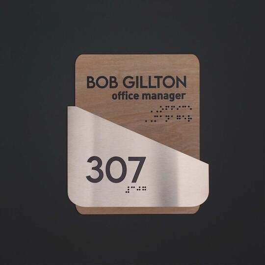
When we talk about braille signs, we must understand that this is a complex system of communication that helps visually impaired individuals navigate their surroundings. In a well-designed sign, every dot matters, because the ability to read Braille quickly and correctly depends on the precision and size of each element.
The quality of Braille signage is determined by three key parameters:
-
• Depth and relief of the symbols — they must be sufficiently raised to be easily felt by touch, but not so pronounced as to cause discomfort when touched. In high-quality products, the dots have a smooth shape, free of sharp edges or defects, since even minor roughness can be perceived as an error.
-
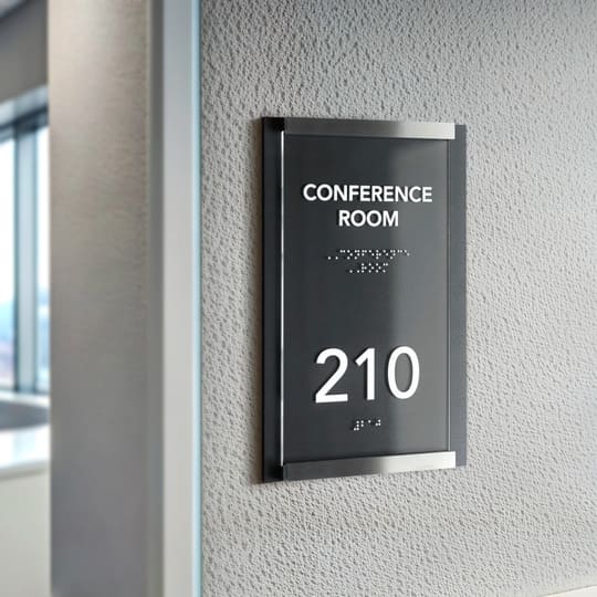
• Font contrast is just as important as the relief itself. Partially sighted users often combine visual and tactile perception, so the colors must be contrasting in tone. For example, light text on a dark background or vice versa ensures better visibility under various lighting conditions.
-
• Line spacing — overly dense dots make reading difficult, while excessive spacing breaks up words and slows down reading. ADA standards specify the exact distances between symbols to ensure that fingers can glide naturally across the surface.

Tactile signs: ensuring compliance with ADA standards
It’s not enough to simply print Braille on a product — that alone doesn’t guarantee functionality. The manufacturer must comply with international ADA signage standards that regulate all parameters of tactile plates. These standards cover everything: from dot diameter to line spacing, from font type to acceptable background color.
The ADA sign design must be fully functional. The font should be high-contrast and legible, and the raised text must be easily distinguishable by touch.
The optimal line spacing and tactile lettering size are determined with consideration for users’ finger ergonomics.
ADA signage height is another critical parameter. Decorative elements are typically installed at hand level — usually 120–150 cm above the floor — so they can be used by individuals in wheelchairs.

Common mistakes when ordering
Even the best idea can lose its meaning due to poor execution. Clients often try to cut costs or overlook details, but it’s the small things that determine whether a sign will actually be useful.
One of the most common mistakes is using cheap materials — thin plastic or film — which wear out quickly, collect dust, and look out of place in modern interiors. Within a few months, such signs fade, and the raised symbols wear off, rendering the signage completely non-functional.
Another critical mistake is insufficient relief of the font. If Braille dots are barely noticeable, visually impaired individuals simply won’t be able to read the information. This often happens when manufacturers ignore standards or try to reduce production costs, neglecting to meet specific size of symbol and relief height.
Too-small fonts or incorrect line spacing are also frequent issues. They cause confusion during tactile reading and make tactile signs practically useless. Placement errors are common too — signs are installed too high, too low, or even behind furniture, where users physically cannot reach them.
A separate category of mistakes is “checkbox design”. In these cases, the main goal is not to help the user, but merely to report the presence of inclusive elements. As a result, such products formally meet ADA compliance criteria but fail to fulfill their actual purpose.

High-quality signage design: how to combine style, functionality, and accessibility
Inclusivity does not contradict aesthetics — in fact, it enhances them. Plate design combines ergonomics, precision, and harmony with the interior.
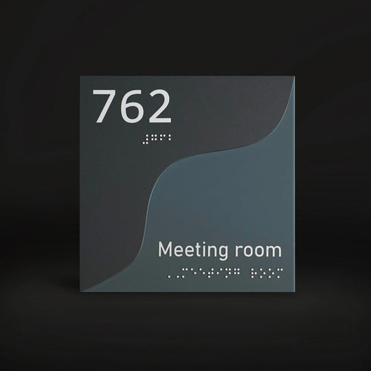
Custom braille signs ensure a unified style across all wayfinding elements within a space. They help create visual consistency, making the environment clear and pleasant for all users — both for visually impaired individuals and those who navigate using visual cues.
For modern interiors, it is important that every decorative element contributes to a sense of visual unity. That is why architects and designers increasingly turn to manufacturers like Bsign for custom-designed signage solutions that create cohesive design systems for entire facilities.
A personalized approach to signage design guarantees functionality, as users can easily locate the necessary rooms. Raised characters are clearly perceptible to touch, and contrasting colors improve legibility for people with partial sight. Such design makes navigation intuitive while making the space comfortable, safe, and stylish at the same time.
Learn more about the role of room number signs in hospitals and schools on our blog.

Design features for different spaces
Different areas within a building have unique requirements, and inclusive signs serve a specific function in each. Effective signage design combines clarity, aesthetics, and convenience for all users.
-
• Braille restroom signs. They should be placed directly next to the door, at a height that is comfortable to reach. Raised markings, Braille dots, and clear symbols — either unisex or gender-specific — are essential. In medical and educational institutions, it is especially important that these plates are moisture-resistant, as they frequently come into contact with cleaning agents.
-
• Braille elevator signs. These are among the key navigation elements in any building. They must include Braille floor numbers, raised buttons with clear labels, and directional signs. In hospitals and multi-story educational buildings, such plates ensure safe movement for visually impaired individuals without the need for assistance.
-
• Classroom door signs. In schools, these signs play both an educational and social role. With their help, children with visual impairments can navigate independently, which builds a sense of self-reliance and encourages respect for inclusivity among all students. It is important that the design of these signs aligns with the overall classroom style — not appearing out of place, but rather enhancing the atmosphere of the institution.
-
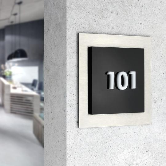
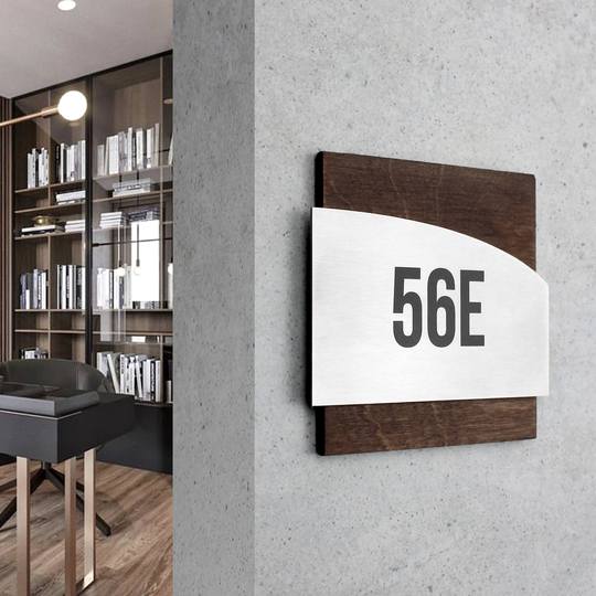
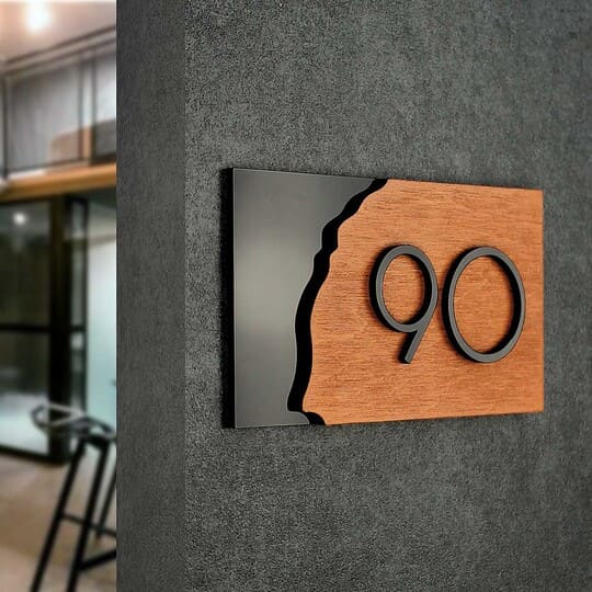
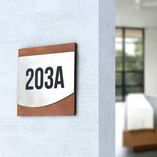
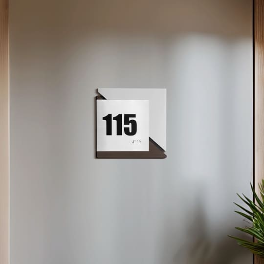
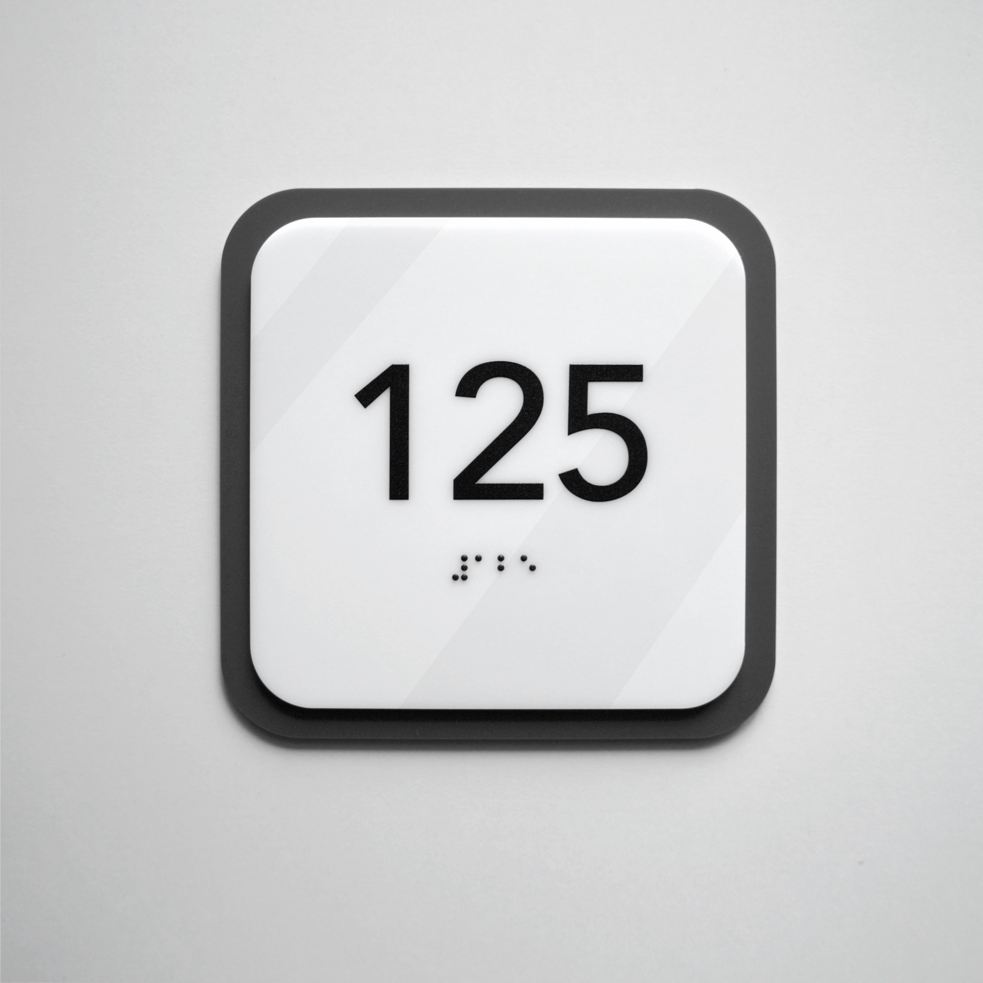
• Room number signs with braille. Properly designed numbers simplify navigation, help identify rooms, and create a sense of order. High-quality materials and precise tactile relief ensure that the plate is equally convenient for touch and visual perception.
-
• Exit signs and fire exits. These indicators are a matter of safety. They must be clear both visually and tactually, so that in case of an emergency, individuals with visual impairments can quickly orient themselves and find the evacuation route.
All these elements form a unified visual system, where every detail meets ADA standards, supports inclusive design, and integrates seamlessly into the interior. When signage is thoughtfully designed, it conveys a sense of care, order, and professionalism — and that is exactly what defines the quality and accessibility of any modern space today.

Inclusive signs as a mark of a mature society
Inclusive design is, above all, about humanity in the broadest sense of the word. It reflects a society’s willingness to see, hear, and respond to the needs of every individual.
When visitors with visual impairments can independently find offices, classrooms, or restrooms, they feel not pity but respect. This is the true essence of accessibility. Inclusive signage fosters an atmosphere of trust, where everyone feels confident and valued regardless of ability.
For business owners and organization managers, an inclusive approach is also a strategic investment. Accessible signage enhances a brand’s image, highlights professionalism, and conveys a sense of care. Facilities that pay attention to such details are seen as modern, welcoming, and socially responsible.
Inclusivity is a mindset reflected in every detail. If you’re planning to refresh your space or create user-friendly navigation, consult the Bsign team. We will help you choose signage solutions that combine aesthetics, functionality, and genuine care for people.
