How to Use Café Signs for Creative Decor: Practical Tips for Café and Restaurant Owners
Modern cafés and restaurants have long ceased to be just places where food is served. In today’s gastronomic culture, every establishment is a micro-universe with its own story, emotion, and unique style. Guests come not only for the dishes, but above all for the experience — they want to feel the atmosphere of the space, the interior aesthetics, and the attention to detail.
But as the number of establishments grows each year, guests’ expectations rise as well. That’s why plaques for restaurants and cafés are becoming one of the key messages to boost visibility and create the difference between “just a nice place” and one people want to return to again and again.
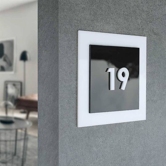
When people enter a café or restaurant, the eye catching dozens of subtle signals — the smell of coffee, the texture of the table, the lighting, the color palette, the decor element on the door. And among all these elements, restaurant and cafe signage remain an incredibly expressive detail. They may be small, but these signs can set the tone for the entire space.
Brands that understand the power of visual appeal and communication know that even the smallest interior elements can contribute to brand recognition. That’s why café plate becomes an unexpectedly powerful tool: it not only guides guests but also tells a story, evokes emotion, and creates a sense of style and completeness.

Café signage design as part of a venue's overall concept
As soon as a guest steps inside, they instantly pick up on dozens of details that shape their first impressions. It’s a combination of décor, colors, interior style, and navigational logic. In such moments, creative and clean designs become especially noticeable. A well designed sign reflects the brand’s personality — it is its own kind of business card.
When café or restaurant owners pay attention to interior signage, they continue the venue’s visual narrative — one that starts with the logo and extends all the way to the smallest details. This builds brand identity, adds professionalism, and shapes how guests perceive the space. This creates a maximum impact on visitors, making them want to return because it feels pleasant here.
Creative signage in specific zones
When we talk about creativity, even simple directional signs can become a decorative element. They direct potential customers and set the mood.
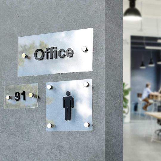
In restroom areas, restroom signs often turn into a humorous or stylish accent. Original pictograms, unexpected inscriptions, or humorous illustrations make people smile, make the guest experience more enjoyable, and leave a positive impression.
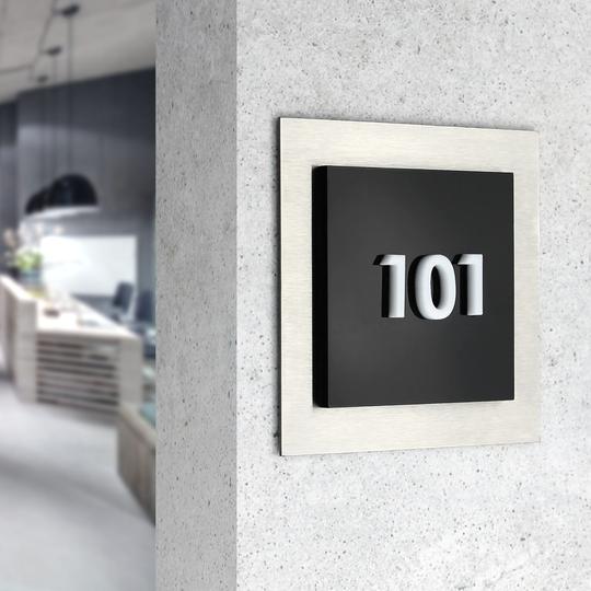
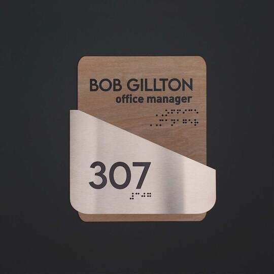
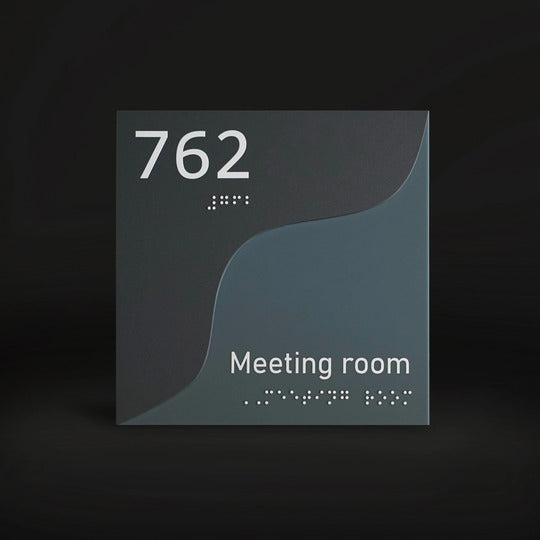
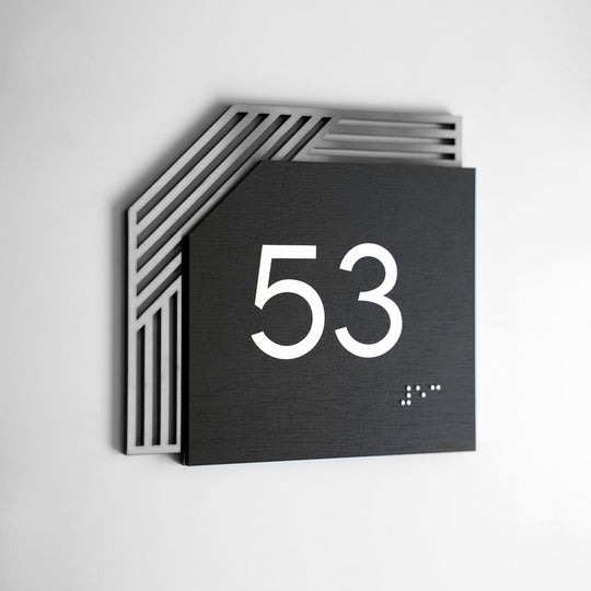
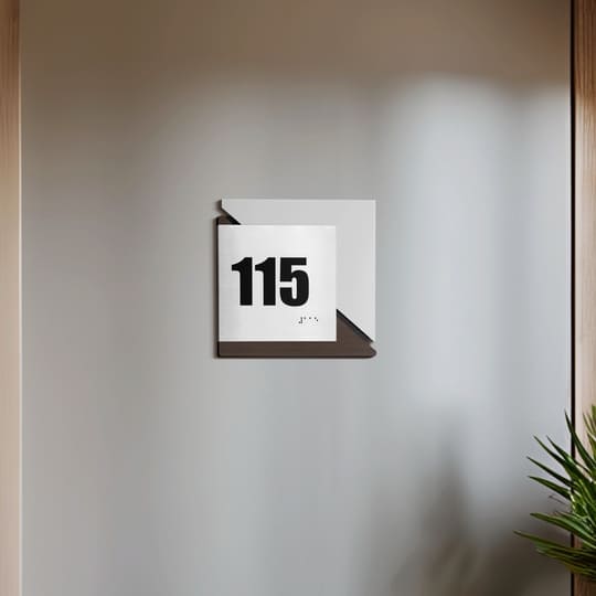
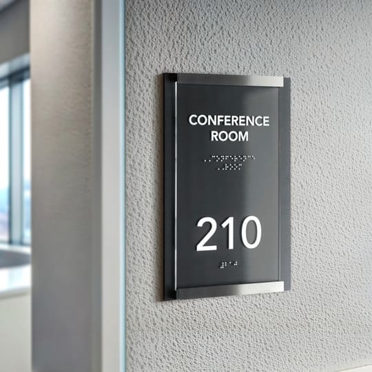
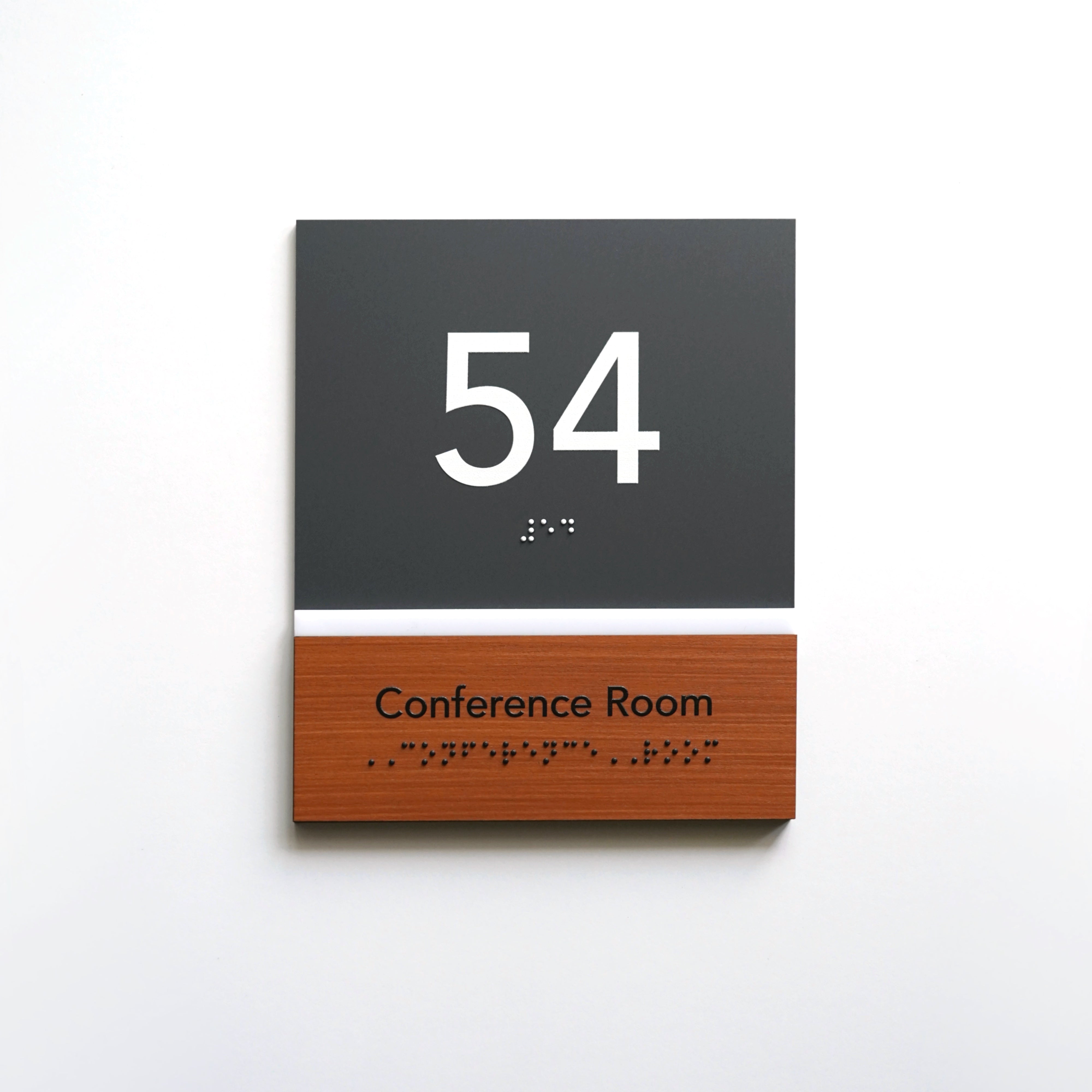
VIP room signs serve a different purpose — to convey a sense of status. Materials such as stainless steel, wood, or acrylic are appropriate here. Concise fonts, minimal colors, and clear geometry create a premium image that emphasizes the style of the establishment.
Even kitchen signs can be part of creative design. Executed in the same style as the rest of the space, they support the visual cohesion of the interior. Such details create a harmonious perception of the environment, where everything is thoughtfully designed — from the menu to the plaque.

Signage Materials That Create a Premium Image
The choice of materials is the tool that determines how guests perceive your establishment. In the HoReCa sector, details always matter, and they are what shape the first impression of the brand. Modern signs create associations with a particular style, such as the warmth of a cozy home, technological sophistication, elegance, or creativity.
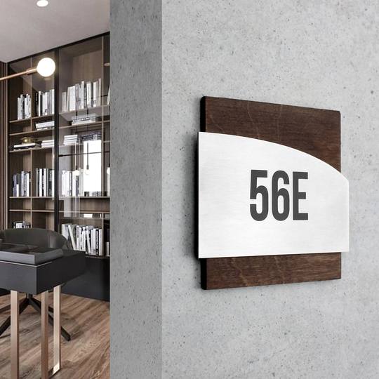
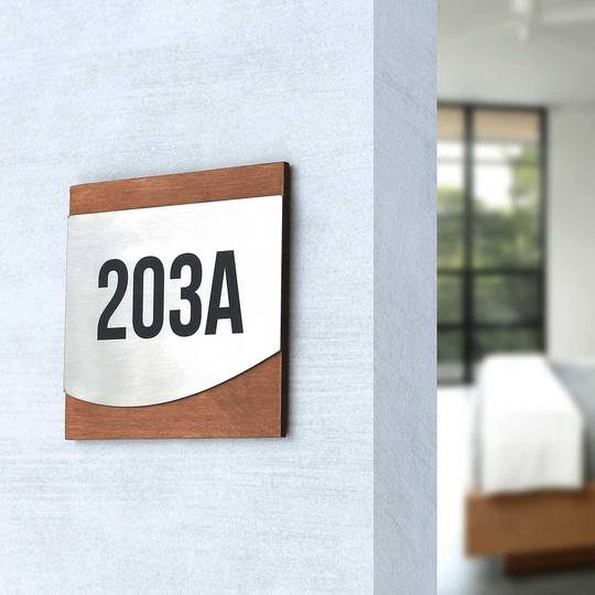
The most effective approach is a combination of wood, metal, and acrylic. These three materials form a versatile trio that helps achieve visual harmony while expressing the character of the establishment.
Wood — warmth, authenticity, and natural aesthetics
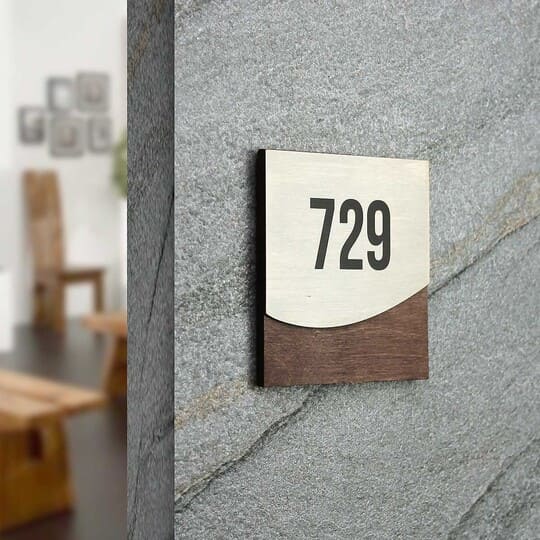
Wood is a material that instantly creates a sense of comfort. It is chosen by owners of cozy cafés and coffee shops who want to emphasize naturalness and closeness to nature. In a world where design is becoming increasingly technological, wood adds a human touch of warmth.
Key benefits of wooden signs:
-
• Tactility and texture. The natural surface of wood is pleasant to the touch and has a unique grain pattern that cannot be replicated.
-
• Eco-friendliness. Wooden elements are associated with care for the environment — a vital part for brands that want to emphasize a smart way.
-
• Design flexibility. Wood is easy to work with, allowing for the creation of intricate shapes, three-dimensional letters, or engraved logos.
-
• Perfect fit for eco and Scandinavian styles. Wooden products pair beautifully with concrete, metal, or textile interior elements.

Stainless steel — strength, stability, and modern aesthetics
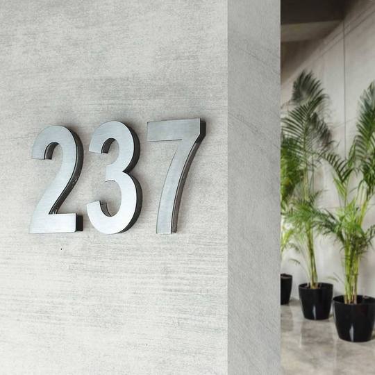
Stainless steel products symbolize confidence, durability, and technological sophistication. They are an excellent choice for restaurants that want to highlight a professional look and modern design. Metal has a restrained yet incredibly striking appearance, especially when combined with proper lighting.
Key benefits of metal products:
-
• Durability. Metal is resistant to moisture, temperature fluctuations, and mechanical impact, making it ideal for heavy use in public spaces.
-
• Premium effect. The shine of stainless steel or a satin finish creates an association with luxury and high standards.
-
• High contrast. Engraving, laser cutting, or embossing allows logos and text to be clearly visible even in low light.
-
• Compatibility with any style. From industrial lofts to classic restaurants, metal always looks appropriate.

Acrylic — lightness, transparency, and modernity
Acrylic has become a favorite among interior plate designers in recent years. It is versatile and allows for both strict and creative design solutions.
Key benefits of acrylic signage:
-
• Visual lightness. Transparency or semi-transparency creates a sense of airy space and does not overload the interior.
-
• High engraving precision. Acrylic is ideal for laser cutting, allowing even the smallest design elements to be realized.
-
• Play with color. Acrylic can be transparent, matte, colored, or mirrored — opening endless possibilities for customization.
-
• Ease of maintenance. The surface is easy to clean, does not absorb odors, and is moisture-resistant — a perfect option for HoReCa.
 The perfect combination of materials — the secret to harmony
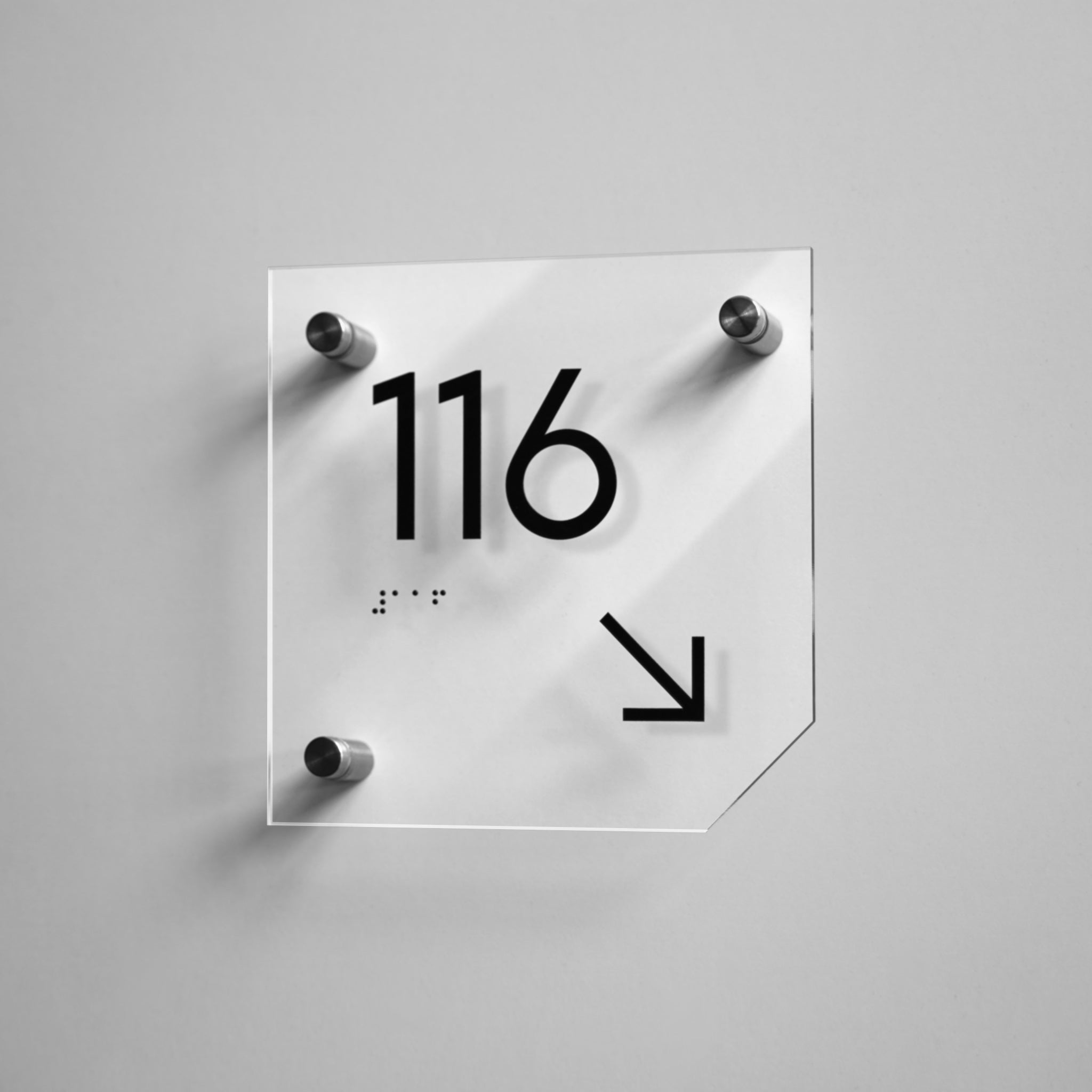
When wood is combined with metal and acrylic adds a transparent accent, a true balance is created. These materials for signs do not compete but enhance each other. Warm wood softens the coldness of metal, while acrylic adds a modern touch. Together, they create a design that conveys quality, stability, and style.
By choosing high quality materials, café owners effectively communicate their values, such as attention to detail, care for clients, and the desire to create a space with thoughtful design. This is a case where even a plate can become an element of branding and an emotional connection with guests.
You can read more about signage materials in the HoReCa industry on our blog.
Custom door signage — your brand’s story in the details
In modern cafés, personalized signage with quotes, short messages, or even QR codes that lead to the brand story page or online menu items are becoming increasingly common.
QR code signs create interactivity and engage new customers in communication. Guests can scan the code to learn about the origin of the coffee beans or even receive special promotions.
Such solutions create a unique customer experience and leave a positive impression. When people notice attention to detail, they feel they are interacting with a brand that thinks modernly, values aesthetics, and strives for excellence.

Sign design as part of the guest experience
In design, aesthetics are important, but logic is just as essential. Effective signage combines two functions — navigational and communicational. They should be clear, concise, and naturally integrated into the establishment’s overall style.
It is ideal when a plaque both draws attention and helps with orientation. It should guide customers through the space, direct visitors, and create a sense of convenience. All of this contributes to a welcoming restaurant's ambiance and strengthens the brand.

Where to Find Inspiration: Examples from Cafés Around the World
Scandinavian cafés: the power of minimalism
In Scandinavia, the concept of “coziness” has been elevated to an art form. Cafés in Copenhagen, Stockholm, or Oslo are places where calm, warmth, and simplicity merge into perfect harmony. Decor elements there are always minimalist: clean fonts, natural wood, minimal color — just what is necessary.
Such interior signs not only guide but also create an aura of calm that stays with you.
Paris and London: elegance in details
In Paris, a café is always a story about style. However, even in the most famous establishments, interior elements do not compete with the decor, but delicately support it.
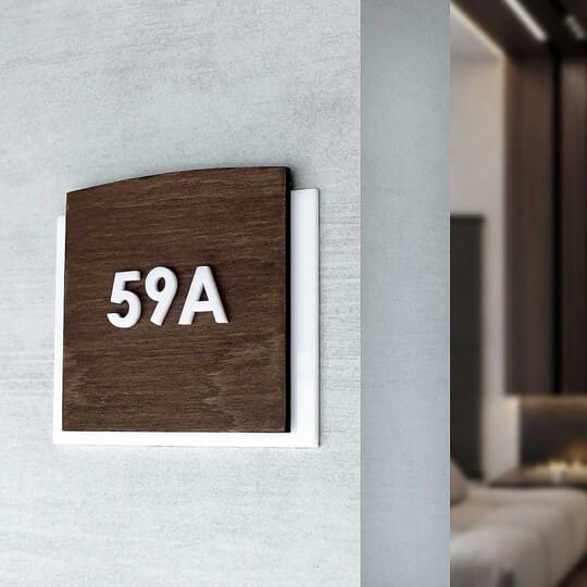
Instead of heavy metals or complex techniques, a more modern approach is used: acrylic plaques with warm wood, delicate colors and fonts with character. This adds lightness to the space and at the same time conveys a sense of French elegance.
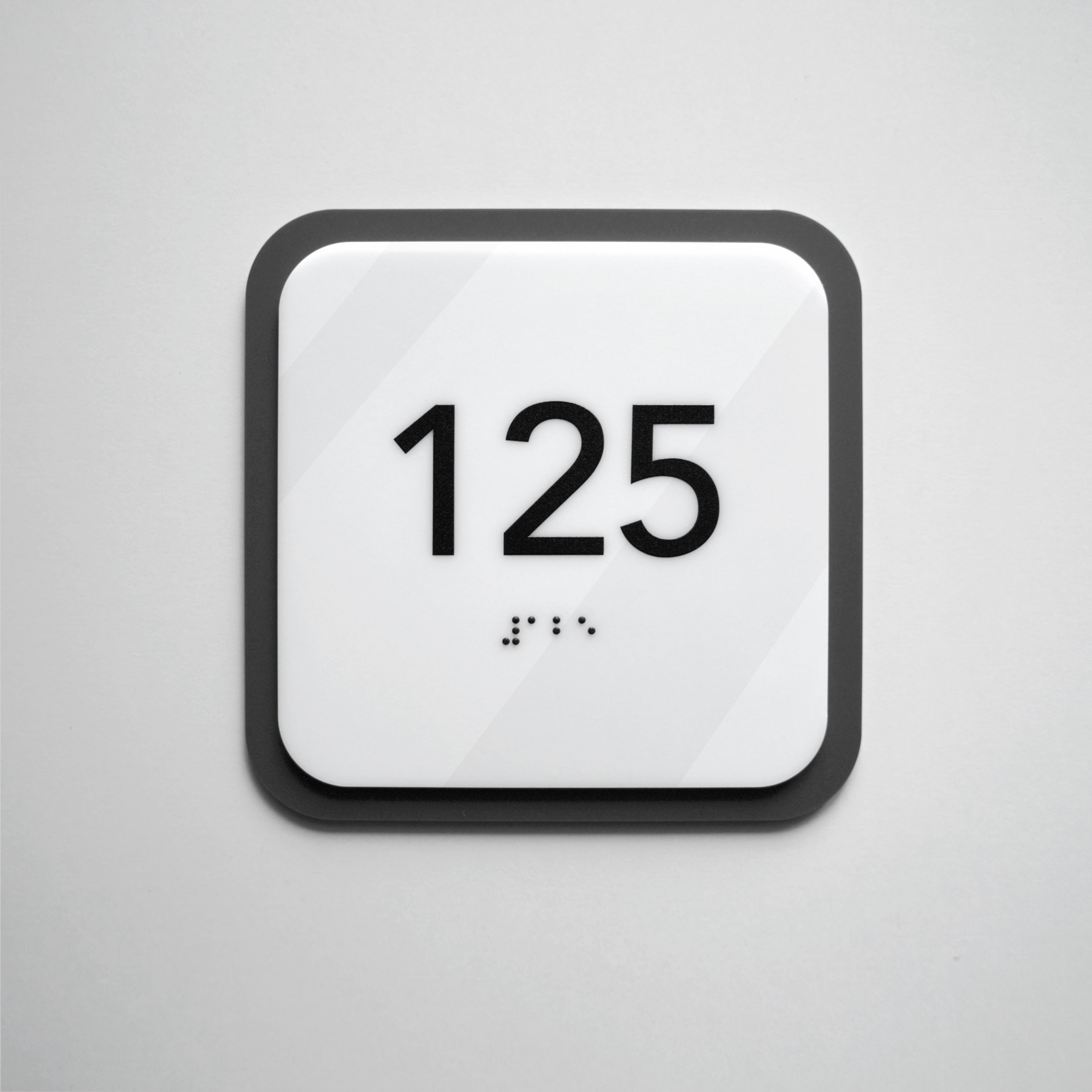
Avant-garde solutions are popular in London. In the interior there, matte acrylic in graphite or milky shades is often used, combining it with thin steel elements. Restrained contrasts and clear geometric shapes form a characteristic London style — modern, but not cold.
Tokyo: calligraphy and the philosophy of details
Japanese establishments are a different story. Here, signs for cafes and restaurants are almost meditative objects. In Tokyo, the “wabi-sabi” style is popular — beauty in simplicity and imperfection.
In establishments, laconic plaques made of stainless steel or acrylic with very clean geometry are often used. They have a minimum of information, sometimes only one symbol or a small printed sign.
Such solutions seem to invite you to slow down. This is the case when the shape of custom door signs becomes part of the interior philosophy.
New York: urbanism and brand personality
In a metropolis where there’s a café on every corner, sign design helps establishments stand out. Brooklyn cafés are known for experimentation. Here, a plate can be not just a guide, but a work of art.
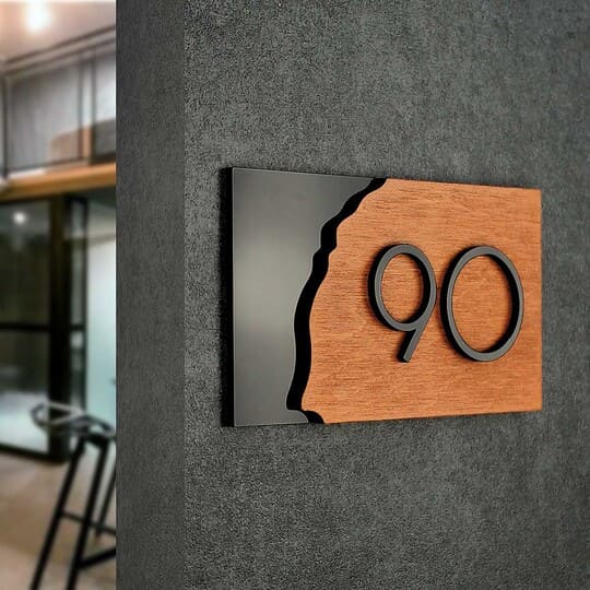
The interior often uses a combination of black steel and wood to emphasize the urban mood. Plaques in such spaces are always about character, geometric shapes, bold contrasts, and thoughtful details.
Here, navigation works as an element of branding. That is why cafes in New York are so memorable.
Barcelona and Milan: design that plays with materials
Mediterranean interiors are full of light and emotion, and the plaques here support this mood.
In Barcelona, coffee shops often use unconventional geometric shapes: asymmetrical shapes, soft radii, colored acrylic accents. Everything looks lively and creative, but not chaotic.
Milan, on the other hand, gravitates towards restrained modern elegance: matte acrylic combined with stainless steel, perfect proportions, exquisite typography. The plaques in such cafes resemble details from the world of fashion — precise, clean and thoughtful.
Kyiv and Warsaw: blending tradition and boldness
In Kyiv, unique door signs are increasingly appearing, where subtle graphic elements are made using UV printing and easily adapt to seasonal themes — this helps establishments change the mood of the interior without unnecessary costs.
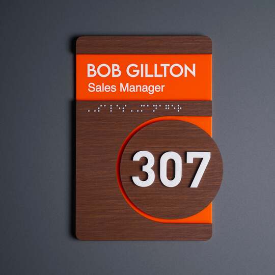
Decorative signs with a combination of wood and acrylic are also popular in such cafes, which harmoniously highlight the entrance while maintaining a minimalist aesthetic.
In Warsaw, black steel is often used in combination with warm wooden surfaces. Thanks to this, even small rooms gain intimacy, and plaques — from informational to decorative — become stylish touches that shape the mood of the space from the very threshold.
Signs as part of a photo zone: a trend that works for the brand
In the digital age, when every guest can become a potential ambassador on social media, visual elements are extremely important. Many establishments incorporate restaurant signs into photo zones.
In many European restaurants and cafés, interior plaques are integrated into visually appealing areas — near decorative walls, installations, or accent lighting. Designers do this deliberately, as these spots are often photographed, and the navigational element becomes part of a stylish compositional background. In some places, it may be placed next to an art panel or modern lamp to create an aesthetic balance and a frame that looks great in guest photos.

Cohesive design of Space: details that create an atmosphere of success
Establishments that pay attention to details always have a professional appearance and are better remembered. When café or restaurant signage design is created with the brand’s philosophy in mind, it becomes an influential tool — subtle yet effective.
In an environment where brands compete not only for attention but also for the guest’s emotion, a true impression of the business is formed not through large-scale campaigns but through small details. Sometimes a decorative element on a door — modest but expressive — can say more about the establishment than the most expensive advertising campaign.
If you want your establishment to have its own character and for café or restaurant plaques to strengthen brand recognition, it is worth starting with a professional approach.
Book a free consultation with our designers, and we will give you advances on how to use door signs for creative cafe decor, what materials, style, and format of signs choose and how to create a premium impression at first glance.
