


by Andrew Stychinskij
Coworking Wayfinding Signs: How to Create an Intuitive Workspace for Teams and Visitors
Coworking wayfinding signs are an operational tool that reduces front‑desk questions and helps newcomers find the right zone without asking for help. A thoughtful coworking signage system serves two distinct audiences — members and guests — and remains flexible as room uses change.
A coworking space differs from a traditional office in that it's used daily by people with very different movement patterns. Some users are regulars; others drop in for a meeting, an event, or a short‑term hot desk booking.
In this environment, even a well‑designed interior doesn't guarantee easy navigation. If a visitor can't quickly locate a conference room, phone booth, or kitchen, the burden immediately falls on the front desk.
Key takeaways:
- Coworking navigation serves two different audiences: members who rely on habit and visitors who need step‑by‑step directions.
- Essential coworking signage includes meeting room signs, open‑space identification, phone booth signs, kitchen and lounge markers, restroom signs, and floor directories.
- Modular signage is the ideal solution for spaces where rooms change purpose or tenants rotate.
- A single visual style and logo signage turn navigation into part of the coworking brand.
- Less is clearer: a few well‑placed directional plaques beat a clutter of small, inconsistent markers.
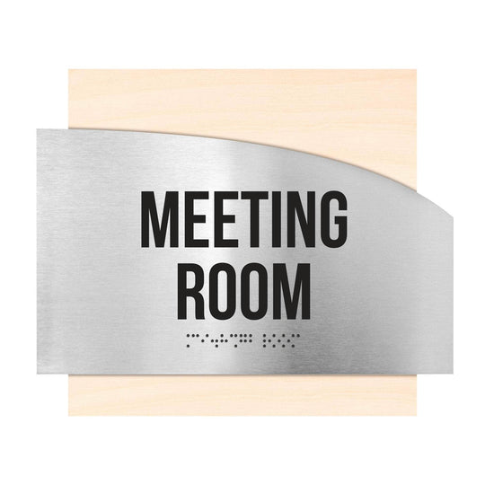
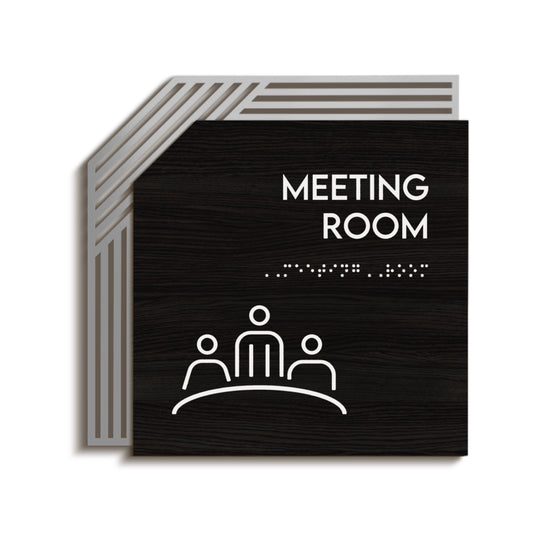
Example of a modern meeting room sign for a coworking space with a minimalist design and clear visual identification:
Why Wayfinding Is Different in a Coworking Space
Wayfinding signage is a system of visual signs that helps people navigate buildings and shared spaces efficiently by identifying locations, providing directions, sharing information, and communicating important rules.
A coworking environment brings together several movement patterns at once. People head to meetings, hunt for an available desk, return from the kitchen, or arrive for an event. Office wayfinding signs work differently here than in a conventional office because the audience constantly changes and room uses aren't always fixed. Another factor is that a coworking space rarely operates like a single-company office — under one roof, you'll find dozens of teams with different schedules, habits, and levels of familiarity with the layout.
Constant movement between zones
Throughout the day, the same person may follow the route "reception → desk → meeting room → kitchen → lounge" several times. Without clear navigation cues at each transition point, even experienced members waste time, and new guests can get lost after the second turn. In large coworking spaces with multiple open areas, identical‑looking zones without identification signs are easy to confuse, especially when someone is rushing to a meeting.
Signage for medical & wellness centers faces similar challenges: visitors also need to find the right offices and zones quickly without asking staff for directions.
Members and first-time visitors at the same time
At any moment, a coworking space can host people with opposite levels of familiarity: those who have worked there for months and those who are attending their first meeting. The navigation signage system must be unobtrusive for the former and crystal clear for the latter. That's one reason there's no universal "one-sign-fits-all" solution. Navigation needs to work on two levels at once: background cues for regular users and clear directional plaques for people who read every marker.
Rooms that change function often
Unlike a traditional office, a coworking space sees tenant mixes and room functions change more often: a meeting room can become a temporary event area, and part of an open space can be reassigned to a dedicated team. That means your coworking signage must be easy to update without replacing the entire sign. If the signage system isn't designed for this level of change, every layout update becomes a separate expense — a new engraved sign, new mounting hardware, and another interruption for the reception desk.
Coworking vs Traditional Office Navigation
Office wayfinding is usually static: departments and offices don't change for years. In a coworking environment, the signage system must be flexible — allowing you to swap a room name, update occupied/free status, or change the list of current tenants quickly without remaking the entire sign. Put simply, office wayfinding is designed for a single tenant and a stable structure, while a coworking navigation system needs to handle constant turnover of people and functions.
Example of office and coworking signage that helps people move quickly between functional zones:
5 Common Wayfinding Mistakes in Coworking Spaces
- No route from the entrance. A guest walks in and sees no orientation cues — where to go, where the reception is, where the meeting rooms are.
- Signs made "just for us." Handwritten stickers or printed sheets instead of a unified signage system create an impression of temporariness and neglect.
- Information overload. Trying to put rules, contacts, Wi‑Fi details, and a room name on a single sign makes it hard to read.
- Static signs in a flexible space. An engraved room name that no longer reflects reality after a tenant change disorients people more than having no sign at all.
- No link to the brand. Generic, unbranded signs don't reinforce the coworking brand, even though every visitor sees them.
A sixth, less obvious mistake is uneven coverage. Owners often plan navigation carefully around the entrance and reception but forget secondary routes: the corridor to service areas, the stairwell between floors, or the path to a distant lounge. Those "forgotten" stretches are the spots that most often generate complaints.
Essential Signs Every Coworking Space Needs
The basic set of coworking signage centers on decision points where people ask, "Where next?". The better each decision point is covered, the fewer questions reach the front desk.
Meeting and Conference Room Signs
Meeting rooms are among the most visited zones, and meeting room signs and conference room signs directly shape a client's or partner's impression. Beyond a name or number, an occupied/free status indicator reduces manual booking friction. For coworking spaces with many meeting rooms, consider numbering or memorable themed names — these speed up orientation even without extra directional plaques.
Open-Space and Zone Identification
Open‑plan areas rarely have physical boundaries, so they're harder to read than rooms with doors. Overhead or hanging directional plates above hot‑desk and fixed‑desk zones help visually separate areas without partitions. You can also use color coding for zones: for example, one shade for quiet work and another for active communication, which signals the character of each area before someone reads the room identification signs. When designing this system, consider color theory in wayfinding: well‑chosen accents help people orient faster and reduce cognitive load.
Phone Booths and Focus Rooms
Phone booths are small functional zones that are easy to miss if they aren't marked. Two elements matter here: clear identification of the booth itself and, where possible, an occupied/free indicator. In coworking spaces with many booths, a continuous numbering system is useful — it not only simplifies navigation but also lets the receptionist direct a guest precisely where to go without escorting them.
Reception, Kitchen, Lounge, and Restrooms
These are areas everyone uses — both members and guests. Leaving them out of the navigation system is one of the most common reasons the reception team gets extra questions.
The kitchen is one of the most frequently used areas in any coworking space. Clear break room signs help new visitors find the break area quickly without asking the front desk.
The lounge is often used for informal meetings, breaks, and networking. Lounge signs help distinguish these areas from work zones and make the layout easier to understand.
Even in small coworking spaces, locating the restrooms is one of the top reasons people approach reception. Clearly visible restroom signs help visitors find the right direction quickly and make the space more comfortable to use.
A guest's first interaction with a coworking space usually starts at the reception desk. Prominent lobby / reception signs help people find the check-in point and get the information they need within seconds of arrival.
It's also common to place Wi-Fi signs near reception or in waiting areas with information about network access for guests and residents. These informational markers reduce routine questions to staff and make the use of space more convenient.
Floor and Building Directories
In multi‑story coworking venues and business centers, add floor directory signs that list the main zones on each level — especially by elevators and stairwells, where people decide where to go next. A dedicated directory board on the ground floor showing all tenants and zones reduces pressure on the front desk before a guest even reaches it.
Staff-Only and Service Areas
Server rooms, storage, administrative offices, and technical areas don't need decorative treatment, but they must be clearly labeled. This improves staff convenience and site safety. For these rooms, office door signs work best: they help people identify back‑of‑house rooms and internal work areas quickly without adding visual clutter.
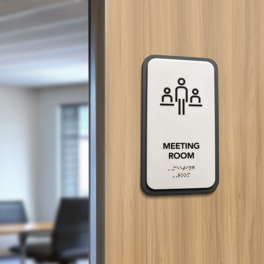
Example of informational signs for meeting rooms and work zones:
Four Types of Wayfinding Signs in a Coworking Space
Before choosing specific elements, it's helpful to understand the four basic categories of wayfinding signage. A well-designed coworking navigation system usually combines all four types to help members and visitors move through the space efficiently.
Identification signs are signs that identify a specific room, office, or functional area, helping people confirm they have reached the correct destination.
Directional signs are signs that guide visitors from one location to another using arrows, symbols, or route information at key decision points.
Informational signs are signs that provide useful details, such as directories, floor maps, visitor instructions, or Wi-Fi information, without directing movement.
Regulatory signs are signs that communicate rules, safety requirements, accessibility information, or restrictions, helping maintain a safe and organized environment.
| Type | Purpose | Typical examples |
|---|---|---|
| Identification plaques | Identify a specific room or area | Meeting room, phone booth, kitchen, restroom signs |
| Directional plaques | Guide people from one location to another | Corridor arrows, floor navigation, directional, hanging signs |
| Informational plaques | Provide useful information without directing movement | Building directories, floor maps, Wi-Fi information, visitor instructions |
| Regulatory plaques | Explain rules, restrictions, or safety requirements | Staff only plates, emergency exit signs, no smoking signs, accessibility notices |
Together, these four sign types create a complete coworking wayfinding system. Identification signs tell people where they are, directional signs show where to go next, informational signs provide helpful details, and regulatory signs communicate important rules that keep the workspace safe and organized.
Wayfinding for Members vs Guests: What Changes
What Regular Members Rely On
Members navigate mostly by habit. They don't need custom directional signs — what matters is that the system stays stable and doesn't change without reason. The biggest annoyance for regular members is the chaotic swapping of labels: when the familiar name of a room suddenly disappears or is moved elsewhere with no clear logic.
What First-Time Guests Need
A guest arriving for the first time follows a clear sequence: entrance → reception → destination. At each step, they need a visible landmark; otherwise, the route becomes trial and error. The first thirty seconds in the space shape a visitor's impression of the whole coworking environment, and wayfinding is one of the main factors behind that impression.
The Arrival Route: Entrance → Reception → Destination
The quickest way to test a coworking navigation system is to walk through the space as a new guest would: can you see reception from the entrance, is the next step obvious, and is there a cue at every decision point? Those decision points determine the number of directional signs you actually need. If people hesitate at any stage, that's a sign that wayfinding support is missing there.
Similar principles apply when designing signage for hotels and resorts, where quick guest orientation and a strong first impression directly affect service quality.
Chaotic Labeling vs a Designed Wayfinding System
| Criterion | Chaotic labeling | Thoughtful navigation system |
|---|---|---|
| User comfort | Stress, disorientation | Orientation without staff help |
| Speed of orientation | Slow, error‑prone | Fast, intuitive |
| Perception of professionalism | "Temporary / careless" | Cohesive, premium image |
| Load on reception | Constant questions | Fewer front‑desk interruptions |
| Impression during meetings / events | Chaos in front of clients | Consistent brand experience |
A well-designed coworking wayfinding system improves orientation, reduces interruptions for reception staff, and strengthens the workspace brand. Unlike chaotic labeling, structured navigation supports both regular members and first-time visitors while remaining flexible as the space evolves.
The difference between these two approaches rarely appears all at once — it builds up day by day through fewer questions at reception, faster visitor orientation, and a more professional first impression. Over time, a structured signage system improves both operational efficiency and the overall coworking experience.
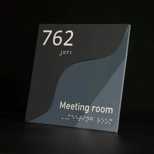
A modular meeting room sign that lets you update information without replacing the entire assembly:
ADA & Accessibility: What Coworking Operators Must Know
ADA signage is signage designed to comply with the Americans with Disabilities Act (ADA). It includes tactile lettering, Grade 2 Braille, high visual contrast, and standardized placement to help people with visual impairments navigate buildings independently.
Accessible wayfinding helps create an inclusive environment for all visitors and may be required for many commercial spaces in the United States. When planning a coworking signage system, accessibility should be considered alongside aesthetics, branding, and functionality.
Which Rooms Legally Need Tactile + Braille Signs
Under ADA accessibility requirements, tactile signs with Grade 2 Braille are generally used to identify permanent rooms and spaces. In a coworking environment, these typically include:
- Restrooms
- Meeting and conference rooms
- Phone booths with permanent room names
- Reception and lobby areas with permanent identification
- Staff-only rooms
- Electrical, mechanical, and service rooms
Accessible entrances, parking areas, and routes should also display the International Symbol of Accessibility (ISA) where applicable, helping visitors quickly identify accessible facilities and services.
Temporary notices, promotional graphics, and changeable information such as daily schedules or event boards generally do not require tactile or Braille signage.
Mounting Height, Placement, Contrast, and Fonts
Accessible signs should be installed consistently throughout the building so they are easy to locate and read while complying with ADA signage requirements. Key best practices include:
- Mount permanent identification signs on the latch side of the door whenever possible.
- Install signs so the tactile characters are positioned 48–60 inches above the finished floor, following ADA mounting guidelines.
- Use Grade 2 Braille together with raised tactile lettering on permanent room identification signs.
- Maintain high contrast between the background and text for maximum readability.
- Use simple, easy-to-read sans-serif fonts.
- Avoid placing signs where they may be blocked by open doors, furniture, or other obstacles.
Permanent Rooms vs Change-of-Function Rooms
One of the biggest challenges in coworking spaces is that room functions often change. Permanent spaces, such as restrooms or utility rooms, should use fixed ADA-compliant tactile signs.
Even when modular inserts are used for changeable room names, the permanent tactile portion of the sign should continue to meet ADA signage requirements, including raised characters, Grade 2 Braille, and compliant mounting, while replaceable inserts allow information to be updated without replacing the entire sign.
Flexible Signage for Spaces That Keep Changing
Modular signage is a flexible signage system with interchangeable components that allows room names, tenant information, or other details to be updated without replacing the entire sign.
Why Flexible Workspaces Need Adaptive Signage
A flexible workspace rarely keeps the same layout for years: tenants change, zones are reconfigured, and new rooms appear. A signage system built only for a static state will need replacement within months. When planning wayfinding, allow for future changes — both by using modular signage and by reserving space for future signs.
Modular and Changeable Inserts
Modular signage is a system of informational panels where individual elements can be swapped without removing the entire sign. That's ideal for coworking spaces where meeting rooms or offices regularly move between tenants. In practice, this can mean a frame with insert cards, magnetic elements, or replaceable tabs — the key is to use a stable base structure with information that is easy to update. Practical examples include modular wayfinding markers.
Keeping One Style While Scaling
When a coworking space adds a new floor or opens a new location, the easiest way to keep a cohesive feel is to reuse the same materials, fonts, and color palette as at the previous stage. A single set of guidelines simplifies procurement: ordering new coworking signage to match existing specs avoids repeated design approvals and preserves the integrity of the signage system.
Branding Through Your Signage System
Architectural signage is a category of permanent interior and exterior signs designed to complement a building's architecture while providing identification, navigation, branding, and informational functions.
Logo and Brand Identity in Wayfinding
Wayfinding signs are a brand touchpoint seen dozens of times during a single visit. Logo signage, a consistent color scheme, and typography turn a functional element into part of a coworking space's brand identity. In spaces that host external clients or partners, this detail subtly supports the venue's reputation.
How Materials Shape Brand Perception
The material of a sign creates a subconscious impression of the workspace. Acrylic reads as modern and lightweight, wood feels warmer and more intimate, and stainless steel signals premium quality and durability. Choose materials that match the overall interior concept instead of treating signage as a separate design decision — otherwise, even a well‑made coworking wayfinding sign can visually clash with the rest of the environment.
Wayfinding Without Cluttering the Interior
"Less, but Clearer"
More signs do not equal better navigation. The most effective signage system covers decision points — places where people need to choose a direction — and keeps the rest of the space free of unnecessary information. Too many markers often backfire: when signage is excessive, people start ignoring it altogether and lose the ability to quickly pick out a directional sign from background noise.
Visual Hierarchy
Information should move from general to specific: first the direction of movement, then the zone name, and only after that the details (room number, occupied/free status, or extra notes). This order reduces cognitive load when people are moving quickly through space. Contrast and a readable typeface are as important as content: even perfectly structured information fails if it's hard to read on the move.
Acrylic, Wood, and Stainless Steel
| Material | Style | Durability | Approximate budget |
|---|---|---|---|
| Acrylic | Modern, lightweight | Medium–high | Affordable |
| Wood | Warm, intimate | Medium | Midrange |
| Stainless steel | Premium, minimalist | High | Higher |
Signage materials should be chosen not only by budget but by how well they fit the overall interior concept.
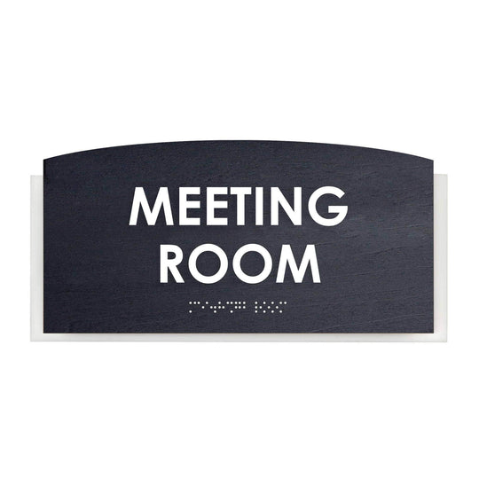
Example of a branded signage system for a modern office or coworking with a unified style and clear sign structure:
Physical vs Digital Wayfinding
Digital navigation can complement a coworking wayfinding system, especially for interactive directories or event information. However, physical signage remains the foundation of effective navigation because it is always available, requires no power source, integrates with the interior design through premium materials, and supports ADA tactile and Braille requirements for permanent room identification. Together, physical and digital solutions create the most complete user experience.
| Feature | Physical Wayfinding Signage | Digital Wayfinding |
|---|---|---|
| Reliability | Always visible and functional without electricity or internet. | Depends on power, screens, software, and network connectivity. |
| Maintenance | Requires minimal maintenance after installation. | Needs regular software updates, hardware maintenance, and occasional replacement. |
| Accessibility | Supports ADA compliance with tactile lettering and Grade 2 Braille for permanent room identification. | Digital displays generally cannot replace required tactile and Braille signage for permanent rooms. |
| Materials & Branding | Premium materials such as stainless steel, acrylic, and wood enhance the interior and reinforce brand identity. | Focuses on screen-based content rather than architectural integration. |
| Best Use | Permanent navigation, room identification, and accessibility. | Interactive directories, event schedules, and frequently changing information. |
How to Build a Wayfinding System That Works for Everyone (Step-by-Step)
Map Member and Guest Movement Scenarios
Start by walking or modeling typical routes: a new guest, a regular member, and an event attendee. This reveals real decision points and prevents you from adding "just in case" signs that don't match actual user needs.
Define the Structure and Pick Sign Types per Zone
Based on those routes, list the required decision points: entrance, reception, each meeting room, open‑space zones, phone booths, kitchen, restrooms, and floor transitions. Decide which points need modular signage and which can remain static for long periods.
Design One Style, Then Fabricate and Install
The wayfinding system should use a limited palette of materials, a single typeface, and a consistent color scheme. Ordering custom office signs helps keep all zones visually consistent and makes adding new signs easier without re‑approving the whole design.
Decision framework:
- If a room's function is stable → use permanent engraved signs.
- If rooms change function or tenants → use modular / changeable panels.
- If many new guests arrive daily → prioritize directional plates starting from the entrance.
- If the coworking targets a premium segment → choose stainless steel, wood, or acrylic with a logo.
- If accessibility is required → include ADA & Braille signs.
Coworking Wayfinding Sign Checklist:
- Directional sign from the entrance to reception.
- Floor directory / information board.
- Meeting room signs for every room (+ occupied/free status).
- Open‑space identification signs.
- Phone booth signs.
- Kitchen, lounge, and restroom signs.
- Floor and building directories.
- Service and technical room labels.
- Unified visual style + logo.
- Braille signs / tactile signs where required.
Accessibility Checklist (ADA):
Use this checklist to help ensure your coworking wayfinding system supports accessible navigation and aligns with common accessibility best practices.
- Grade 2 Braille on permanent room identification signs.
- Raised tactile lettering that can be read by touch.
- High contrast between text, symbols, and the background for better readability.
- Tactile restroom, exit, and other permanent signs for visitors with visual impairments.
- Consistent mounting height and placement for all permanent signs throughout the building.
- Directional plaques that clearly indicate accessible routes, entrances, and facilities where applicable.
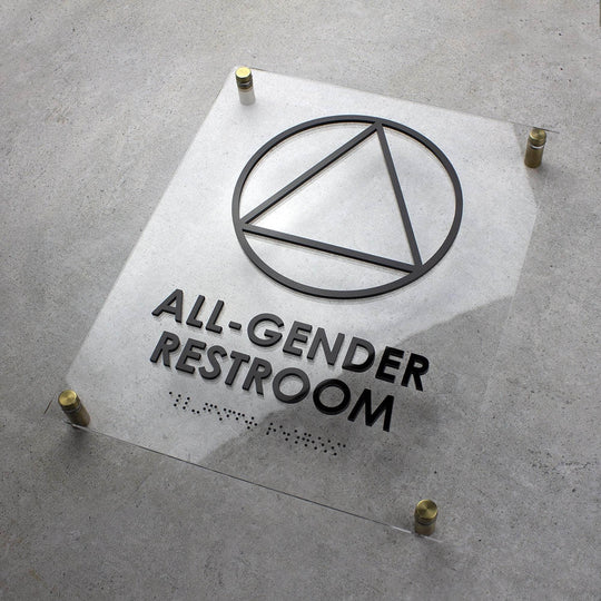
Tactile restroom sign with Braille that follows accessible navigation principles:

BSign's Manufacturer Perspective: What to Consider Before Ordering Signage
When working on navigation systems for offices and coworking spaces, we often notice one consistent pattern: most problems come from unclear routing logic. If people have to stop and look for the next visual cue, the wayfinding system is already underperforming.
Also, plan for future changes to the space. In coworking, meeting rooms, team zones, and offices change purpose far more often than in traditional offices. That's why signage for business spaces with changeable information elements usually proves more practical in the long term.
Expert Recommendations
- Plan your wayfinding system early. Design navigation during the planning stage rather than after furniture and interior elements are installed. This helps avoid unnecessary rework and ensures signs are placed at key decision points.
- Choose modular signage for flexible spaces. If meeting rooms, offices, or tenant allocations change regularly, modular signs with replaceable inserts provide a more cost-effective long-term solution.
- Maintain a consistent visual identity. Use the same typography, materials, colors, and mounting styles throughout the coworking space to create a cohesive navigation system and reinforce your brand.
- Install signs only where people make decisions. Focus on entrances, intersections, elevators, stairwells, and room entrances instead of filling every wall with signage. Clear placement improves usability and reduces visual clutter.
- Include accessible signage where required. Add tactile lettering, Grade 2 Braille, and high-contrast designs for permanent room identification and restroom signs to support inclusive navigation and comply with accessibility standards.
How a Wayfinding System Improves Comfort and Professionalism
Coworking wayfinding signs are an investment that pays off every day. A clear signage system reduces the number of questions directed to the front desk, creates the impression of an orderly space from the first seconds, and reinforces the coworking brand at every step of a visitor's journey.
Unlike a one‑off decor purchase, a navigation system works only when all its elements are coordinated. That's why it should be designed systemically, taking into account both current needs and future changes in the space.
Coworking spaces that invest in a flexible system at the start typically spend less on later navigation fixes, because built-in adaptability lets them respond to change without a full redesign.
If you're launching a new coworking or updating an existing location, plan the signage during the design phase. BSign specialists can help select the navigation structure, materials, sign types, and mounting format for your specific space. Getting a quote and consulting specialists before renovation or installation begins can help avoid unnecessary rework and extra costs later.
Example of a modern universal restroom sign that combines clear pictograms, tactile elements, and minimalist design:
FAQ
How many wayfinding signs does a coworking space actually need?
The exact number depends on the size of the space, but a simple rule of thumb is one sign per functional decision point: entrance, reception, each meeting room, open‑space zones, kitchen, restrooms, and floor transitions.
What's the difference between member and new visitor navigation needs?
Members navigate by habit and need minimal, stable markers. New visitors follow the route entrance → reception → destination and require clear directional plaques at each step.
What is modular signage, and when is it worth it for a coworking space?
Modular signage is a system with replaceable information panels that enables users to update a room name without replacing the whole sign. It's worth installing in spaces with frequently changing room functions, high tenant turnover, or phased expansions.
Should I add QR codes to wayfinding signs?
Yes — QR codes are a useful supplement for booking meeting rooms, accessing Wi‑Fi, or viewing a floor map. They extend functionality, especially for guests who prefer to look up extra info on their phones.
Acrylic, wood, or stainless steel — which is best for coworking signs?
Acrylic is an affordable, modern option for most zones. Wood adds warmth and intimacy. Stainless steel is the most durable and premium choice for entrances and meeting rooms.
Are Braille and ADA-compliant signs required in a coworking space?
Accessible navigation makes the space usable for people with visual impairments and aligns with inclusive design principles. Tactile signs and Grade 2 Braille are commonly placed at entrances, on meeting room doors, and at restrooms.
How do I keep one consistent signage style as the space scales?
The most reliable method is to lock in one set of materials, a single typeface, and a color scheme in a short design guideline and use it for every new zone or location.


