





by Oleh Tomilenko
How to Create a Unified Signage Style for a Multifunctional Space
In a multifunctional space, navigation is built from dozens of elements that must work together. When door numbers, directional signs, and wayfinding signs follow the same principles, visitors find their way more easily and the space feels cohesive and professional. That's why signage for multifunctional spaces should be planned as part of the building's architecture and brand rather than as a set of separate products.
Signs shape a guest's first impression even before they reach reception or interact with the staff. For that reason, the approach to wayfinding should be planned as a system.
Key Takeaways:
- A unified signage system brings together door numbers, directional signs, and information signs under a single style and specification.
- Wayfinding works best when it's embedded at the level of architecture and interior design.
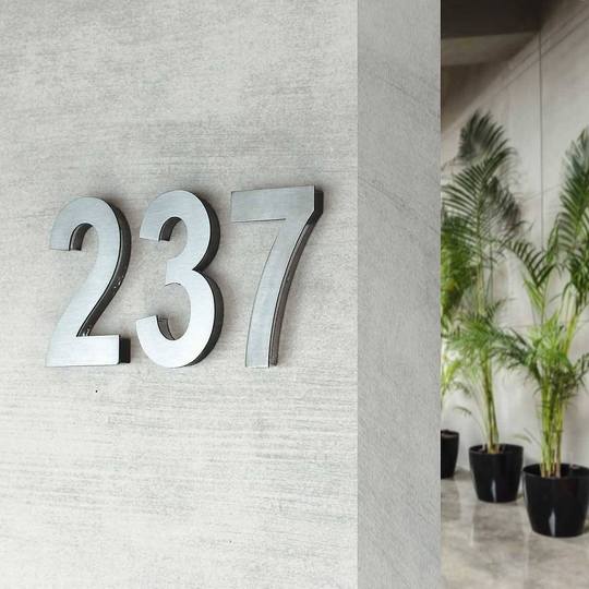
- The material of a sign shapes the emotional perception of a space: wood adds warmth, acrylic emphasizes a modern interior, and stainless steel conveys reliability and status.
- Documented navigation standards (material specs, typefaces, colors, and mounting rules) allow the system to scale during expansion without losing style.
- Signs with Braille and tactile elements make navigation accessible and are part of a complete signage system.
- Bsign Store manufactures custom wayfinding systems for hotels, resorts, apartments, offices, and medical centers, taking into account each building's architecture and brand.
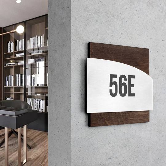
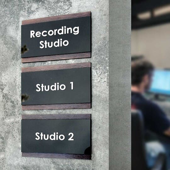
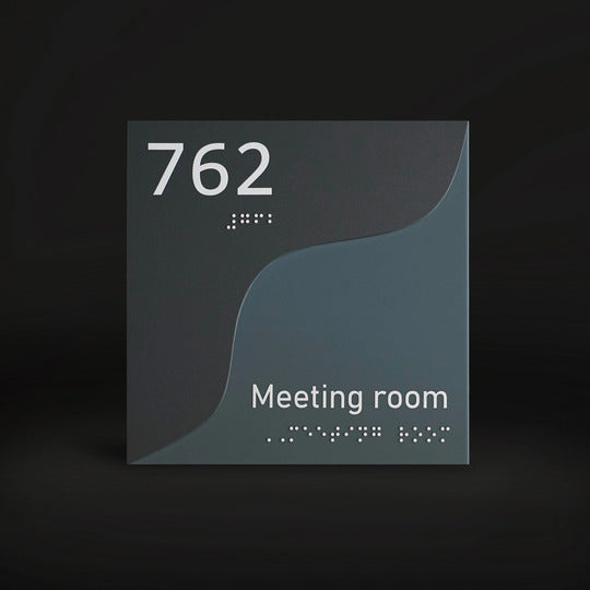
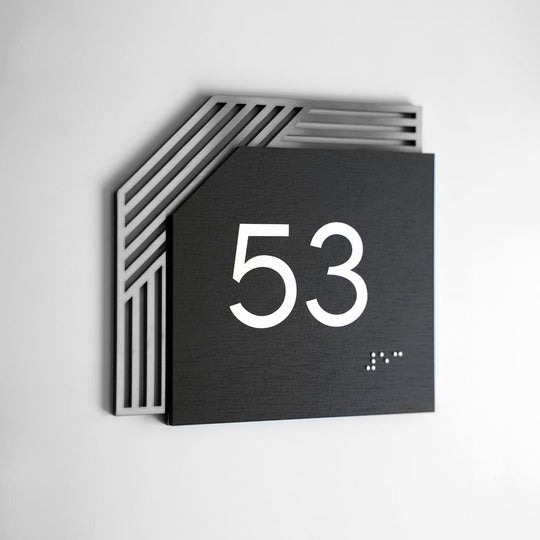
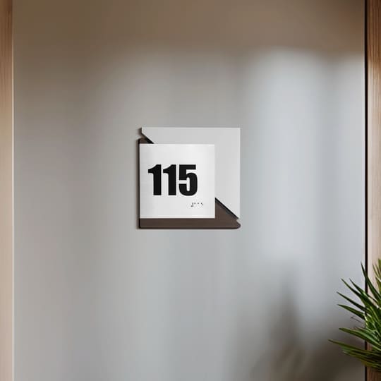
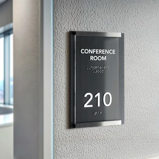
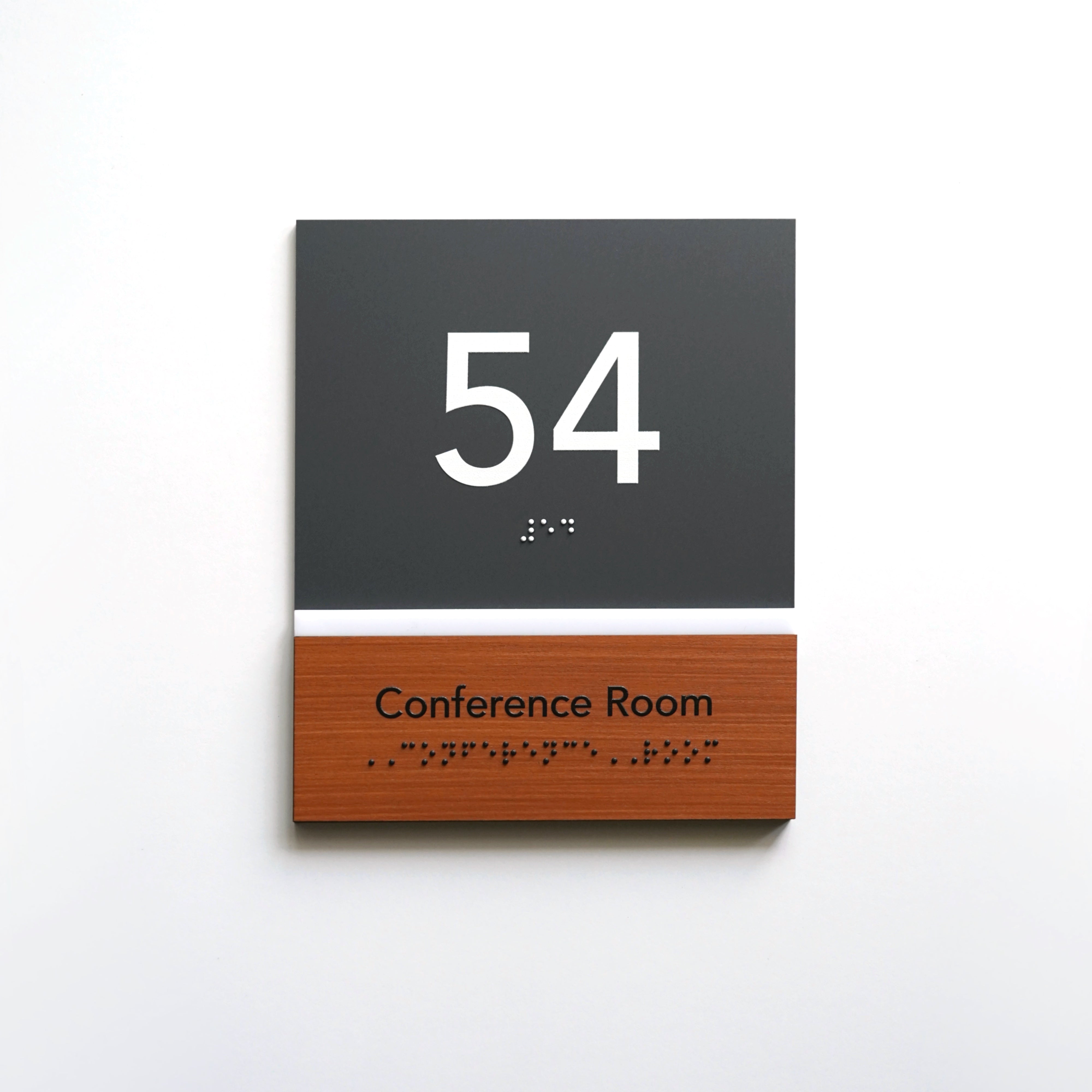
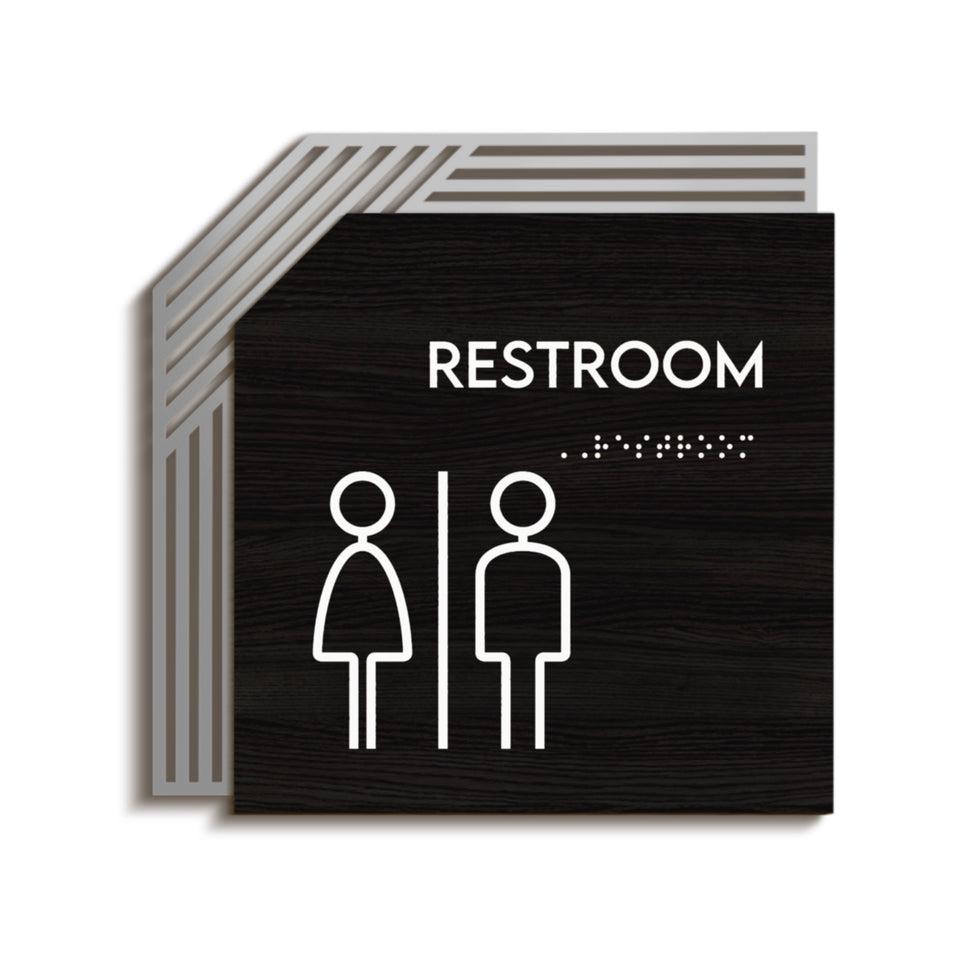
Example of a unified signage system where door numbers and directional signs harmonize with a modern interior:
Why Signs Appear Ad Hoc and What To Do About It
At a project's start, door signs are usually ordered in one batch: room numbers, floor signs, a few information signs. A year later a meeting room is added; two years later a new wing or a renovated reception arrives. Each new order often goes to a different contractor who uses whatever font, color, or material is at hand.
As a result, the owner ends up with a collection of separate items. Each may be neat on its own, but together they create the impression of an unkempt space. The solution is to treat the signage system as a long-term standard that's defined once and applied to every new element.
Why Signage Belongs in Interior Design
Wayfinding signage is not a decorative afterthought added once a renovation is complete. It shapes how people move through a space, how long it takes them to find a room, and the overall impression they take away.
When directional signs are designed alongside the architecture, navigation becomes intuitive. A guest doesn't stop to figure out where to go; they move naturally because the signage system cues the direction at the right moment.
If signs are added without regard for the interior, they feel like stickers stuck on afterward: the material clashes with wall finishes, the typeface conflicts with the brand book, and sizes look arbitrary. The space loses a sense of thoughtfulness even when each individual element is well made.
What is a unified signage system? A unified signage system is a set of wayfinding, informational, and service elements produced according to shared rules. They use the same materials, typography, colors, proportions, and placement principles so that navigation supports the logic of the space, the interior design, and brand recognition.
7 Signs Your Signage System Has Lost Its Consistency
- Door numbers differ in typeface or material thickness from floor to floor.
- Directional signs are made from different materials in adjacent zones on the same floor.
- Sign colors don't match the brand's corporate palette.
- New information signs are added "temporarily" and remain that way for years.
- Staff regularly have to tell guests where the room they are looking for is.
- Braille or tactile elements are present only in parts of the building.
- After a renovation or expansion, new elements look like they belong to a different property.
If three or more of the items above apply, it's a signal to review wayfinding as a system.
Types of Wayfinding and Interior Signs That Work as One System
Each sign type has its own function, but all should follow a shared visual logic: material, typeface, color palette, and proportions. All interior signs should follow the same design principles to support intuitive navigation and visual consistency. This includes door signs, directional signs, floor signs, and information signs that are designed as one coordinated system.
| Sign type | Function | Where it's used | What keeps it consistent |
|---|---|---|---|
| Door numbers | Room identification | Hotel rooms, offices, apartments | Single typeface; consistent digit size; same material and mounting |
| Directional signs | Orientation between zones | Corridors, lobbies, decision points | Unified iconography; color coding; consistent mounting height |
| Meeting room and office signs | Functional room identification | Offices, business centers, coworking spaces | Same typography as door numbers |
| Information signs | Rules, instructions, service info | Reception, elevator lobbies, service areas | Unified text layout and icon style |
| Floor signs | Orientation within vertical circulation areas | Elevator lobbies, stairwells | Agreed floor colors and numbering |
| Tactile signs and Braille | Accessibility for visually impaired users | Room doors, elevators, restrooms | Same material and color logic as the rest of the system |
Tip from Bsign: Including Braille/ADA signs in the initial specification simplifies implementation and helps maintain consistent placement, materials, and design across the property. Applicable accessibility requirements should be checked for each project and location.
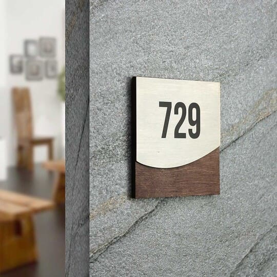
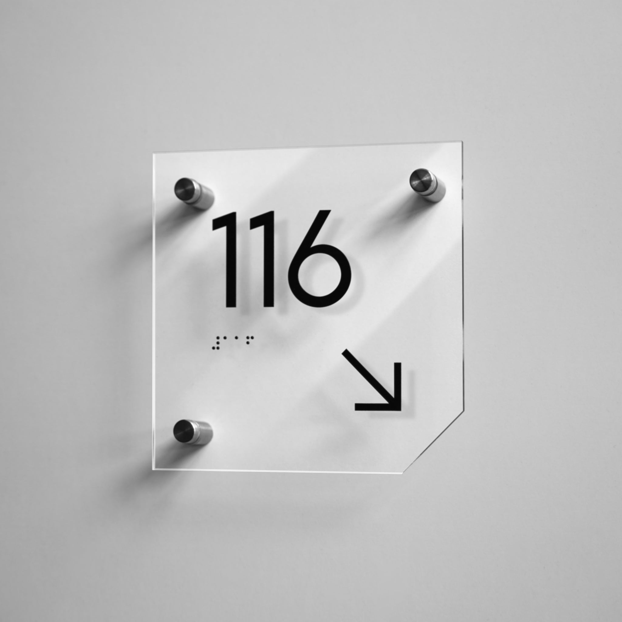
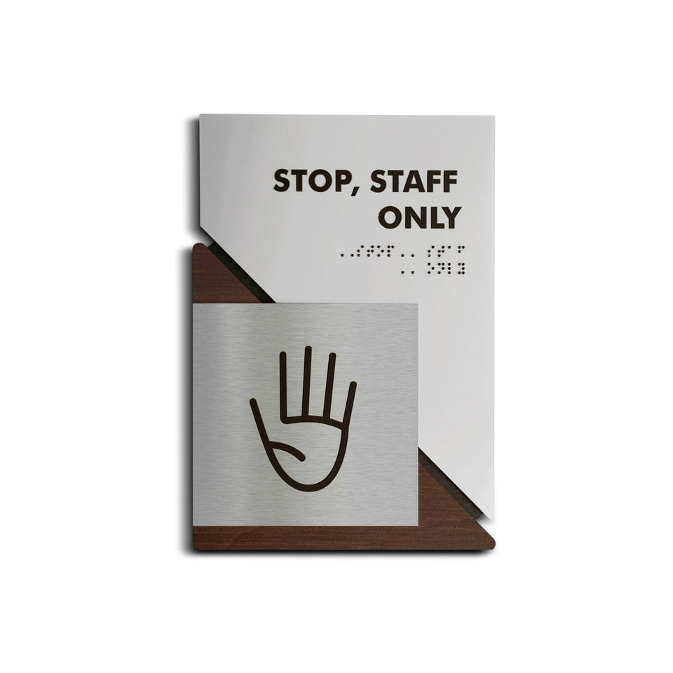
Signs made from the same materials and typography help create a coherent route for visitors:
How to Combine Door Numbers, Directional Signs, and Information Signs in One Style
Visual unity is built from a few repeating elements: a single font family for all signs, one color palette, consistent proportions, and a shared mounting logic. Once these parameters are fixed, a designer or manufacturer applies them to any new sign type.
Information hierarchy matters too: the primary label (room number, zone name) must be readable at a glance, while secondary details (an icon, the original-language name, or a tactile element) support the main label. An overloaded door sign slows orientation even within a unified system.
Recognition comes from repetition. A guest who sees one door number in a hotel should immediately recognize the rest of the signs as part of the same environment. Consistent room door signs make individual rooms easier to identify while preserving the overall design language of the building.
For more practical recommendations on organizing door signs within interior spaces, read our guide How to Properly Organize Door Sign Placement in Interior Spaces.
Separate Signs vs a Unified Signage System: What's the Difference?
| Criterion | Separate decisions | Unified signage system |
|---|---|---|
| Visitor orientation | Slower; users re-learn each sign | Faster; one consistent logic |
| Staff workload | More "where is?" questions | Fewer interruptions |
| Brand perception | Fragmented, ad‑hoc | Coherent, professional |
| Scaling | Breaks as space grows | Extends to the same standard |
| Long‑term ROI | Frequent reworks | Lower total cost over time |
How Materials Shape the Character of a Space
A sign's material influences how a space feels more than you might expect. The materials chosen for interior signs influence both the atmosphere of the space and the overall visitor experience. The same door number reads differently depending on what it's made from.
Wood Signs: Warmth and a Premium Perception
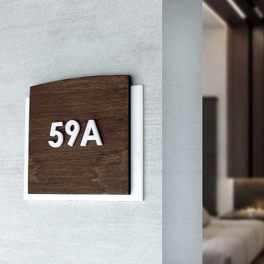
Wood brings a sense of warmth and hospitality. It's often chosen for hotels, resorts, and apartments where a homely, comfortable atmosphere is important. Hotel door numbers and directional signs made from wood pair well with natural textures in wall finishes and furniture.
If you're planning navigation for hotels or resorts, explore our guide Wayfinding Signs for Hotels and Resorts 2026 for practical recommendations on improving the guest experience.
Acrylic Signs: Modern Clarity and Versatility
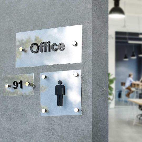
Acrylic delivers a clean, minimalist aesthetic, which is why it's often chosen for contemporary offices where office signs form part of a unified signage system. The material integrates easily with modern interiors, reproduces corporate colors well, and suits both minimalist and richer design schemes. Office door signs help identify meeting rooms, departments, and private offices while maintaining a consistent visual language throughout the workplace.
Stainless Steel Signs: Durability, Status, and High-Traffic Use
Stainless steel creates a high-end impression and withstands heavy use, making it a frequent choice for medical centers, business centers, and high‑traffic areas. The material resists moisture and mechanical damage, which is important for restrooms, elevator lobbies, and service zones.
| Material | Visual character | Durability | Best‑fit spaces |
|---|---|---|---|
| Wood | Warm, cozy, premium | Medium–high with proper finishing | Hotels, resorts, apartments |
| Acrylic | Modern, light, clean lines | High; fade resistant | Offices, coworking, business centers |
| Stainless steel | Status, reliability, austerity | Highest; resilient under load | Medical centers, high‑traffic zones |
The key is to maintain a consistent material strategy across the entire property. Mixing materials without a clear rule (for example, wood in guest areas and steel in service zones) creates the same sense of imbalance the system is meant to avoid.
For hotels and apartment complexes, a practical approach is to choose one primary material for door numbers and directional signs in guest areas and a more durable material for service and technical rooms. What matters is documenting clear rules for combining the materials.
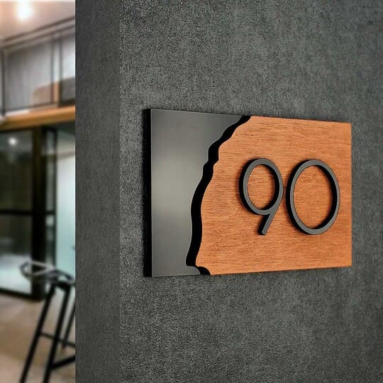
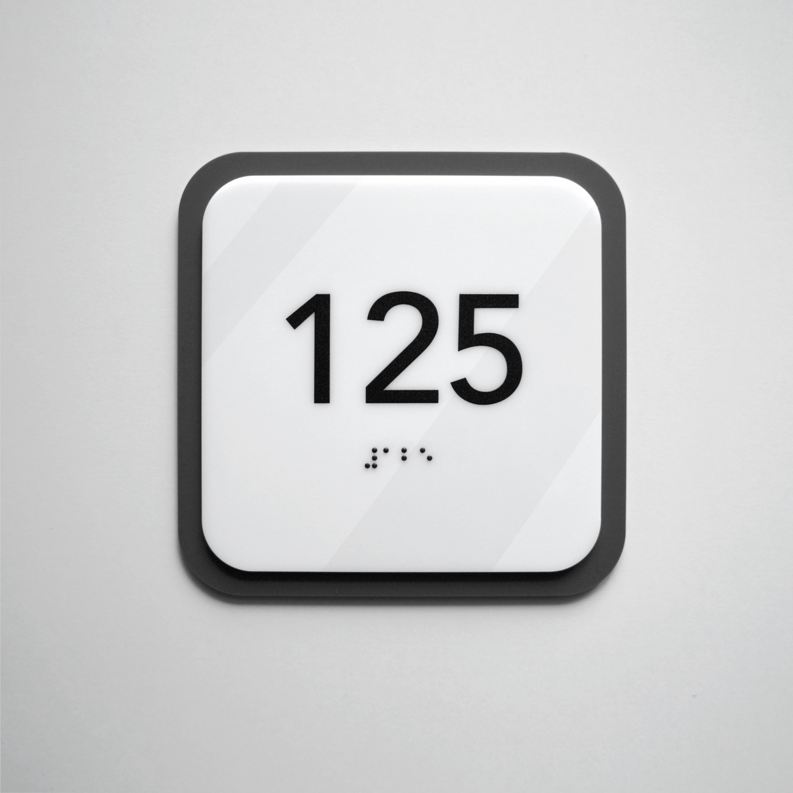
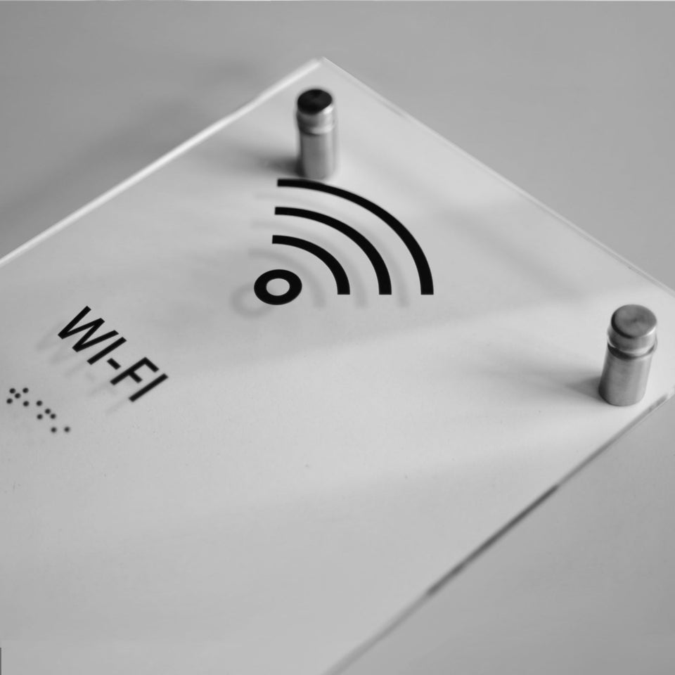
Example of an interior where door numbers and directional signs support a unified brand identity:
How to Reinforce Your Brand Through Signage Details
A building's brand is expressed through the details visitors encounter along their route: the color and material of door numbers, the styling of directional signs, typography, and information plates. These details repeat dozens of times during a guest's stay in a hotel or office, so they build recognition more effectively than isolated marketing pieces. Even restroom signs should follow the same visual system and support the overall style.
When corporate colors, typography, and shapes are applied consistently across all signs, the space reads as considered and reliable. Disparate or temporary‑looking signs, by contrast, weaken brand perception, even if the main interior design is flawless.
A custom signage system developed to match brand guidelines brings the corporate identity into the everyday interactions guests have with the space.
5 Mistakes to Avoid When Scaling a Space
Business expansion, renovation, or reconfiguration almost always requires new wayfinding elements. If they're added without a unified system, the space gradually loses visual cohesion. This usually happens because of a few common mistakes.
1. Adding new signs without checking the specification
New offices, floors, or functional zones are often fitted out separately from the original concept. Materials, colors, typefaces, or mounting methods change. Small differences accumulate and the system loses its unified look.
2. Using temporary solutions as permanent fixes
During renovations or openings, simple temporary signs are often installed with the intention of replacing them later. In practice they remain for years, creating an unfinished impression and breaking the overall style.
3. Losing the brand style after an interior update
After a redesign, furniture, finishes, or the color palette may change while wayfinding is only partially updated. Old and new elements begin to compete, and brand identity becomes less consistent. Visitors perceive the space as fragmented and inconsistent.
4. No documented standards
If materials, typography, colors, sizes, icons, and mounting rules aren't documented, every new contractor is forced to make decisions on their own. As a result, even well‑made elements can differ from what's already installed.
5. Ordering signs from different manufacturers without a single design system
Each manufacturer has its own approach to proportions, material finishing, colors, and production techniques. Without a clear specification, new elements gradually become inconsistent with the overall design. This is especially noticeable in hotels, business centers, and medical facilities where a signage system can include dozens or even hundreds of signs.
To prevent scaling from breaking a space's cohesion, it is worth preparing a navigation system specification at the beginning of the project. It should document materials, colors, typography, sizes, mounting methods, and placement rules for all elements. Such a document makes it possible to add new signs one year or ten years later while preserving a single style and the space's visual identity.
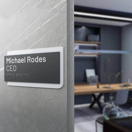
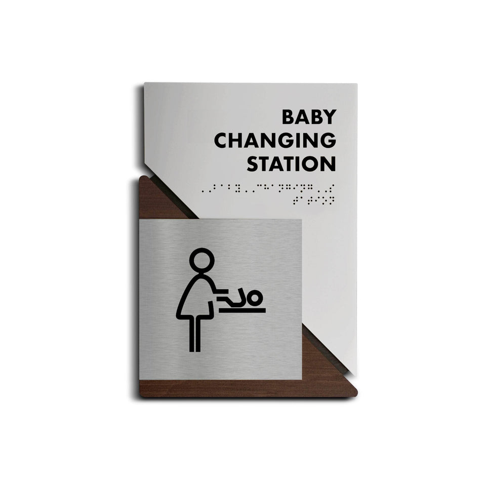
Information signs in a consistent design improve orientation and support the interior style:
How to Build a Signage System: A Step-by-Step Guide
A successful wayfinding signage strategy begins with understanding visitor routes before selecting materials or sign types.
| Step | Action | Output |
|---|---|---|
| 1. Audit | Assess existing signs; record discrepancies in materials, colors, typefaces | A clear understanding of the scope of the problem |
| 2. Architectural analysis | Identify key decision points and visitor circulation routes | Logic for sign placement |
| 3. Design concept | Choose material, typography, and color palette aligned with the brand | Visual foundation for the whole system |
| 4. Specification (Sign Schedule) | Document sizes, materials, and mounting for each sign type | A scalable standard |
| 5. Pilot zone | Implement the system in one area or on one floor | Test and refine the solution before full rollout |
| 6. Full rollout | Replace or add signs across the facility according to the single specification | Cohesive wayfinding throughout the property |
| 7. Maintain the standard | Apply the same specification to every new element | A system that retains its style over time |
When a System Is Mandatory and When You Can Proceed in Stages
A full system with a documented specification is especially important for large business centres, residential complexes, and medical facilities. Here mistakes can be costly: without a standard, discrepancies accumulate quickly and at scale.
For smaller sites, for example a single office or a small coworking space — wayfinding can be implemented in stages, but with a consistent approach: even a minimal specification (one typeface, one palette, one material) significantly eases future expansion.
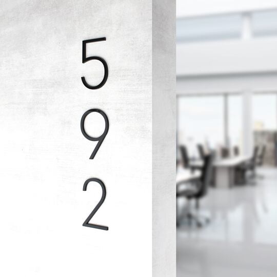
For properties with their own grounds or separate entrances, address house numbers executed in the same style as the interior wayfinding can also be part of the unified identification system.
If you're planning a navigation project from scratch, our guide How to Create a Wayfinding System in a Building explains each stage of the process in greater detail.
How to Create a Signage System That Stays Relevant for Years
Any signage system is designed to accommodate a facility's development. Over time, new offices, floors, or functional zones appear, or room uses change. If these changes are considered at the design stage, wayfinding scales easily and retains a cohesive appearance. That is why it's important to set rules that allow the system to be extended without losing its style and logic. A carefully planned wayfinding signage solution adapts to new rooms, departments, or visitor routes without requiring a complete redesign. This approach helps maintain consistency across the property for years.
How to Document Signage Standards and the Sign Schedule
Long‑lasting interior signage is designed around the building's architecture. Trends change over a few years, while the layout of a building and visitor circulation logic remain stable for decades.
A practical approach includes several elements:
- a flexible specification that allows for adding new rooms without breaking the style;
- use of durable materials that keep their appearance under heavy use;
- documented navigation standards (Sign Schedule) with exact sizes, colors, and typography;
- reduced rework costs because every new element is produced to the same specification.
Documented navigation standards make it possible to scale the system during renovations without losing cohesion, even when different contractors work on the project at different times. For a broader look at how wayfinding improves navigation and visitor experience, explore The Art of Wayfinding Signage.
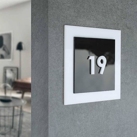
A unified sign design helps maintain brand recognition and provides clear wayfinding for visitors:

Practical Approach to Creating a Custom Wayfinding System
In sign manufacturing, the material and design of each item matter, as does the way all elements work together in the space. For hotels, offices, business centers, and medical facilities, this means a single specification for door numbers, directional signs, information signs, floor signs, and accessible wayfinding signs. This approach helps preserve the style even when the system is expanded gradually.
If you plan to order door signs or create a signage system for a hotel, office, business center, medical facility, or other multifunctional space, the Bsign team will help develop the specification, select materials, and manufacture a signage system that matches your building's architecture, interior, and brand identity.
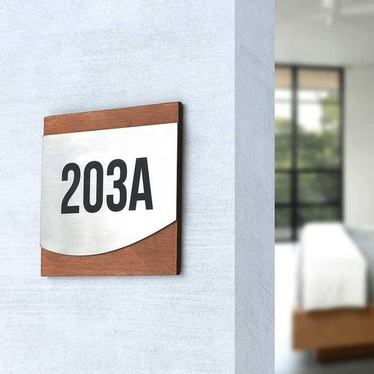
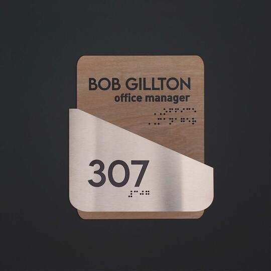
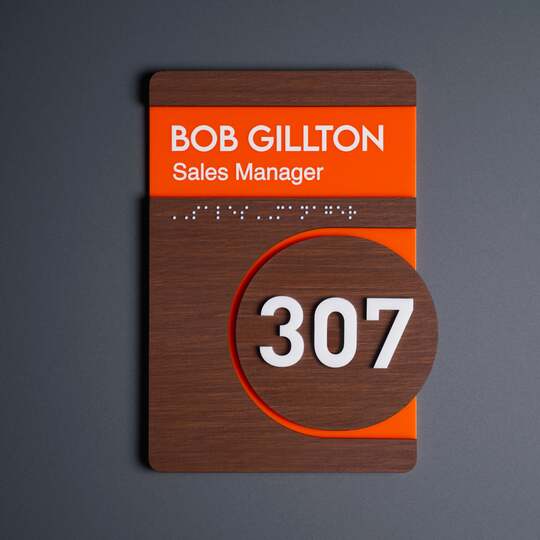
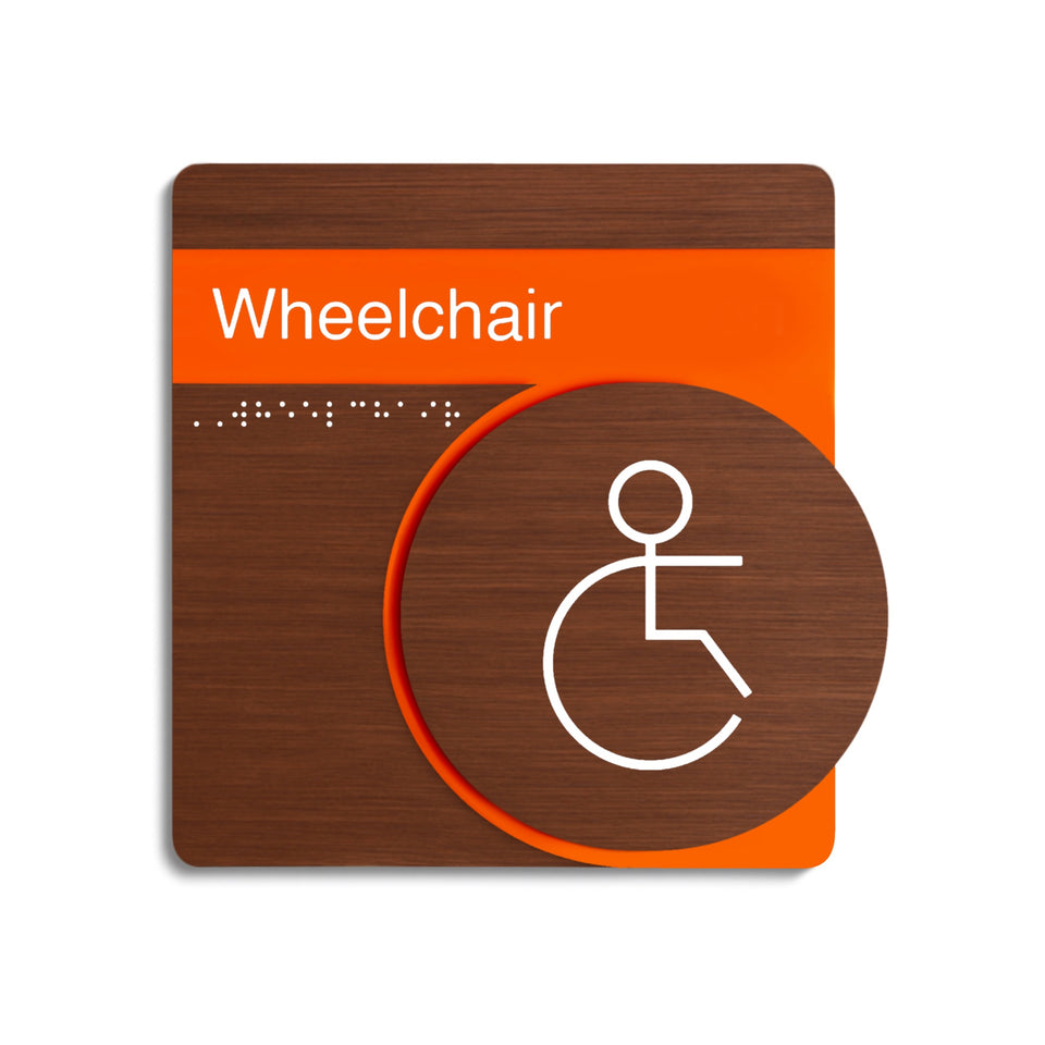
A combination of wood and acrylic allows you to create a durable signage system for contemporary spaces:
FAQ
What Is a Unified Signage System?
A unified signage system follows a single documented specification and guides visitors through a space using a consistent navigation logic. It connects room identification, directional guidance, and service information so that every sign feels like part of the same environment. This approach makes the system easier to maintain, expand, and keep visually consistent over time.
Why don't separate beautiful signs always create a good visitor experience?
Individual signs can be attractive yet inconsistent, forcing visitors to re‑interpret the space at every turn. Mismatched styles, materials, and typefaces create visual noise and slow orientation. A positive visitor experience depends on consistent visual logic across the entire route, not on the isolated quality of a single sign.
Which materials work best for a complete signage system?
Wood, acrylic glass, and stainless steel each suit different goals: wood adds warmth and a premium feel for hotels and apartments; acrylic gives a clean, modern look for offices and coworking spaces; stainless steel signals durability and status for high‑traffic business or medical settings. The best choice is to maintain one material logic across the whole system.
How does signage affect brand perception?
Interior signage shapes first impressions because it is one of the first details visitors notice before they interact with staff or experience the service. Consistent colors, typography, and finishes across every sign make a space feel considered and professional. Inconsistent or temporary‑looking signs weaken credibility, while coherent wayfinding signs quietly reinforce the brand throughout a guest's journey.
What mistakes happen most often when a business space expands?
Common mistakes include adding new signs without checking the existing specification, relying on cheap temporary fixes, partially updating wayfinding after a redesign, lacking documented standards, and ordering from multiple suppliers without one concept. Each mistake fragments the system, so a growing facility gradually loses a unified, intentional appearance.
How can a business keep signage consistent after renovation or scaling?
Keep signage consistent by documenting your standards: materials, typography, colors, sizes, and mounting rules. Apply the same specification to every new sign, and produce additions through one supplier or one design system. With written standards in place, a renovation or expansion extends the system instead of breaking it, even when different people manage the work.
How do you create a signage system that stays relevant for years?
Base the system on the building's architecture and visitor circulation, use durable materials, and plan for future floors, rooms, or rebrands from the start. Record clear standards for any new element so the system can be extended without ad hoc choices. This approach prevents costly reworks and keeps the signage timeless.


