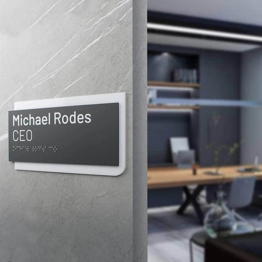
5 Common Mistakes When Choosing Business Signs and How to Avoid Them
Custom signage for companies is a tool for managing the environment. It directs the flow of people, reduces the time spent searching for the right room, and shapes a sense of order — or, conversely, chaos. How quickly a person can read information from a plate directly affects their first impression, level of trust, and overall perception of the brand.
Poorly chosen materials, fonts, or styles are rarely noticed immediately, but these details accumulate over time and begin to work against the business. Visual noise, unreadable text, and dissonance with the interior gradually reduce comfort and devalue even the most expensive space. Thoughtfully designed product, by contrast, creates a sense of logic, intention, and professionalism and helps to avoid common mistakes brands make with interior signs.
Most often, businesses do not fail because of their desire to make something “beautiful”, but because of details that quietly reduce the effectiveness of navigation. Below are five common choices that work against the space:
-
• insufficient contrast and glossy surfaces that make information harder to read;
-
• fonts and sizes that are not adapted to viewing distance and movement scenarios;
-
• signs that visually conflict with the interior or brand identity;
-
• lack of a unified navigation logic between zones, floors, and functions;
technical miscalculations: installation, wear, and neglect of accessibility and tactile lettering.
These signage mistakes create a sense of chaos even in a well-designed space. In this article, we will explain how businesses can avoid chaotic decisions and share how to design a consistent signage system.
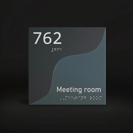
Example of low-contrast restroom signage with glossy finish under artificial lighting:

How Low Contrast and Glossy Surfaces Prevent Improving Sign Readability
The most common mistake is a situation where text is present but very difficult to read. The sign visibility suffers due to a combination of low contrast and glossy surfaces. A person can see the object but cannot quickly read the information. This is critical in spaces where decisions are made on the move — while walking down a corridor, entering a reception area, or searching for the correct room, which directly affects interior visual communication.
The problem occurs when light-colored text is placed on a light background in pursuit of a “clean” or minimalist look. In real-world conditions, this approach works only in renderings. Natural or artificial lighting is added, shadows appear, and the text begins to lose visibility. The situation is further worsened by polished materials with strong reflective surfaces, as light literally “overpowers” the text, changing its perception depending on the viewing angle.
Another factor is ignoring the ambient lighting impact within the space. What looks good under frontal lighting in a showroom may be almost invisible in a narrow corridor or near a window. As a result, the text “disappears” from view already at a distance of 2–3 meters, even though this reading distance is standard for most spaces and movement scenarios.
This issue is particularly acute at entrances and doors, where decisions are made instantly. That is why the question of how to choose the right business sign is directly related to contrast, surface finish, including the right stainless steel finish, and the stability of perception under varying lighting conditions.
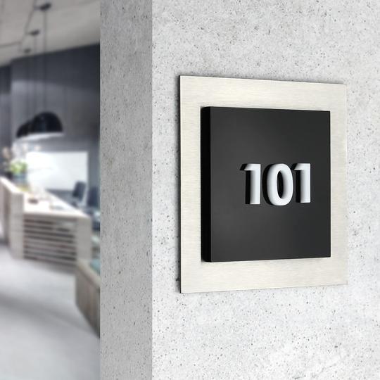
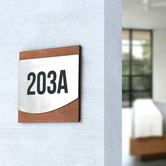
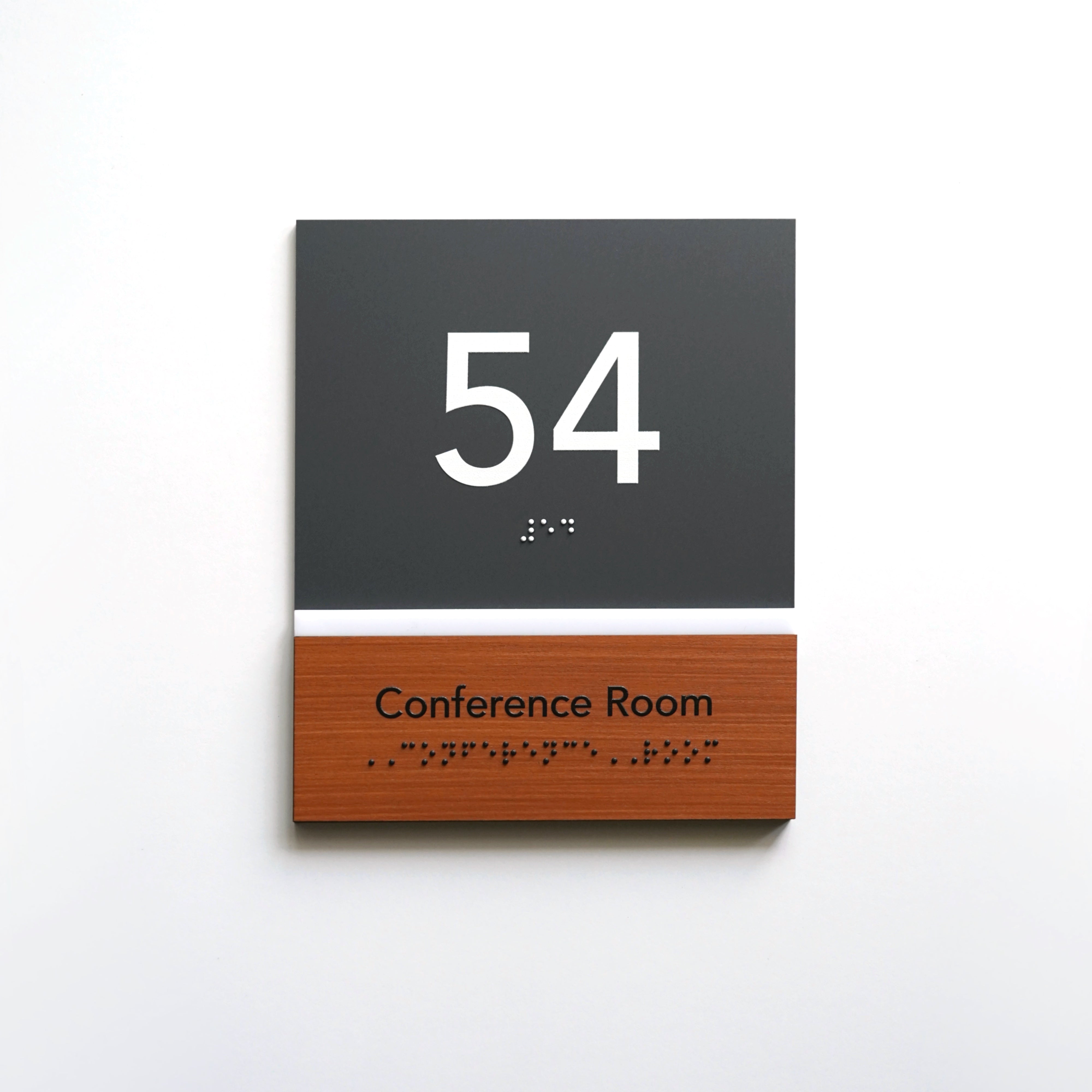
Effective solutions begin with understanding why contrast matters in signage design. Matte finishes instead of gloss reduces light reflections and makes information consistently readable regardless of lighting. Dark text on a light background, or vice versa, increases color contrast ratios and allows the text to be read without eye strain. Wood texture contrast creates a natural background that does not overload the visual perception. UV-stable printing and dimensional elements ensure consistent clarity without degradation over time. As a result, the plate remains readable even after years of use.
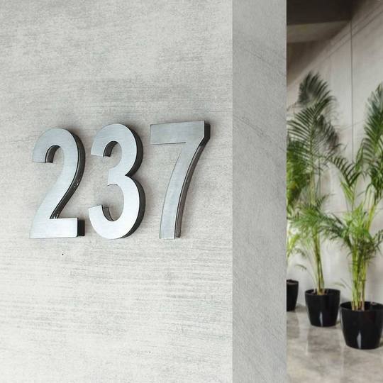
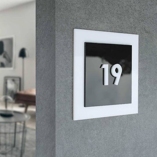
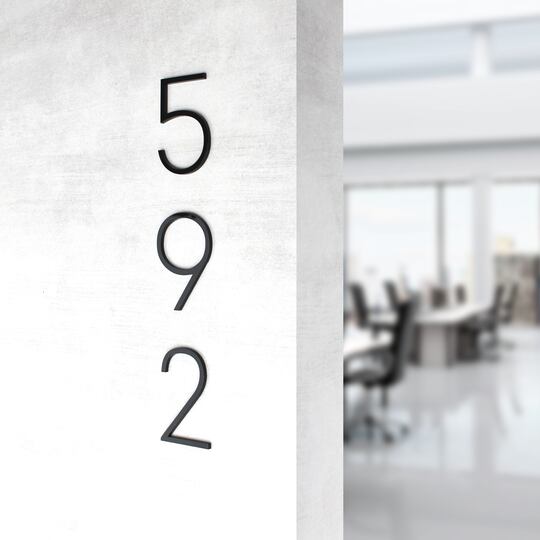
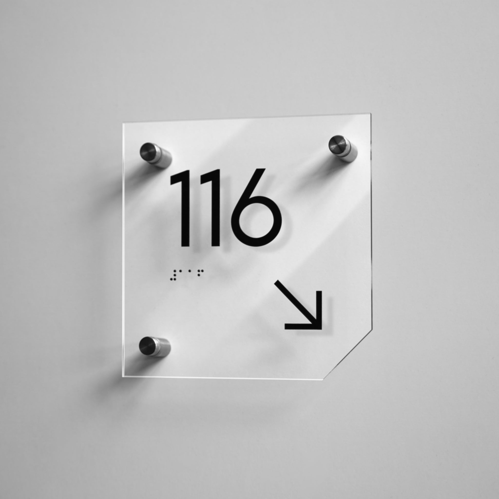
Door number signage with thin typography that becomes hard to read from a distance in a corridor environment:

How Typography Mistakes Ruin Even the Best Fonts for Signage
Even high-quality sign materials will not solve the problem if the wrong fonts are chosen for interior wayfinding. Typography most often becomes the weak point. The text is technically present, but it is difficult to read quickly and effortlessly. Decorative typefaces, excessively thin strokes, or small font sizes reduce readability and disrupt visual hierarchy, forcing visitors to stop or spend more time focusing on the plate than necessary.
If a font looks impressive only at close range but “falls apart” from a few meters away, it does not fulfill its function. On textured or non-uniform surfaces, the issue becomes more pronounced, as thin strokes lose their shape and letters begin to blend into the background.
Scaling requires special attention. Using the same font size for all decor elements may look neat in a design layout, but it does not work in real spaces where viewing distance changes. What is clearly readable near a door may be almost unnoticeable in a corridor or lobby.
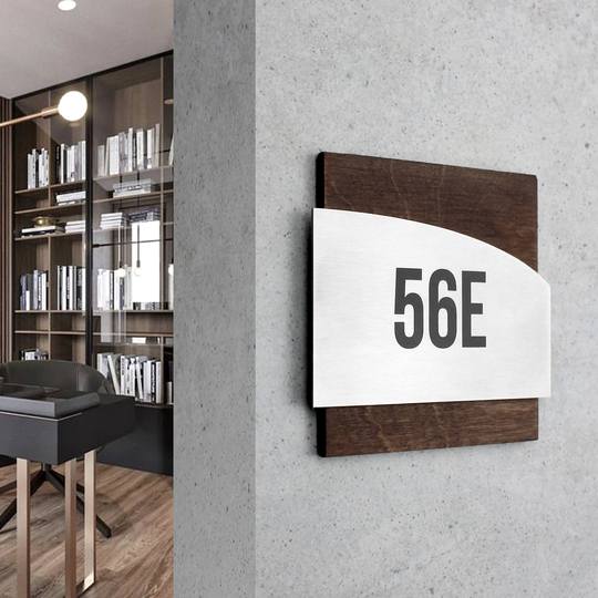
Practice shows that simple geometric fonts are read more quickly, and scale should correspond to viewing distance and the function of the product. Clear letter proportions, sufficient stroke thickness, and a well-considered size help maintain navigation clarity without visual overload.
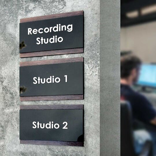
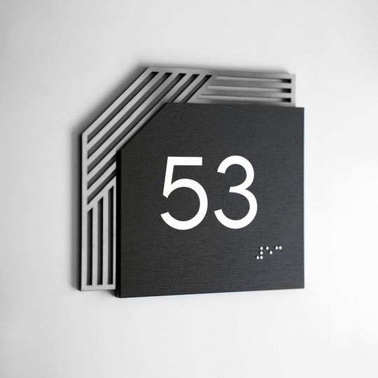
Reception area signage that visually aligns with interior materials and architectural rhythm of the space:

When Business Sign Design Doesn’t Match the Interior or Brand Identity
A wayfinding sign may be technically correct yet still feel “out of place”. This happens when the design of business signage is not aligned with the architecture, furniture, or corporate brand identity. In such cases, even a well-made element starts to appear random — as if it were added after the renovation was finished, without considering the overall concept of the space.
This problem often arises when navigation is commissioned separately from interior design or when different zones are developed without a unified visual approach. As a result, plates may visually clash with wall colors, furniture textures, or the rhythm of architectural elements. People perceive this subconsciously: the space feels less thought-through, even if they cannot immediately explain why.
Consequences:
-
• the space looks fragmented;
-
• the cohesive design is disrupted;
-
• the level of trust and the overall impression of visitors is reduced.
Fragmentation is especially noticeable in large spaces — offices, business centers, hotels — where office signage solutions must work as a single system. Here, any visual inconsistency is amplified by scale and begins to affect overall brand perception. Signage stops being part of the environment and starts to resemble isolated objects that “fall out” of the interior.
To avoid this, the interior signage design should take into account:
-
• the corporate color palette and graphic principles;
-
• compatibility of forms and proportions;
-
• consistency of materials and details across all zones.
It is important not only to choose the right colors or materials, but also to maintain consistency in small details such as line thickness, corner shapes, and the way information is presented. These details are what create a sense of order and thoughtful design.
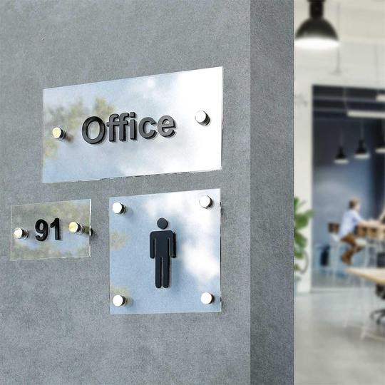
Interior signage example where inconsistent design elements disrupt the visual unity of a commercial environment:

How Inconsistent Wayfinding Signs Create Confusing Navigation Inside Your Space
Lack of a system is one of the most costly mistakes. When one set of formats is used on the first floor and different ones appear on the second or third, interior navigation loses its logic and stops fulfilling its primary function. People are forced to stop, double-check, turn back, or ask for directions, even when all the plates are technically in place.
Confusion arises not from a lack of information, but from its unsystematic presentation. When each zone is designed “in its own way”, the brain cannot form a familiar reading pattern. As a result, the space feels more complex than it actually is, and movement through it becomes less intuitive.
Problems typically occur due to:
-
• ignoring visitor movement logic;
-
• the absence of a clear placement strategy.
This is especially noticeable in large facilities, where people interact with navigation repeatedly rather than just once. If each new solution looks different, visitors are forced to “relearn” the system every time, spending extra time and attention. This creates a sense of chaos even in a well-designed space.
Systematic navigation signage works differently:
-
• one typeface and format across all zones;
-
• a clear sign hierarchy;
-
• pictogram clarity without decorative overload;
-
• consistency of the navigation system between floors.
Thanks to repeated principles, people can read information quickly without thinking about how it is presented. The eyes “recognize” the structure, and attention focuses on the content rather than on trying to figure out what is in front of them. This is a key step toward visual clutter reduction and increasing the efficiency of a space where navigation supports movement.
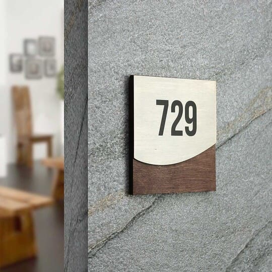
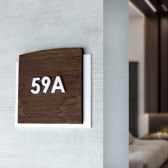
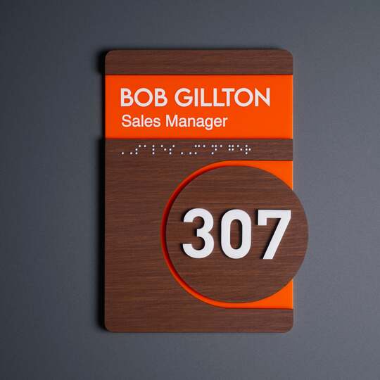
Wooden door numbers used as part of a consistent navigation system across multiple floors:

Technical Issues: Missing Tactile Signage and Incorrect Installation Methods
Even a well-thought-out design will not work if the technical principles of navigation are violated. The two most critical aspects remain: installation and accessibility. They determine whether a plate will be a useful tool in space or become a decorative but non-functional element.
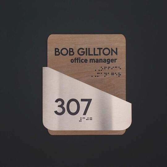
The absence of tactile elements is especially critical in spaces with complex or intensive navigation, where ADA accessibility standards according to Braille requirements are ignored. In such cases, the information is formally present but practically unavailable to people with visual or orientation impairments, reducing the functionality of the space and creating additional barriers for some visitors.
In medical facilities, this directly affects safety and speed of orientation, as patients are often under stress, have limited mobility, or visual impairments.
In business centers and office campuses, tactile features reduce orientation time for visitors and new employees. Clear embossed markings of floors, zones, and service rooms reduce the load on the reception and create a sense of a thoughtful, professional space.
In hotels and apartment complexes, accessible navigation directly impacts the visitor experience. Tactile signs near rooms, elevators, and common areas ensure intuitive movement through the building, increase comfort, and meet the expectations of modern service.
Another common issue is incorrect sign installation. Visible screws, misalignment, or uneven mounting immediately reduce the perception of even a high-quality sign. Such flaws are rarely noticed at the design approval stage but become obvious after installation. The space becomes less convenient and, in some cases, unsafe or legally vulnerable if basic requirements are not considered.
A professional approach includes:
-
• neat mounting hardware: double-sided tape or spaced metal holders;
-
• ADA Braille signs;
-
• embossed symbols and contrast for safety.
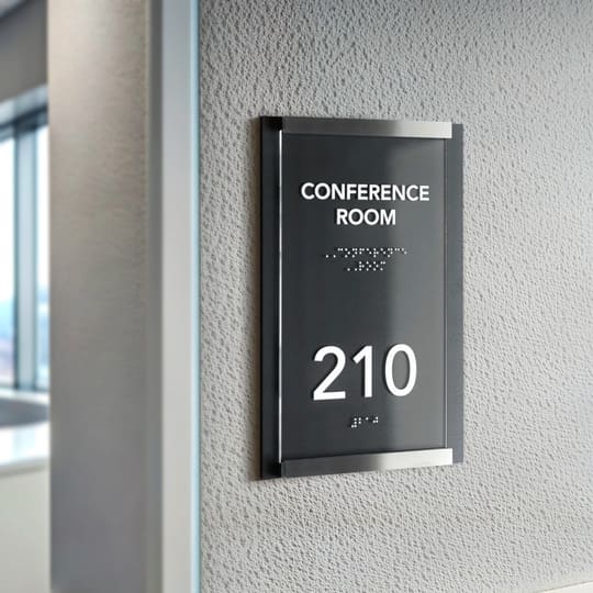
Tactile signage with Braille and raised symbols installed at accessible height near doorways:

Business Signage Tips for Choosing the Right Materials, Placement, and Visual Style
A rational choice starts with function. Room numbers, navigation, or informational plates require different solutions and varying levels of visual emphasis. At this stage, the logic of the entire system is established: what should be noticeable from a distance and what should be readable only up close. Next, it is important to understand how to choose the right materials for business signs so that they not only match the style but also perform consistently under specific operating conditions.
Stainless Steel Signage
These navigation elements are usually chosen for prestigious spaces and high-traffic areas. They are associated with reliability, restraint, and durability, working well in business interiors and public zones. This material is resistant to mechanical damage and environmental changes, but careful attention to surface treatment is required to avoid unwanted reflections and loss of font legibility.
Acrylic Signage
These plates are valued for the shape stability and acrylic durability. They allow for clean, minimalist designs with clear lines and neat graphics. The material works well in modern offices and business spaces where ease of perception and an attractive appearance are important. At the same time, acrylic requires correct selection of thickness and mounting method.
Wood Signs
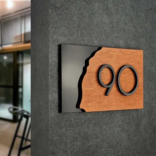
Wooden products best complement warm interior concepts, where a sense of coziness and naturalness is important. Wood adds character and tactile quality to a space and pairs well with natural materials and soft lighting. It is important to consider operating conditions to ensure that wooden plates maintain their shape and appearance over time.
Mini-Checklist: How to Choose Business Signs
-
• Clearly define the function of each sign: navigation, room number, or information.
-
• Distribute visual emphasis: decide what should be noticeable from a distance and what should be readable only up close.
-
• Choose the material according to the environment: high traffic, humidity, or frequent contact.
-
• Align the material and style of the product with the overall interior concept.
-
• Check legibility: contrast, font size, and absence of unwanted reflections.
-
• Plan the mounting method at the design stage, not after production.
-
• Establish a unified style for all plates in the space, rather than using separate, ad hoc solutions.
-
• Include additional elements if needed: logo, Braille (ADA), QR code.
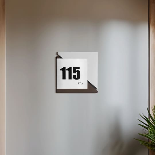
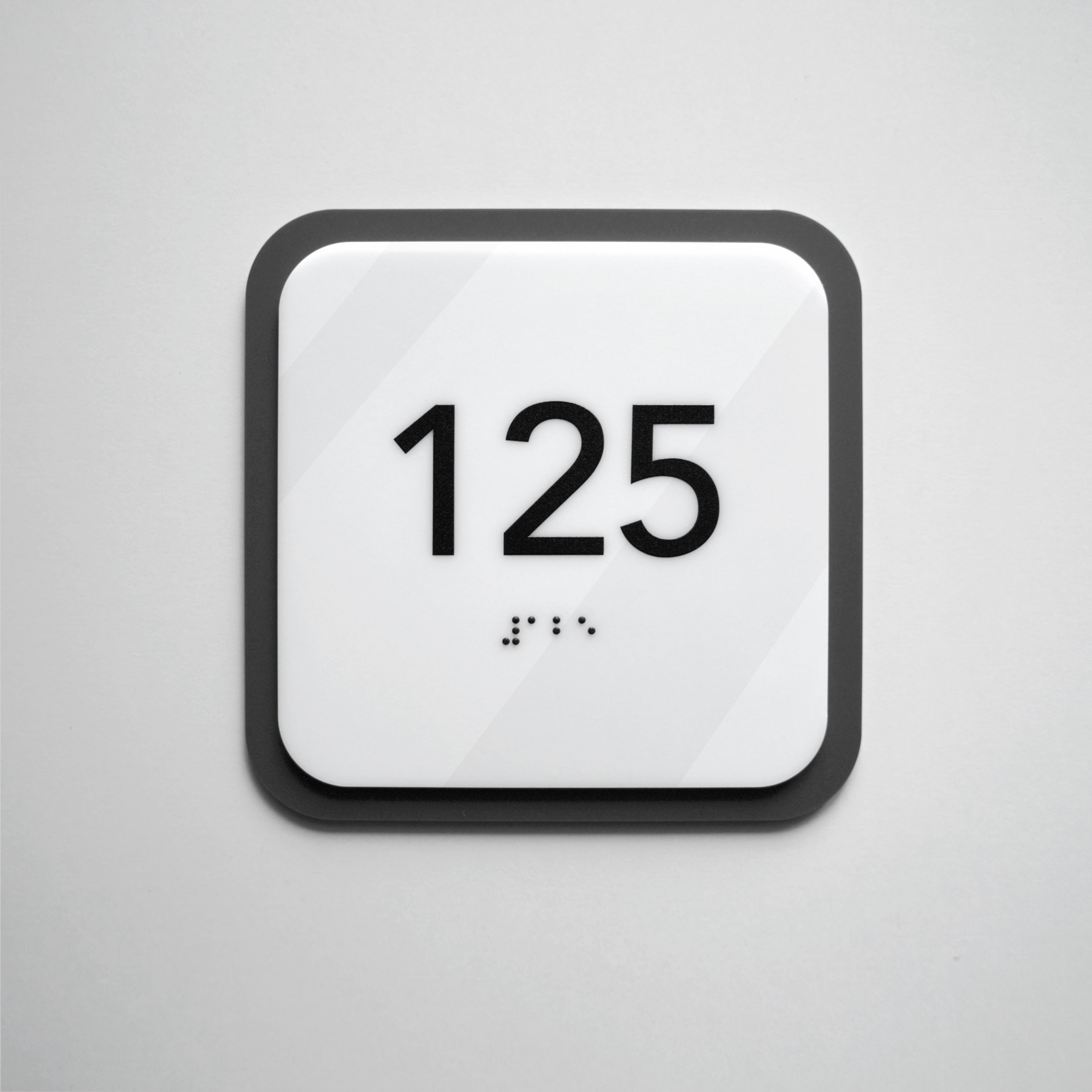
Interior door number signage combining durable materials and clear typography for long-term use:

How Professional Signage Solutions Enhance Brand Perception and Durability
Professional business door plates are the result of systematic design. In such solutions, there are no minor details, as every element is guided by the logic of the space, movement patterns, and the overall visual code of the brand. That is why navigation elements in well-planned spaces combine hand assembly, precise graphics, three-dimensional elements, and tested material compatibility, which together create a stable and predictable result in daily use.
This approach affects both appearance and durability. Navigation elements maintain legibility, form, and neatness even under heavy use, do not require constant replacement, and remain relevant after interior updates. As a result, a business receives not just individual products, but a carefully thought-out system that supports the brand at all points of visitor interaction.
That is why professional signage for commercial interiors becomes part of a brand strategy rather than a disposable solution. They contribute to reputation as consistently as architecture, furniture, or graphic identity.
If you are planning a space or updating navigation, schedule a consultation with our specialists at the selection stage. This will help avoid mistakes and create a solution that remains relevant for years.
