Braille Signage for Inclusive Institutions: On Responsibility and Aesthetics
Today, inclusivity is a hallmark of a mature culture and respect for every individual. Public institutions, business centers, hotels, and healthcare facilities that genuinely aim to be accessible to everyone understand that attention to detail builds trust.
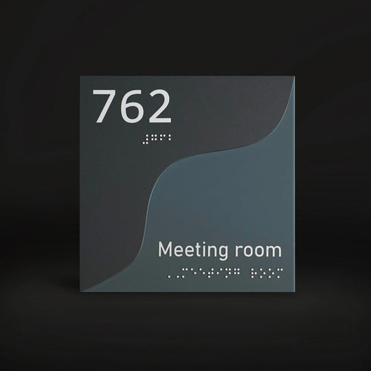
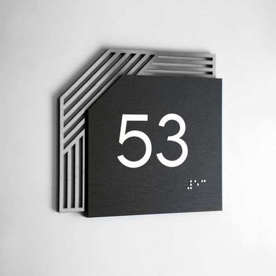
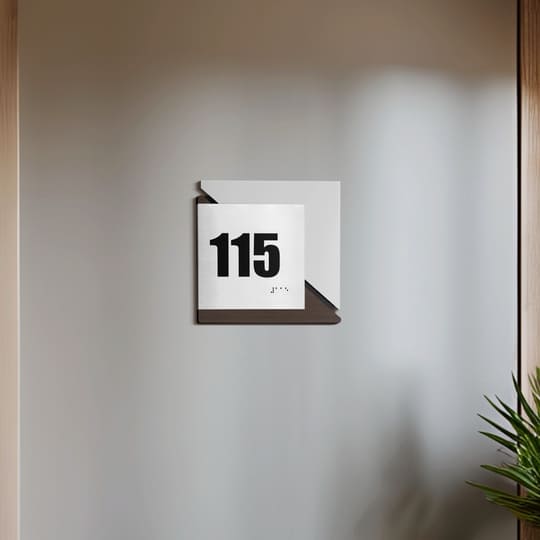
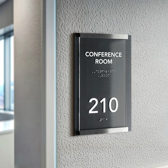
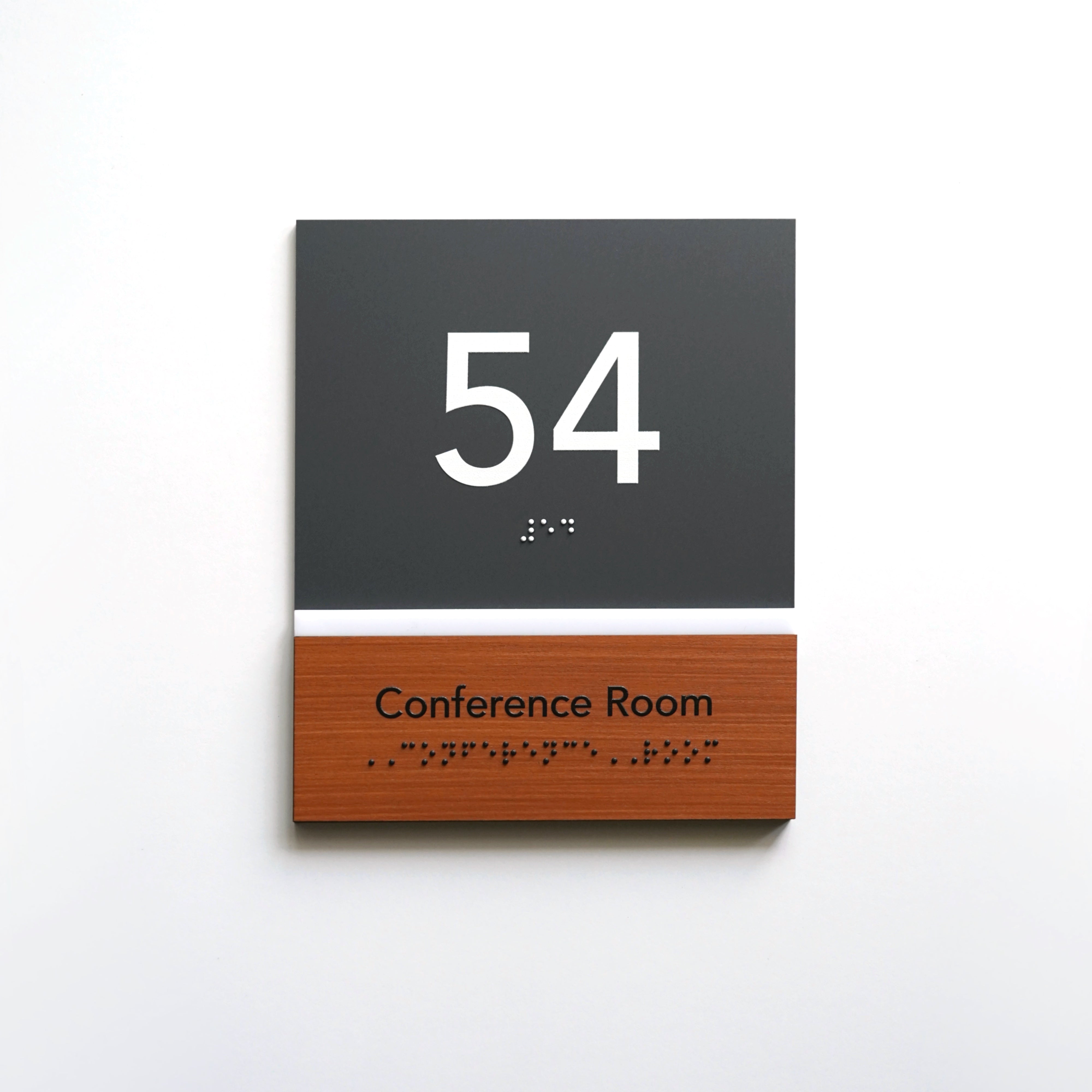
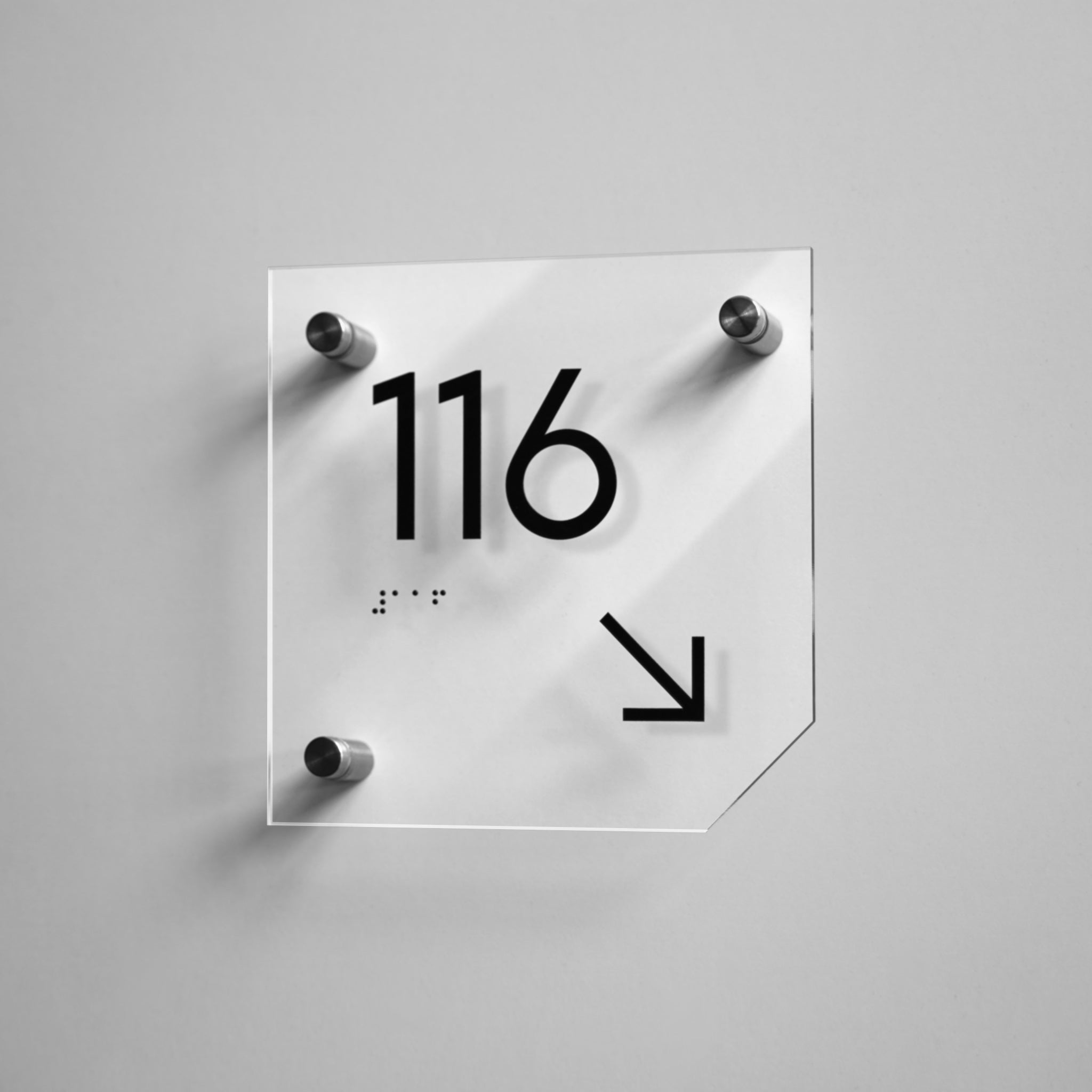
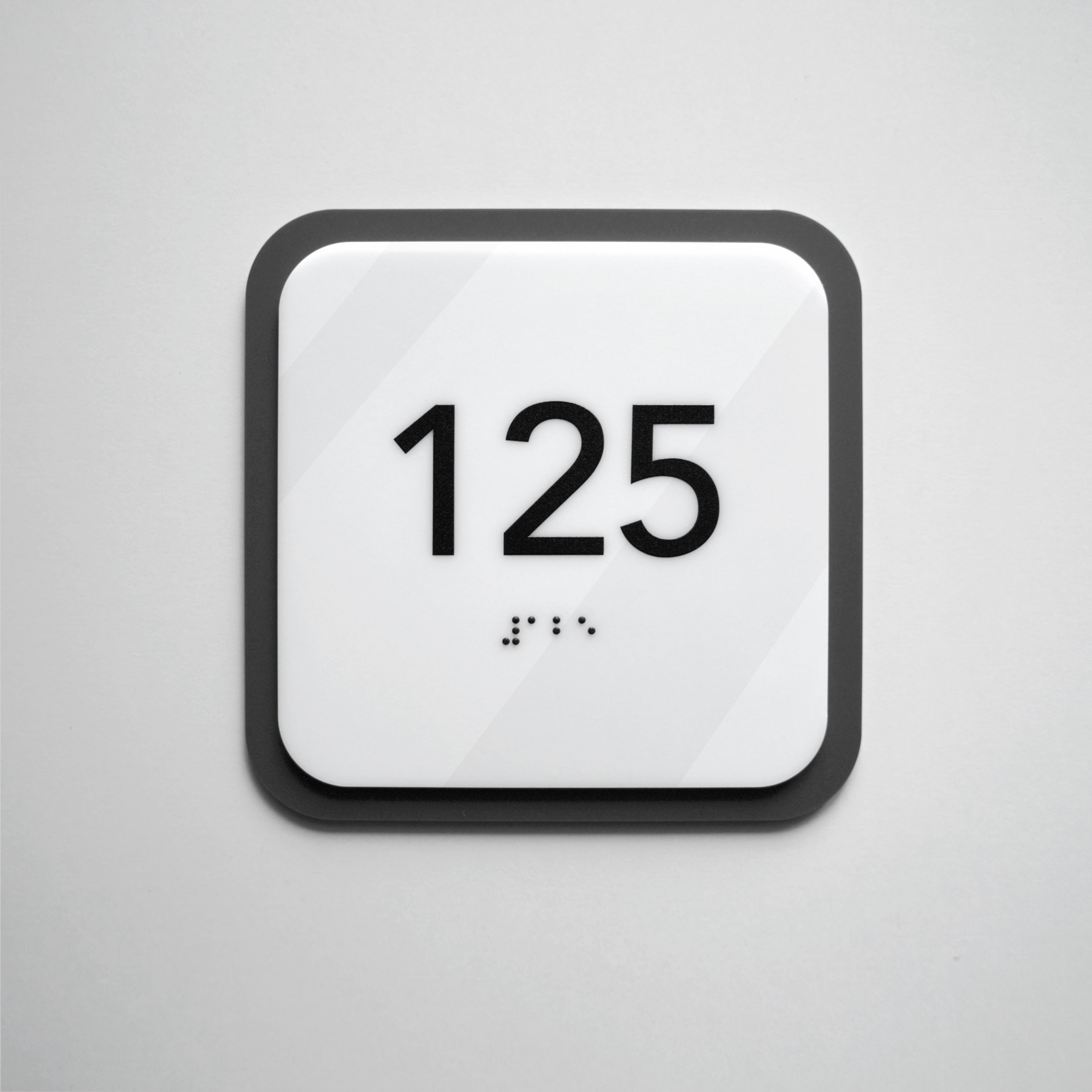
One such important element is ada braille signs. These plates allow visually impaired individuals to navigate independently and serve as a symbol of responsibility, ethics, and aesthetics.
Bsign has specialized for several years in developing inclusive solutions for modern institutions, combining design, functionality, and technological precision. Our approach is based on the understanding that Braille signs are part of a brand’s visual identity, reflecting care for all visitors without exception.
Modern technology makes it possible to integrate these elements seamlessly into the overall design. This is where the key difference emerges between a “tick-box” approach and genuine care for an inclusive environment — the very principle Bsign stands for. We take into account the modern features of each space so that even the smallest detail contributes to the comfort and safety of all users.

The Role of ada compliant signs in Creating an Accessible Space
Braille signage is a practical tool for ensuring equal access, not just a legal requirement under disabilities act. These plates enable people with visual impairments to navigate spaces confidently without assistance, reducing stress and enhancing their sense of autonomy. For someone who is blind or partially sighted, the ability to independently locate a specific office or floor conveys dignity, independence, and societal respect.
Tactile symbols and raised characters make recognition intuitive:
-
• Room number signs;
-
• Floor levels;
-
• Service areas;
-
• Elevator signs;
-
• Exit signs;
-
• Restroom signs with Braille;
-
• Emergency exits.
Thanks to the logical placement of these elements within a space, users can navigate just as effectively as individuals without visual impairments.
The presence of text language braille ensures basic safety. In critical situations — such as during evacuation, a fire, or simply when locating an exit — tactile cues help users orient themselves quickly and leave without risk. This creates an atmosphere of trust and confidence, as individuals understand that their needs have been considered.
Such wayfinding signs become an integral part of the architectural environment, creating a space where everyone feels included. Their function goes far beyond mere information, as they help establish a culture of support accessibility. The very presence of these plates demonstrate that the institution’s leadership understands the importance of inclusion not just in words, but in practice.
For government buildings, business centers, educational institutions, and healthcare facilities, ada signs demonstrate respect for every visitor, regardless of their physical abilities.

Tactile signages: How Design Enhances Accessibility
Modern durable signages also represent functional design. In the past, such elements often appeared “out of place” due to the use of plain plastic, minimal visual expressiveness, and standardized symbols.
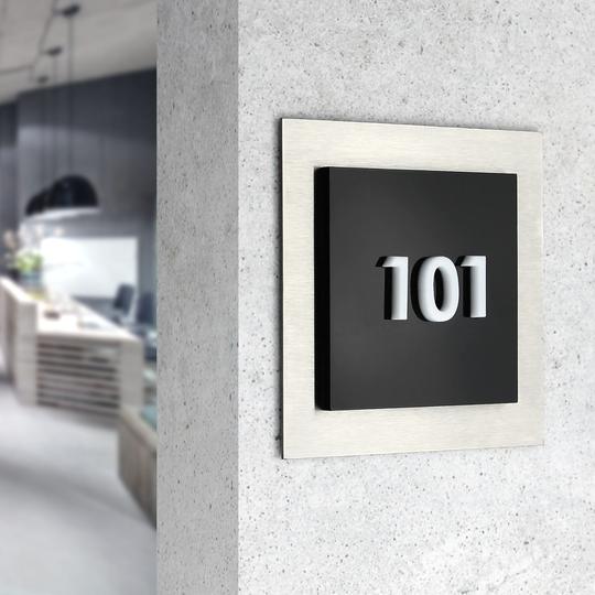
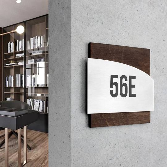
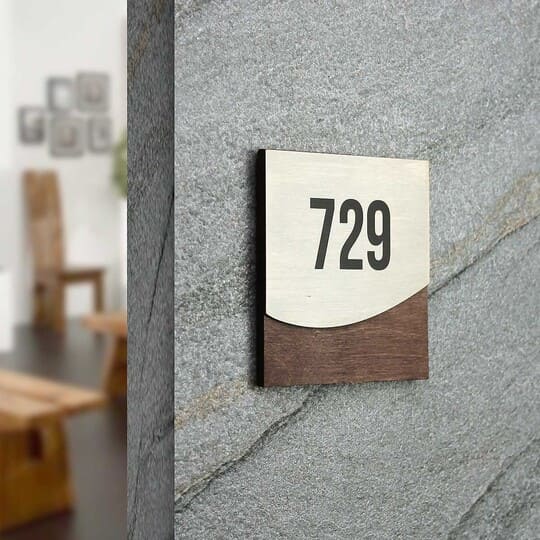
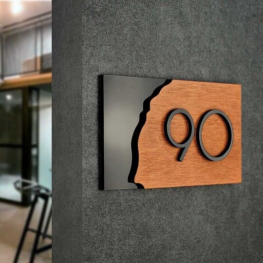
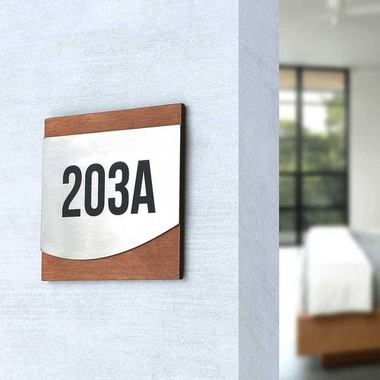
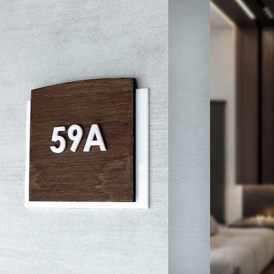
Today, high-quality products are crafted from sustainable signage materials such as stainless steel, acrylic, or wood. These robust materials ensure long-lasting performance and integrate seamlessly into the design of interior elements.
Several key aspects:
-
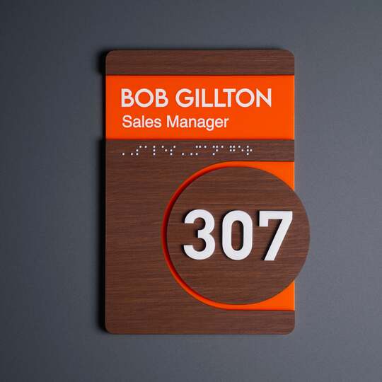
• Easy-to-read fonts for signs, combined with contrasting colors, make information easy to perceive even in challenging lighting conditions. The contrast should not be aggressive but well balanced, with background and symbol colors creating a clear visual accent while maintaining the overall harmony of the interior. Premium establishments often use muted shades of metal, natural wood, or matte acrylic to blend functional design with refined aesthetics.
-
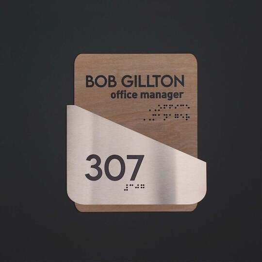
• Tactile characters and Braille dots add texture to the products without compromising aesthetics. High-quality tactile elements must feel pleasant to the touch, with sufficient depth to ensure they remain easy to read even after prolonged use. The clarity of the relief directly affects the comfort of people with visual impairments, which is why these details must be manufactured with impeccable precision.
-
• The use of custom signage design makes it possible to integrate the plates into the brand’s or space’s style and ensures that they remain both informative and representative. When visual signs harmonize with the company’s overall visual identity, they reinforce a coherent appearance, build trust, and enhance the perception of the establishment. For businesses, this has a direct effect on how clients perceive the organization: professional, attentive, and modern.
-
• Modern signs can stylistically become part of the architectural design. They emphasize the interior concept and act as an extension of the design logic. In public buildings, hotels, offices, or medical centers, well-considered aesthetic plates create an atmosphere of orderliness and care.
Indeed, accessibility signs have long ceased to be merely a “marker” of impairment. Today, they serve as an example of care and public accessibility.
 Aesthetic Signs as Part of Inclusive Design in Modern Facilities
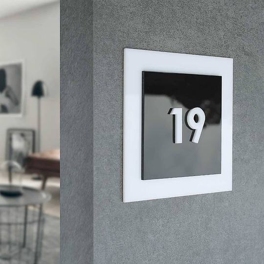
Inclusive design and visual appeal do not contradict one another. On the contrary, aesthetically crafted products can emphasize the status of a facility, bring a sense of completeness to the interior, and demonstrate a high level of cultural standards. Manufacturers working with steel, wood, and acrylic create custom signs with Braille that combine precision, style, and durability.
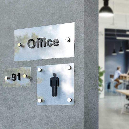
Minimalist forms are essential in such products, contributing to a sense of modernity and conciseness. High-precision tactile elements make the product pleasant to the touch. Clear symbols are used to ensure proper perception of information: a male symbol on restroom doors, a female symbol on the corresponding facilities, a wheelchair symbol at accessible entrances, and a stairway symbol in areas with elevation changes.
At the same time, all these markings must convey vital information and remain clear to everyone, regardless of vision or age. Additionally, the product features a high-quality surface finish that maintains its visual appeal even after many years of use.

Typical Mistakes in Creating Signage
Despite the growing attention to accessibility standards, many institutions still approach the implementation of inclusive solutions in a formal manner. At first glance, everything appears correct: plates are installed, yet users with visual impairments continue to experience difficulties. The root cause lies in the absence of a systematic approach and attention to detail.
Common issues include:
-
• The use of cheap plastic that quickly fades, deforms, and spoils the overall appearance of the space. Such material cannot withstand daily use, causing plates to look worn out after just a few months.
-
• Another frequent mistake is sign placement at an incorrect height, which creates real obstacles for wheelchair users or shorter individuals. The lack of standardized placement results in disorganized navigation.
-
• Insufficient relief of Braille dots or tactile symbols that cannot be read by touch is an issue that completely nullifies functionality. When raised letters are made superficially, people with visual impairments cannot feel them and therefore cannot access the information.
-
• Overly small text or insufficient color contrast is another common problem. Even individuals with partial vision impairments may find it difficult to read the inscriptions, which unfortunately turns the plate into a merely decorative element.
-
• The absence of logical navigation is yet another example of a formal approach. When plates are installed randomly, without considering traffic flow, people cannot tell where to go next and are forced to ask for assistance.
Such mistakes create an impression of neglect and indifference. Formally, the space may appear inclusive, but in practice, it is poorly thought out and inconvenient to use.

Accessibility signs as a Reputational Factor
Today, inclusivity is an integral part of a modern institution’s image. A business that implements inclusive signage demonstrates maturity, ethics, and social responsibility. For government institutions, educational centers, medical facilities, or hotels, the presence of Braille plates is a clear indicator of a high level of service and compliance with international ada standards.
Parents choose schools where children with visual impairments can navigate independently and feel equal among their peers. Visitors trust hospitals that ensure accessibility, as this reflects systematic thinking and genuine care for people. Businesses that pay attention to thoughtful details are consistently perceived as reliable and socially responsible.
Well-designed Braille signs for hospitals and schools enhance an institution’s image. They convey care for comfort and respect for human dignity, showing that inclusivity is a conscious choice based on values and attention to every individual.

Сustom signs with Braille: Combining Standards and Uniqueness
There is no one-size-fits-all approach to inclusivity. Every space has its own specific features. That is why modern manufacturers offer custom braille signs for inclusive facilities adapted to the corporate style and the needs of each institution.
Advantages of a personalized approach:
-
• Individual design of tactile elements — alignment with the brand’s visual identity or color palette;
-
• Option to include QR codes with extended information;
-
• Use of plates made from durable materials that retain their appearance for years;
-
• Precise integration into the interior signage design.
Modern tactile signs with raised lettering and text language braille demonstrate that everyone is cared for here.

An Investment in Tactile Products that Builds Trust
Investing in high-quality signs is a strategic decision. Such tactile elements do not require regular replacement, do not lose their color or shape, and remain resistant to moisture, mechanical damage, and the passage of time.
When decorative elements are designed with a clear understanding of user needs and aligned with accessibility standards, they become part of an institution’s culture.
The absence of these elements today represents a reputational loss. Visually impaired individuals are clients, employees, guests, and members of the community, and their comfort is a true indicator of a civilized society.
Those who implement tactile and aesthetically pleasing room numbers and signage create an environment where every client feels included.
Inclusivity begins with the right decisions. If you wish to make your establishment accessible to everyone while preserving its aesthetic appeal, request a free consultation from the Bsign team. We will show you how to turn compliance with ada requirements into genuine comfort and trust.
