


Colors and textures in the interior: important nuances
Colors are powerful tools that can radically change a space. Textures are an equally important component of interior design, as they make the room more attractive not only visually, but also physically. We'll talk about the important nuances of using colors and textures later.
What is important to know about colors in the interior
Zoning of a room
First of all colors in the interior have the ability to create illusions related to the perception of space and volume. Thanks to this the room can seem bigger or smaller than it really is.
For example, using light colors such as white or pastel, maybe visually make the room more spacious and as if filled by air. Whereas darker colors, such as navy blue or burgundy, can create a more intimate and cozy atmosphere.
In addition to changing the perception of space, colors can also be used for accent placement and drawing attention to certain parts of the room. By using contrasting colors, interior designers can emphasize:
- architectural features;
- furniture items;
- works of art.
Bright colors, such as red or yellow, can be used dosed to create focal points, which attract attention. By the way, this is one of the trends in interior design. To apply it optimally, you can use the color wheel.
Psychology of color in the interior
Colors can also affect our psychological state and mood:
- warm colors like red, orange, and yellow are associated with energy, emotion, and passion;
- cold colors (blue, green and purple) have a calming and relaxing effect.
This knowledge can be used to build a color scheme of a room and to create different areas in the room, for example, lively and energetic working zone. And nearby there can be intimate and peaceful place to relax.
Colors in branding
Brands can also use colors to convey their philosophy and values. For example, the use of green and other natural colors can convey environmental friendliness and sustainability. But black and gold can hint at luxury, exclusivity and sophistication.
By choosing the right colors, companies can create "visual tone of voice", which resonates with their target audience and at the same time reinforces the message of their brand.
Of course, brands should also take into account the trends in interior design that prevail at one time or another. Using some of them, you can show your progressiveness and awareness.
What about textures?
There are two types of textures, the first are those that largely relate to the tactile (or physical) qualities of the interior design material. The second ones are created using patterns, colors, and so on. Both physical and visual textures get a lot of attention when it comes to visual design and interior textures.
Feelings, which call contemplation and touch of textures are important in the perception of the interior.
Smooth in texture and shiny surfaces give the impression of elegance and sophistication. And rough textures that look raw, cause a sense of reliability, comfort, and naturalness.
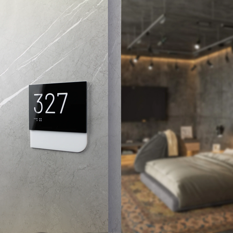
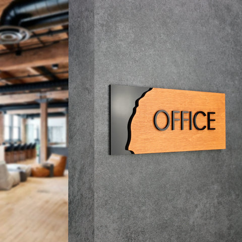
The combination of different textures in the room looks attractive and involuntarily catches the eye. An example of this are stylish interior signs on the door made of wood and acrylic, really different materials to the touch.
Textures can also be used like accents, to draw attention to certain areas of the room. For example, a wall with textured wallpaper can be used as an accent in the living room, and a fluffy carpet with bright drawing can become a real highlight of the bedroom.
Using textures can also underline three-dimensional interior by adding space, depth, and scale.
Textured walls, ceilings, and floors can create a sense of volume and movement, visually transforming a room into a dynamic environment.
There are many effects that can be created using textures, depending on the desired mood and style of the space. For example, using naturalistic textures such as wood, stone, and brick, can create a warm atmosphere typical of country houses.
And metal and glass textures add a touch of elegance and modernity to the room.
Among popular textures are the following.
- Wood: versatile material that will help create a pleasant atmosphere. It can be both, main and accent. It can be used in furniture, floors, and decorative accents.
- Stone: it adds a touch of naturalness and organicity to modern interiors. If you recall marble, granite, they are traditionally associated with luxury and sophistication. They are often used for countertops, floors, and fireplaces.
- Metal: creates elegant, sometimes even industrial and slightly rough look, especially when it comes to brushed nickel, brass and copper. In general, metal is often used to make lighting devices, accessories and decor.
- Fabric: it makes even a trendy minimalist space softer and more comfortable. Velvet, linen, wool, etc., have such properties. They are often used for draperies, decorative pillows.
How to combine colors and textures
Combination of colors and textures works effectively for creating a harmonious and visually appealing environment that reflects your personal style and taste. Here are some tips on how to combine colors and textures in interior design.
- Start with the color palette. This is the first step is to combine colors and textures. The base of the palette should consist of two or three colors that complement each other. Consider the purpose of the room and the mood you want to create.
- Add a texture. When you have a color palette, it's worth adding a texture. What will you choose? Roughness or softness?
- Balance textures and colors. When combining textures and colors, it is important to achieve balance. When there is too much texture or color in the room, the impression of it can be literally mind-blowing. And when there's lack of them, the space can seem boring.
Aim for a combination of textures and colors that complement each other and create a harmonious look. For example, if you have bright fuchsia wallpaper on your walls, balance it with the addition of white and neutral textures. Such as alder wood or light marble. You can use both materials for interior decoration, as well as high-quality artificial ones.
Also, for a harmonious combination, you can use the following: "connecting links". For example, to create a sense of a single style solution in a commercial space, you can use navigation signs from Bsign everywhere in the same design. For example, made of wood, the color of which dominates in the furniture or doors. You can choose really stylish combinations that emphasize the concept of the room.
You can also use colors for this purpose. For example, add everywhere at least one element in your company's corporate color: logo, poster, figurine, pillow, etc. Below is an example of the harmonious use of textures in interior design.
If you have already decided that you want to create a stylish multi-layered interior, but are not sure which signs will suit it, fill in the form. A Bsign store manager will contact you and conduct a free consultation that will answer most of your questions. For example, you can talk about trends in interior design or the nuances of choosing signs in accordance with the conditions in which they will be used.


