ADA Compliant Door Signs: A Complete Guide to Accessible Wayfinding in 2026
ADA door signs that meet accessibility standards are often perceived by businesses as a formality or regulatory pressure. In practice, ADA compliant door signs work differently. They structure the space, improve the clarity of wayfinding, and create a sense of a well-considered, professional environment. For users with different physical abilities, this is a matter of orientation and safety; for property owners, it is an indicator of service quality and responsibility.
That is why accessibility should not be viewed solely as a design choice or a standalone initiative. It is based on clear principles and standards that establish a coherent logic for spatial design.
It is important to understand the context. ADA standards are mandatory in the United States and are actively applied in many international projects in countries such as Canada and Australia. In Ukraine, most European countries (for example, Germany, France, Italy, Spain) and many other parts of the world, ADA has no legal force; however, it is widely used as a practical accessibility reference in international projects, hotels, offices, and public buildings focused on inclusive navigation in building and universal design principles.
Braille door signs play a central role in this system. They transform accessibility standards into a physical movement tool that can be understood not only visually, but also through touch. By combining raised text, Braille, and predictable placement, tactile door signs make it possible for people with visual impairments to navigate buildings independently, while also improving clarity and structure for all users.
In this article, the Bsign team will examine what is ADA signage, how it works in real spaces — from the basic principles of accessible navigation to the practical nuances of design, placement, and integration into modern interiors. We will explain why tactile elements are needed, in which spaces they are required, how to interpret ADA standards without legal confusion, and why accessibility is an integral part of service.
Special attention will be given to the rules for using Braille, including placement logic, mounting height, tactile reading zones, combination with raised text, and contrast requirements.

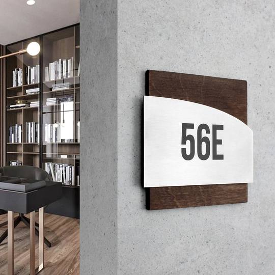
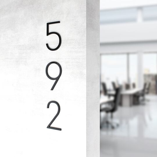
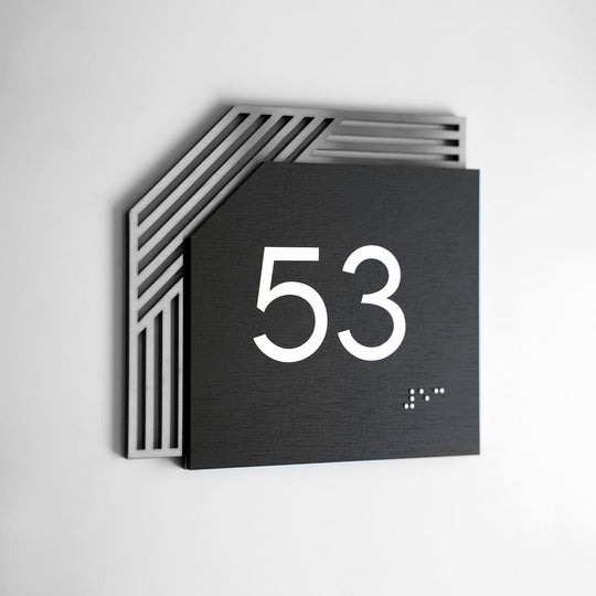
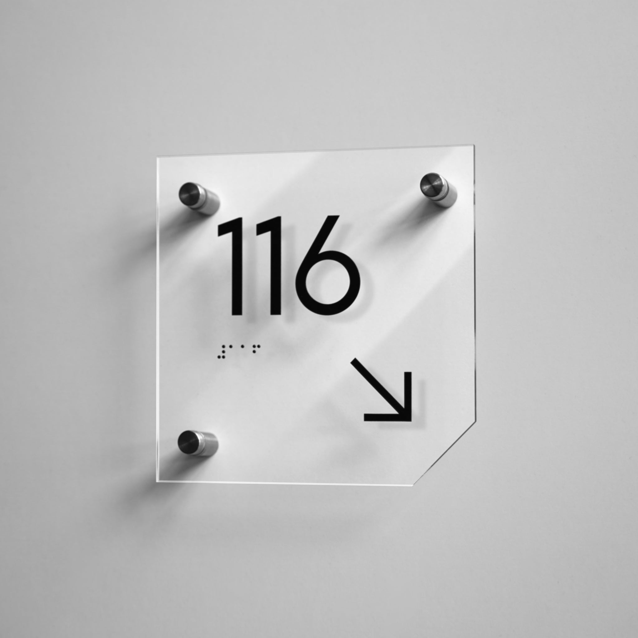
An example of an acrylic door plaque with a minimalist design, demonstrating the balance between readability and modern interior aesthetics.
What Are ADA Door Signs
Tactile Braille signs are navigation elements designed to be read not only visually but also by touch. They include raised text, symbols, and Braille on the sign surface, allowing people with visual impairments to navigate a space independently.
Unlike standard informational plaques, these indicators have clearly defined parameters. What matters is not only the wording but also the mounting height, the depth of the raised characters, the contrast between text and background, and the fixed placement relative to the door. Together, these elements create a predictable system that users can “read” with their hands as logically as others do with their eyes.
In this context, navigation for people with visual impairments is a fully integrated part of the spatial system. It works in conjunction with the building’s architecture, helps prevent confusion, reduces the number of incorrect routes, and makes orientation intuitive for all users, regardless of their level of vision.
The role of Braille on doors goes beyond a purely functional solution. It increases the overall clarity of the building for everyone, reduces movement errors, and helps create an accessible environment.

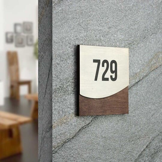
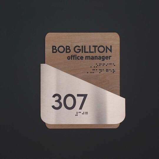
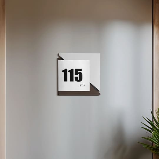
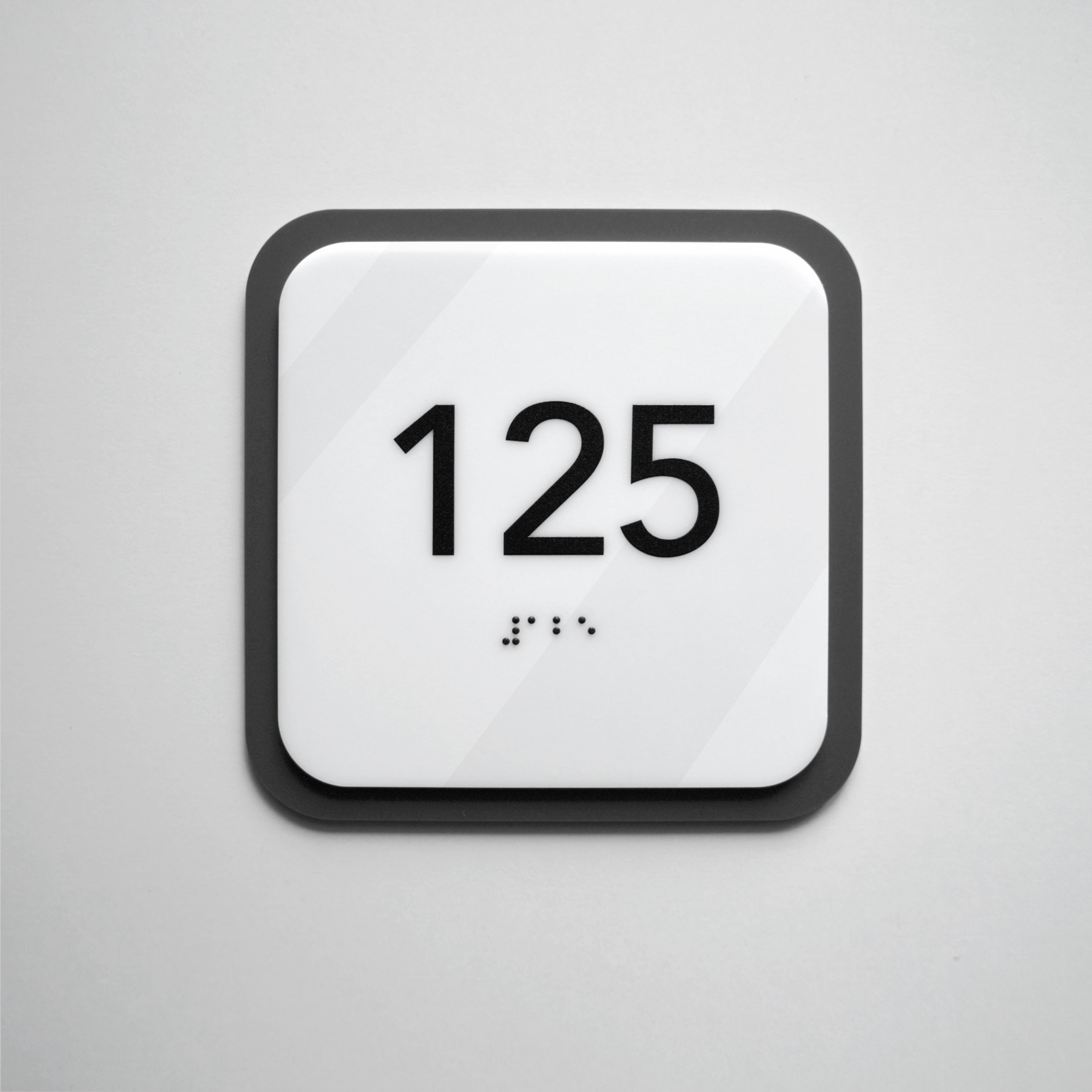
An example of a tactile door plaque with high-contrast text and Braille, executed in a restrained minimalist style for an office interior.
When ADA signage is required
This question already arises at the space design stage. Accessibility requirements primarily apply to public and commercial facilities, where tactile wayfinding systems in buildings must be universally understandable for different user groups and must not rely on external assistance.
First and foremost, this concerns permanent spaces — those with a fixed function that are used daily. For these areas, it is essential to provide a stable and predictable orientation system. Below is a list of spaces where tactile navigation is appropriate:
-
• ADA restroom signs;
-
• ADA office signs;
-
• ADA hotel signs;
-
• ADA medical facility signs.
Temporary or decorative elements that do not affect orientation usually do not fall under these requirements. At the same time, businesses are increasingly investing in accessibility even without direct regulatory obligations, as interior ADA signage increases user loyalty and improves the overall quality of the environment.

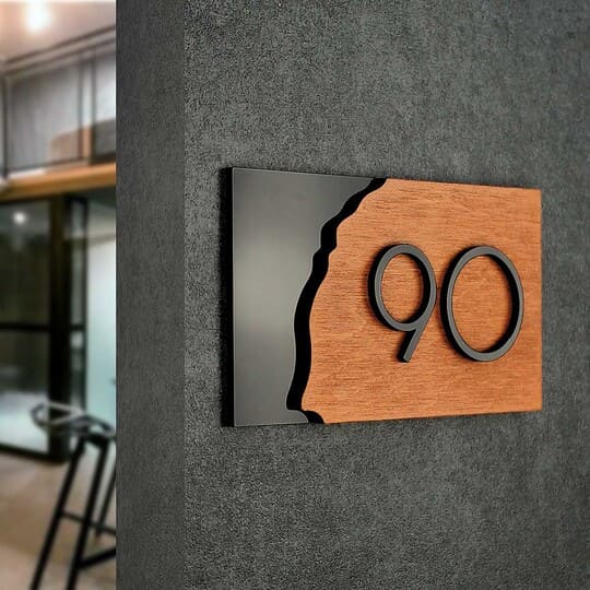
An example of the use of tactile wayfinding elements in a public space for permanent areas.
How Tactile Door Signs Work
Tactile wayfinding is not limited to a single element. It functions as a system in which each component reinforces the others and ensures predictable information reading. In navigational signage, three components play a key role: Braille, tactile text, and contrast. It is their combination that allows users with different levels of vision to navigate a space with equal confidence. Below, we will look at each component in detail.
What are Braille Door Signs
Braille is a system of raised dots, standardized in size and spacing, designed to be read by touch. It is intended for sequential tactile reading and is effective only when produced accurately and arranged in a logical order. Its functionality depends on correct placement relative to the text and ease of tactile reading.
A common mistake is placing Braille chaotically or mixing it with visual text without clear logic. In such cases, the information becomes difficult to perceive and loses its purpose.
Tactile Text
Tactile text on signs consists of raised letters and numbers that can be read by touch. These raised symbols for navigation complement Braille, allowing people with low vision or partial sight loss to quickly identify rooms.
This way, users receive information through multiple channels at once, without spending time searching for confirmation.
Contrast and readability requirements
The contrast of text on signs determines how easily information can be read visually. For people with low vision, this is critical, as insufficient contrast makes perception difficult even with large fonts. A clear distinction between background and text improves orientation in space, makes navigation predictable, and reduces cognitive load for the user.

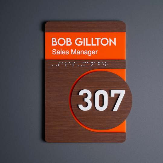
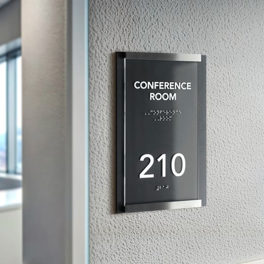
A wayfinding plaque with a clear contrast between text and background, ensuring easy readability under different lighting conditions.
How to Properly Place ADA Signature
Correct placement is a core requirement of accessible wayfinding, not a secondary design detail. ADA standards define clear, measurable parameters — including tactile sign installation height — that ensure information can be easily located and read by touch without additional effort. When these rules are followed consistently, navigation becomes predictable and intuitive for users with visual impairments.
|
Parameter |
ADA requirement |
Common mistake |
|
Mounting height |
140–160 cm from floor |
Installed too high |
|
Placement |
Latch side of the door |
Mounted on door leaf |
|
Access zone |
Clear space in front |
Furniture blocking access |
Proper placement directly affects whether tactile signs actually function as movement tools. Even well-designed plaques lose their purpose if mounted at the wrong height, placed unpredictably, or obstructed by furniture. Treating placement as part of the navigation system — rather than a technical afterthought — ensures compliance, usability, and a consistently accessible experience throughout the space.

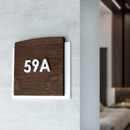
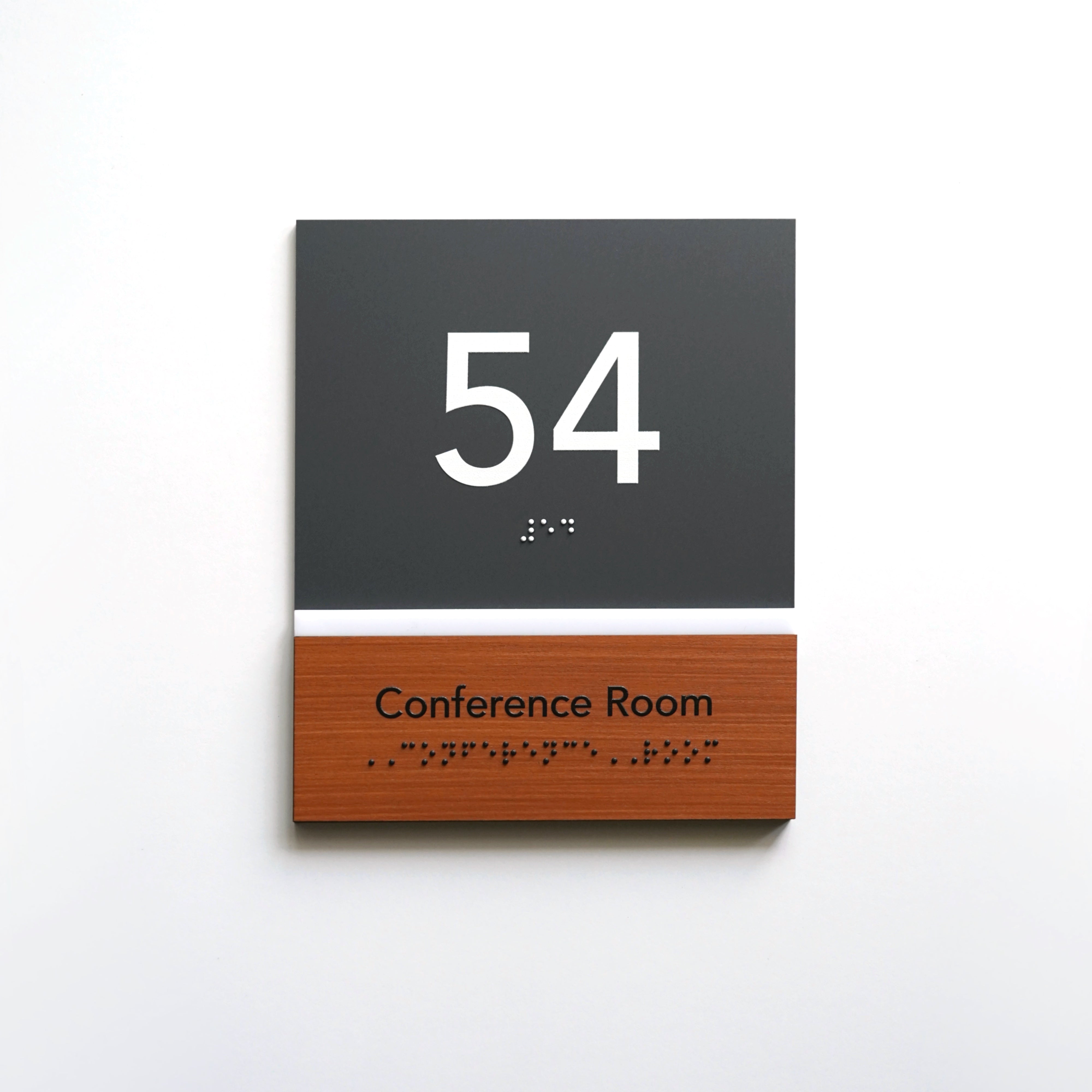
A wooden tactile plaque integrated into the interior, emphasizing natural materials and architectural restraint.
How to Combine ADA Compliance with Modern Design
International accessibility standards do not dictate material choices. They define functional parameters. This is why minimalist Braille door signs can be easily integrated into modern interiors without disrupting the architectural logic of the space. With proper design, accessible interior environments become an unobtrusive part of the interior, not a separate technical element.
Materials such as wood, stainless steel, and acrylic allow for a restrained, architectural look while meeting all tactile reading requirements:
-
• Acrylic ADA signs are suitable for offices and business centers, providing visual neutrality and ease of perception.
-
• Wooden Braille signs work organically in hotels and apartments, supporting a warm interior atmosphere.
-
• Metal signs with raised lettering ensure durability in public spaces and maintain clear navigation under heavy use.
Modern tactile signage design does not conflict with accessibility if solutions are integrated at the interior design stage. In this case, compliance with ADA requirements becomes a natural extension of the design.

Metal tactile sign with an icon and Braille, intended to designate quiet zones in public and workspaces.
Common Mistakes Businesses Make When Ordering Tactile Signage
When ordering movement solutions, businesses often focus on the speed of implementation or visual effect, underestimating the functional accessibility requirements. As a result, the plaques are formally present but do not fulfill their navigational role for users with visual impairments. We have collected the most common mistakes:
-
• Focusing only on visual appearance without considering standards, where design takes precedence over reading logic;
-
• Ignoring tactile reading, making embossed raised letter signage inconvenient to use;
-
• Incorrect placement of plaques, which makes them hard to find and disrupts predictable navigation;
-
• Insufficient contrast, reducing readability for people with low vision;
-
• Adapting ready-made solutions instead of designing from scratch, without accounting for the specifics of the space.
These mistakes most often make raised letter signs difficult to read and reduce the overall effectiveness of movement.

Navigation sign for a sanitary area, combining embossed text and clear room identification.
ADA Compliant Signage Checklist
Before ordering or auditing navigation, it is important to ensure that the plaque serves not only a formal but also a practical function. This checklist helps assess whether the solution meets the basic Braille requirements for ADA signs.
-
• Clear room designation, formulated unambiguously and without unnecessary information.
-
• Tactile text with correct relief, easy to read by touch and resistant to wear over time.
-
• Braille lettering, placed logically, in a predictable area and with the correct reading sequence.
-
• High visual contrast, ensuring readability for people with low vision.
-
• Correct height and positioning, allowing the navigation element to be located without additional movement.
-
• Comfortable tactile reading reach zone free from obstacles and extraneous elements.
-
• Neat, secure mounting ensures the plaque remains stable and properly aligned.

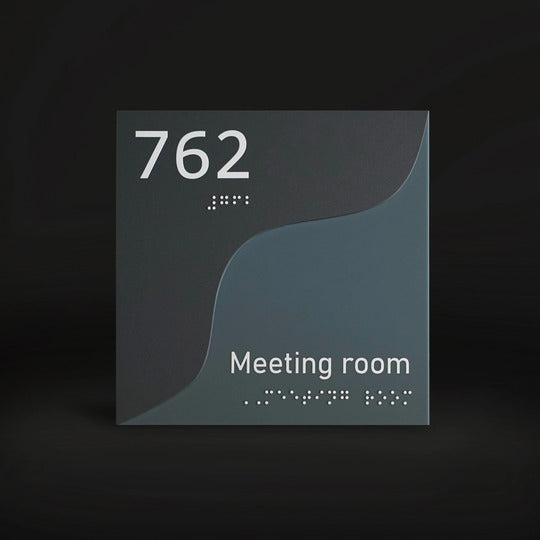
Example of a sign with logically structured information, adapted for both visual and tactile reading.
How Tactile Navigation Works in Different Types of Spaces: Examples
Practice shows that the effectiveness of navigation directly depends on the building context and its usage scenarios. Signs with tactile elements perform different functions depending on the type of space, but in all cases they help make orientation clear and predictable.
Signs with Braille for restrooms provide clear room identification and help users quickly locate the required area without any outside assistance. Tactile signage for offices structures work zones, simplifies movement between rooms, and reduces the number of questions directed to staff. ADA signage for hotels enhances guest comfort by helping visitors confidently orient themselves in an unfamiliar space from the very first minute of their stay.
Signs for medical facilities reduce stress levels, as patients can independently find the necessary offices or waiting areas. Tactile navigation in public buildings creates a safe environment where movement routes are clear for all users. At the same time, door signs for business centers support a professional image and emphasize the thoughtful organization of the space.

Wooden tactile plaque with a pictogram and Braille, integrated into the interior as part of accessible navigation in a public space.
Navigation Signs with Braille: Accessibility as Part of the Service
Bsign produces ADA signage, tactile signs, and inclusive door signage for office centers, business parks, hotels, apartments, and public buildings. These solutions help create clear movement systems in which Braille functions as a full-fledged orientation tool rather than a formal add-on.
The products are made from wood, acrylic, and stainless steel, taking into account international accessibility standards and modern architectural logic. As a result, the navigation elements integrate seamlessly into the interior and support a sense of thoughtful, user-centered service for all visitors.
If you are planning a new project or updating movement within an existing space, the Bsign team can help select the optimal solution based on the building type, interior design, and accessibility requirements. A consultation makes it possible to address all key details in advance and avoid common implementation mistakes.

Acrylic navigation plaque with Braille, designed for use in public spaces with diverse audiences.
Answers to Common Questions about Tactile Signs
Is Braille always required on door signs?
Braille is mandatory for permanent rooms in public spaces where navigation must be accessible for people with visual impairments. This primarily applies to spaces with a fixed function that users need to locate independently. These requirements usually do not apply to temporary or decorative elements.
Can tactile signs be minimalist?
Yes. Minimalism and accessibility can be successfully combined when proportions, relief, and contrast are properly designed. When tactile elements are integrated at the interior design stage, the plaques maintain a restrained appearance and do not visually overload the space.
Which mistakes most often make signs difficult to read?
Incorrect mounting height, low contrast, and the absence of a clear tactile reading zone are the most common issues. Such mistakes make navigation less intuitive and reduce its practical value for users.
