Design vs. Chaos: Why Random Interior Signs Destroy the Interior Concept
Imagine walking into a high-end hotel, office, or restaurant. What forms your first impression? Elegant design, meticulously curated details, harmonious navigation? Now, imagine this: a lavish interior, obscured by inappropriate signs — some plastic, others are metal, incompatible materials, chaotic fonts for signs. Instantly, the design falls apart.
This visual noise creates a sense of dissonance for the customers. The brand identity is blurred, the perception of the brand becomes muddled, and the interior feels like a random assortment of elements. The result is visual clutter in the design, signage confusion that creates unclear navigation and diminishes customer trust. So why is it crucial to choose stylish and cohesive signage? Let's break it down.
Interior wayfinding signage: how to avoid chaos in space
The worst things that can happen to a space are mismatched signs and design inconsistency. You could invest tens of thousands in aesthetic interior design, hire top-notch designers, select expensive furniture, use natural materials, and even ensure unique lighting solutions... However all of this effort can be undermined by signs that don’t align with the overall style. Imagine: one sign is wooden, another is shiny cheap plastic, and in the restroom, a bright adhesive film with a pictogram is slapped on the wall. This mix stands out immediately, creating a chaotic vibe and ruining the harmonious interior design.
And this isn't just a minor detail. It is a loss of unity of image, a decline in the level of brand perception, and even a decrease in customer trust. People pay attention to details, especially in business spaces. And when the signs look cheap or mismatched, it's not merely an aesthetic issue — it's a reputation problem.
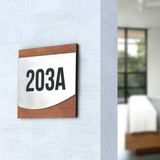
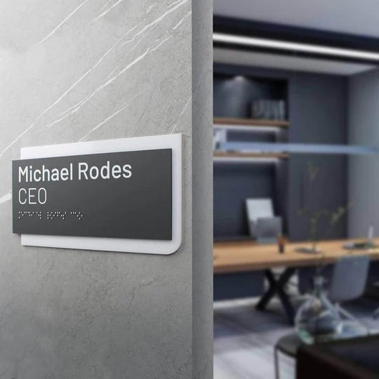
That’s why custom door signs for offices, hotels, medical facilities, restaurants or apartments should be more than just informative — they should be seamlessly integrated into the interior. They must be a unified element of the signage strategy. They are not just decor or a technical accessory — they are an integral part of the space that should work for your brand.
A successful solution in this case are premium interior signs, designed with a holistic approach, considering the interior's style, architectural solutions, and location specifics. Such signs are not "just placed there" — they enhance the atmosphere, aid in navigation, emphasize the institution’s quality and reinforce its status.

Examples of good signs: what works and what doesn't?
The most common mistake is neglecting a strategic approach to signage placement and style consistency. Typical issues seen in many offices, hotels, and clinics include:
- Signs made from incompatible materials: wood, plastic, paper — all at once.
- Chaotic aesthetics, disparity between the style of the space and the signage design: the interior has a classic design, yet the signs feature bright, almost childish pictograms.
- Chaos in colors: one sign is black, another is white, one more is gold.
- Fonts are difficult to read, not visible from a distance, or completely inappropriate.
-
Lack of color coordination, resulting in visual noise effect.
Visual noise disrupts harmony. Such seemingly small details can leave an impression of disorder, disorganization, and lack of professionalism. Conversely, when signs seamlessly align with the interior design, they work to enhance the image, foster trust, and elevate the status of the space.
Signs design: what is important to consider?
- Consistency in style — elegant signs should complement the design concept and support it rather than compete with it.
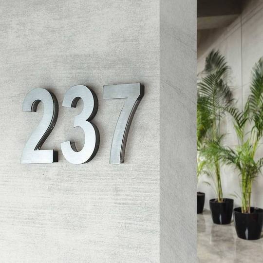
- Durable materials — wood, acrylic, stainless steel exude sophistication, offer longevity, and remain visually appealing over time.
- Strategic placement of signs — it is important not just to "hang them near the door", but to consider the logic of people’s movement within the space to ensure effective navigation.
- Contrast in signage — background and text should be easy to read, even from a distance. This is a matter not only of design, but also of usability.
- The psychology of signs colors— colors influence perception: deep, muted tones convey sophistication and restraint, natural wood evokes comfort and warmth, black and white emphasizes contrast and clarity.
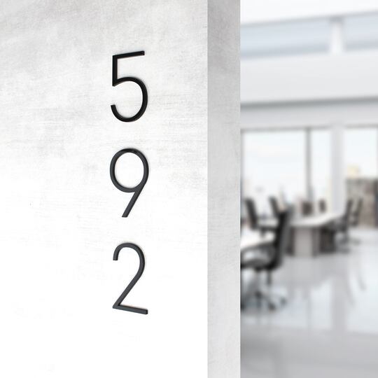
- Minimalist design — less is more. The simpler the design, the better — no unnecessary elements, just essential information that truly matters.
- Legible fonts — choose clear, modern typefaces that feel contemporary and don’t strain the eyes.
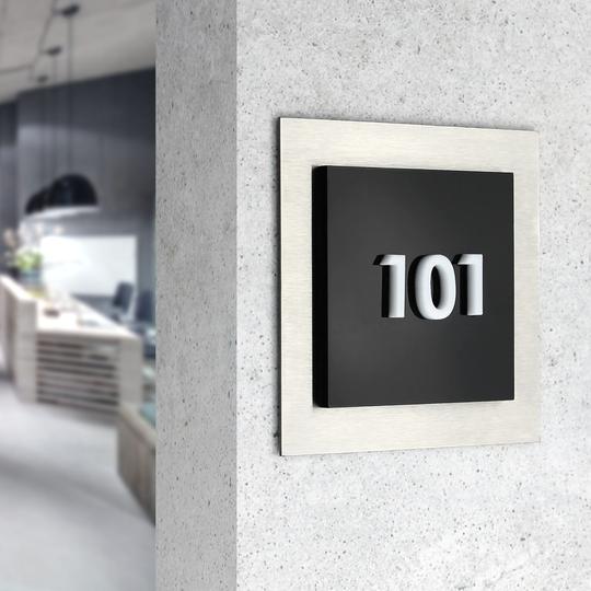
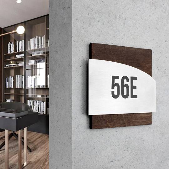
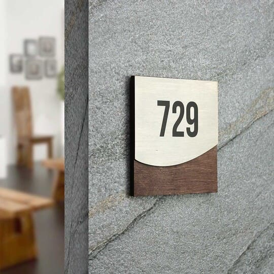
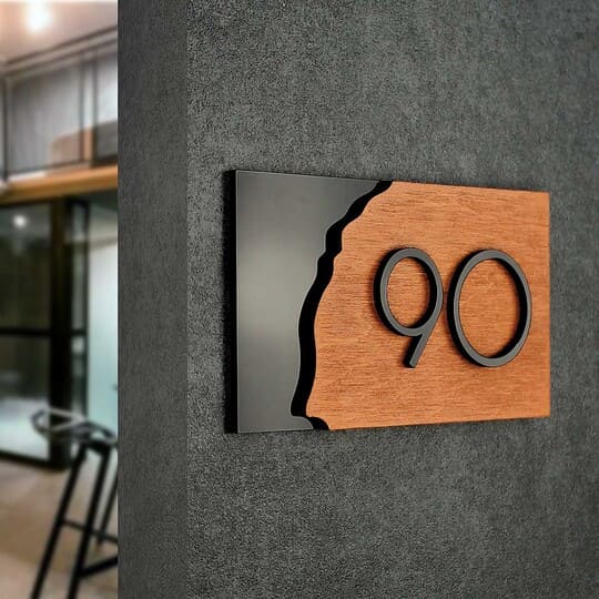
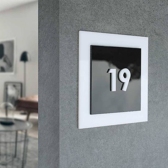
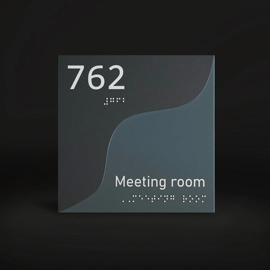
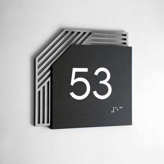
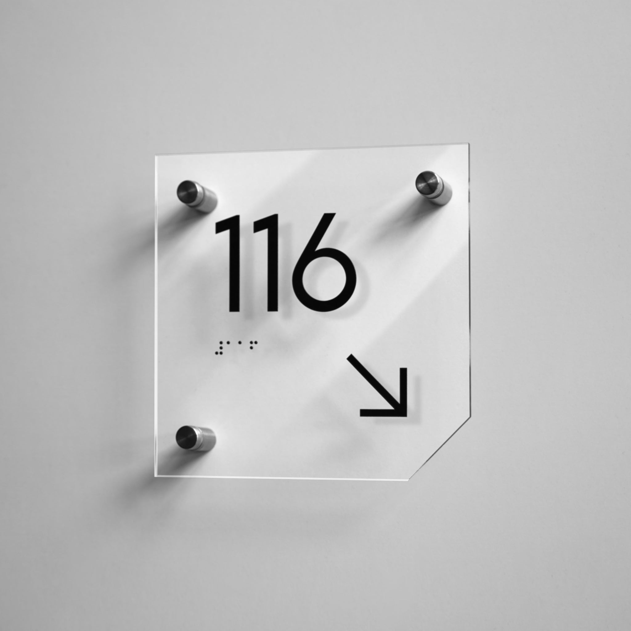
For instance, Creative Signs are unconventional signs that are both stylish and functional. They serve as a visual accent, enhancing the uniqueness of a space rather than disrupting it.

Cohesive design: how to choose the right interior signs for your business
In modern commercial spaces, interior signs serve not only a functional purpose but also an aesthetic one. Office door plaques or navigational signs guide, inform, and divide areas, while simultaneously shaping the overall impression of the space. To make the signs look harmonious and appropriate, it is worth considering every aspect of their choice, because this will help create a space for increasing customer loyalty.
-
Only select proven types of signage material. The visual quality of a sign is directly tied to the materials used. For example, options like acrylic, wood, stainless steel are not just about aesthetics — they ensure durability, reliability, and tactile comfort. These materials are perfectly combined with each other, making it possible to create a modern and at the same time everlasting look.
- Consider space color coordination. Sign colors should complement the overall interior mood rather than clash with it.
- Unification is the key to style. Consistency in fonts, format and materials is the basic principle when creating a signage system.
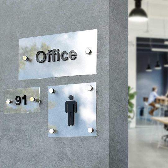
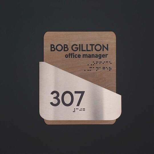
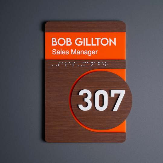
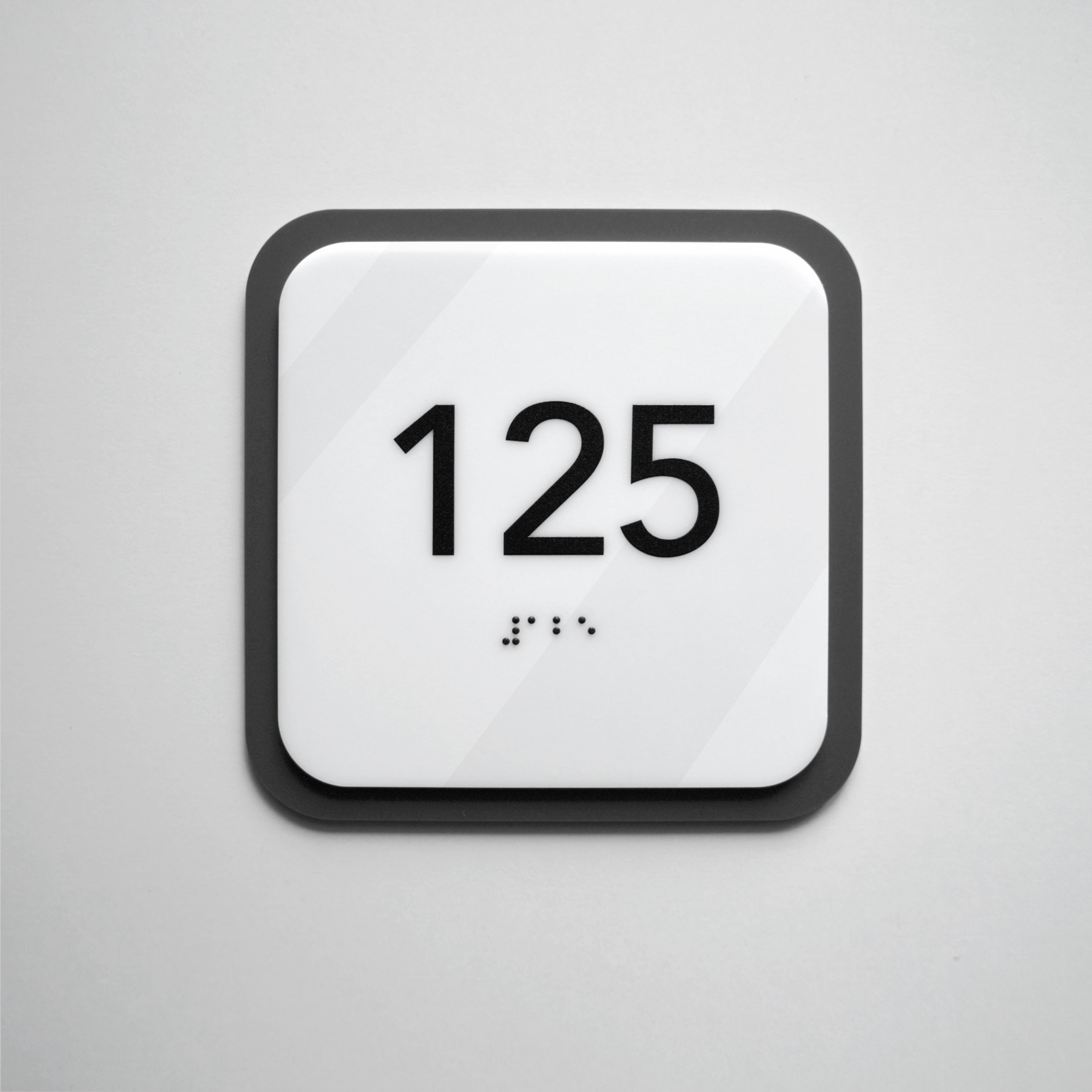
- Functionality first. A good sign is more than just a room label. It may include a company logo, a QR code with information, a tactile Braille font for accessibility, or even a stylish icon that communicates content without words. All these elements should be thoughtfully designed to fit the purpose of the space.
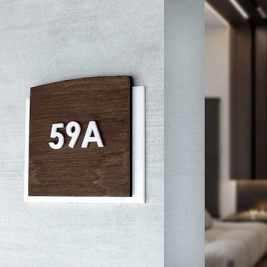
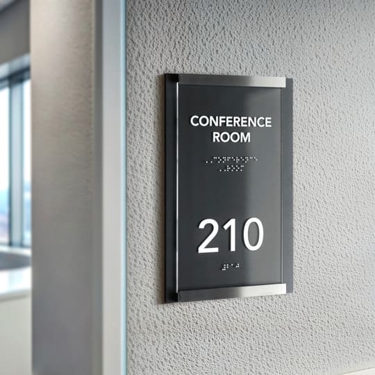
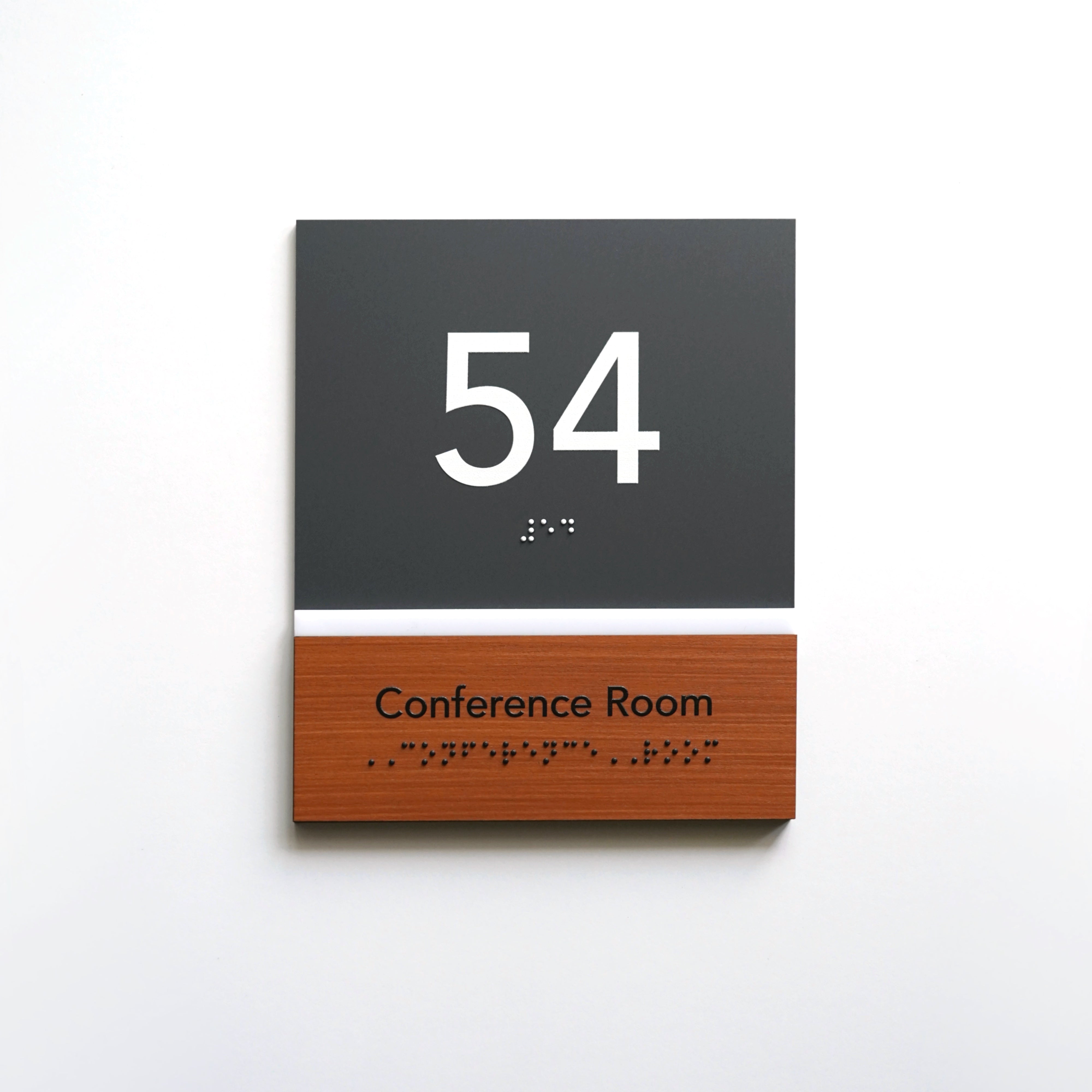
- Take into account the character of the facility. For a truly refined but understated design, Authentic Signs are an excellent solution. They are the perfect choice for hotels, restaurants and offices where classics and elegance matter.

Key signage details that define their effectiveness
A successful business is built on small details that shape customer trust and perception. A cohesive signage design is exactly what emphasizes the professionalism of the company.
Effective navigation ensures better orientation within the space without cluttering the interior with unnecessary elements. Business signs should be visible but not intrusive.
Proper signage contrast plays an important role in the perception of space. Signs should be bold enough to be easily read while blending seamlessly into the interior palette.
The choice of signage style should be well thought out: legible lettering, optimal sizing, and a lack of unnecessary embellishments. All this reinforces the credibility of the brand and adds solidity.
The quality of the details of the signs, such as the three-dimensional elements, the finish coating and the precision of assembly, form the idea of your business as responsible and reliable.
The design principles of the signs should be a natural extension of the style of the space. If minimalism prevails in the interior, the signs should not be variegated or decorative. The first impression is important, and harmony is the key to it.

Conclusion: why custom signage solutions are needed
Interior signs are not just information, but a fundamental part of the holistic design of the space. When signage feels random, visual noise disrupts the concept of the space and negatively impacts the customer experience.
Harmonious, premium interior signs create a sense of quality and professionalism. They form the perception of the brand at the highest level.
If you're looking for custom signage solutions, our team is here to help! Order stylish and personalized signs from Bsign! Our elegant signs will help your business look harmonious and professional.
