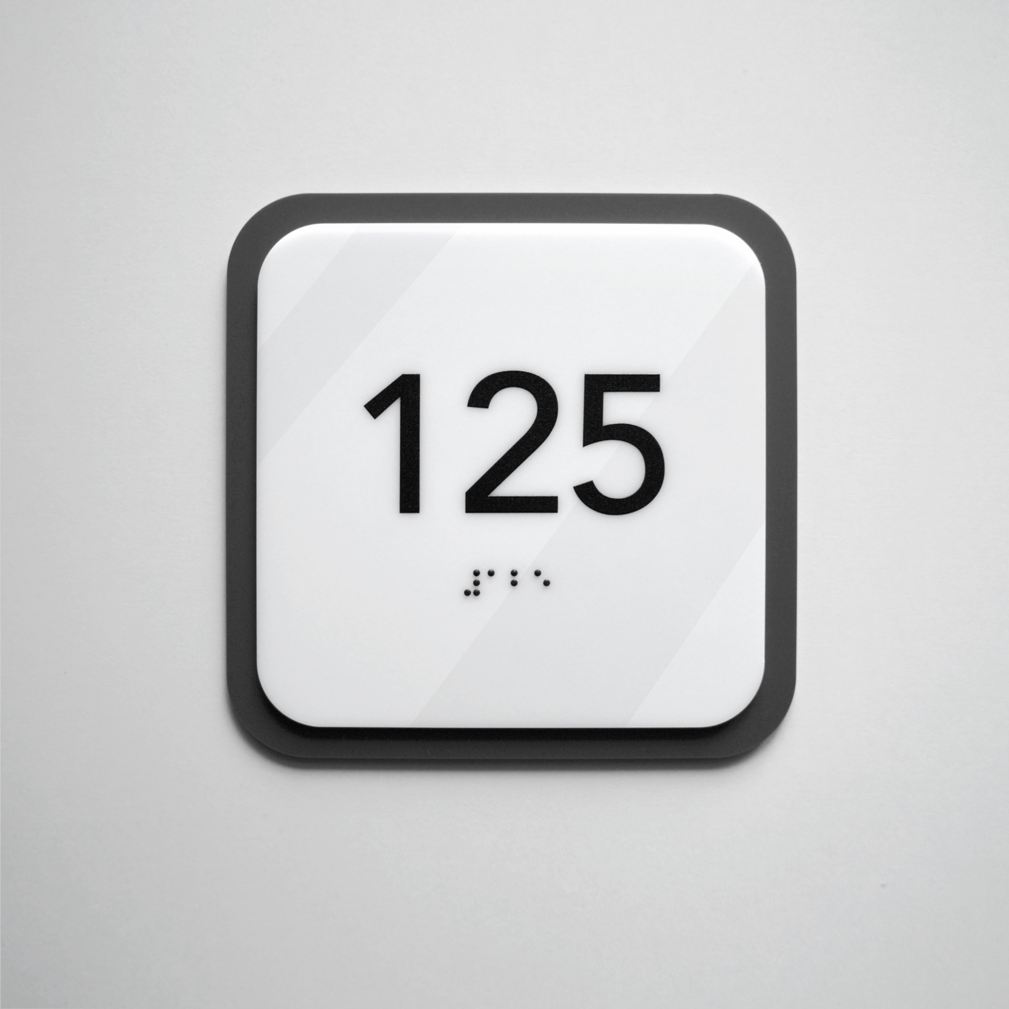
Features of perception of visual information in design of signs
Now a person is forced to receive and process a huge amount of information every day.
In such circumstances, the primary task of marketing in any business is to break through this rapid flow.
Marketers can reach out to the consciousness of their consumers using three channels. After all, in terms of information perception people are divided into the following categories:
- audials (assimilate information mainly using hearing);
- visuals (remember the information they saw more);
-
kinesthetics (perceive information through tactile sensations).
What is visual perception?
Visual perception is information that the human brain receives using vision.
Since it is considered that approximately 90% of information a person receives through vision, visual elements play an important role in the promotion of goods and services.
It is image that is the fastest way to transfer the required information to the user.
For example, for the best visual perception in interior design it is very important to choose the right color, which will fit a specific room. We wrote an article in which we talked in detail about what is important to know about colors and textures in the interior.
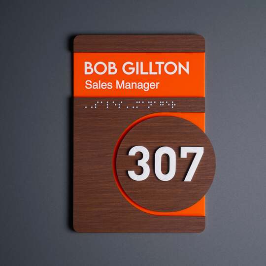
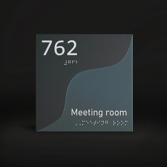
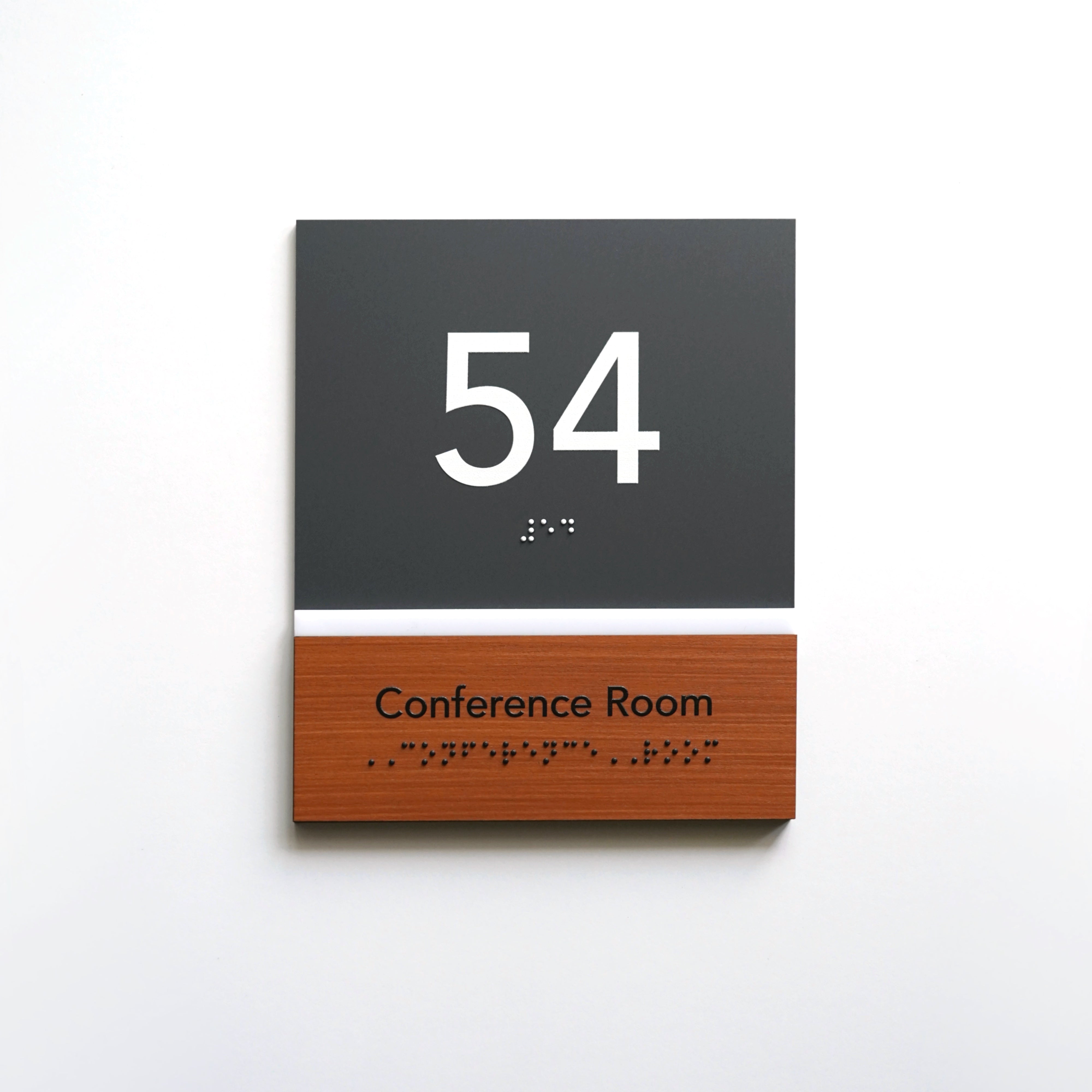
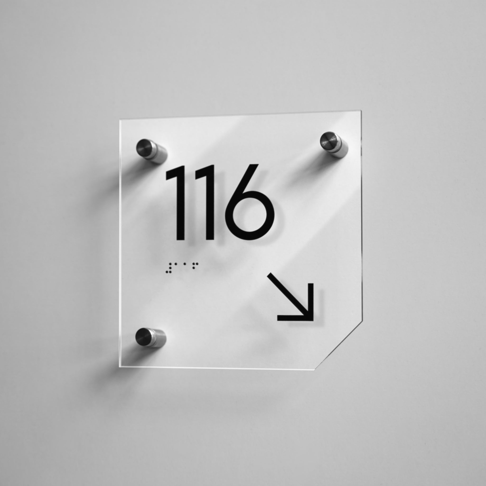
Designers of the space should also consider that information signs are the first thing that the eye of a person who is trying to find the necessary object or room looks for. Therefore, Bsign team pays a lot of attention not only to sign design. It also considers how they will be perceived by the eye of an ordinary person.

Five basic principles of visual perception in design
There are five basic principles of visual perception, which form the basis for the development of any design.
1. Similarity
In the process of cognition, people tend to group objects that have similar features. You can create similarity in design using color, size, or shape.
2. Proximity
Objects in the composition that are closer to each other are perceived as belonging to the same group (proximity, touch, overlay). In design only those things that support common logic are grouped.
3. Simplicity
The brain perceives and analyzes unusual or complex images using as simple and even shapes as possible. In the process of perception, the brain cuts off everything that complicates the composition and distracts from the contemplation of harmony.
4. Completeness
Our brains distinguish shapes, group information, and fill in the blanks to form a complete picture. It also automatically complements the image of an unfamiliar object.
5. Moving direction
A person's gaze subconsciously chooses to move from left to right; from darker to lighter; the gaze moves to light and is following light. Starting the review in a certain direction, the viewer will look there until something else (more interesting or more important) attracts their attention.

How the design of Bsign indication signs and numbers considers basic principles of visual perception
All Bsign signs are created in the style of balanced minimalism. General concept of designs was made in such a way as to focus the viewer's attention while contemplating the product on the main thing.
For example, an icon placed on a sign should quickly and easily convey a large amount of information about something important. What is important, this approach does not force a person to strain to understand the meaning contained in the sign. So, such design meets one of the basic principles of visual perception — simplicity.
And also designs of Bsign signs are developed according to the principle of similarity. Decorating the premise with signs in one design creates an attractive aesthetic effect.
Remember: if information signs in the room will visually look the same or very similar, this will give the space a sense of completeness, uniformity.
When there are many doors in a premise that are located close to each other, you should mark them with signs in one design. This will consider the principle of proximity and moving direction. This creates the effect of belonging to a whole, one group.

The principle of Sanocki and Sulman experiment in sign design
According to numerous psychological studies, combinations of uniform colors are more harmonious and pleasant for human vision.
In 2011, Thomas Sanocki and Noah Sulman proved that:
- people are better able to remember drawings with fewer colors (two-color palettes) than drawings with more colors (four-color palettes);
- the contrast of colors next to each other affects how well we remember the drawing;
- color differences between content and background can improve our ability to focus on the content itself.
Bsign designers consider the principle of Sanocki and Sulman experiment — all information signs and numbers are made in similar or, conversely, contrasting colors. In addition to the aesthetic function, this encourages the visitor to better remember the room in which they found themselves.
Sign design from Bsign
Bsign specialists will help you choose the design for door signs and numbers which will fit exactly into your premise.
We offer more than 25 design options for signs and numbers.
Fill in the form and register for a free consultation. There you can choose together with our specialist design of door signs and other products that will emphasize the individuality of your business. You will also receive tips that will help you improve the visual perception of the space of your premise.


