












by Oleh Tomilenko
Wayfinding Signage Glossary: 50+ Terms Explained
This wayfinding signage glossary explains more than 50 terms used in interior and architectural signage, organized into six areas: wayfinding, sign types and numbering, accessibility and ADA, materials, mounting, and design and typography. Entries connected to the 2010 ADA Standards for Accessible Design distinguish defined terms and mandatory requirements from professional guidance and everyday industry usage.
Architects, interior designers, developers, and facility managers use signage terminology to turn a room list into a clear set of project requirements. But similar words can describe different things: a room number identifies a space, while an employee name identifies its current occupant. That distinction can affect both the order and the applicable accessibility requirements. Use this wayfinding signage glossary to clarify specifications, compare related terms, and discuss details with a manufacturer. ADA references identify the provisions that apply to particular sign functions or features; they do not imply that every sign follows the same rules.
Contents
- • Wayfinding Terms and Types of Wayfinding Signs
- • Sign Types and Room Numbering Terms
- • Accessibility, Tactile Signage, Braille, and ADA Terms
- • Signage Materials and Manufacturing Terms
- • Sign Mounting and Installation Terms
- • Signage Design and Typography Terms
Wayfinding Terms and Types of Wayfinding Signs
Identification, directional, informational, and regulatory signs are common industry categories; orientation signs help visitors understand the larger space. These categories describe a sign's purpose, while ADA requirements depend on the provisions that apply to its content and location.
Types of wayfinding signs: identification, directional, informational, and prohibition signs

1. Wayfinding
Wayfinding is the process of figuring out where you are, choosing a route, and reaching a destination. Signs support that process alongside architecture, lighting, landmarks, and room numbering. In a medical office, wayfinding covers the whole trip from the entrance to the exam room.
2. Signage vs sign
A sign is an individual object displaying a message through words, numbers, or graphics. Signage refers collectively to the signs in a building or setting. Coordinating those signs under shared rules is the role of a sign system, defined next.
3. Sign system (sign family)
A sign system is a coordinated set of signs with consistent materials, typography, colors, messages, and placement principles. A sign family is the group of related designs within that system, while a sign type is one repeatable design, such as a room-number panel. Brand identity may inform the appearance, but each sign type serves a particular function.
4. Identification sign
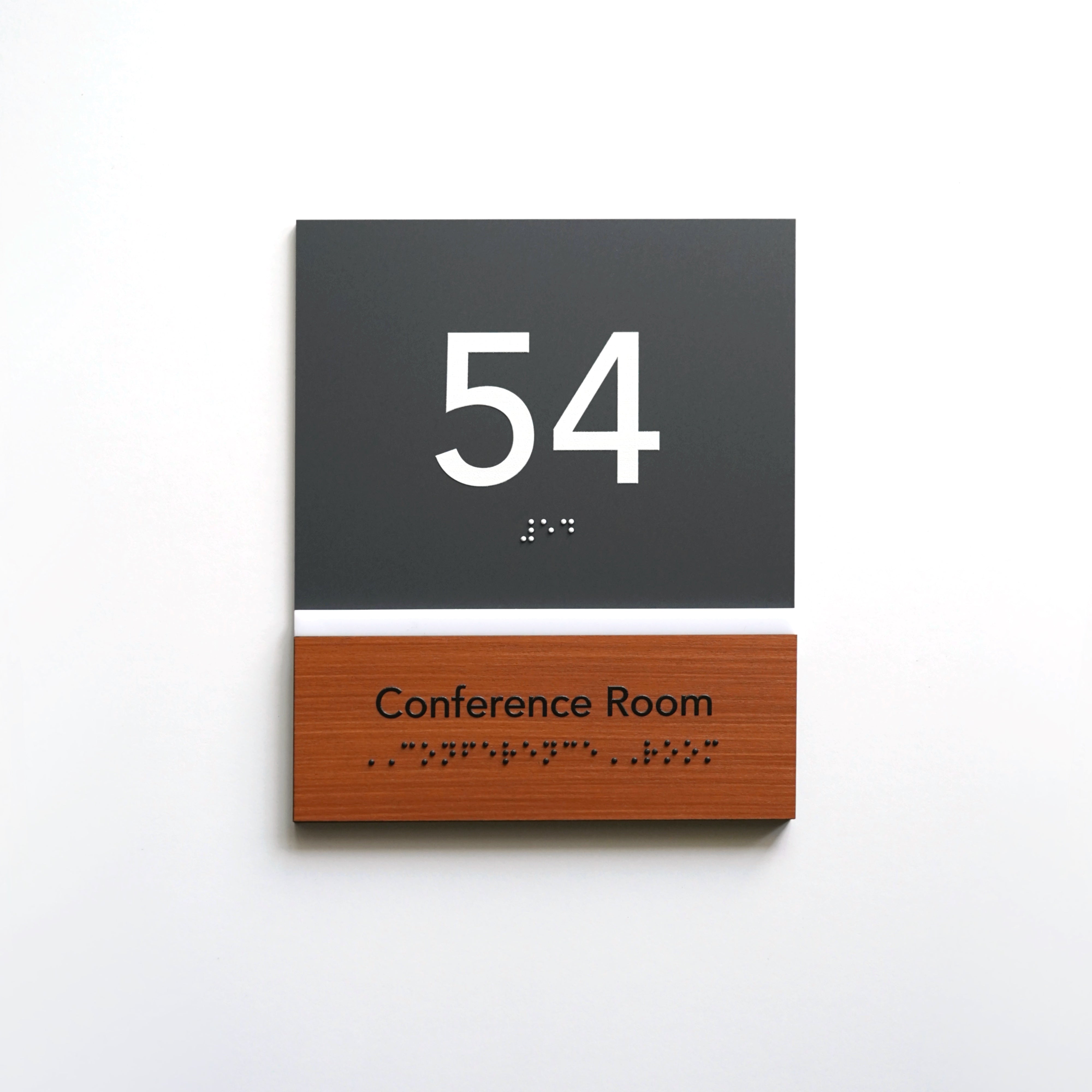
An identification sign names a specific place, such as a restroom, office, or conference room. It confirms arrival, while a directional sign points the way. For permanent room and space designations, §216.2 requires applicable tactile and visual features, with raised characters and Braille addressed in §703.2 and §703.3.
5. Directional sign
A directional sign points toward a destination, usually with an arrow and a room or area name. Corridor directional signs help visitors choose a route before reaching the room. Signs covered by §216.3 must meet §703.5 visual-character requirements; that provision does not impose a general Braille requirement.
6. Informational sign
An informational sign explains a service, operating hours, or how a space is used. A notice listing reception hours informs visitors; a No Smoking sign communicates a restriction. Under §216.3, signs providing information about interior spaces and site facilities must meet applicable §703.5 visual requirements.
7. Regulatory sign
A regulatory sign communicates a rule, restriction, or required action, such as No Smoking or Authorized Personnel Only. This is an industry category for building signage. Its label alone does not determine the applicable standards, so check the provisions that apply to the sign's content and function.
8. Orientation sign (directory, map)
An orientation sign helps visitors understand a building's layout or find a destination within it. Examples include tenant directories, floor plans, and You Are Here maps. A directional sign points along a route. Building directories are specifically exempt under §216.1; the exemption does not automatically cover every orientation graphic.
9. Decision point
A decision point is a location where someone must choose which way to go, such as a corridor intersection or elevator lobby. In wayfinding practice, it helps determine where directional information is needed so visitors can choose a route before passing the turn.
10. Environmental graphic design (EGD)
Environmental graphic design brings graphics, architecture, and spatial information together to shape how people understand and experience a place. It can include wayfinding, interpretive displays, and branded environments. Signage is one component; wayfinding is one of the functions the broader design may support.
11. Nomenclature (naming convention)
Nomenclature is the agreed system of names and abbreviations used throughout a building. If a room is called Conference Room A, that name should match on its door sign, directory, and booking system. This naming practice is separate from the rules used to assign room numbers.
12. Information hierarchy
Information hierarchy ranks messages by importance: which destination or instruction a visitor needs first, and which details can follow. Visual hierarchy expresses those priorities through design. For example, identifying the correct department may take precedence over listing every room within it.
Sign Types and Room Numbering Terms
Some sign names describe where a sign goes; others describe what it communicates. A permanent room designation and a changeable occupant name can share a panel while remaining subject to different requirements.
13. Door sign
A door sign is a sign on or beside a doorway that displays a room's name, number, function, or other information. The term covers several kinds of door signs. Permanent room identification brings §216.2 into play, and tactile signs must follow applicable §703.4 placement requirements.
14. Room identification sign
A room identification sign labels a permanent room by name, number, or function. Unlike a directional sign, which points the way, it labels the place itself. Under §216.2, applicable raised-character, Braille, and visual requirements apply when these signs are provided. Visual and tactile information may appear on one sign or on separate signs under §703.1.
15. Door number sign (room number sign)
A door number sign displays the number assigned to a room or unit, either as individual digits or on a panel. Decorative door number signs and tactile identification signs serve different reading needs. Raised digits alone do not satisfy all applicable §703 requirements, including Braille.
16. Suite number
A suite number identifies a separately designated office or group of rooms within a building. It differs from an individual room number and from the building's street address. A sign identifying a permanent suite is subject to the applicable room-designation requirements of §216.2.
17. Floor identification sign
A floor identification sign tells visitors which floor they have reached, often near an elevator or stairway. It identifies the current level, whereas a directional sign points toward another destination. Elevator and stairway signs can have additional requirements; verify the provisions applicable to their location.
18. Address sign (house number)
An address sign identifies a building by its street number or full address. A room number identifies a space within that building. Address-sign requirements can arise under state or local codes, so verify the applicable code requirements.
19. Name plate
A name plate displays a person's name or job title. Occupant names are exempt under §216.1. That exemption does not automatically extend to a permanent room number or function shown on the same panel, so each part of the message needs to be considered separately.
20. Changeable insert (slide-in insert)
A changeable insert is a removable card or panel used to update a name, schedule, or other message without replacing the entire sign. A replaceable format does not itself create an ADA exemption. The content and applicable §216 provisions determine the requirements.
21. Door hanger
A door hanger is a removable sign that hangs from a door handle, often carrying a hotel message such as Do Not Disturb or Please Service Room. It communicates a temporary request. The permanent room number remains a separate identification element.
22. Slider sign (occupied/vacant)
A slider sign has a moving panel that reveals a room's current status, such as Occupied, Vacant, or In Use. Unlike a door hanger, it generally stays in place. Unlike a changeable insert, it updates the message by moving a built-in part.
23. Exit sign
An exit sign identifies an exit or helps mark an egress route. Illuminated exit signs and tactile exit-door signs perform different functions. §216.4.1 requires tactile identification on doors serving exit passageways, exit discharge routes and exit stairways; applicable fire and building codes address additional requirements.
24. Room numbering system
A room numbering system is the method used to assign numbers to rooms or units. Numbers may reflect floor levels, corridor sequence, or odd and even sides. Nomenclature governs names and abbreviations; numbering establishes the numeric structure that signs and directories use.
25. Projecting (flag-mounted) sign
A projecting sign extends perpendicular to a wall so its face can be seen along a corridor. A conventional wall sign lies parallel to the wall, while an overhead sign is supported from above. Projecting signs must account for applicable protruding-object requirements in §307.
Accessibility, Tactile Signage, Braille, and ADA Terms
The phrase ADA signs covers signs with different functions and requirements. The U.S. Access Board's guide to signs explains how those requirements apply; its advisory guidance should be distinguished from the mandatory provisions in Chapter 7 of the Standards.
26. ADA (Americans with Disabilities Act)
The ADA is a federal civil rights law enacted in 1990 that prohibits discrimination against people with disabilities. The law establishes broader obligations, while the 2010 ADA Standards set scoping and technical requirements for accessibility in covered facilities.
27. 2010 ADA Standards for Accessible Design
The 2010 ADA Standards for Accessible Design are enforceable accessibility standards adopted by the U.S. Department of Justice for facilities covered by its ADA regulations. For signage, §216 establishes which signs are covered, and §703 addresses their technical features. State and local codes may add requirements.
28. ADAAG (ADA Accessibility Guidelines)
ADAAG refers to accessibility guidelines developed by the Access Board. The 2004 ADAAG provided the underlying design requirements incorporated into the 2010 ADA Standards. The guidelines and the adopted Standards are related documents, but their names should not be used interchangeably in specifications.
29. U.S. Access Board
The Access Board is a federal agency that develops accessibility guidelines and publishes technical assistance. Its guides help explain the Standards. The U.S. Department of Justice adopted the enforceable 2010 ADA Standards under its regulations; the agencies have distinct roles.
30. Accessible
Accessible is defined in §106.5 as "A site, building, facility, or portion thereof that complies with this part." This is a defined standards term. Universal design describes a broader design approach and does not, by itself, establish compliance with the applicable requirements.
31. Tactile
Tactile is defined in §106.5 as "An object that can be perceived using the sense of touch." In signage, tactile information may include raised characters and Braille. These communicate through different forms, and a textured surface alone does not establish that a sign meets §703.
32. Raised characters
Raised characters are letters and numbers that project above a sign's background and are read by touch, while visual characters are read by sight; a sign can carry both. §703.2 requires at least 1/32 inch of relief, uppercase sans serif characters, and specified character dimensions and spacing, with accompanying Braille. Recessed engraving cannot supply that relief. See ADA requirements for door and room number signs.
33. Braille (contracted, Grade 2)
ADA Braille Signs feature a writing system read through patterns of raised dots. §703.3 requires contracted (Grade 2) Braille, with domed or rounded dots, placed below the corresponding text.
34. Visual characters
Visual characters are characters intended to be read by sight. §106.5 defines characters to include letters, numbers, punctuation, and typographic symbols. Applicable §703.5 requirements address form, size, spacing, finish, and contrast. They differ from raised characters, which are read by touch.
35. Finish and contrast (non-glare)
Finish describes how a surface reflects light; contrast describes the visual difference between characters and their background. §703.5.1 requires non-glare surfaces and light characters on a dark background or the reverse. It specifies no minimum contrast percentage. Greater contrast is advisory guidance, rather than a separate numeric requirement.
36. Pictogram
Pictogram is defined in §106.5 as "A pictorial symbol that represents activities, facilities, or concepts." Where used to designate permanent interior rooms or spaces, §216.2 and §703.6 require a field at least 6 inches high and a tactile text descriptor below it. Informational and directional pictograms do not automatically carry those requirements.
37. International Symbol of Accessibility (ISA)
The ISA is the familiar wheelchair symbol used to identify accessible facilities and features. §703.7.2.1 specifies its form, and §216 identifies where it is required. The symbol is not required on every sign.
38. Permanent room or space
A permanent room or space has a designation expected to remain stable, such as a room number or restroom label. This explains the scope of §216.2; it is not a separate §106.5 definition. Changing occupants or meeting schedules does not necessarily change the designation. See which rooms require ADA signs.
39. Mounting height and location (tactile signs)
Mounting height and location describe where tactile information is installed. §703.4.1 sets the lowest tactile-character baseline at 48 inches minimum and the highest at 60 inches maximum above the finish floor or ground. These measurements include Braille and refer to character baselines. See ADA sign mounting height and placement.
ADA tactile sign placement diagram showing mounting height and location beside a door

The 48–60-inch range is measured to the lowest and highest tactile-character baselines, including Braille, rather than the sign's edges (§703.4.1).
40. Latch side
The latch side is the side of a doorway where the door latches, usually opposite the hinges. §703.4.2 generally places a tactile sign alongside a single door on this side. However, if a door has a closer and no hold-open device, the sign may be installed on the push side of the door.
41. Equivalent facilitation
Equivalent facilitation is the provision in §103 allowing alternative designs, products, or technologies that provide substantially equivalent or greater accessibility and usability. It is not an automatic exemption from the requirements.
42. Universal design
Universal design is an approach to making environments and products usable by the widest practical range of people. In signage, it can inform consistent naming, understandable symbols, and multiple ways to receive information. It is a design approach, separate from the Standards' defined term accessible.
Signage Materials and Manufacturing Terms
A material describes what a sign is made from; a manufacturing process describes how its shape or message is produced. For a comparison of options, see best materials for door signs; BSign uses acrylic, wood, and stainless steel, with processes including UV printing.
43. Acrylic (PMMA, cast vs extruded)
Acrylic, or polymethyl methacrylate (PMMA), is a plastic used for sign panels and individual elements. Cast sheet is formed through casting; extruded sheet is produced in a continuous extrusion process. Clear, colored, frosted, and matte options are available. Acrylic is a different material from polycarbonate or PVC.
44. Two-layer (laminated) acrylic
Two-layer acrylic engraving stock combines a surface layer with a contrasting core. Engraving removes the top layer to reveal the color beneath, forming the message. With printed acrylic, ink supplies the graphic instead. The exact composition and engraving method depend on the specified stock.
45. Stainless steel (brushed finish)
Stainless steel is a corrosion-resistant steel alloy used for panels, numbers, and lettering. A brushed finish has a directional grain and generally produces less mirror-like reflection than a polished finish. It differs from aluminum in composition and weight; a brushed surface alone does not establish compliance with non-glare requirements.
46. Aluminum
Aluminum is a lightweight metal used for sign panels, frames, and lettering. Anodizing modifies its surface oxide layer, while powder coating adds a separate finish. These treatments differ from the metal itself, so a specification should identify both the substrate and the intended surface treatment.
47. Brass
Brass is a copper-and-zinc alloy used for sign panels, plaques, and lettering. Its warm metallic appearance differs from stainless steel or aluminum. The alloy and finish affect its appearance over time; a brass-colored coating on another material is not solid brass.
48. Wood (veneer, plywood, solid)
Wood signage can use solid wood, plywood made from bonded wood layers, or a thin veneer applied to a substrate. These constructions differ from printed woodgrain finishes. Wood may also be combined with acrylic or metal to separate the sign's background from its lettering or graphic elements.
49. PVC (expanded PVC)
PVC is polyvinyl chloride, a plastic used in several forms. Expanded PVC sheet has a cellular structure and is used for lightweight sign panels and printed graphics. It differs from clear acrylic and from solid PVC; the specified grade determines its fabrication and service characteristics.
50. Photopolymer
Photopolymer is a light-sensitive material used in a signmaking process that forms raised characters and Braille as part of the sign face. Exposure and processing develop the relief. The process differs from attaching separate letters, and the finished sign still needs to meet its applicable technical requirements.
51. Substrate
A substrate is the base material that supports a sign's printed graphics, applied letters, or other components. The face is the visible message surface; an insert is a replaceable component. A sign can therefore have a substrate, a decorative face, and a separate insert.
52. Engraving (laser, rotary)
Engraving removes material to create recessed text or graphics. Laser engraving uses a focused beam, while rotary engraving uses a cutting tool. A recessed inscription differs from raised lettering and does not, by itself, meet the raised-character requirements of §703.2.
53. Laser cutting
Laser cutting uses a focused beam to cut through suitable material along a specified outline. It can produce panels, numbers, and separate letters. Engraving works on the surface to form a mark or recess; cutting defines the shape of the part itself.
54. UV printing
UV printing applies ink that cures under ultraviolet light to produce text and graphics on a compatible surface. It differs from engraving, which removes material. Ordinary UV-printed graphics do not replace the raised characters and Braille required for applicable tactile signs.
55. Dimensional (raised) letters
Dimensional letters are individual letters with physical depth, often made from acrylic, metal, or wood and attached to a background. Decorative dimension and tactile readability are separate properties. Such letters satisfy §703.2 only if their form, dimensions, spacing, and other applicable features meet its requirements.
56. Matte vs gloss finish (non-glare)
A matte finish scatters reflected light, while a gloss finish produces more distinct reflections. Glare can obscure a sign's message under certain lighting. §703.5.1 requires applicable visual characters and backgrounds to have a non-glare finish; a material's marketing label alone does not establish that performance.
Sign Mounting and Installation Terms
Mounting terminology describes the connection between a sign and its supporting surface. The definitions below distinguish common methods; the door signs installation guide covers the installation process in more detail.
57. Mounting method
A mounting method is the means of securing a sign to a wall, door, glass panel, or support. It depends on the sign's weight, the supporting surface, and removal needs. Mounting height describes the sign's vertical position, which is a separate specification.
58. Standoff (spacer)
A standoff is hardware that holds a sign panel away from its supporting surface, creating a visible gap. Flush mounting positions the panel against or close to that surface. BSign's mounting options include metal standoffs; the appropriate hardware depends on the sign and installation conditions.
59. Double-sided foam tape
Double-sided foam tape has adhesive on both sides of a foam carrier to bond a sign to a compatible surface. It differs from liquid adhesive and mechanical fasteners. Suitability depends on the tape, sign weight, surface condition, and installation environment. BSign offers double-sided tape mounting.
60. Mechanical fastening (screws, anchors)
Mechanical fastening secures a sign with hardware such as screws, bolts, or anchors. The fastening system must suit the wall or other support and the load it carries. It provides a physical connection, whereas adhesive mounting relies on a bond between surfaces.
61. Concealed (hidden) mounting
Concealed mounting uses hardware hidden behind the sign or within its construction, such as rear clips or studs. The term describes whether the fasteners are visible from the front. It does not necessarily mean flush mounting: a concealed system can also hold a sign away from the wall.
62. Mounting template
A mounting template marks the intended positions of a sign, individual letters, or fixing holes. It helps installers repeat a layout accurately across a series. A shop drawing specifies the sign's construction; a template transfers selected positions to the installation surface.
63. Wall-mounted vs door-mounted
A wall-mounted sign attaches to the wall; a door-mounted sign attaches to the moving door leaf. For tactile signs, §703.4.2 generally requires a location alongside a single door at the latch side. Door mounting is permitted only in specified configurations or under the applicable exception.
64. Glass mounting
Glass mounting secures a sign to a glass door or partition using a suitable adhesive or purpose-designed hardware. The attachment, visibility from both sides, and glass construction need consideration. Window graphics are applied directly to the glass and may not involve a separate sign panel.
65. Overhead (suspended) mounting
Overhead mounting supports a sign from a ceiling or structure above a circulation area. Suspended signs can present information across a lobby or along a corridor. A projecting sign attaches perpendicular to a wall. Applicable §307 provisions address overhead clearance and objects extending into circulation paths.
66. Sign post / freestanding stand
A sign post or freestanding stand supports a sign independently of a wall or door. Interior examples include lobby directories and portable directional stands. The term describes the support arrangement and should be distinguished from large exterior pylon advertising structures.
Signage Design and Typography Terms
Typography affects both the recognition of individual characters and the reading of a complete message. Project documents translate those design decisions into repeatable specifications for a coordinated sign series.
Signage typography elements: letter height, stroke thickness, letter spacing, line spacing, and visual hierarchy
67. Typeface vs font
A typeface is the design of a family of letters, numbers, and symbols. A font is a particular implementation or style within that family, often supplied as a digital file. Lettering may instead be drawn specifically for a sign or graphic.
68. Sans serif
Sans serif describes letterforms without the small finishing strokes called serifs. §703.2.3 requires sans serif raised characters. For visual characters, §703.5.3 requires conventional forms and excludes certain stylized forms, but it does not impose a universal sans serif requirement.
69. Character height (cap height)
Character height is the physical height of a letter or number; cap height refers to uppercase letter height. Font point size is a different measurement. §703.2.5 and §703.5.5 address raised and visual character heights, respectively. See door sign and door number sizes for sizing context.
70. Stroke width
Stroke width is the thickness of a line forming a character. Font weight describes a typeface's overall visual heaviness, while stroke width is measurable. For raised characters, §703.2.6 limits stroke thickness to a maximum of 15% of the character height.
71. Letter spacing (tracking) and kerning
Tracking adjusts spacing across a group of characters; kerning adjusts the space between particular pairs, such as A and V. §703.2.7 regulates the actual distances between raised characters. Software spacing settings therefore need to be evaluated in the finished physical layout.
72. Line spacing (leading)
Line spacing is the distance between the baselines of adjacent lines of text. It differs from the spacing between letters within a line. For separate lines of raised characters within a message, §703.2.8 requires baseline spacing of 135–170% of the raised-character height.
73. Legibility vs readability
Legibility is how easily individual characters can be distinguished. Readability concerns how easily the whole message can be read and understood. Visibility is the ability to notice the sign itself. A conspicuous sign can still have hard-to-distinguish letters or an unnecessarily complicated message.
74. Viewing distance
Viewing distance is the distance from which a sign's information is intended to be read. For applicable visual characters, Table 703.5.5 relates minimum character height to mounting height and horizontal viewing distance, measured to an obstruction preventing closer approach. It is not a universal panel-size formula.
75. Visual hierarchy
Visual hierarchy uses text size, weight, color, and position to guide the order in which a reader notices information. A department name might stand out above a room range. Information hierarchy establishes the priorities; visual hierarchy makes those priorities apparent on the sign.
76. Color coding
Color coding assigns colors to floors, departments, or destinations across a wayfinding system. As a design recommendation, color should reinforce names, numbers, and symbols so the system remains understandable when someone cannot distinguish the colors. Consistent use gives each color a predictable meaning.
77. Arrow conventions
Arrow conventions are the agreed rules for arrow shape, direction, and placement relative to destination text. They help a sign system communicate routes consistently. Unlike a pictogram identifying a facility or activity, an arrow's main job is to communicate movement or direction.
78. Sign schedule and sign type
A sign type is a repeatable design with defined features, such as a room-number panel or corridor direction sign. A sign schedule lists the project's individual signs by type, message, location, quantity, material, and mounting method. Together, they connect design intent with estimating and production.
79. Mockup, proof, shop drawing
A mockup shows a proposed appearance, digitally or as a physical sample. A proof lets the buyer check text and layout, while a shop drawing records fabrication details such as dimensions, materials, and mounting. Unlike an ordinary rendering, which illustrates the general look, these documents are tied to the actual sign content and specifications. BSign prepares mockups for approval before manufacturing.
FAQ
What is the difference between wayfinding and signage?
Wayfinding includes everything that helps a person understand a space and reach a destination. Signage supplies written and graphic directions within that experience. In signage terminology, the signs are one part of the system: in a hotel, the lobby layout, visible elevators, floor numbering, and corridor signs all contribute to wayfinding.
Do all wayfinding signs have to meet ADA requirements?
No. The requirements vary by function and scope. Permanent room identification is covered by §216.2, while directional and informational signs fall under §216.3 and applicable visual requirements. §216.1 exempts certain content and signs, including directories, occupant names, and temporary signs used for seven days or less. Braille is not required on every wayfinding sign.
Are raised characters and Braille the same thing?
No. Raised characters preserve the familiar shapes of letters and numbers for reading by touch. Braille represents language through dot patterns, including contractions in Grade 2. Where §703.2 applies, raised characters must be accompanied by Braille meeting §703.3. One element does not substitute for the other.
What does "tactile sign" mean?
A tactile sign makes information available through touch. On a permanent room sign, this commonly involves both raised text and Braille. A textured background or decorative raised logo does not establish compliance: the message, character design, Braille, and installation must meet the requirements applicable to that sign under §216 and §703.
What is a standoff mount?
A standoff mount holds a panel away from the wall using spacers and fixing hardware. Some systems secure the panel through holes; others grip its edges. The visible gap distinguishes the arrangement from flush mounting. Hardware and attachment details depend on the panel and supporting surface.
What should a sign schedule include?
A sign schedule should identify each sign's type, exact message, location, quantity, material, size, and mounting method. Record applicable accessibility requirements so tactile and visual features can be specified for the correct signs. This shared reference helps the designer, buyer, and manufacturer price the same scope and track revisions.
Planning signage for an office, hotel, clinic, or other commercial building? Use these terms to prepare your room list or sign schedule, then send it to BSign to request a quote for a coordinated sign system. BSign prepares mockups for approval before production so you can review the proposed series together.


