Emotional design: how colors and shapes of signs affect the mood of customers and guests
Have you thought how a first impression of a space can depend on a regular sign? The color, shape, font, and even the material of the signs can subconsciously affect emotions, user engagement, set the right mood, or help maintain the style of the interior. Today we will reveal the secrets of emotional design and psychological influence, explain to you how exactly color and shape affect perception and how you can create an atmosphere that will strengthen your brand identity and make it recognizable with the help of signs.
The importance of emotional interior design
Imagine a modern office or a cozy coffee shop: every detail of the space, from the color of the walls to the furniture, works for creating a certain mood and evoking feelings. Signs are not just information carriers. They can become a significant part of the interior and create balance, shaping the atmosphere and leaving a lasting impression on visitors. Their design, color, shape, and material play a crucial role because they are the first to meet customers, to improve their experience and help them feel the special emotions and atmosphere of the space.
Why are the visual elements of the signs essential for the atmosphere
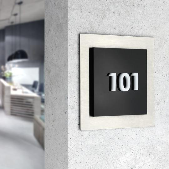
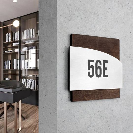
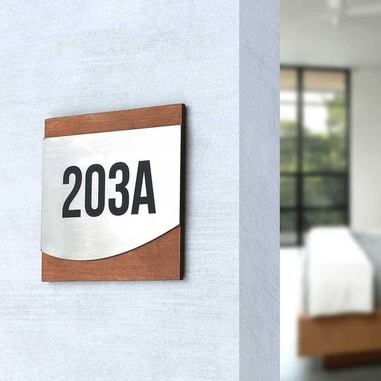
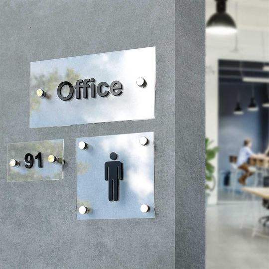
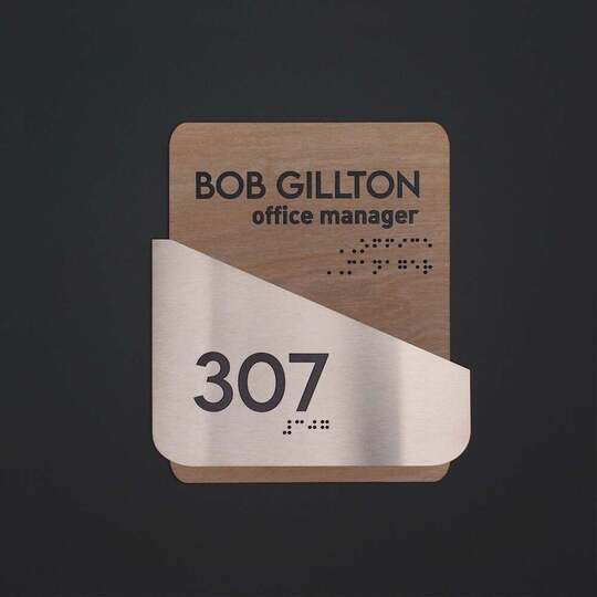
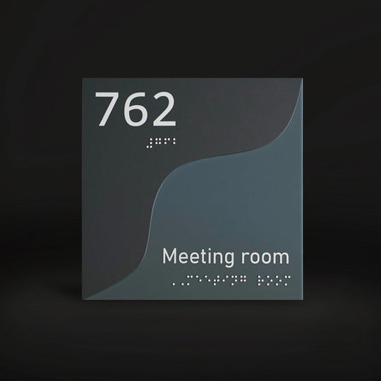
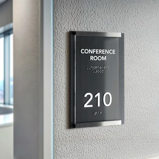
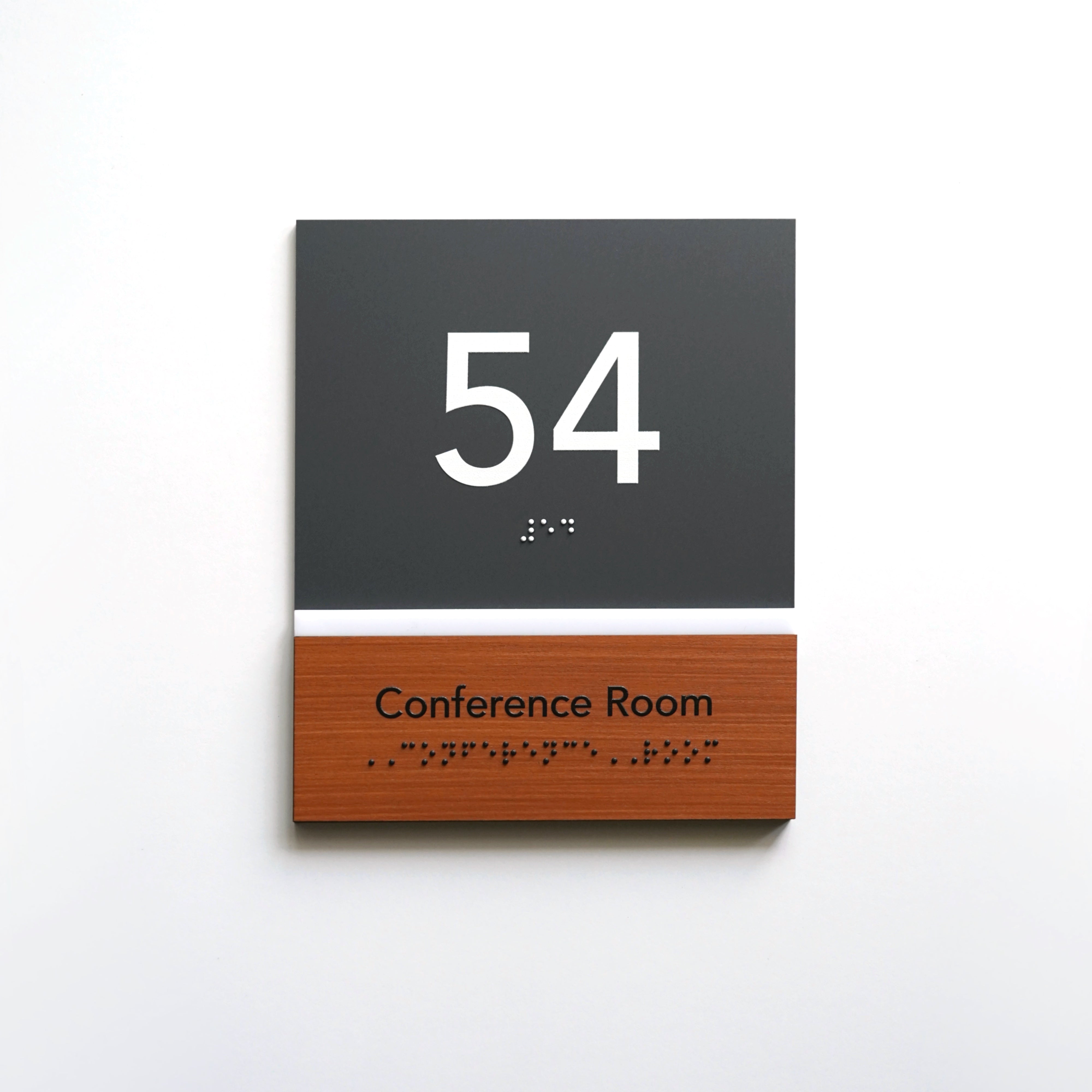
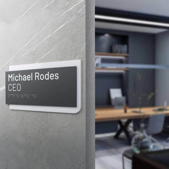
Visual elements of signs, such as color, shape and material, can enhance or, conversely, worsen the overall impression of space and decrease visual appeal. Signs that correspond to the general style can "complement" the atmosphere, raise emotional impact while improper or too sharp designs can distract attention and even create discomfort, affecting human perception. For example, in the offices of modern companies, metal and glass signs give a sense of formality and professionalism, representing stability while in creative spaces wooden or plastic signs with bright accents or warm colors that set the mood for creativity are preferred.
Psychology of color: how the color of a sign affects emotions
Color palette plays a key role in the perception of information, and can also have different emotional effects. The signs may have a calm and neutral shade or a bright one that attracts attention and conveys messages, depending on the function and the desired effect.
- Colors associated with tranquility and harmony

- Bright colors for energy and attention-grabbing
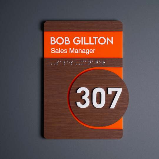
Red, orange and yellow colors are able to draw attention and evoke emotions. Such signs are an ideal powerful tool for activity areas, events or shopping areas where it is necessary to increase the interest of visitors and reinforce brand identity.

- How to take advantage of corporate colors in the sign design?
Using corporate colors in signs can help strengthen the brand personality and make it recognizable. Compliance with the corporate palette allows you to create a holistic style and strengthens the association with the brand as well as brand's values.
Shape and style of the sign: accents and associations
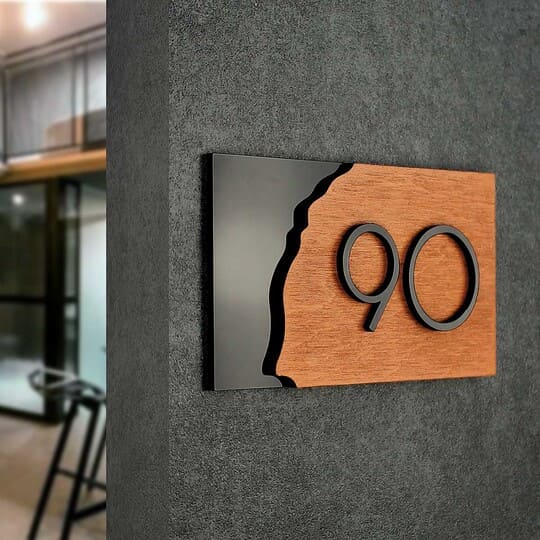
The shape and style in design can also convey a specific mood and add a unique charm to the space. Different shapes of signs symbolize different emotions and evoke certain associations.
- Round, rectangular, oval and other shapes
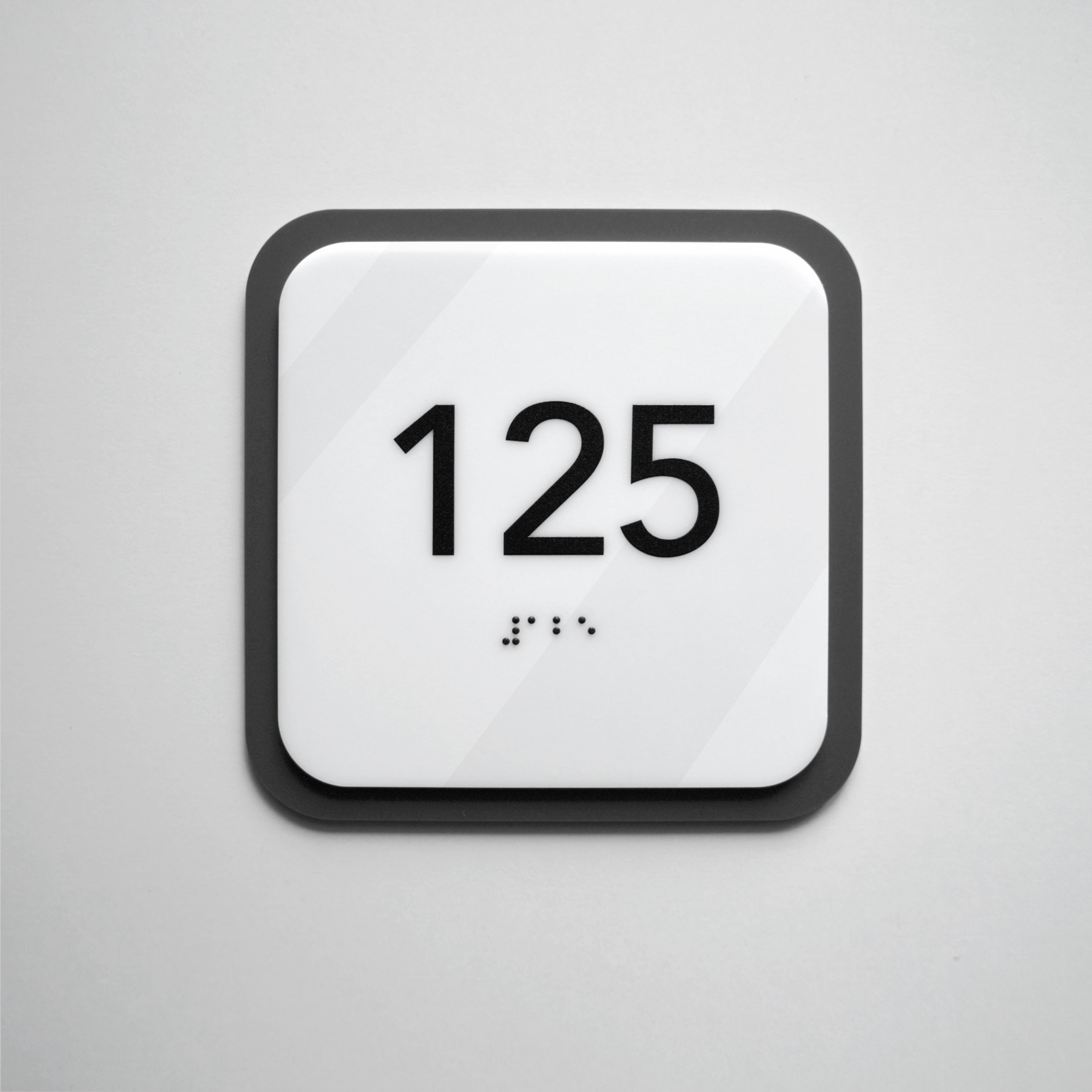
Round and oval signs are often associated with friendliness and smoothness, so they are usually used in children's institutions or cafes.

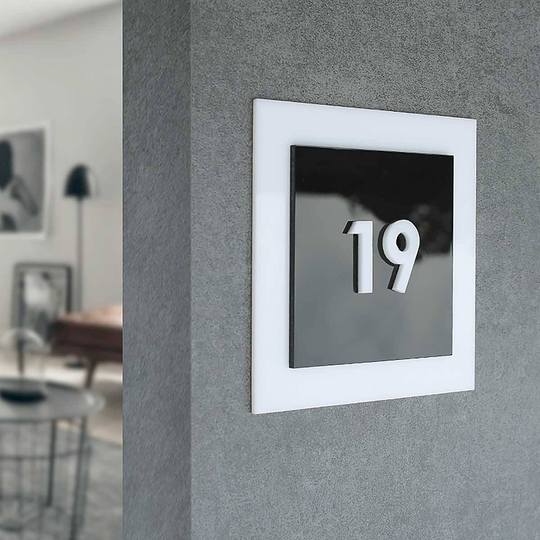
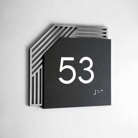
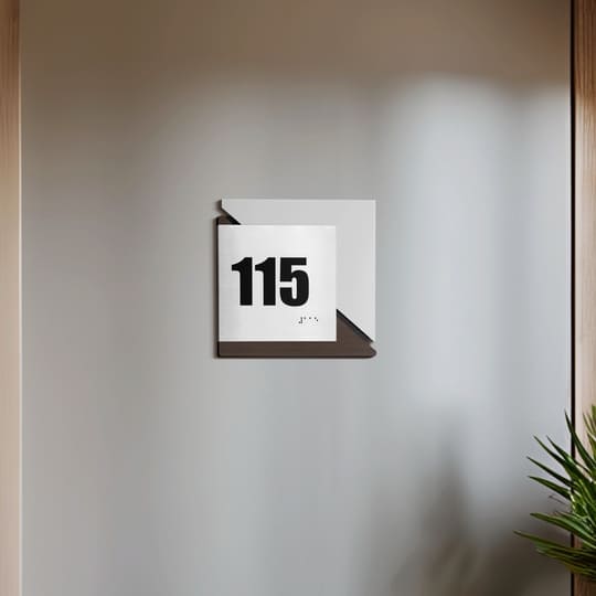
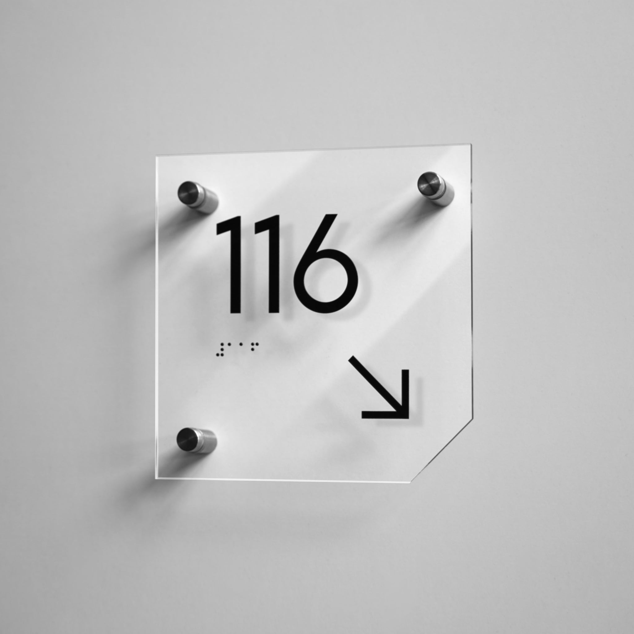
Rectangular signs with sharp angles symbolize stability and rigor, so they are used for offices and business centers. Unusual shapes — triangles, hexagons — add creativity and originality to the space.

- Minimalism, classics, modernity
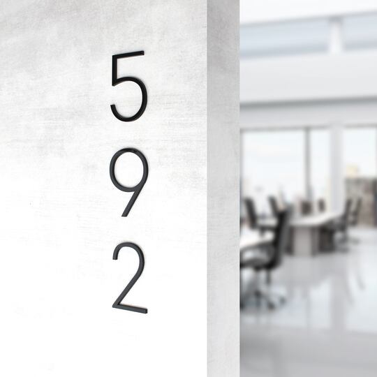
Minimalist signs with clear lines are suitable for modern brands that want to show themselves as innovative and engage user interactions.
Classic style with intricate decorative elements will be a good choice for brands with history or for places that convey the atmosphere of a certain era highlighting the deep understanding.
- The choice of fonts and their impact on the perception of text
Fonts for signs also play a crucial role. Clear and simple fonts create a sense of professionalism, while more decorative ones can give notes of lightness or playfulness.
Materials for signs
Types of signage material can enhance or, conversely, alleviate the impression of the interior design. The choice of material not only adds to the aesthetic effect or visual appeal, but also influences tactile sensations and perception of the space.
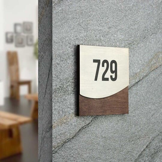
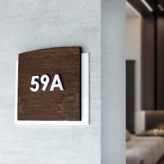
- Wooden types of signage material provide coziness and are often used in catering establishments, where it is important to convey a feeling of naturalness and warmth.

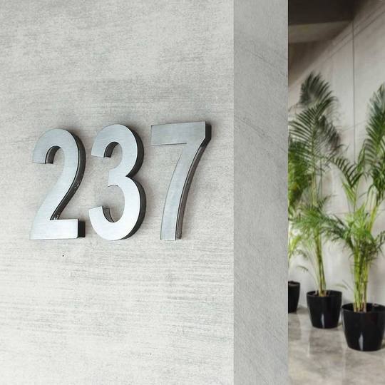
Metal signs, especially with a polished surface, are associated with reliability and stability in contrast to moods and emotions, so they are often used in business spaces.

- Plastic signs allow you to experiment with color and shape, which is common for creative institutions, providing emotional impact.

Tactility and its influence on the formation of a pleasant impression
When the sign has a fascinating texture, it adds special tactile impressions and enhances the emotional connection and response with the space. For instance, a smooth surface is associated with restraint and purity, and textured — with naturalness and comfort.
How emotional signs design affects customers' experience
The emotional design of signs directly influences customers' perception of your brand, its recognition and the overall customer experience and human behavior. Choosing colors, shapes, fonts and materials helps to set the mood and express the message you want to effectively convey to customers.
Many well-known brands, such as Starbucks or Google, actively use signs as part of branding. They choose materials and styles that complement the atmosphere of their premises, maintaining the corporate concept and symbolizing unity.
For signs to become part of brand communication, it is essential to maintain consistency in style, color scheme and the overall spatial concept. Use signs as an element that reinforces your values and visual identifiers and expresses symbolic meanings. Also it is important to choose an emotional interior design that emphasizes the peculiarities of your brand, its loyalty values.
Conclusion
The design of the signs is not only about information, but also about creating an emotional connection and psychological influence with customers. A thoughtful choice of cool colors, shapes, fonts and materials helps to create a special atmosphere that enhances the impression of modern space, increases brand awareness and makes the stay at your institution pleasant and memorable.
We advise you to entrust the manufacture of signs to professionals with experience. By contacting Bsign, you will receive high-quality interior signs that will become an effective element of your space. Our team will help you find solutions that meet the needs of your business and increase its recognition. We offer a wide selection and full customization: you can choose an appropriate size, different shapes, accent colors and additional elements to create a unique sign. Sign up for a free consultation — together we will find the best solution for your interior!
