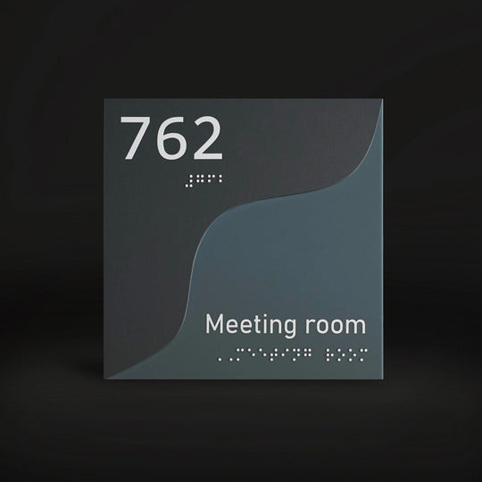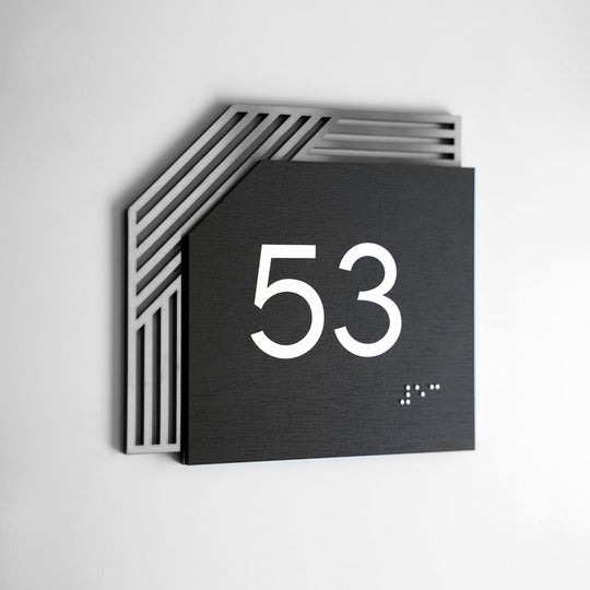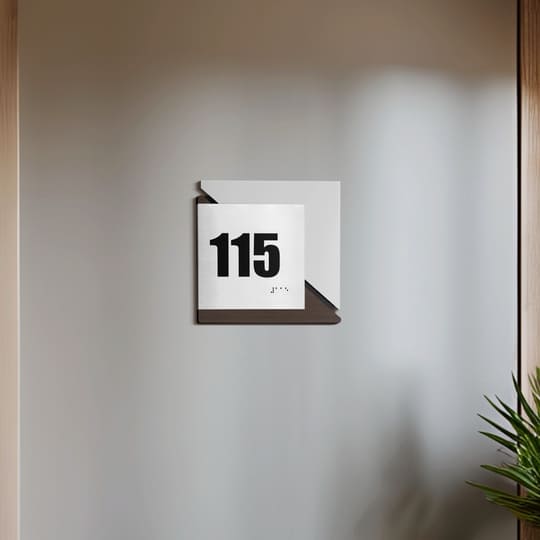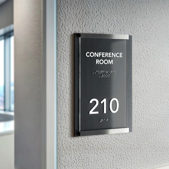
Features of perception of signs that need to be taken into account
When it comes to efficiency of business signs as with any other form of communication with potential or existing customers, you need to take into account all factors that can influence it. We will talk about them next.
To begin with, people usually spend very little time studying advertising signs, signboards, and other information carriers.
Someone says that this time is four seconds, someone is talking about eight seconds. In any case this isn’t too much. So, when ordering the production of signs for your business, you need to make every effort to ensure that the person can perceive the maximum amount of information that you want to convey.
At the same time, there are basic principles of production of signs which should be followed:
- the design should be extremely clear and concise, but attract attention (in 2023 will dominate 7 trends in office design);
- it is better to place the image to the left of the text;
- information placed should be the most important one;
- text quantity and font size have to correlate well with size of the door or wall signs and the distance from which it will be read.

Now let's talk about the important factors of perception of business signs in more detail.
What should you know about colors?
Yes, they change the way we respond to information in a certain way.
Red color
For example, everyone is used to the fact that notifications about something as important as possible are highlighted in red. Well, or dangerous. That is why prohibition signs and signs marked as a fire hydrant or fire extinguisher are often made completely or partially red.
At the same time, too much red is also not good. Therefore, you can make signs, for example, white and red.

Black color
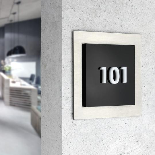
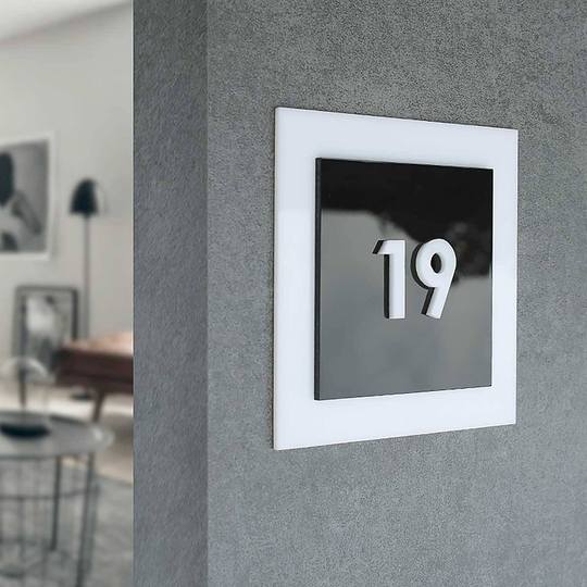
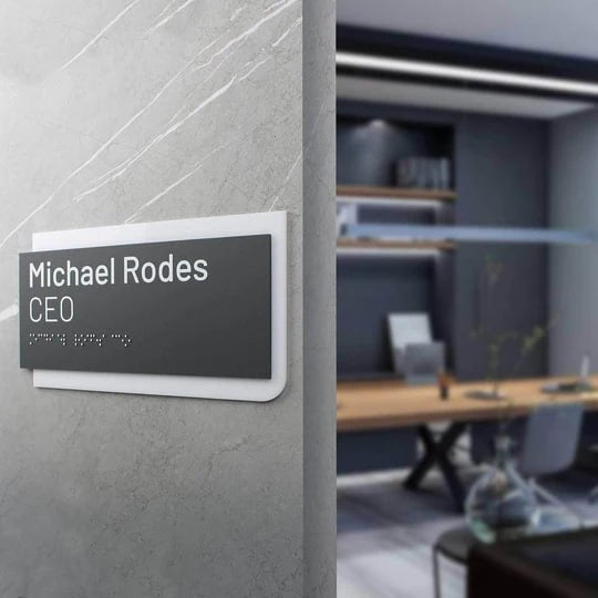
Black color is a universal solution. It is about grace, asceticism, and aristocracy with elegance and luxury. Therefore, this color can be safely used in any information campaigns and on various media, for example, door signs or pointers. It's really simple and stylish.
Let's add that black can be both the base of the information plate or sign, and the text or icon.
Blue color
Blue — a color that embodies calmness, reliability and trust. It is often chosen to inform about the services of banks, insurance companies, and technology businesses.
Green color
When you need to remind your audience about nature, environmental friendliness, and health care, you should use green color. In addition, it is really optimistic.
Yellow color
About yellow colors, then it evokes associations with high levels of energy, cheerfulness and happiness. About yellow colors, then it evokes associations with high levels of energy, cheerfulness and happiness. Therefore, information signs with such meanings should be decorated in this color.
Important! In any case, ordering production of signs remember the principle of contrast. That is, you can safely order a black and red or white and blue product. But yellow on a green background or vice versa are questionable solutions from the point of view of ease of perception.

Icons and their meaning
Icons and symbols are also an important aspect of information signs. A single icon can easily replace an entire word or even a sentence. On small information carriers, this is very valuable, so you should actively use icons.
However! They should be clear and concise. For one thought — only one image. Use of an excessive number of icons or complex symbols on information signs can confuse a person, distract their attention and strain them without giving any information.
If we talk about examples, then the very first one is the most famous golden arches of McDonald's. They are recognized instantly and transmit a message about fast food. At the same time, there are no other graphic symbols in such messages. In fact, Apple does the same.
Of course, direct advertising and information and navigation signs on doors or walls are different spheres. But the principle of perception remains unchanged. The less information there is, the more likely it is to be noticed and understood.
Fonts are also important
In general, the following rule works:
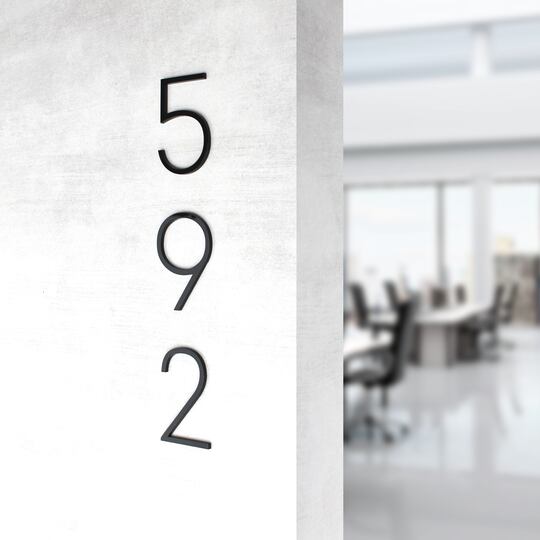
- thin and long fonts on the address plates are perceived as more attractive, sophisticated, elegant, and expensive;
- wide lines, simple letters and numbers are associated with masculinity and solidity;
- complex, swirling fonts for door signs are often chosen to emphasize exclusivity and sophistication.
Therefore, it is worth remembering this when ordering signs for brands.
So, if the company operates in the economy segment, provides daily services and emphasizes the reasonable price of its work, you should not choose complex handwritten fonts for signs on the door. Simple and clear fonts that show the service as familiar and secure will work better.
And vice versa: too simple address signs for businesses that offer expensive services, might not be a good solution. After all, subconsciously, people want to see visual signs that the offer is truly unique.
So: one best font for signs doesn't exist. The font should be a logical complement to the values and philosophy that the company broadcasts.

Materials and nuances of their perception
Each material has its own unique properties and conveys a specific message. After reading it from the advertising sign, a person, among other things, shapes his/her attitude to your brand.
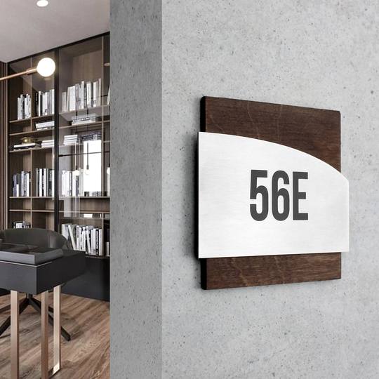
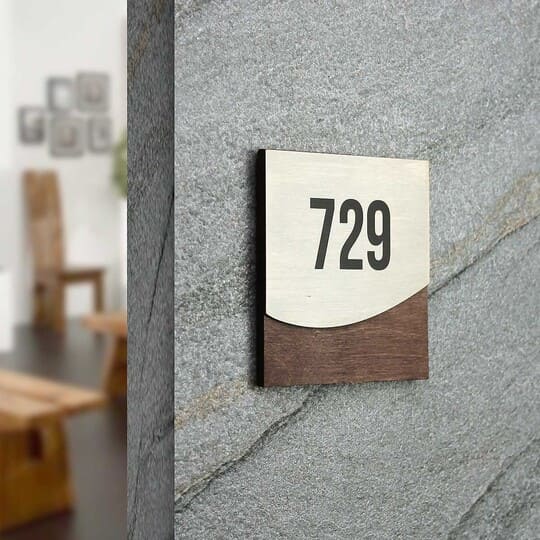
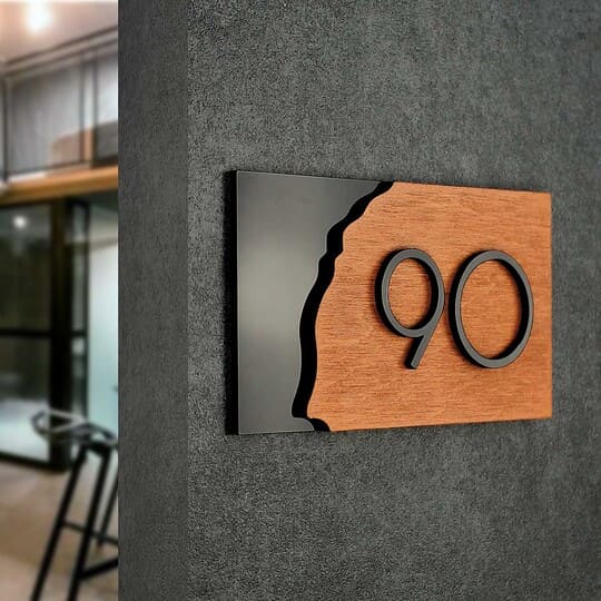
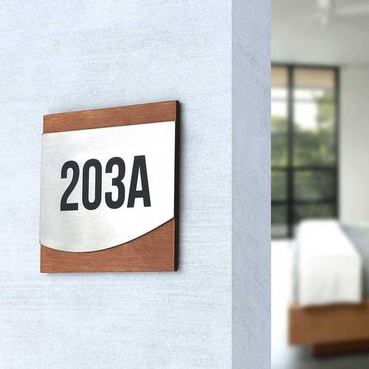
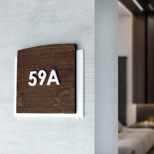
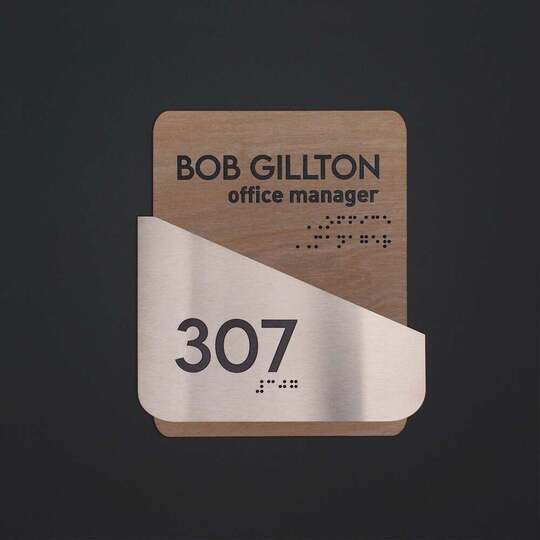
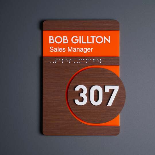
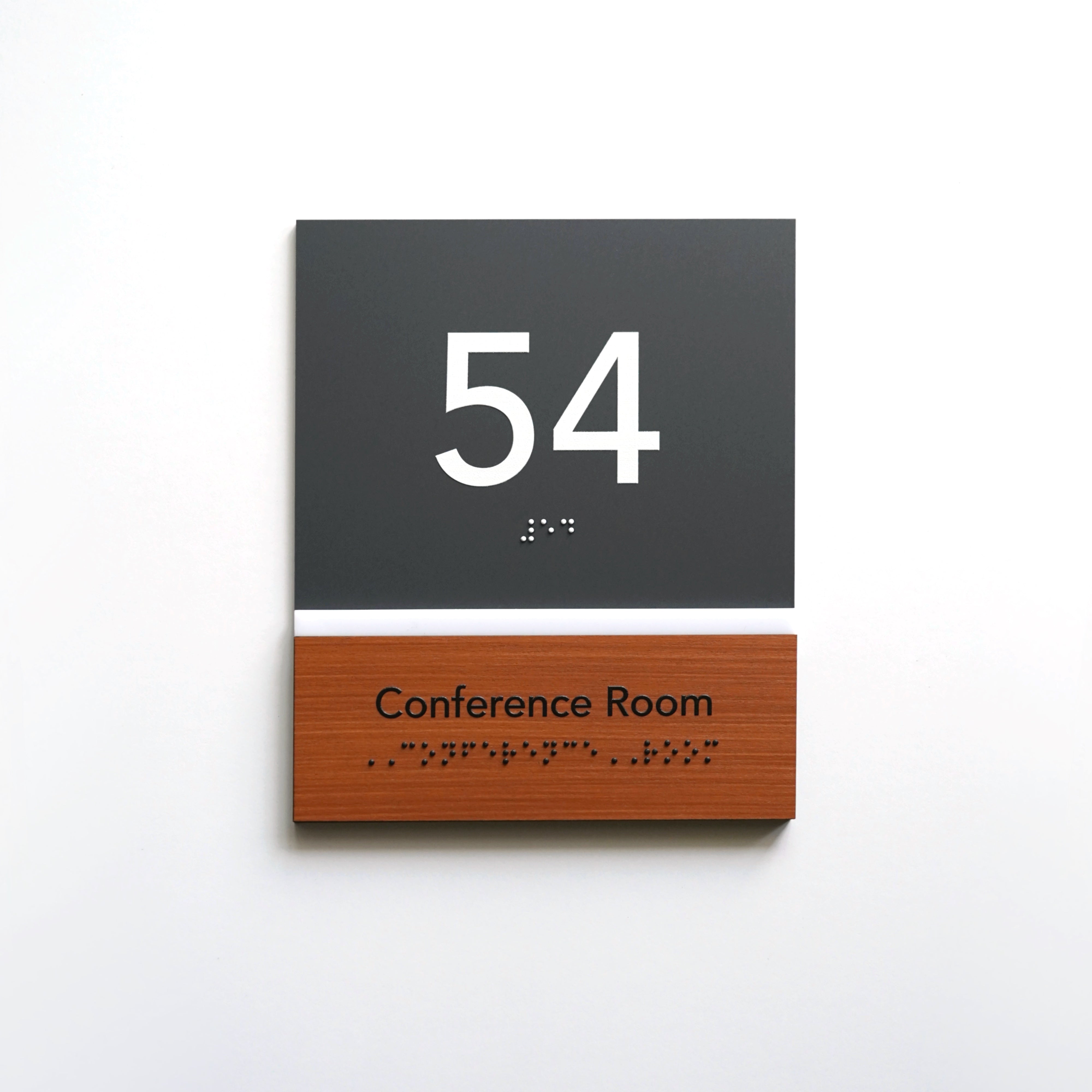
Wood, for example, it is often associated with naturalness, warmth, and authenticity. This material is relevant out of time. Therefore, if you plan to show your stability, but still do not want to often change office signs — take a closer look at the wood of different colors for production of custom door plates.
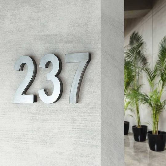
Looking at metal signs we often think about strength, modernity, durability. Besides, metal signs look stylish and organic in almost any room.
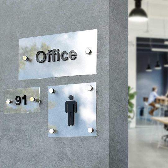
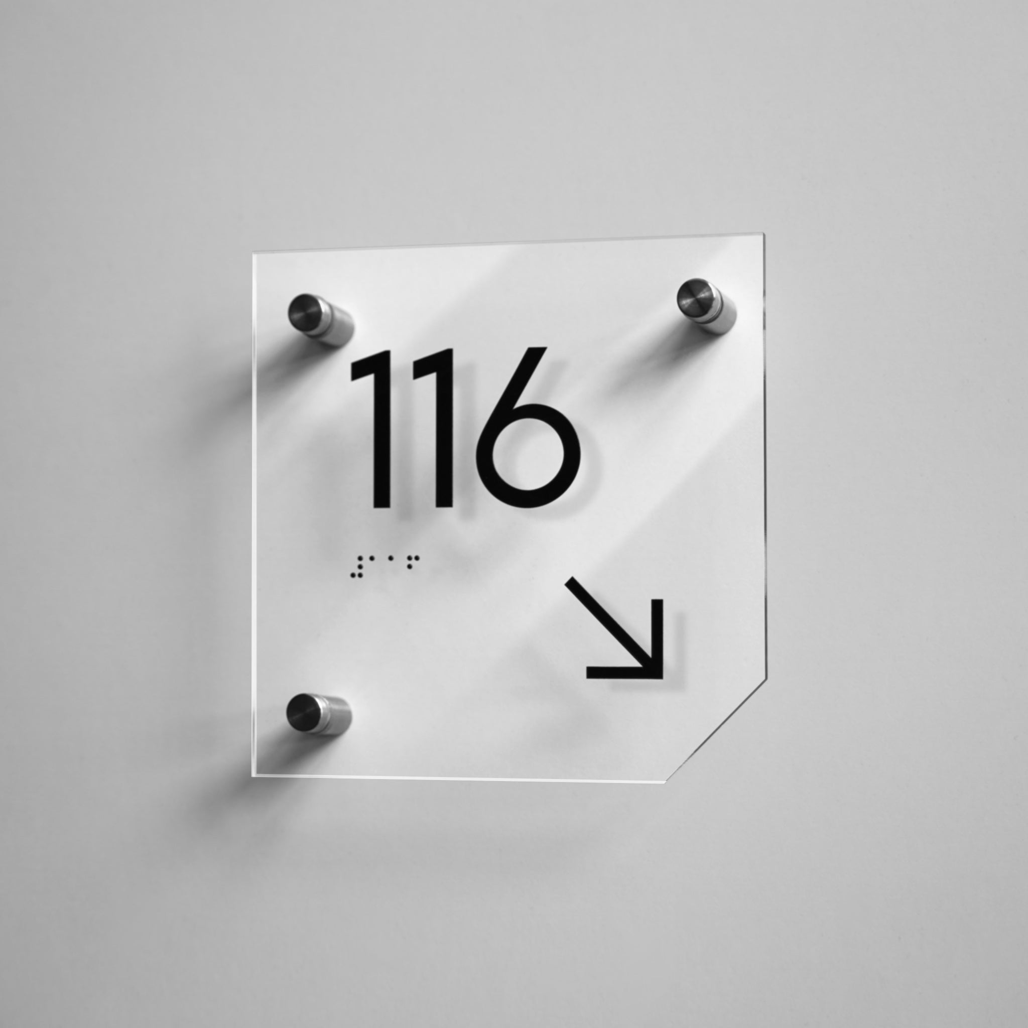
Glass is perceived as a light, clean and modern material. It can be successfully used for businesses that want to show their openness and transparency. Another advantage of transparent glass is the ability to integrate products made from it into very different interiors. If you are confused by the fragility of organic glass, pay attention to acrylic. Visually, it is the same, but much stronger. Door signs made of this material look stylish and also very restrained.
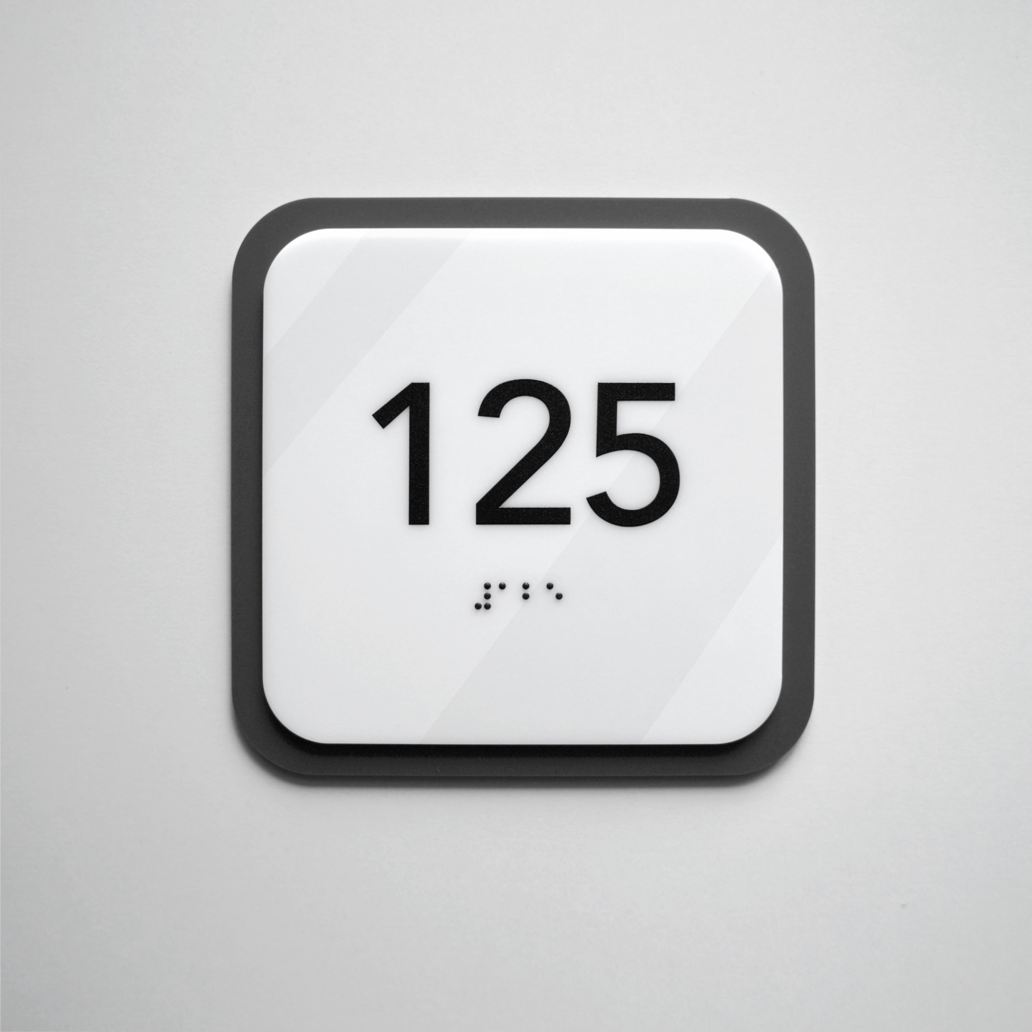
Plastic can be perceived in different ways, depending on its quality and scope of application. Low-quality materials are often associated with cheapness and disposable items. But high-quality plastic and address signs on the walls made of it (as well as advertising signs) can convey a sense of innovation and durability.

So, understanding the peculiarities of perception of the components of door signs and numbers, specialists can create individual commercial sign designs for the customer's needs which clearly and concisely convey the desired message. This is how our team works.
So, if you want to order a door sign or number, fill in the form. In the near future, our manager will contact you and conduct a free consultation to answer all your questions and help with the choice, taking into account features of making signs for business.
