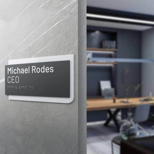
How to Properly Pair Signage Fonts and Materials in Modern Interiors
In today’s business environment, easy-to-read fonts for signs are no longer a secondary element of interior design. They shape the first impression of a space, set the tone for navigation, and directly influence how visitors perceive a brand, its service, and the level of organization of the environment. A well-chosen typographic solution works systematically: information is read quickly, the space feels structured, and the interior appears complete.
The material of the products plays no less important a role than the font itself. Stainless steel, acrylic, and wood have different surface textures, react differently to light and shadow, create varying levels of contrast, and affect reflective surface readability in different ways. What looks clear on acrylic may lose definition on a brushed metal finish surface or become “lost” in the natural wood grain. That is why signage typography cannot be based solely on intuition or visual trends.
In this article, we will examine practical principles that help combine materials and fonts so that wayfinding elements function effectively in real spaces, not just in design mockups. In particular, you will learn:
-
• how signage materials affect font readability and perception;
-
• which solutions work best for stainless steel, acrylic, and wood;
-
• how to account for reading distance, line thickness, and the impact of ambient lighting effects;
-
• what common mistakes are made when designing navigation systems;
-
• how to create modern interior signage that supports branding and remains visually relevant over the years.

Why Sign Materials Matter When Choosing Fonts for Signs
The material sets physical constraints for the font even before the design stage. It determines how accurately character shapes are reproduced, how letter edges behave, and whether the contour remains stable over time. What looks balanced on a screen may change its proportions in a real environment due to micro-shadows, glare, or the natural irregularity of the surface.
Tactile perception is also important to consider. Materials with natural unevenness affect how the eye “reads” the shape of a letter. The gaze may linger longer, and symbols require greater simplicity and predictability. That is why, in interior spaces, the material effectively determines how complex a font can be.
Another aspect is the longevity of the visual solution. The material and the font should age in the same way. If a surface changes its tone or level of matte finish over time, overly thin or highly contrasting typography may lose balance and start to look out of place. Thoughtful pairing from the very beginning helps avoid situations where a plate remains functional but visually “falls out” of the space.
That is why working with materials is a foundational step in making typographic decisions. In well-designed interiors, materials and fonts do not compete with each other but reinforce the overall logic of the space, making navigation clear without the need for additional explanations.

Core Readability Principles for Commercial Signage Design
The design of commercial signs starts with function, as information must be read quickly, effortlessly, and without error. To achieve this, several basic principles need to be considered.
-
• First, contrast. Recommendations regarding contrast depend not only on color but also on the matte or glossy nature of the surface. High contrast text on matte materials performs more consistently under different lighting conditions. Such solutions also align with ADA contrast guidelines, which emphasize predictable contrast levels to ensure information remains readable in dynamic interior environments.
-
• Second, stroke thickness. For UV-stable printing signs and acrylic elements, it is critically important to avoid excessively thin strokes. They lose their shape during printing and under lighting conditions.
- • Third, the viewing distance from which the navigation element is perceived. Decor elements intended to be read from a distance require completely different letter proportions than door signs. In such cases, legible sans serif fonts for signage.
It is also important to consider how lighting impacts sign readability. Warm, cool, direct, or diffused light changes the perception of character shapes.
In addition to basic parameters, readability depends on the usage scenario of the space. In business environments, plates often function as quick orientation points rather than carriers of detailed information. That is why typography should be designed to work at first glance, without requiring visitors to stop or change their movement trajectory.
Another important factor is consistency. When the same typographic logic is applied throughout the entire space, the brain recognizes information faster, even if the plates differ in format or size. Consistent proportions, stable character height, and predictable composition improve overall navigation usability without additional explanation.
This is why readability principles should be established at an early design stage. They help avoid local compromises later and ensure stable functionality of signage in real operating conditions.

Best Font Pairings for Stainless Steel Signs
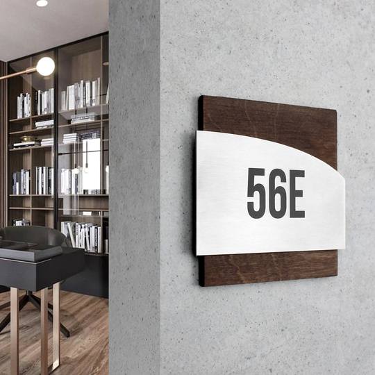
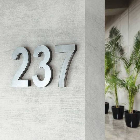
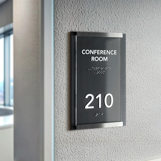
Such signs are associated with precision, status, and durability. They are often used as architectural signage in offices, business centers, and medical facilities, where clear navigation and a restrained visual language are essential.
That is why stainless steel signs for business centers have become the standard for spaces that aim to maintain a composed, professional, and up-to-date appearance regardless of time.
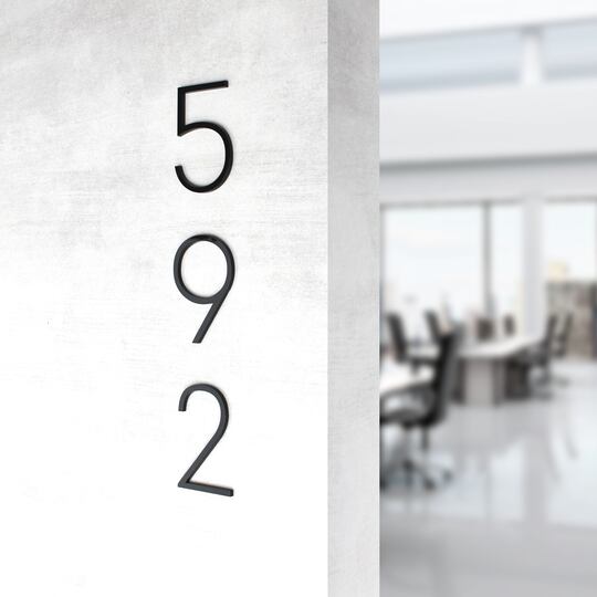
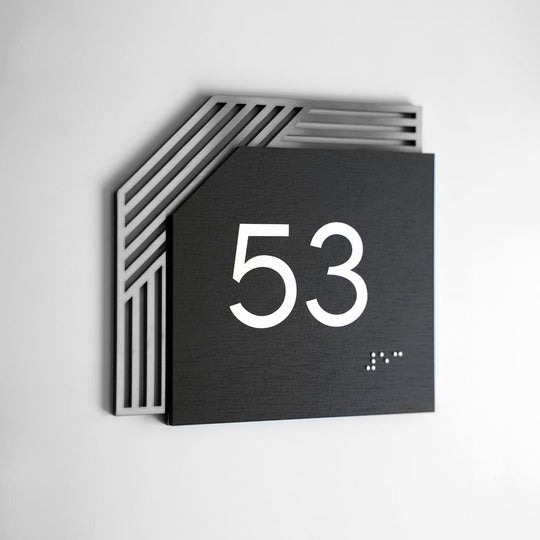
Fonts for signage in the style of modern grotesques work best here: geometric, restrained, and with clear proportions. Decorative typefaces lose their clarity on metal due to reflections and shadows. This is especially important in projects where navigation must support inclusive use, as stainless steel plates often form the basis of systems designed around ada compliant signage font legibility, where character geometry and spacing must remain stable under real lighting conditions.
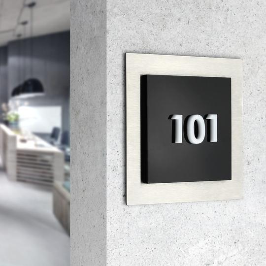
Matte surfaces reduce glare and improve perceptual stability. Combining steel with acrylic overlay elements or dimensional letters helps enhance contrast and create minimalist signage that remains highly readable even in challenging lighting conditions.

Font Pairing Principles for Acrylic Signs
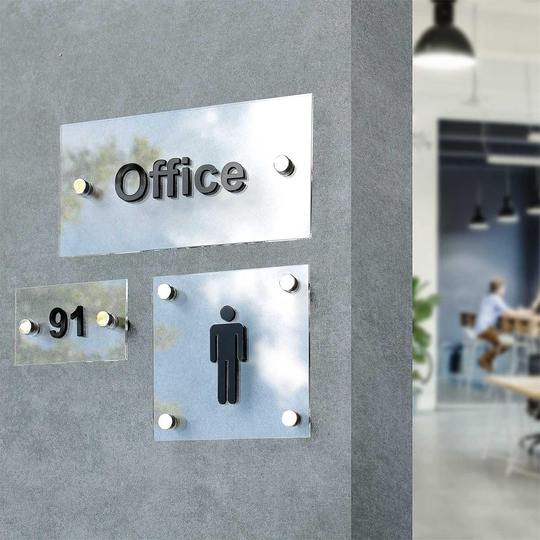
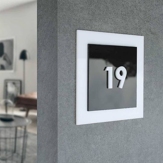
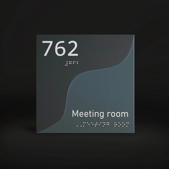
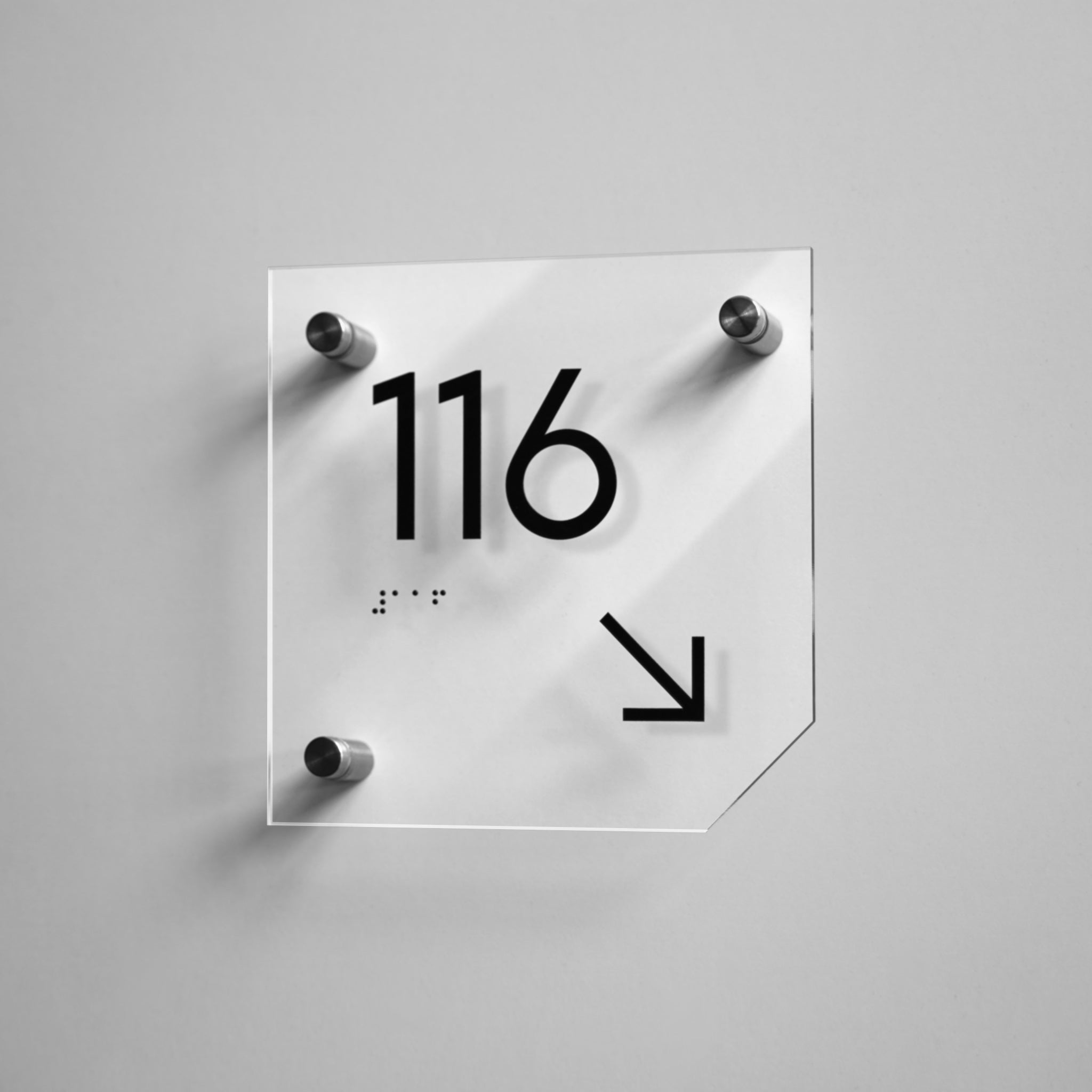
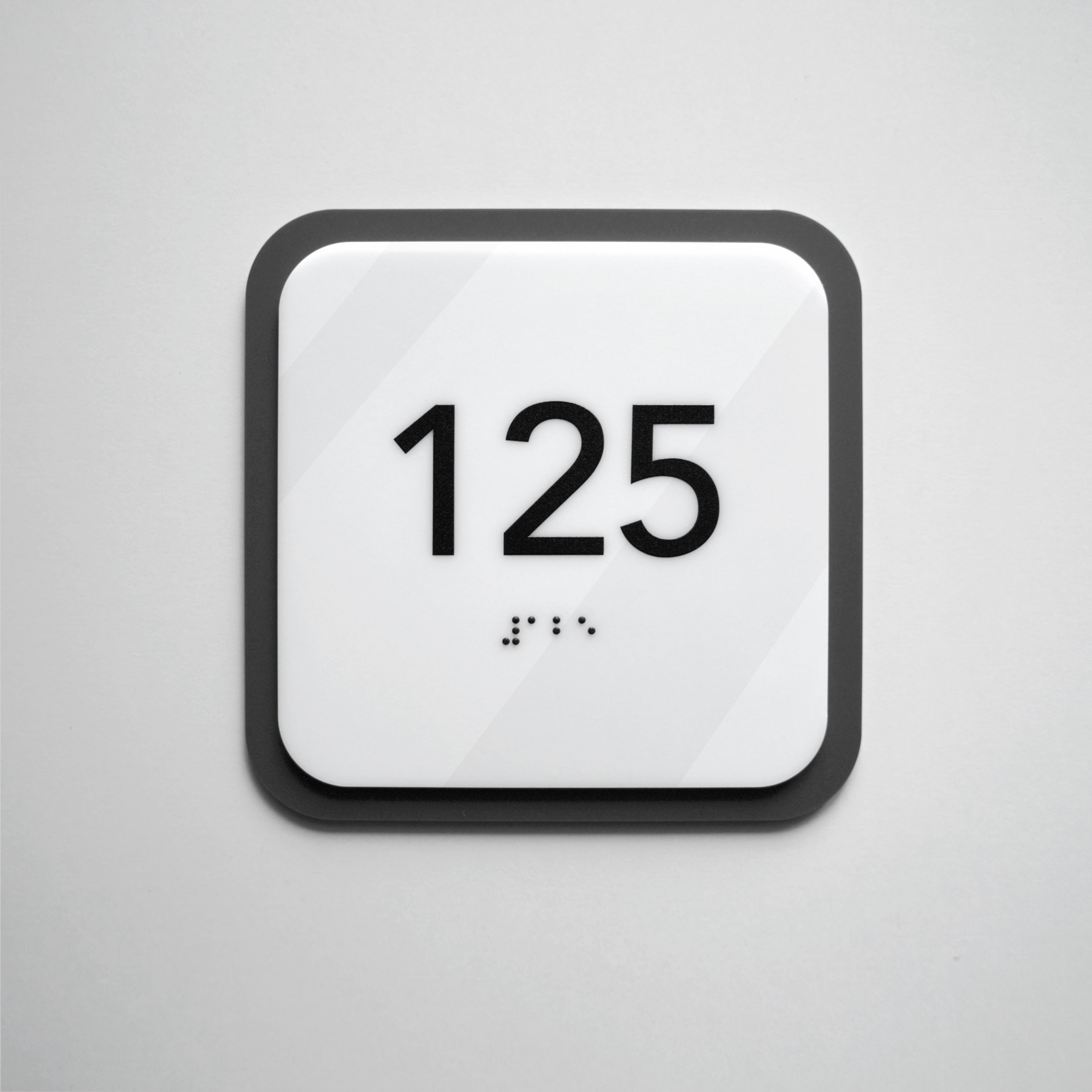
Acrylic signage opens up a wide range of possibilities for contemporary graphics. The smooth surface, clean edges achieved through laser-cut acrylic, and stable geometry make acrylic an ideal material for minimalist typography. This is why acrylic signs with modern fonts are frequently chosen, where precision, clean edges, and stable proportions are critical for long-term readability.
Geometric typefaces of medium weight work best here, as they retain their shape in 3D acrylic letters. Fonts that are too thin or vintage-inspired may look striking in mockups, but in real spaces they quickly lose readability.
Acrylic makes it possible to build cohesive graphic systems in which font, form, and color support modern interior branding without unnecessary decorative elements.

How to Choose Fonts for Wood Signs
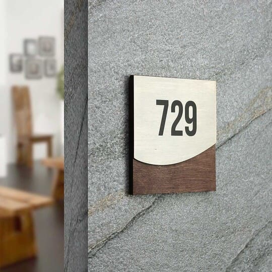
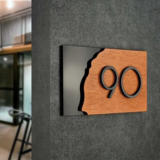
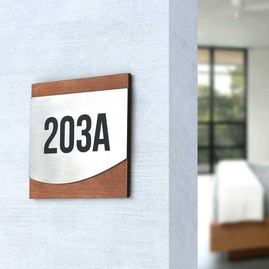
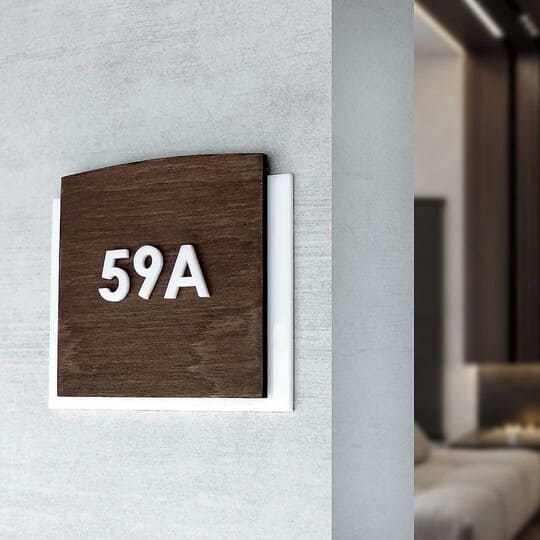
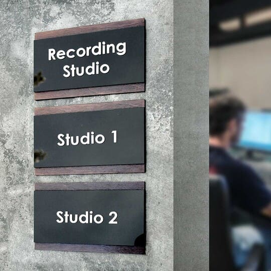
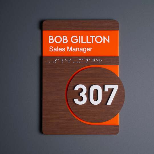
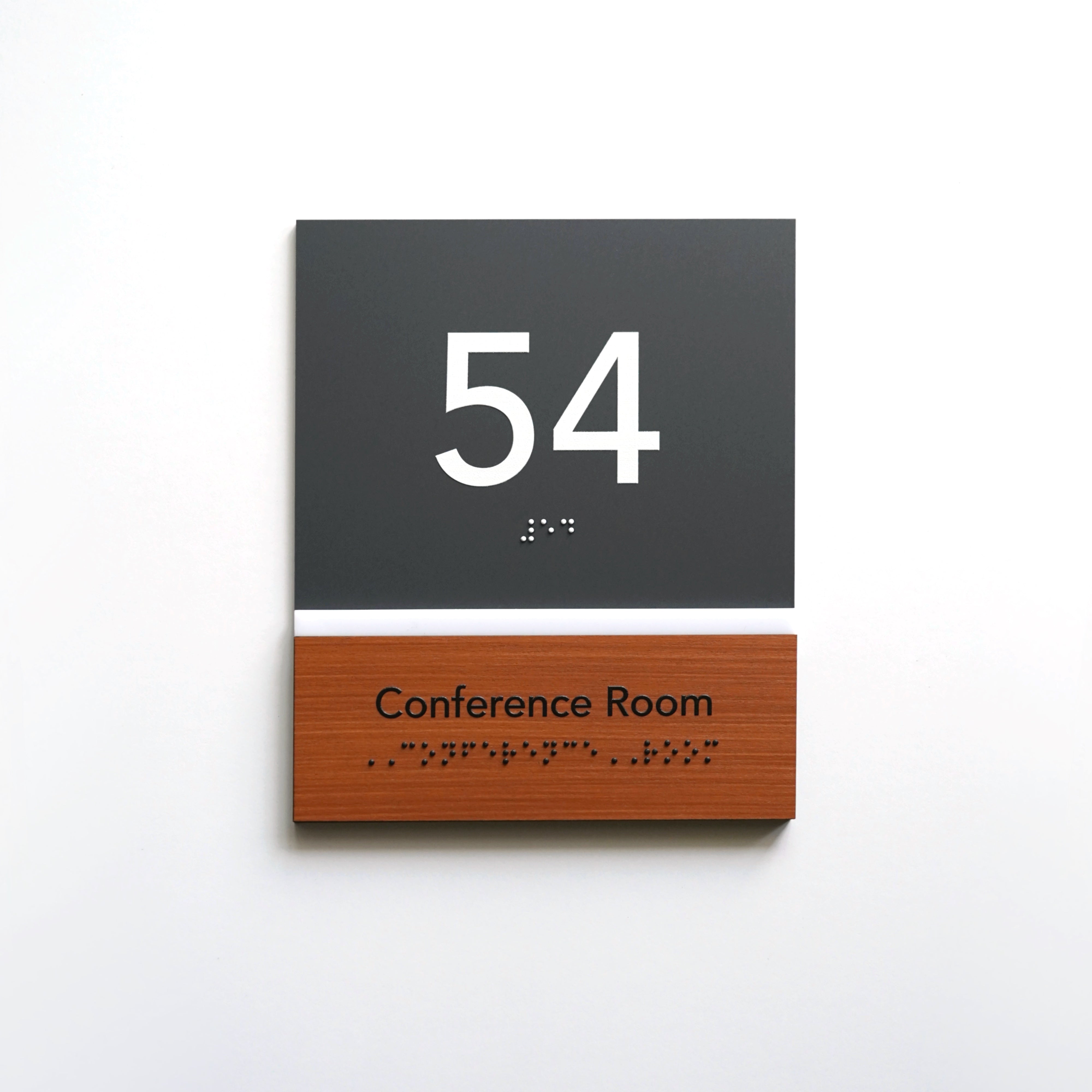
Fonts for wooden signage must take into account the living material texture. The direction of the grain, the tone, and the density of the wood affect the perception of characters no less than the typeface itself.
Geometric fonts of medium weight perform best, creating sufficient contrast with the surface. Lines that are too thin get lost, while overly decorative fonts conflict with the natural texture.
Wooden signs with engraved typography integrate seamlessly into spaces with soft neutral palettes — such as cafés, hotels, and residential complexes — where clear interior visual communication is needed without the feeling of “office” sterility.

Top 5 Universal Rules for Choosing Best Fonts for Signs
-
• Choose sans-serif fonts — they ensure stable readability.
Geometric sans-serif typefaces are more easy to read fonts for signs from a distance and at an angle. They are less sensitive to glare, shadows, and uneven lighting, which is especially important for interior spaces with multiple lighting scenarios. Such fonts do not overload perception and remain clear even when people are moving quickly. -
• Avoid decorative fonts in navigation and working areas.
Decorative typefaces may look attractive as isolated accents, but in navigation elements they complicate reading. Complex shapes, unconventional proportions, or stylizations meant to reflect the “character” of a space often reduce functionality and create unnecessary cognitive load. In working and public areas, clarity should always take priority over visual effect. -
• Always test the layout at real scale, not on a screen.
What appears readable on a monitor can be perceived very differently in a physical space. Actual size, mounting height, and viewing distance change the proportions of characters. Testing at a 1:1 scale makes it possible to see whether letters merge, whether numbers are clearly legible, and whether the balance between text and background is maintained.
-
• Control line thickness according to the material and application method.
Lines that are too thin can lose their shape or appear unstable depending on the surface. The material and the technique used affect how the edges of the letters appear in a real space: whether micro-shadows appear, the contour “blurs,” or the clarity is maintained over time. Optimal line thickness ensures a consistent appearance of the decor element throughout its lifespan. -
• Test readability under different lighting conditions.
Lighting affects the perception of shapes more than it seems during the design phase. Daylight, evening light, warm or cool lighting all highlight contours differently and influence contrast. Testing under multiple scenarios ensures that the font remains readable regardless of the time of day or the space’s usage conditions.

Common Signage Typography Mistakes to Avoid
The most common mistake is trying to make a sign stand out with a complex or unusual font. In navigation, this approach doesn’t work because unfamiliar letterforms slow down reading and force people to spend time recognizing the symbols. As a result, the sign may attract attention but fails its primary function — to convey information quickly and unambiguously. That is why the best font styles for modern commercial interiors are those that remain neutral, proportionate, and highly readable in real spaces.
Another common issue is incorrect scaling. Text that looks neat on a mock-up can become difficult to read in a real environment, especially from side angles or while moving. Conversely, an overly large font can disrupt the plate’s proportions and create visual noise in the space.
The impact of shadows from three-dimensional elements is often underestimated. If the depth or spacing between letters is miscalculated, shadows can overlap the contours of the characters and reduce text clarity.
Contrast requires special attention. Insufficient contrast between text and background may seem acceptable under controlled conditions, but in a real interior it can quickly “disappear” due to changing lighting, reflections, or dark areas in the space. In such cases, the information is no longer readable at first glance.
Lack of consistency is also a common mistake. When different font solutions are used in a single space without a unified logic, navigation becomes fragmented. Even high-quality individual products start competing with each other instead of working as a single, coherent system.
Avoiding these mistakes does not require complex solutions. It requires a clear understanding of the space’s usage scenarios and testing typography not in theory, but in real-life conditions. This approach ensures the creation of plates that remain clear and appropriate throughout the entire lifecycle of the interior.

A Practical Guide for Architects and Developers: How to Choose the Right Font for Indoor Signage
Working with a font does not start with choosing a style, but with analyzing movement scenarios — specifically: where a person first sees the product, at what angle, from what distance, and under which lighting conditions.
The first step is readability testing. If the information is not immediately legible, no stylistic choices can compensate for this problem. At this stage, it is important to evaluate not only the character size but also the font proportions, letter spacing, and overall text density.
The second step is testing the layout under real or simulated lighting. Lighting directly affects the perception of form, as contours can sometimes “disappear,” shadows or reflections may appear, and contrast levels may change. Checking under different scenarios helps avoid situations where a decor element only works under a single ideal lighting condition.
Equally important is the application technology. Durable UV printed signs ensures the preservation of letter shape, contrast, and detail even on complex surfaces.
Special attention should be given to alignment with branding. The font of the products should support the visual identity of the space but not literally duplicate marketing materials. In navigation, functionality is key, so branded signage is usually executed in an adapted, simplified version of the brand’s font logic rather than in decorative variations.
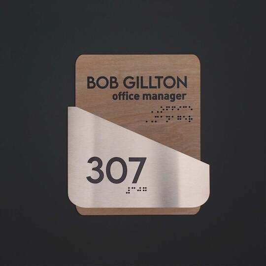
If the project includes inclusive solutions, the font must be adapted for tactile perception from the start. Braille signage for inclusive institutions and tactile lettering require clear geometry, stable proportions, and sufficient spacing between elements. These requirements should be considered at the beginning, rather than adding inclusive elements as a separate layer at the end of the project.
Approximate scaling rules for different scenarios
Font scale is always determined by the viewing distance and the type of interaction with the navigation element, not by the desire to “make it more noticeable.”
-
• Door signs (0.5–1.5 m)
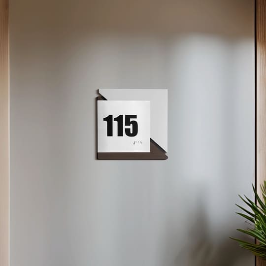
The person stops directly in front of the door. Text is read in a static position, so neat proportions, moderate stroke thickness, and comfortable letter spacing are important. Overly large characters at this distance create a sense of visual pressure. -
• Corridors and common areas (2–5 m)
Information is read while moving or from a side angle. The font should be open enough, with clear forms and stable contrast, so it can be read without the need to stop or change the path of movement. -
• Wayfinding signs and landmarks (5–10 m)
Immediate recognition is important here. Simple, well-balanced fonts without small details that may disappear at a distance are used. The ratio of text to background and the overall composition of the element are crucial.
The final step is checking consistency. The same font should work reliably across different media: door signs, informational plaques, and wayfinding design. Consistent proportions and a unified logic create cohesive interior navigation systems.
This approach reduces the number of compromises during implementation and ensures a long-lasting result, where typography supports the space rather than competes with it.

How Materials Affect Font Readability and Create a Unified Signage System
The choice of material for custom business signs directly determines how quickly and accurately information is read within a space. Properly pairing wood, acrylic, and steel with fonts allows for plates that perform consistently under real conditions: in various lighting, from different distances, and for different usage scenarios. This systematic approach directly improves the efficiency of interior signage using fonts & shapes, allowing navigation elements to work intuitively without visual overload.
This approach creates an environmental graphic design, where each element serves a function, and typography supports order and orientation. Systematic design ensures that the products remain relevant over time and do not require constant updates.
If you are working on a project for a business space, office, hotel, or residential complex, consulting at the stage of material and font selection will help avoid common mistakes and save implementation time. Professional selection of typography and materials allows you to establish solutions from the start that work for branding, navigation, and user comfort in the long term.
