How to improve the efficiency of interior signs using fonts and shapes
Have you ever wondered why some signs immediately attract attention, while others remain unnoticed? Not only the content of the sign, but also its visually appealing design plays an important role here. Fonts and shapes can significantly affect the perception of the interior signage, its visibility and effectiveness. A well-chosen font or shape can not only improve communication, but also help a business stand out from the competition. In this article, we will consider how to choose the right font and shape of signs to make them work for your business and advertise your brand recognition.
Features of different fonts for signs

Choosing the best fonts for signs is a matter not only of aesthetics and lasting impression, but also of functionality. Let's look at the key categories.
1. Serif Fonts
These fonts have an elegant, classic look and aesthetic appeal that evokes a sense of tradition, trust and professionalism. Thin serifs at the tips of the letters add detailing and improve readability in printed materials. Serif fonts are often associated with the corporate, business environment due to their serious and structured style, consistent body text, and business sign design.
2. Sans-serif fonts
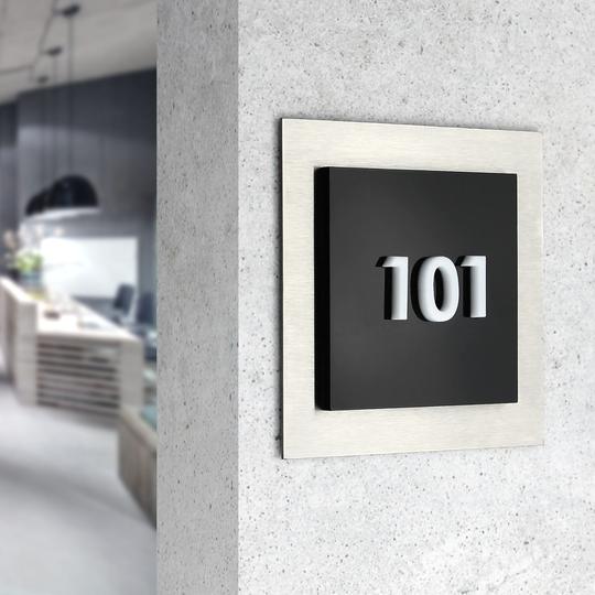
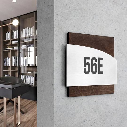
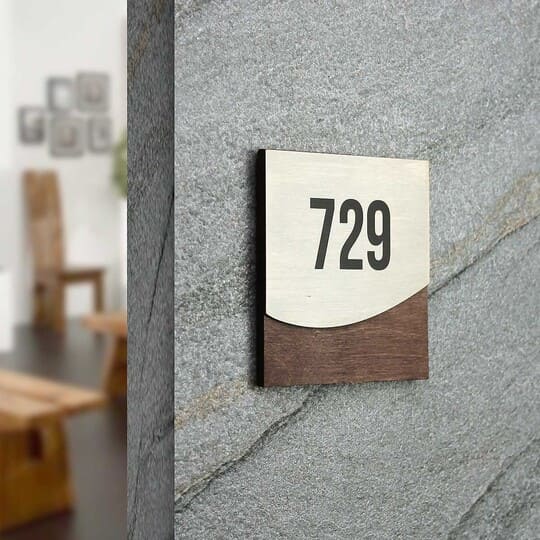
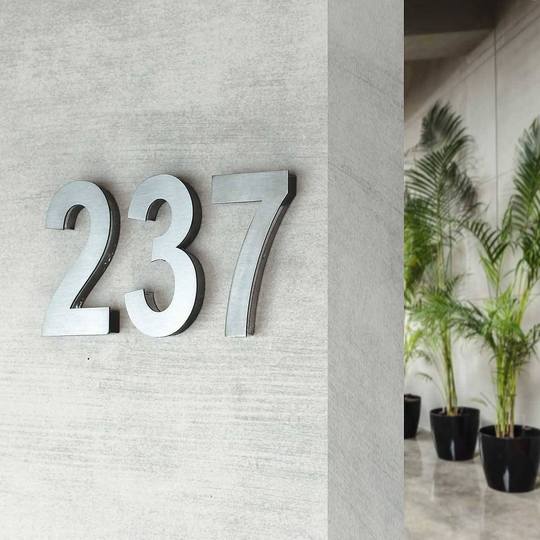
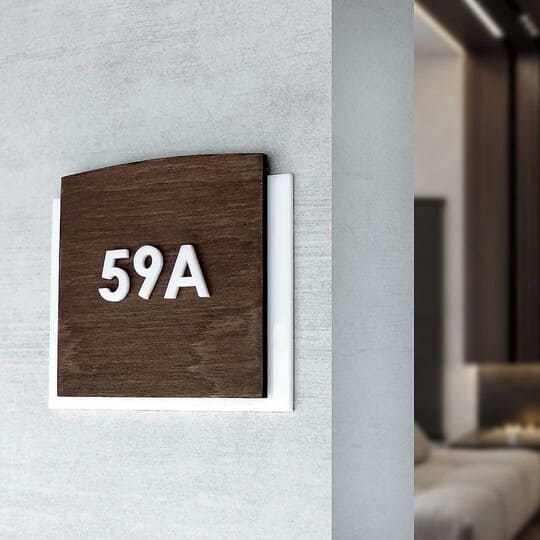
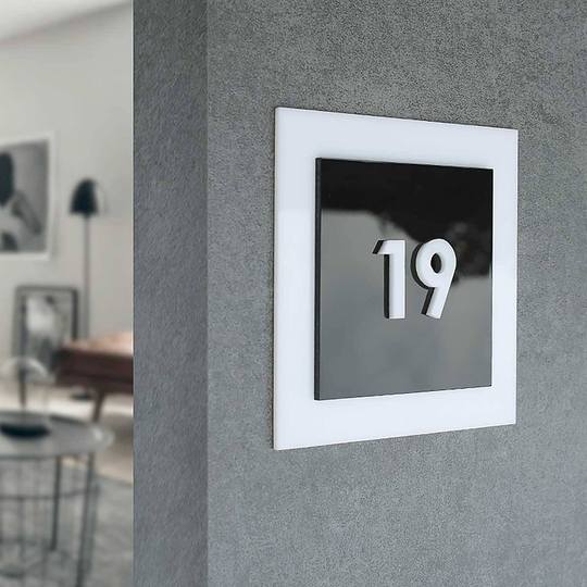
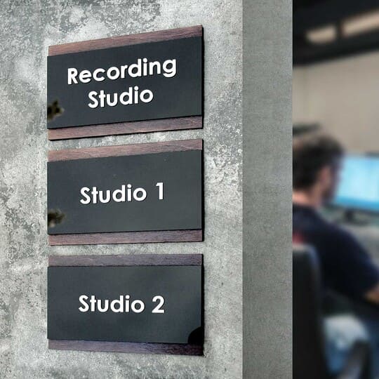
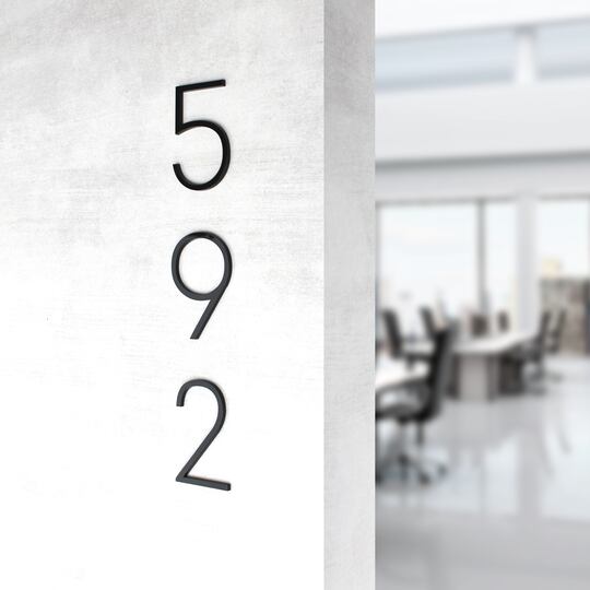
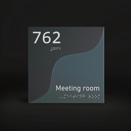
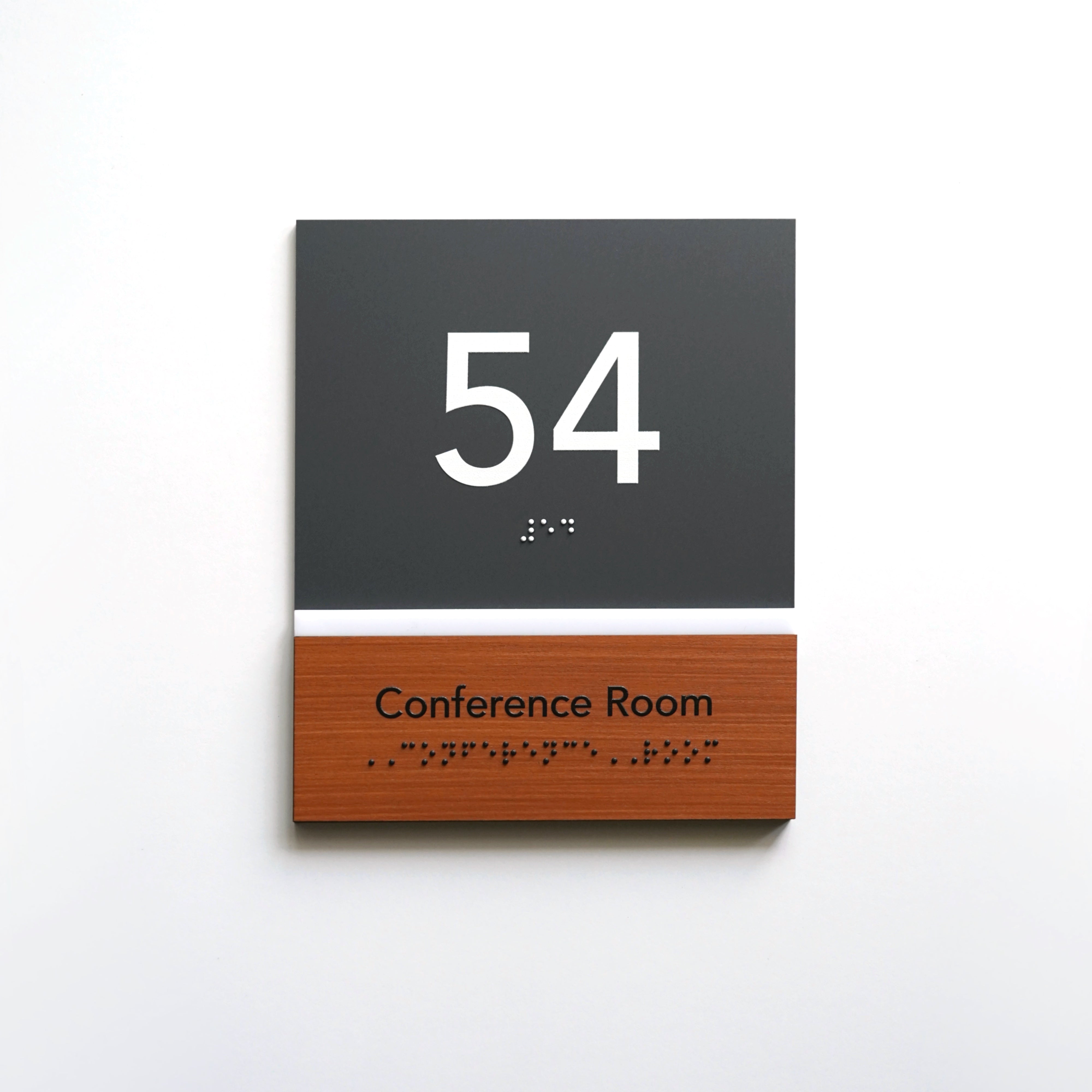
Modern and clear, sans-serif fonts on interior signages have a minimalistic look that makes them extremely convenient for quick perception. They provide a sense of simplicity and clarity due to the lack of decorative elements. Such fonts are easy to read both at long and short distances, which emphasizes their versatility and maximum visibility. Stylistically, these sign fonts correspond to more modern, innovative brands and can convey a sense of dynamism and manufacturability due to interior office signs.
3. Handwritten fonts
These fonts stand out due to their individuality and creativity. Their appearance mimics handwriting, adds depth, giving the signs softness, ingenuity and uniqueness. They are often used in an organized environment to convey emotions of tenderness, warmth, creativity. The letters and shapes of handwritten fonts are a great option for creating a more informal, friendly atmosphere.
4. Heading Fonts
These are large and prominent fonts that are designed to attract the attention of customers at first glance. They are central visual elements and are commonly used in headlines and key messages. Heading fonts can be either sans-serif or serif, but their main feature is expressiveness and visibility from long distances. This style helps convey important brand messages clearly and directly.
What fonts should be chosen for interior signs?

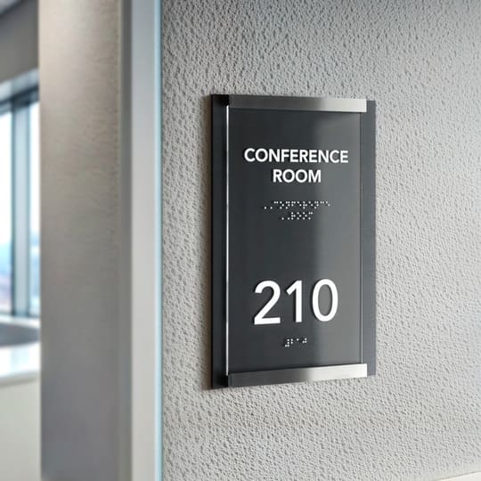
When choosing multiple fonts for signs, it is important to pay attention to their visibility, thoughtful placement and ease of perception. Heading fonts are perfect for this, because their main function is to attract attention from a distance and clearly convey information. They are key elements to form the first impression and simplify navigation for visitors.
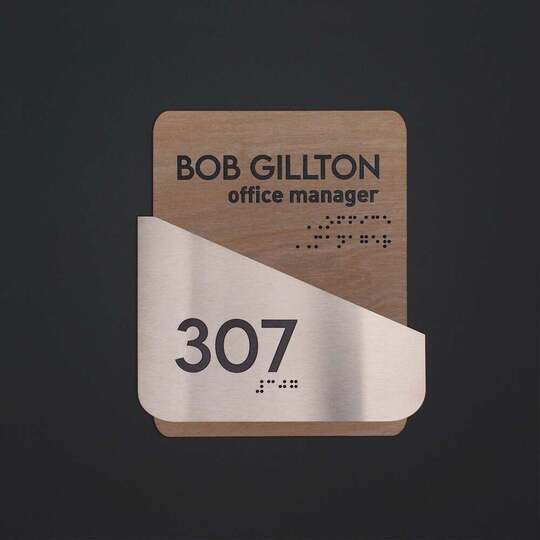
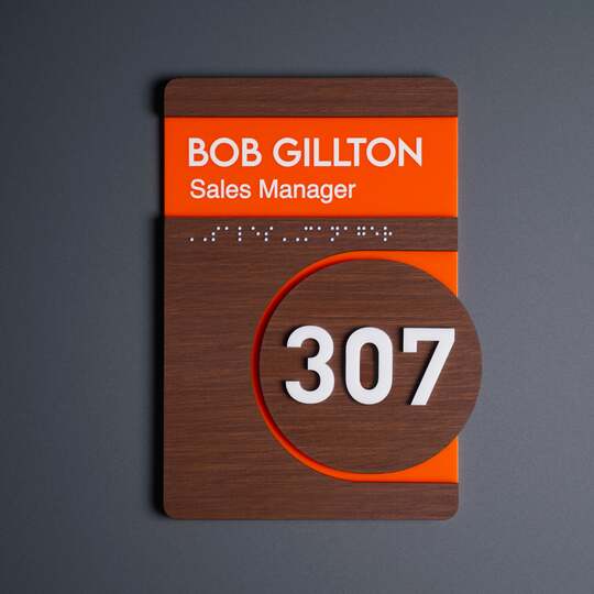
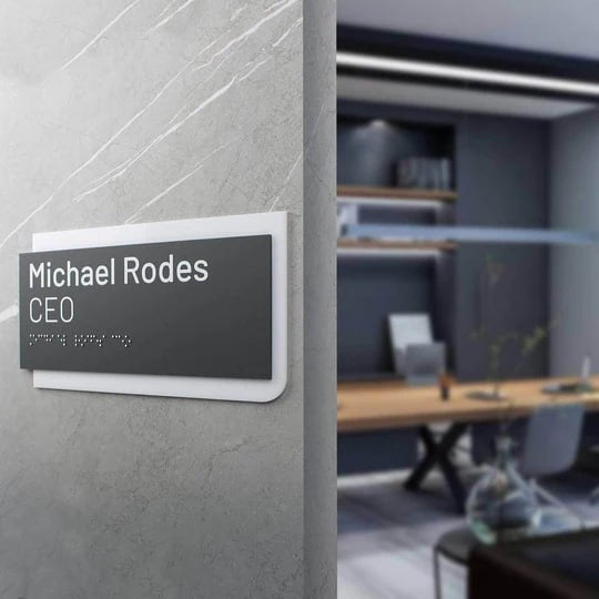
Sans-serif fonts are also an excellent choice for the target audience. They can be used for additional inscriptions, such as the name of the specialist and his/her position, indicated near the office number.
Features of different shapes of signs
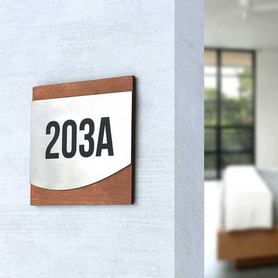
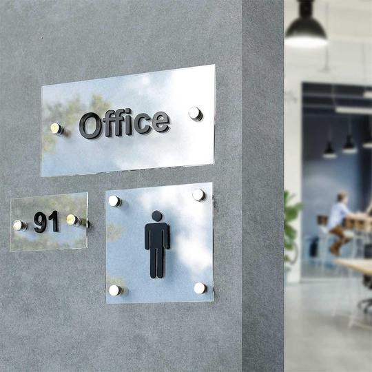
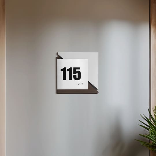
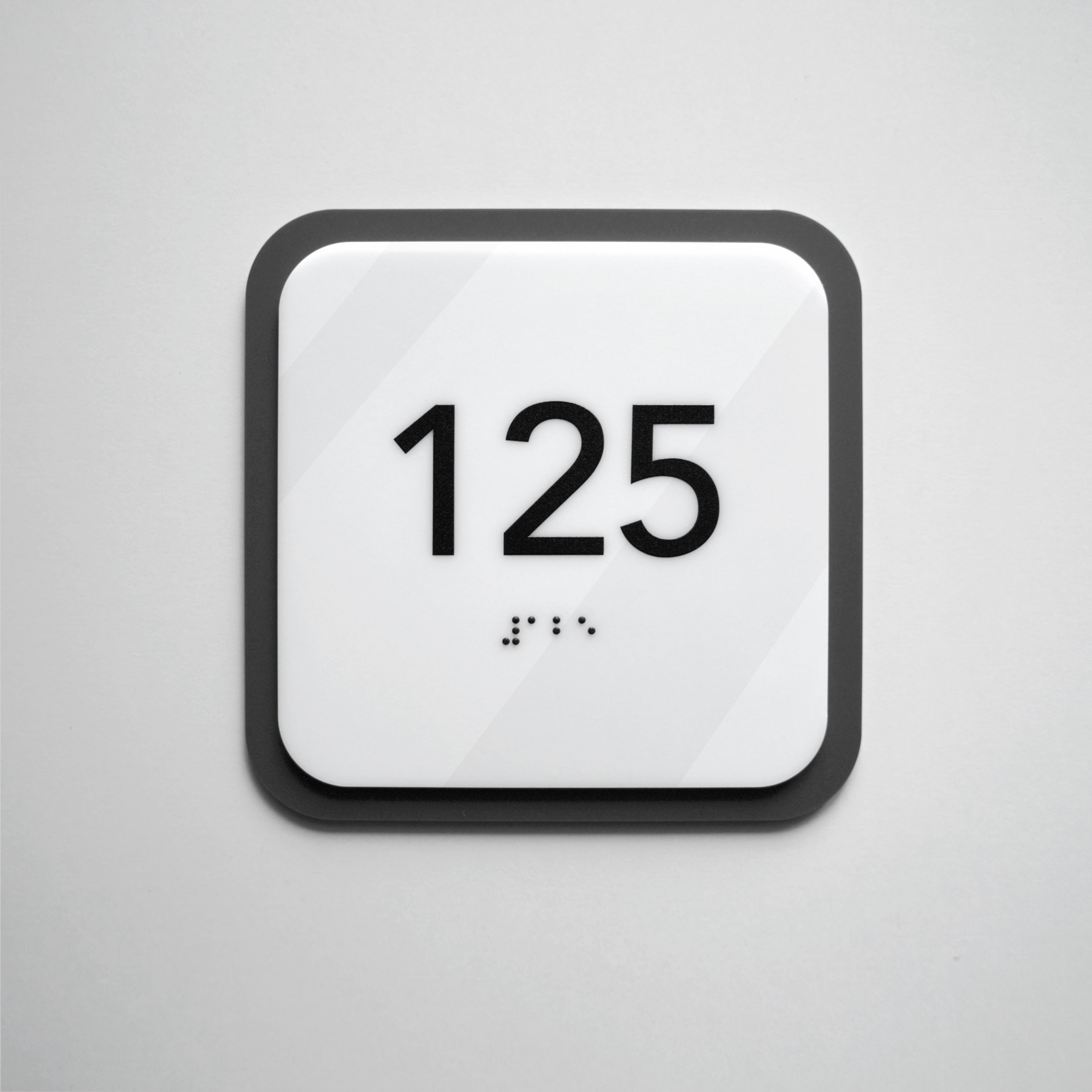
The shape of the sign is an important aspect that determines not only its functionality, but also its visual impact for customer experience. Rectangular signs with their clear lines and structure are often used as a perfect choice for informational messages since they contribute to clarity, visual appeal, and orderliness.

Round shapes convey an atmosphere of safety and friendliness, so the round signs are usually used to indicate safe areas or guide visitors to recreation areas.

Triangular signs, on the contrary, can signal danger to customers due to their shape, which attracts attention and calls for caution.
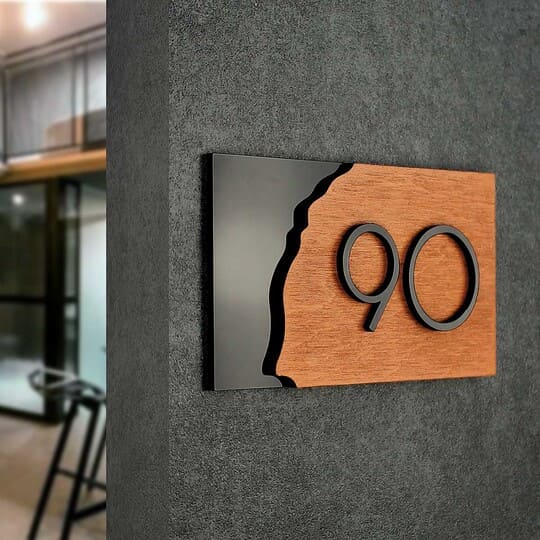
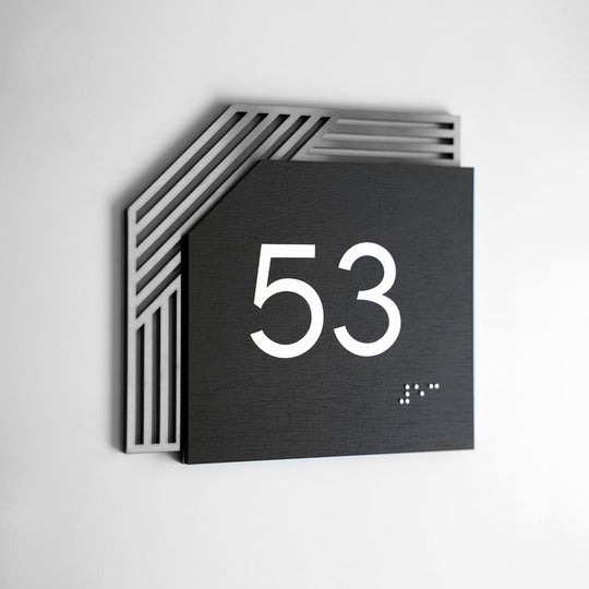
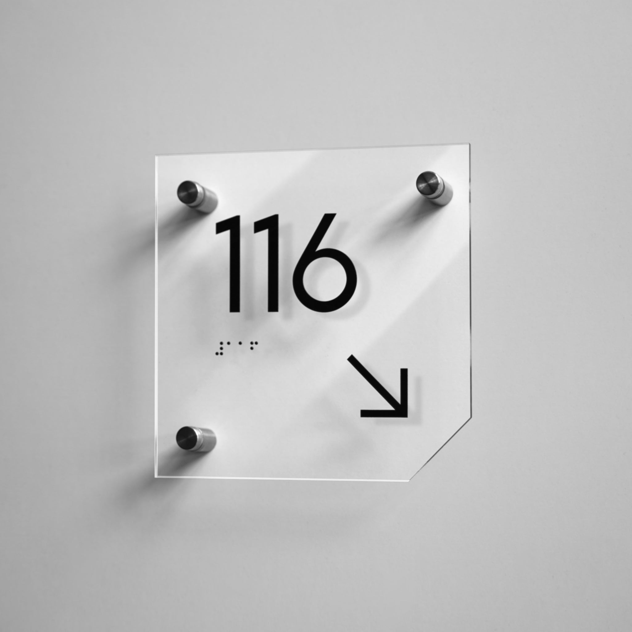
Not all signs, however, have traditional shapes. Using unusual shapes such as stars, honeycombs, and other creative silhouettes can significantly increase brand awareness and brand's identity. For example, a star-shaped sign can be eye-catching and emphasize achievement. Such forms not only attract attention, but also contribute to the formation of a positive image of the company, brand personality, distinguishing it from competitors.

What shapes should be chosen to design custom interior signs
When selecting the shape of the interior sign, it is essential to consider its purpose and context to ensure it conveys the message effectively. Creative solutions in sign design can be a powerful tool and play a crucial role, as they form the first impression and attract the target audience.
Your company deserves high-quality and effective signs! That's exactly what you can get with Bsign. Contact us for a free consultation to get comprehensive sign selections and place an order. We'll help ensure a professional look for your business with well designed custom interior signs.
