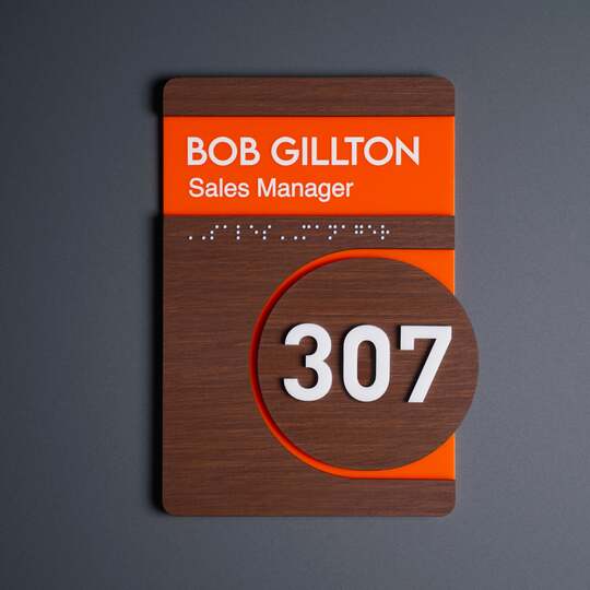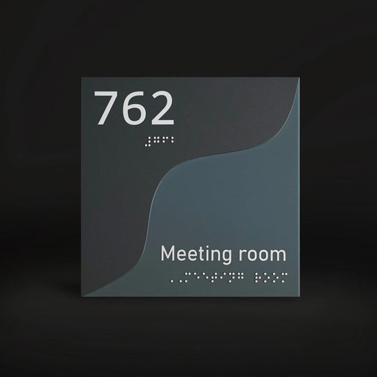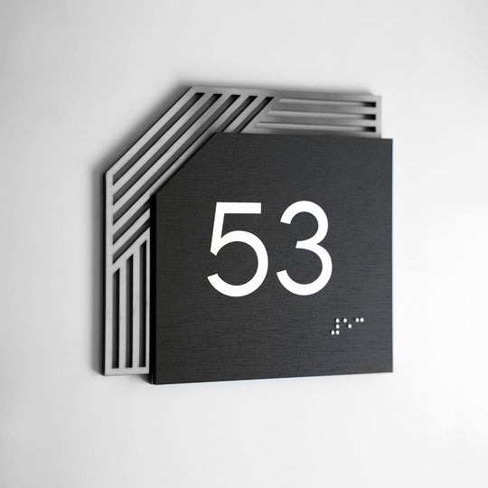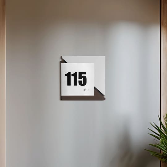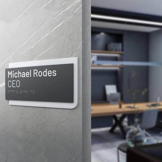
How to develop a commercially successful sign and number design?
The success of a business largely depends on the ability to communicate with existing and potential clients. Signs and numbers are one of the communication tools. To make it fruitful, you should know how to design a sign adhering to the principles of creating informative products. We'll talk about them later.
What is a sign and its commercial design?
When it comes to commercial sign design it is assumed that it should contribute to the growth of sales of goods or services. Therefore, you need to understand that the quality of such materials directly affects the profit of the business.
At the same time, the quality here is not only and not so much about the materials used or aesthetics, although they are also important.
In commercial sign design among the main tasks of products is to attract attention. The most important thing here is to clearly convey your message. In other words, make it clear to your target audience.
Therefore, it is very important to be able, so to speak, to «distance yourself» from your own tastes and preferences and focus on what your existing and potential customers like.
For example, in Asian design, a large number of details is normal, and for residents of Europe and America, such compositions cause a feeling of congestion.
Accordingly, in a commercially successful sign design you will have to focus on perception of your target audience, not on your own. Otherwise, we will not be talking about a commercial product, but about an image product.
It will also be useful for you to get acquainted with the material «Advantages that high-quality signs give to your business».

Factors to rely on when creating design of commercial signs
As we said above, it is very important to focus on the target audience of your business. To get the most complete picture of it, you can use the following sources of information:
- various industry studies from specialized companies;
- own surveys;
- statistics on sales, orders, and so on.
For example, it may turn out that your hotel or restaurant is mostly chosen by families with children of different ages. So, you need to consider their needs:
- availability of restrooms adapted for parents with children;
- entertainment areas for kids;
- wheelchair ramps.
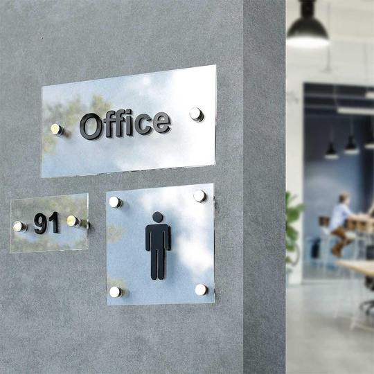
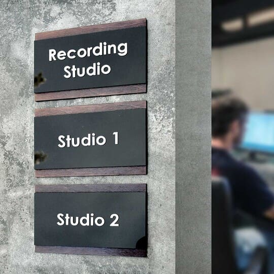
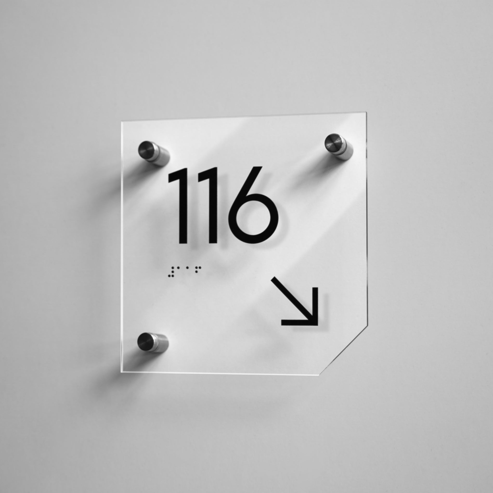
But it is not enough to have all this, it is important that visitors know about the existence of such things. So, you should create business signs which will indicate what is available on the territory of the institution and how to get to certain locations.
Business specifics should also be taken into account when creating commercial sign design. For example, if you provide medical services, you should understand that patients will come to you.
Therefore, your signs and numbers will often be disinfected, just like all other surfaces. This means that they must be made of materials that tolerate it well.
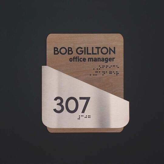
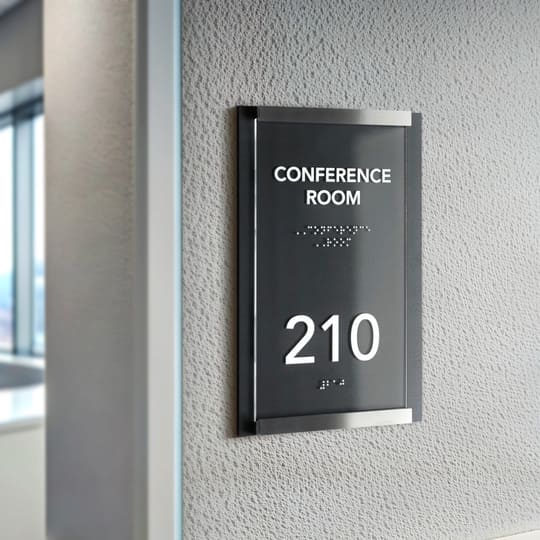
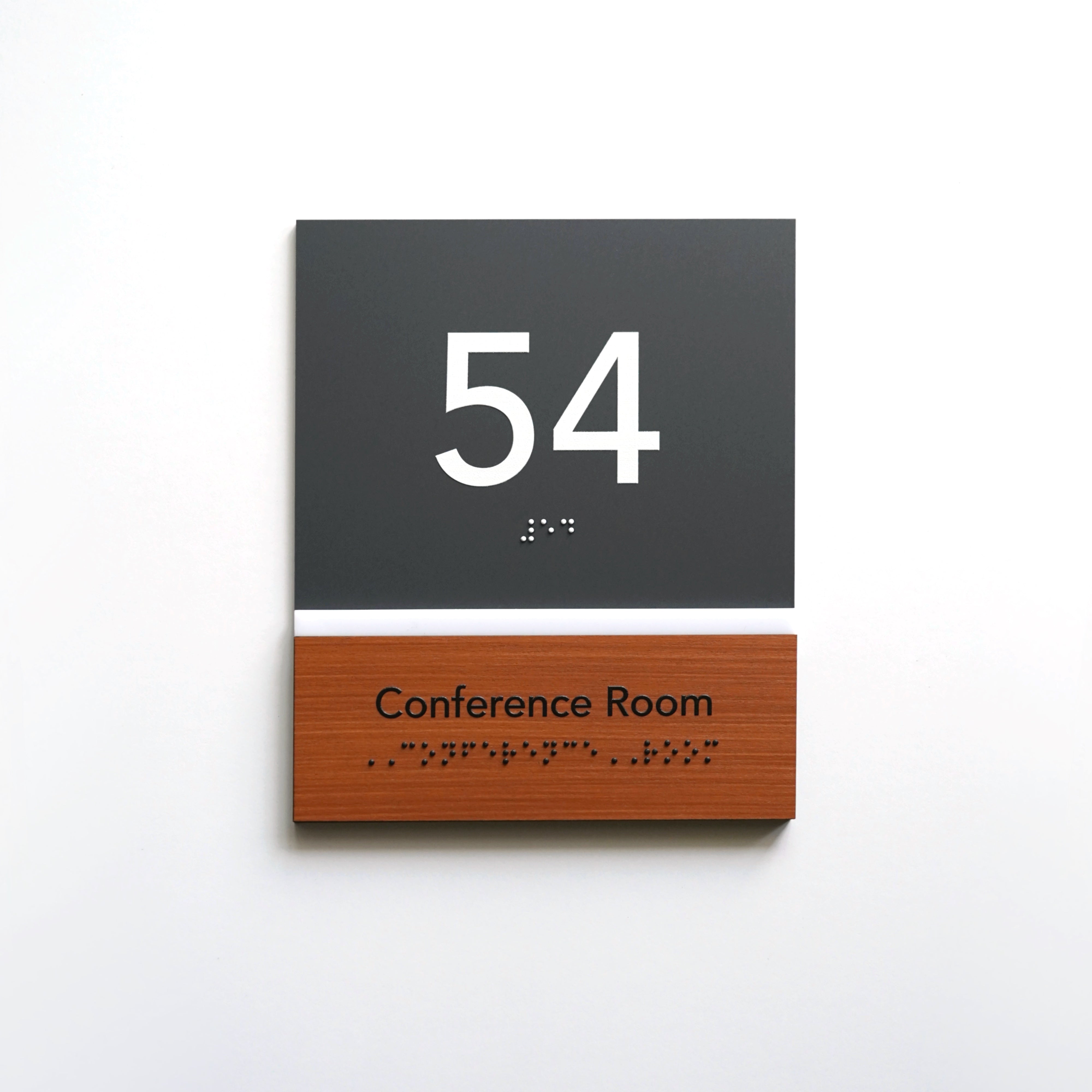
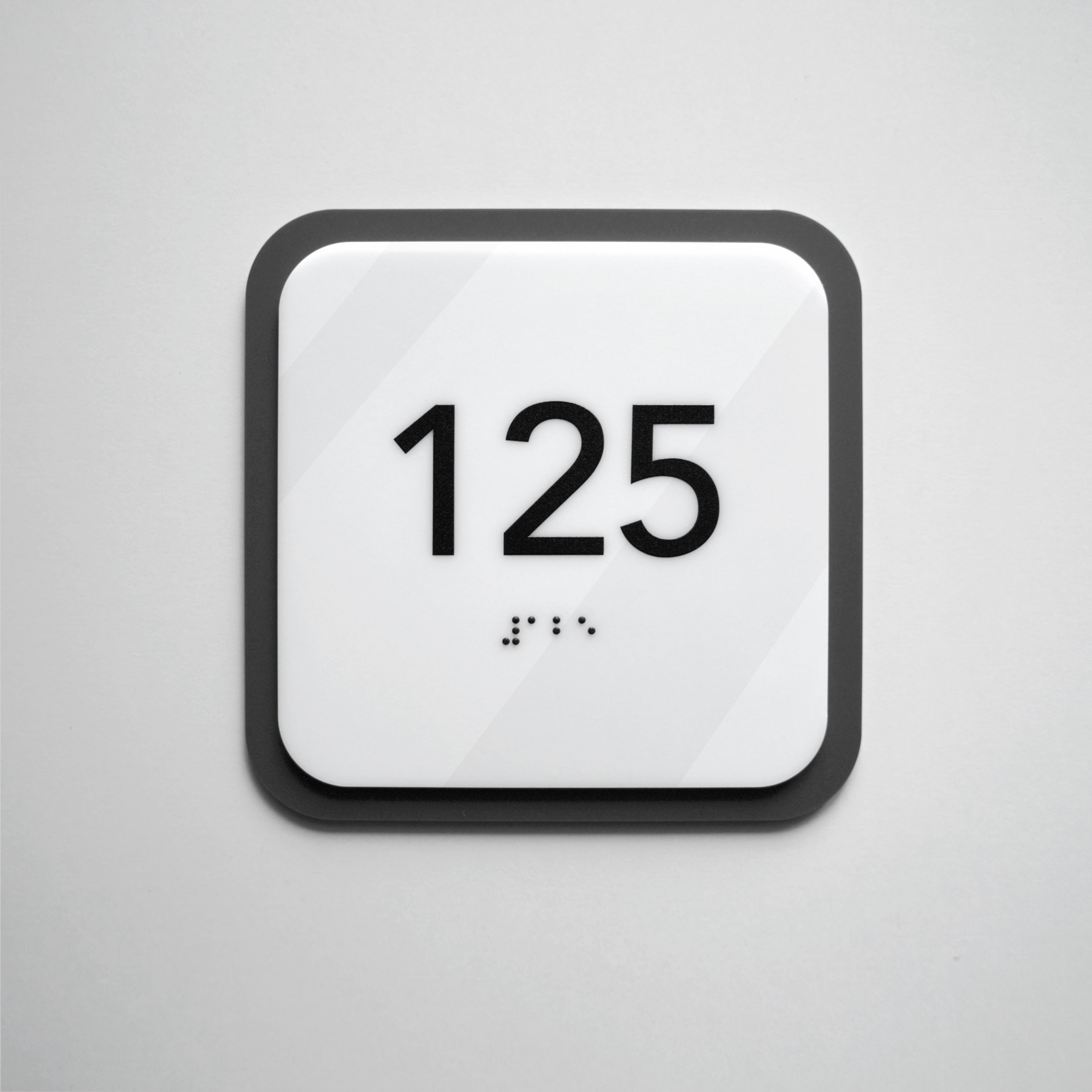
You will also be approached by people with hearing, vision impairments, and so on. For them, you need to make signs for business with tactile fonts.
Of course, each area has its own nuances that need to be taken into account.
Another important factor — the task that performs a custom sign. It's usually about informing. But it can also be different.
For example, it is better to highlight very important information in color. In other words, if the text on most signs in the building is written in black, then it is better to mark the warning about the ban on smoking or the fire extinguisher sign in red.
It is also worth remembering about the place where the interior sign is located. If it is fixed to the wall in the corridor where there is little light, take care of the backlight so that people can make out the text.
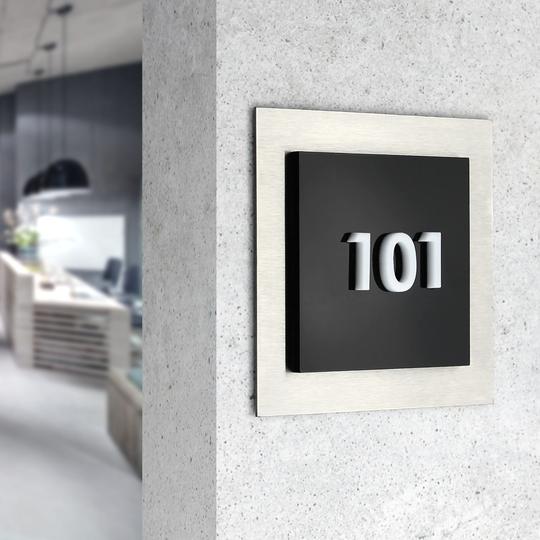
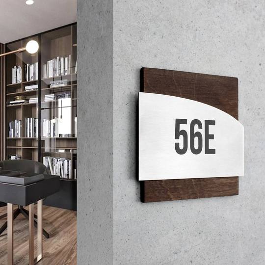
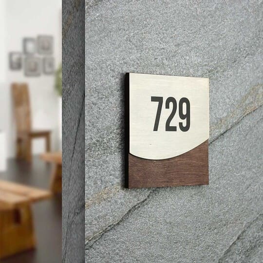
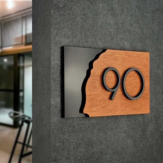
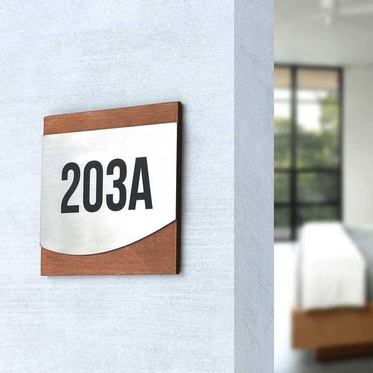
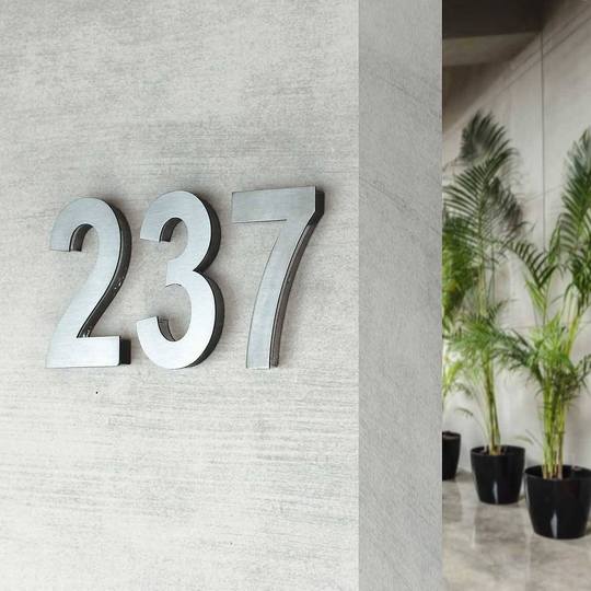
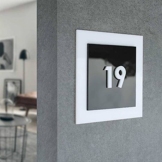
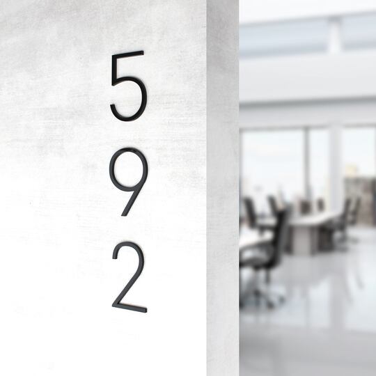
And if it's a sign with the apartment number, make it large enough so that the numbers are visible without coming close to the door.

Tips to help you in making non-standard signs
After taking into account all the previous tips, you can proceed directly to development design of numbers and signs.
As for the choice of style and combination of materials, much depends on the «context», that is, the interior in which the signs will be integrated.
But there are nuances that should definitely be taken into account.
Availability of «air»
In order for the information office door sign or office plate not to resemble a child's application or a work of a maximalist artist, you should take care of the free space on its surface. Yes, this is what is called «air» in the composition.
Its presence makes it easy to identify the main object and does not make a person strain, trying to understand where the important thing is located.
Designers are aware of this pattern in manufacturing of information signs: the more free space there is around an object, the more important it seems to the user. On average, 60% of the sign area should be filled in. Less is possible, but more is better not to.
Legibility
Beauty and originality are good and important. But if the text written in a very beautiful and unique font is impossible to make out at first glance — this is not about a commercially successful sign design.
Therefore, give preference to fairly simple fonts. For example, bars or grotesques. However, it is better to abandon handwritten and decorative fonts on non-standard signs.
Details and «highlights»
For example, your logo or unusual icons can act in this capacity. The main thing is that there is only one such element on the sign. Otherwise, it will no longer attract attention.
Correct colors
A lot depends on what message the sign carries. If they want to warn you about something, then the right thing to do is bright and contrasting to the interior and other signs color.
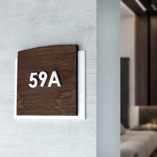
For example, when all signs are designed in brown and white colors, the emergency exit sign can be marked in red.

Laws of composition
Usually, looking at the custom sign of a good quality we don't even think about whether any rules are observed in it. But when creating a product, you should keep them in mind.
The golden ratio. This rule states that there is a proportion of 1 to 1.618. This is exactly what the ratio of parts of the composition should be.
Anchor objects. These are elements that immediately catch your eye. They should be placed in the center of the composition or in its corners.
The tincture rule. It came to the design from heraldry, but it is very important. The essence of the rule, if we transfer it to modern realities, is that you should not impose metallic colors on metallic ones, and light colors on light ones (or dark colors on dark ones).
If you already have address sign ideas or an idea of which commercial signs you want to order, please fill out the form.
Very soon, the manager of the Bsign company for business sign design will contact you and during a free consultation will help you finalize the design and place an order even for very non-standard signs and numbers for the house, door, etc.
