Invisible comfort: why high-quality wayfinding signage reduce visitor stress
Have you ever walked into a hotel, office centre or hospital and felt confused, not knowing where to go? It's a familiar feeling when the space seems chaotic and the room you need seems to be hidden in a maze of corridors and doors. Your eyes dart around looking for any signposts, you have to ask the staff for directions or just wander around, hoping to find the right direction. At such moments, the invisible comfort turns into discomfort and confusion, and uncertainty increases, causing unnecessary stress and time loss.
However, in a well-organised space, the situation is completely different. You intuitively find the right areas, doors or exits, moving easily and without stress. High-quality navigation signs for business are the very "invisible heroes" that make the space not just orderly, but also intuitive and comfortable for every visitor. They create a logical route, help you find your way around quickly, save time and prevent unnecessary difficulties.
Correct navigation is not only a convenience, but also an important element of the company's image. It demonstrates customer care, emphasises the status of the establishment and affects the overall impression of the space. It is not just a detail, but a strategic tool that works to improve the visitor experience. How exactly does this mechanism work and why are effective signs a strategic tool for business? Let's find out together.
Poor navigation solution is a hidden business problem
In every space with visitors, there is a demand for a navigation system. Owners of hotels, hospitals, and office centres often don't notice the problem until they receive complaints or see staff having to explain over and over again how to find the right office. This is not just a small thing, but a factor that has a significant impact on the experience of visitors. If we take into account the psychology of customers, it becomes obvious: the space should "speak" to the person, guide them without the need for further explanation.
In addition, the absence or incorrect placement of prohibition signs can lead to undesirable behaviour, violation of safety rules and general chaos in the space.
When a visitor is forced to find their way around, their stress level increases. In healthcare facilities, this can add to the stress of patients, in hotels it can create a sense of disorganisation, and in business centres it can make a client late for an appointment. But if the signage system is well thought out, people move confidently and calmly.
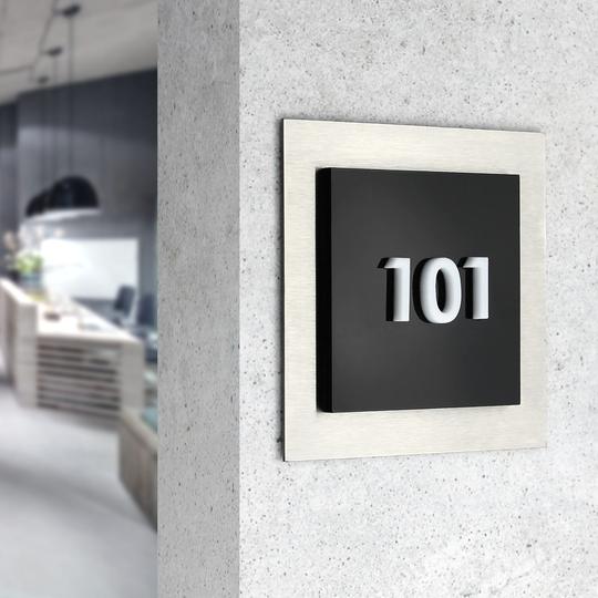
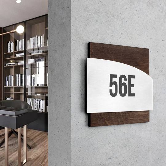
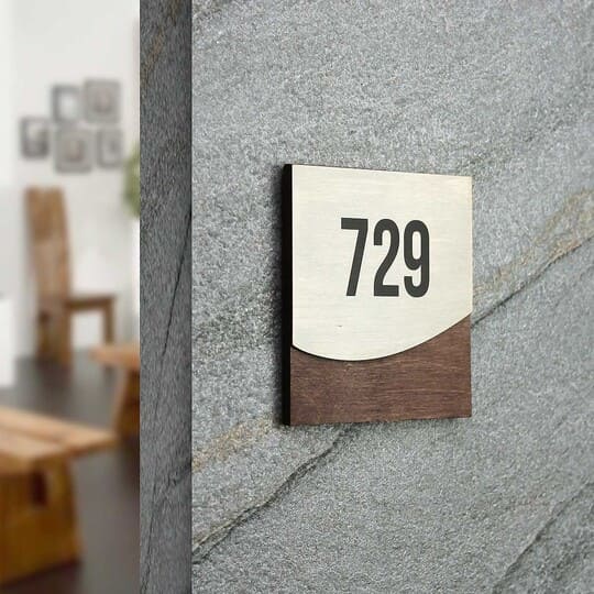
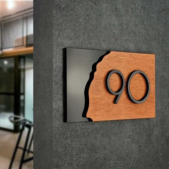
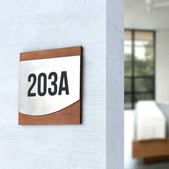
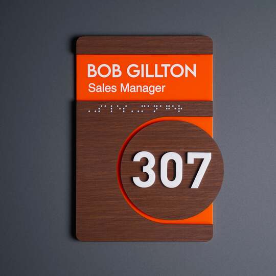
We offer customised navigation solutions that not only help you find your way around, but also harmoniously fit into the design of the space. Our signs are handmade from premium materials — wood, acrylic and stainless steel — and create a holistic image that emphasises the status of the establishment.

High-quality signage design and navigation: what makes the difference?
High-quality signage design doesn't just provide direction, it integrates into the space, making navigation easy and intuitive. It is important that the information on the sign is read instantly, without the need for additional effort.
Readable fonts for signage make the text easy to understand, contrasting colours improve visibility, and clear visual cues help to navigate quickly. Thanks to this, visitors can easily find the information they need, making the space more comfortable and functional.
The role of materials in the perception of information
In addition to their functional purpose, signs are part of the design of a room and can emphasise its status and brand identity:
-
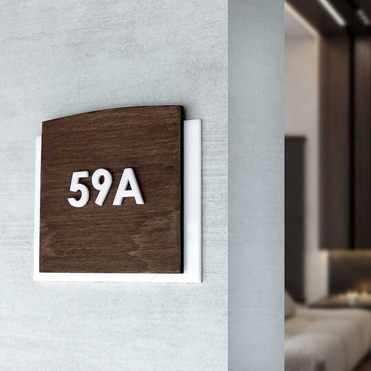
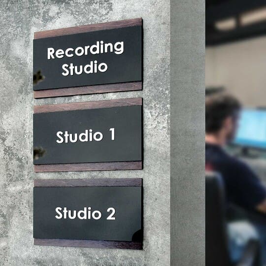
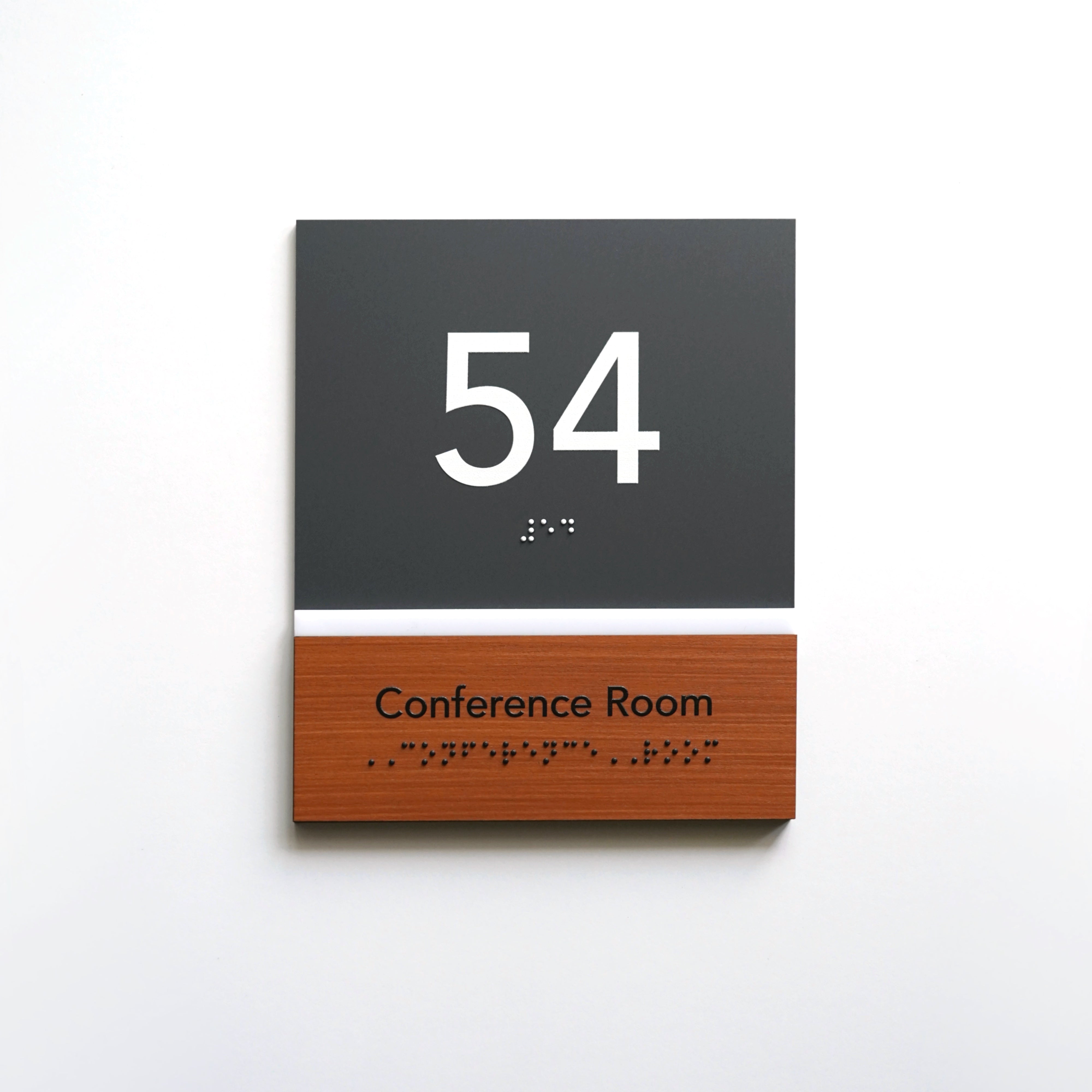
Wooden signs add natural warmth and cosiness, creating a sense of eco-friendliness and naturalness.
-
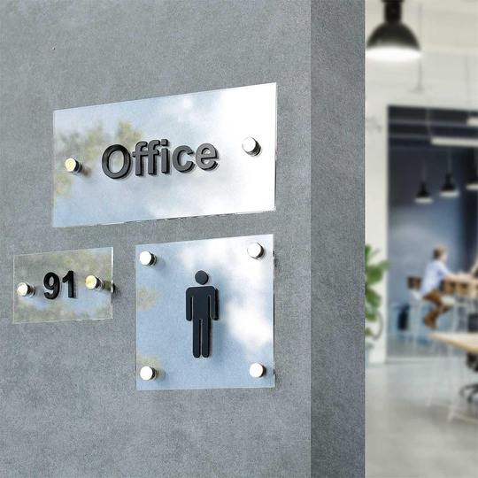
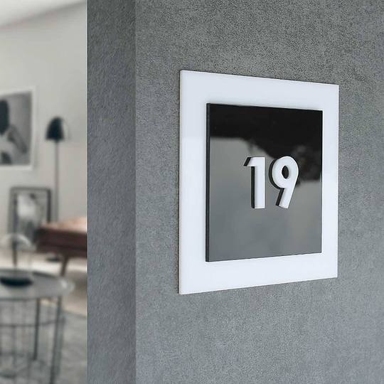
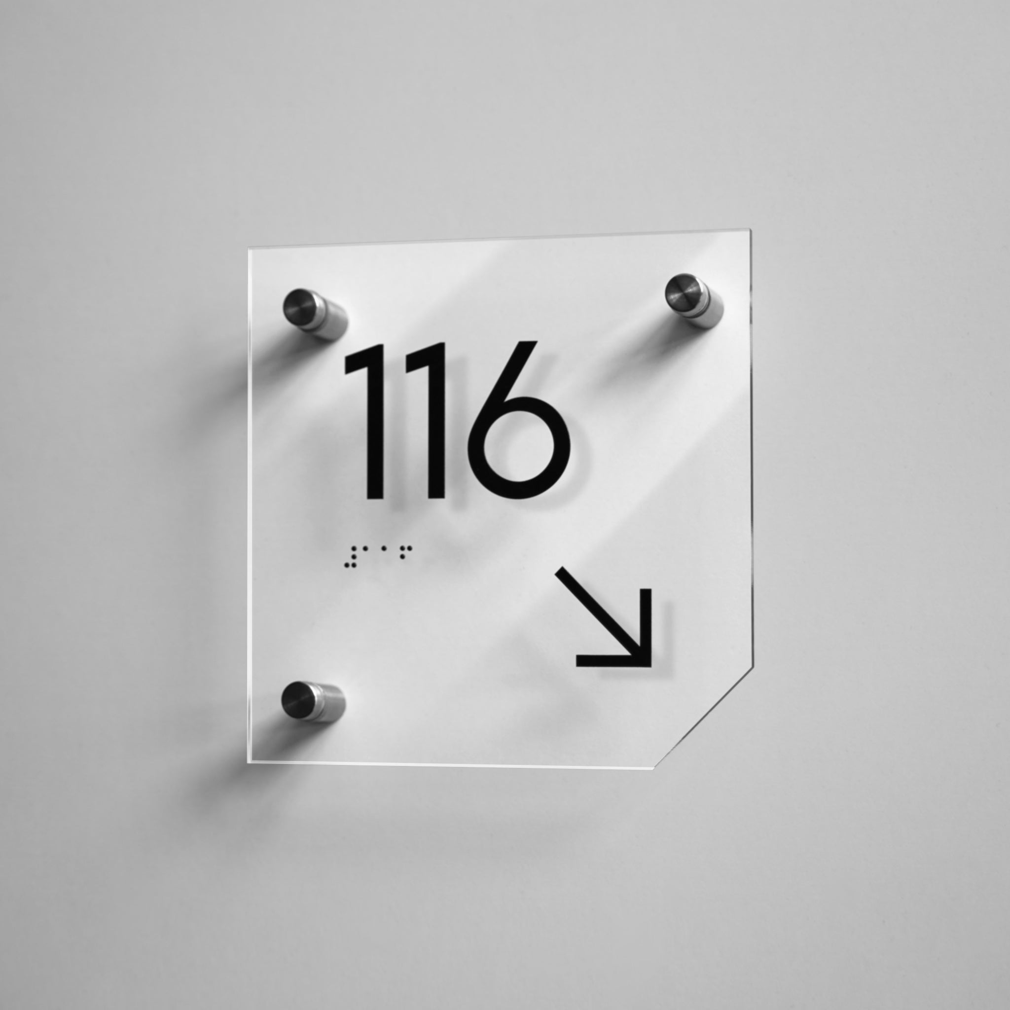
Acrylic signs have a modern look, are ideal for minimalist interiors and allow you to create spectacular three-dimensional solutions.
-
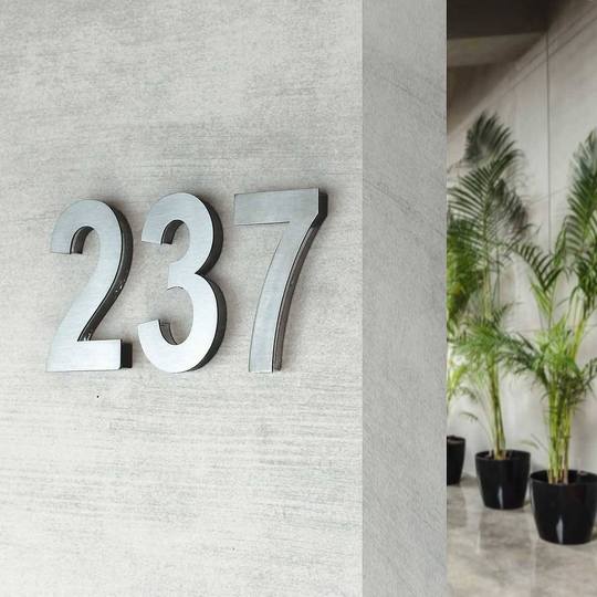
Stainless steel signs add a premium look and durability to your space, while remaining stylish and professional.
User-friendly design: what navigation errors cause confusion?
In navigation, balance is important. Too few signs and a person gets lost. Too many and the eyes cannot quickly find the information they need.
Common navigation issues can seriously impact visitor comfort. For example, room identification signs that are only visible up close force people to get closer to read the text.
It's also common to see signs that don't match the style of the room, which makes them look out of place and lack credibility.
Another common mistake is overloaded text and complex symbols, which makes it difficult to quickly perceive information.
Imagine a healthcare facility where a patient needs to quickly find the reception desk, but instead faces confusion. In such situations, effective navigation solutions reduce stress and increase patient satisfaction.

How do well-designed business signage improve the customer experience?
Information signage for business works in a variety of areas
Information signs are an important element of navigation, helping visitors, customers and employees to easily find the right places and navigate in space. They perform not only a functional role, but also become part of the company's image, emphasising a professional approach to space organisation.
Well-designed signage in hotels plays a key role in ensuring the convenience of guests. They help them easily find their rooms, navigate the corridors, find the reception, restaurant or other recreational areas. High-quality navigation not only simplifies movement, but also creates a positive experience of staying in the establishment, which contributes to guest loyalty and positive feedback.
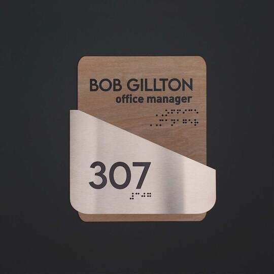
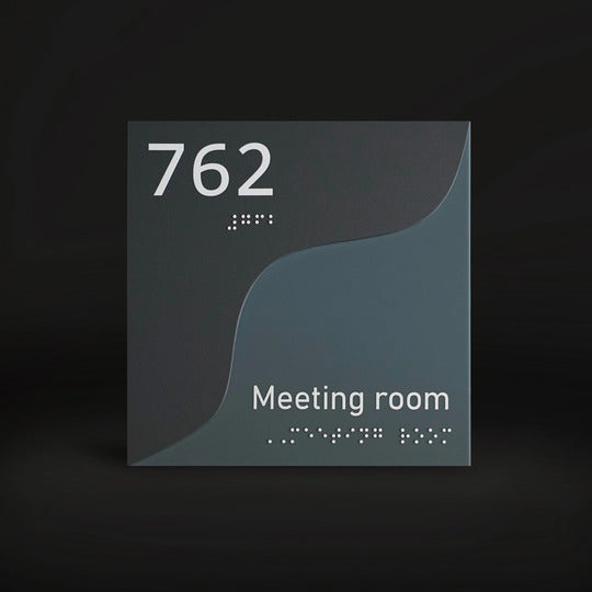
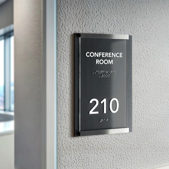
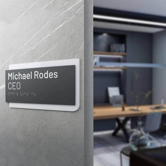
In office buildings, an appropriate signage system helps visitors quickly find the right office, meeting room or reception area. Office door signs allow you to instantly understand who works in a particular room, and also provide structure and order in business centres.
In commercial premises, street signs play an important role in helping customers quickly find the right establishments, offices and shops. They create the first impression of a business, so the quality of materials and thoughtful design are critical.
Information signs for businesses simplify the navigation experience and increase trust by making the space more organised, accessible and comfortable for all visitors.

Effective hospital signage: wayfinding system that "speaks" a clear language
A hospital is a place where quick and easy orientation is critical. Medical signage helps patients, visitors and staff to move around the facility without hindrance, which is especially important in emergency situations. Clear signage not only contributes to comfort, but also plays an important role in overall safety by helping people quickly find exits, reception areas, wards and services.
-
The importance of wayfinding signage in a complex hospital structure. Wayfinding signs are a key tool for organising space. They should be highly visible, placed in strategic locations and contain clear information. This is especially important in corridors, at intersections, near lifts and stairs.
-
Accessibility and inclusivity. Healthcare facilities serve people with different needs, so it is important to consider inclusive signage design. Hospital navigation signage provides a user-friendly design with disability in mind and includes accessibility features. For example, they take into account language barriers by using universal symbols, making information understandable to all visitors, regardless of their language or physical abilities.
-
Functionality and durability. Medical signs should be made of materials that are easy to disinfect, as hospitals require a high level of hygiene. Wood, acrylic and stainless steel are ideal materials as they are resistant to wear and tear and provide an aesthetic appearance even after prolonged use.
A well-designed navigation signage system makes the hospital more convenient and safe for all categories of visitors, and comfortable orientation in space has a positive impact on the overall experience of staying in a medical facility.

Wayfinding solutions as a business investment: long-term benefits
Installing clear signage is not just an expense, but a crucial part of business development. Aesthetically pleasing signage and its strategic placement, as well as directional signs, are a business investment, as they help reduce the workload of staff, as customers easily find the right premises without having to ask for help. In addition, properly organised navigation creates a better image because the space is perceived as well organised and convenient.
High-quality signage also contributes to increased customer loyalty, as a comfortable environment motivates visitors to return. At the same time, it improves operational efficiency by optimising the flow of people, which is especially important for large commercial and healthcare facilities.

Comfort is in the details: tactility, accessibility, precision
When a space is thoughtfully designed, people hardly notice it. They just feel comfortable. This is the art of good navigation — it works unobtrusively but effectively.
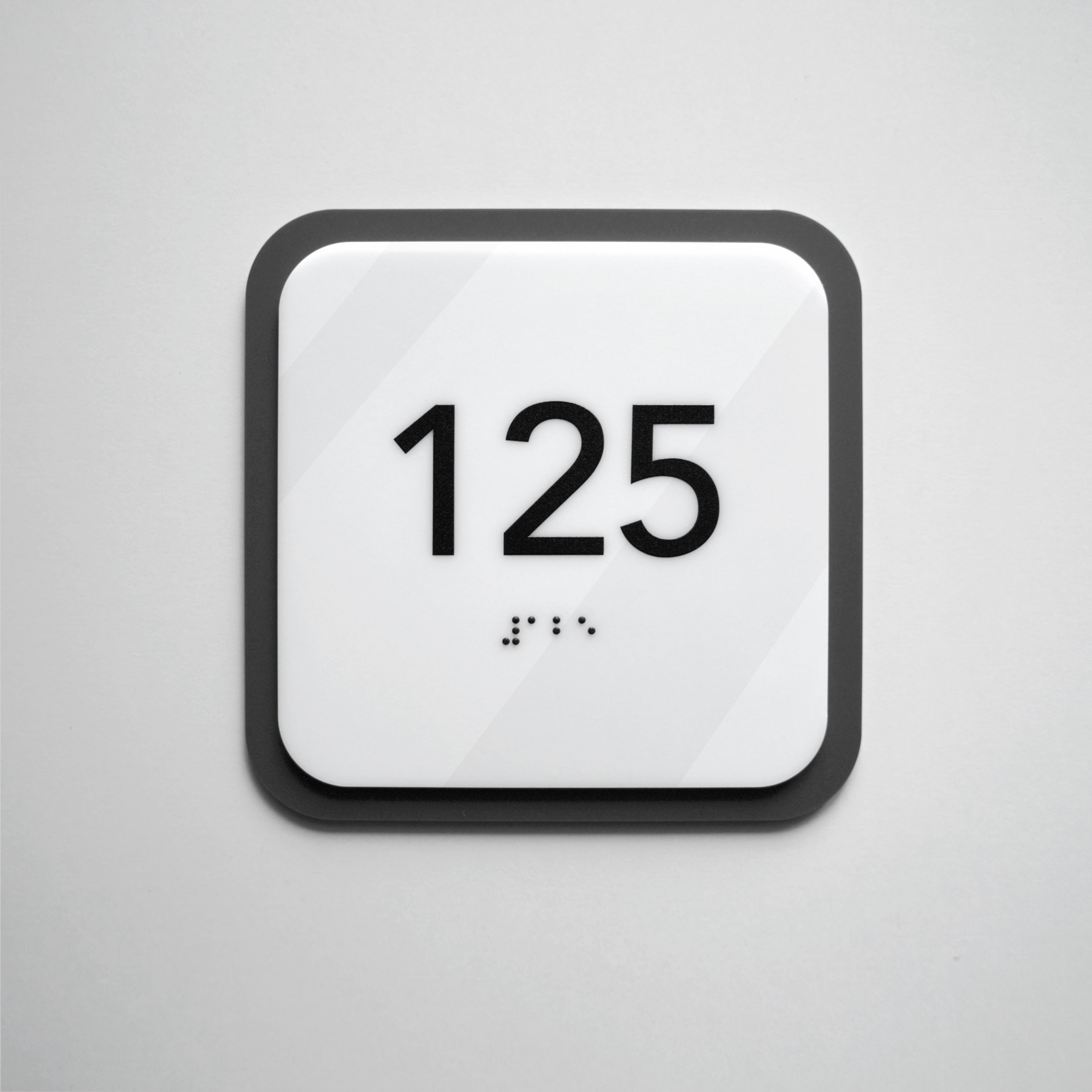
The tactility of the signs plays an important role for all visitors, especially for the visually impaired. The use of Braille and embossed symbols makes the space accessible to everyone. This is not just compliance with standards, but a manifestation of care and professionalism.
Accessibility is more than just the convenient location of navigation signs. It's about choosing the right materials and contrast so that the information is clear even in low light. The stainless steel, wood and acrylic signs we create provide an aesthetic look and durability, and most importantly, they are intuitive and easy to read.
Precision in navigation means that every sign is in its place and leaves no room for doubt. The visitor doesn't waste time guessing or asking staff questions — they instantly find the right way.
A well-thought-out system of navigation signs is a contribution to comfort that works without further ado.

The key to effective navigation: custom directional signs
Effective indoor navigation is not only about comfort, but also about safety, accessibility and harmonious design. Here's what you need to consider:
-
Proper placement
Signage should be placed at key points of choice so that people can quickly find their way around. This is especially important:
-
for evacuation routes, where every second can be crucial;
-
for waiting rooms of healthcare facilities where visitors need clear navigation;
-
near emergency exits so that people can quickly find their way to safety;
-
in lifts and on inter-floor runs, where correct labelling helps to avoid confusion;
-
in office spaces and coworking spaces, where clear navigation creates convenience for guests and employees;
-
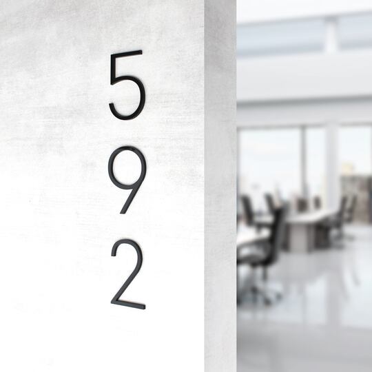
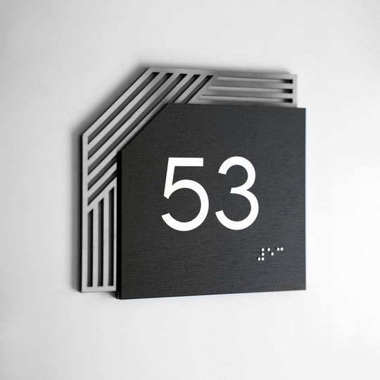
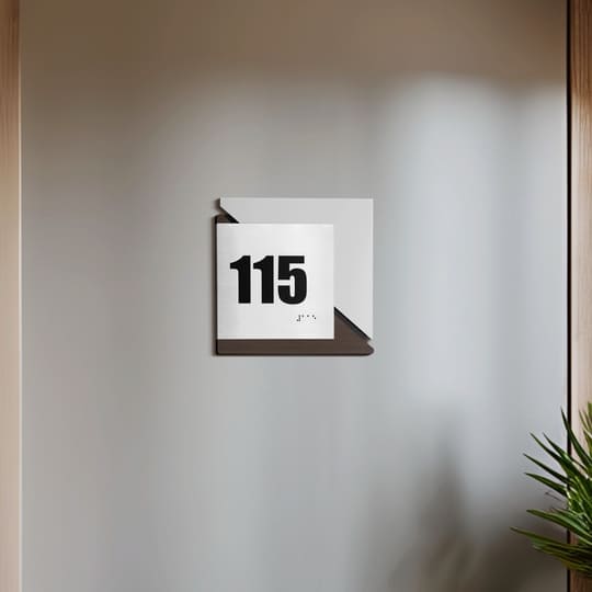
in hotels and apartments, where number plates and information signs make your stay more comfortable;
-
in public places (airports, train stations, shopping centres), where navigation helps to avoid chaos.
-
Accessibility for all
Taking into account the special needs of visitors makes a space inclusive:
-
Signage in Braille allows visually impaired people to easily access information, which is especially important in unfamiliar environments.
-
Contrasting design and large symbols help visually impaired people to better perceive information.
-
Tactile elements enable navigation without additional assistance.
3. Emergency preparedness
In an emergency, people don't have time to look for a way out, so it's important to:
-
use clear symbols and arrows for quick navigation;
-
place safety signs at eye level and in places where they cannot be missed;
-
use durable, damage-resistant materials so that the signs remain functional in all conditions.
4. Durability and quality
Signs should be not only aesthetically pleasing but also practical:
-
stainless steel, wood and acrylic are materials that combine style and reliability;
-
permanent printing and three-dimensional elements ensure that information remains clear even after years;
-
the absence of mechanical fasteners (screws, dowels) makes installation neat and visually appealing.
5. Harmony with the interior
Navigation signs should not look alien in space. They can:
-
complement the style of the room through individual design;
-
maintain a common colour scheme and materials;
-
emphasise the status of the establishment through premium materials and quality workmanship.

Conclusion: how signage improves the customer experience
Functional signage is not just an accessory, but an important design element that has a significant impact on the perception of space. They make navigation easier in hospitals, hotels and office centres, helping visitors to find the right room quickly.
Well-designed navigation reduces tension and therefore decreases visitor stress levels, which is especially important in large and complex spaces. High-quality signage helps people to feel confident and safe, navigating the space without any difficulties.
In addition, information signs shape visual appeal, creating a positive impression of the space and contributing to increased customer satisfaction.
They can emphasise the status of the establishment, match its corporate identity and create a harmonious combination with the interior. That's why the choice of materials, fonts and design is of great importance. Stylish and high-quality signage not only serves as a navigation tool, but also helps to create a positive company image.
If you want your space to look aesthetically pleasing, be convenient for visitors and meet the best navigation standards, don't hesitate to contact us. We'll help you choose the perfect signage that will highlight the uniqueness of your business and make navigation as efficient as possible. Sign up for a free consultation right now!
