


Color schemes in interior design 2023
We regularly hear that the interior should be trendy. One of the main components of its creation is knowledge of current color schemes. Next, we will tell you about those that will definitely be in fashion in 2023. We will also give you useful tips on what accessories to add to the interior so that it really opens up and makes a really pleasant impression.
A few terms
To move on, we need to define terms. For example, color is something that makes things not black, white, or gray. In fact, each person perceives a wave of light with a certain spectral composition subjectively. This perception (or sensation) is color.
When we talk about colors, we mean, first of all, such as red, blue, yellow, etc. These are the main (or primary) colors. If you combine two of them together, we get secondary ones: purple, green, and orange.
Also, each color has shades. The difference between these two definitions is that when white is added to any color, it becomes lighter. This is the shade, for example, pink is a shade of red.
And there are also tones. They are created when black is added to primary colors and they become darker.
When it comes to even pure colors we mentioned above, you need to understand that each of us sees them a little differently. As for the tones and shades, there is even more space for individuality. So don't be surprised if different people call the same wall purple and blood red, for example.
Also, when planning finishing, it is important to consider the temperature of colors in the interior, it can be:
- warm (red, yellow);
- cold (blue, purple).
In addition, color perception is affected by the:
- level of illumination and its variety (for example, in the light of a candle, the color looks completely different than under a fluorescent lamp);
- colors of objects that surround us;
- texture of the surface itself.
Designers, working on the design, rely not only on their own eyes, but also on special tools-color combination palettes where they have numbers and names. So, if you plan to update or create your interior from scratch, you can also use them.
Fashion colors 2023
Below we will describe several popular color schemes of this year, which will remain relevant in the future.
Combination of gray, brown, and blue
The color scheme with shades of gray, brown and blue is a great option for interior design that exudes sophistication and calmness. Combining these colors can create a unified and balanced look for a room, and each color can be used to emphasize accents.
One of the tools to implement this color scheme is to use neutral gray walls as a basis, which can become a background for other colors. After all, answering the question, what colors are suitable for gray, we can safely say that any.
Then add accents in the form of brown and cool blue. They can be implemented through furniture, accessories, and decor. For example, a brown leather or velour sofa and blue decorative pillows on it will look quite organic. In addition, such solutions can add warmth and depth to the space. And the combination of gray with them in the interior is non-trivial.
Another way to implement this is combination of colors in the interior — use fabrics with patterns that contain all three colors. Alternatively, buy a floor mat with blue and brown geometric shapes on a gray background.
Calming effect of the blue color and the grounding effect of warm brown will help create a calm and inviting atmosphere.
The advantages of this combination of colors in the interior include versatility and timelessness. These colors go well with both modern and traditional designs. In addition, such an interior can be updated with brighter colors or metallic accents, for example, steel navigation signs, if we are talking about commercial premises.
Pastel
By implementing this color scheme in interior design, it is important to use pastel colors in moderation. The fact is that too much enthusiasm for them can create a blurry, indistinct effect. In general, use of pastel colors adds a touch of elegance and sophistication to the room.
Choosing pastels, consider using the following shades: warm pale pink, cool mint green, lavender and blue. These colors can be combined with white or dark tones. As accents, use fuchsia or dark blue to create a contrast. Also, in order to beat the pastel colors in the interior, patterns are appropriate.
In general, this combination of colors in the interior creates a cozy and peaceful atmosphere, perfect for places where rest and relaxation are planned.
Beige or milky color combined with red, salmon or coral
Application of such a color scheme in interior design will help you turn an ordinary room into an attractive and bright one. If you are considering this option of arranging a space, then start with a neutral base. Use beige or milky as the dominant color for walls, furniture, and floors. These neutral base colors look unobtrusive and act as canvas to show the passionate character of other colors.
Introduce shades of coral, red and salmon as bright spots. These can be decorative pillows, curtains, paintings, reproductions, carpets, poufs. These bright and bold colors will bring energy and warmth to the space. For contrast, add dark tones: purple, berry, wine.
To make the combination of the entire palette look as harmonious and balanced as possible, add natural elements. Wood or live plants will become a chain that combines all colors and shades into a single ensemble.
Grey, black, white and yellow
This color scheme in interior design allows you to create a modern, dynamic and at the same time refined atmosphere.
To make this solution look organic, give preference to gray, black and white colors on the walls, floor and large furniture. All this will allow you to highlight bright and cheerful yellow accents that will remind you of the warmth and sun.
Accent color is better integrated in the form of patterns, stripes, chevrons (zigzags) and abstract geometric patterns. It is worth combining both delicate shades, for example, straw, vanilla, sand, lemon, and darker tones: mustard, amber, golden oak.
Also in such interiors, you should have objects made of wood, metal, textiles with a variety of textures. In the background of white color in the interior they will look especially attractive.
Such a combination of colors and textures in the interior is suitable for office spaces, after all, it can motivate and inspire in the workplace.
Blue, black, beige
The combination of blue, black and beige colors in a room can create a refined and even aristocratic atmosphere.
Usually, this scheme is implemented through the use of beige as the main color, black as an accent, and blue as an additional color. But you can move away from the classical approach.
How about making blue primary? This will create a brighter and more energetic space.
If you want to create a more non-standard, elegant and slightly shocking space, consider using black as the primary color in interior design. This can be especially effective in a room with high ceilings or plenty of natural light.
And this scheme can also help arrange the room in a style that reminds you of the sea. In this case, the base will be a light blue or turquoise shade, and beige and black will become accent and auxiliary. Add rattan or wicker furniture, jute carpets and decor in the form of fish, shells or corals to make the interior warmer and visually perfect.
To add a little glamor and sparkle to the room, place metallic accents such as gold, bronze, or silver (picture or photo frames, figurines, candlesticks, etc.).
Are there win-win accessories for any color scheme?
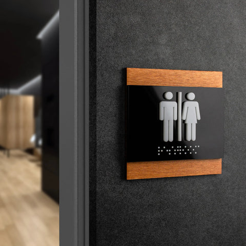
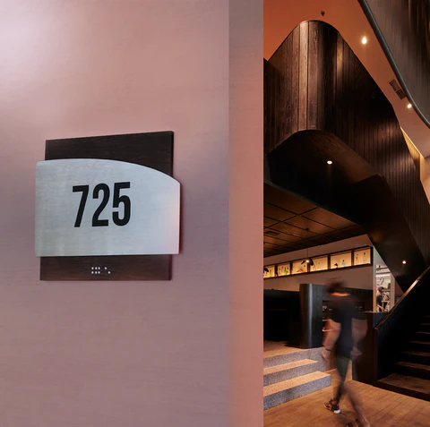
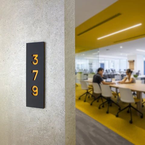
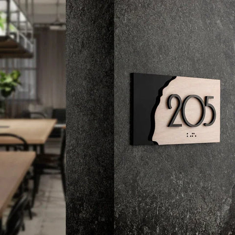
Describing options for implementing schemes with fashionable colors 2023, we mentioned wood a lot of times. Not for nothing, because it is really universal. The main thing is to choose the right color. You can integrate it not only in the form of furniture. Picture frames, interior signs and numbers, plant pots, etc. will also look good.
Steel accessories are also suitable everywhere. This material itself is neutral, but it can become an interesting but restrained accent on different backgrounds.
Also, of course, you can safely integrate glass into a variety of spaces. It can be either transparent or colorless, or have saturated or barely noticeable colors. Vases, lighting, tableware, and even interior signs all can be made of glass. By the way, if you are concerned about the safety of glass, you can give preference to acrylic. In appearance, it is not much different from organic, but it is much lighter and more durable.
If you have already decided on the color scheme for your room, but are still thinking about which signs or numbers to choose, please leave your contacts in the form. BSIGN online store manager will contact you soon and he will conduct a free consultation. You may want to buy something out of stock, or stop at making a customized sign to order.


